Weekend links 568

gekko.jpg

Dragon Rising to the Heavens (1897) by Ogata Gekko.

• “Electronic music of the past is often portrayed in a dreamy, magical light—a hazy historical landscape filled with misty, otherworldly sounds. But while the music of a bygone era may seem ineffable, it is not inaccessible.” Geeta Dayal reviews Reminded by the Instruments: David Tudor’s Music by You Nakai.

• Modular Therapy: Mute Records boss Daniel Miller and former snooker champ turned kraut-psych powerhouse Steve Davis discuss their love of modular synthesisers, ill-fated Jools Holland collaborations, commandeering Elton John’s ARP 2600 and more.

• “Some contemporary art is a little bit like an intellectual game…I’m not a big fan of this kind of stuff, because I’m a musician.” Ryoji Ikeda presents: point of no return.

One of the tunnels that Turrell has completed is 854 feet long. When the moon passes overhead, its light streams down the tunnel, refracting through a six-foot-diameter lens and projecting an image of the moon onto an eight-foot-high disk of white marble below. The work is built to align most perfectly during the Major Lunar Standstill every 18.61 years. The next occurrence will be in April 2025. To calculate the alignment, Turrell worked closely with astronomers and astrophysicists. Because the universe is expanding, he must account for imperceptible changes in the geometry of the galaxy. He has designed the tunnel, like other features of the crater, to be most precise in about 2,000 years. Turrell’s friends sometimes joke that’s also when he’ll finish the project.

Wil S. Hylton on an exclusive visit to James Turrell’s astronomical art complex at Roden Crater, Arizona. Related: 147 Orbiting 1 Through 6 for 5, Music for Roden Crater by Paul Schütze (with free download of an excerpt from the 5-hour piece)

• New music: The Black Mill Tapes, Volume 5 by Pye Corner Audio, and Interreferences by Richard Chartier.

• At Spoon & Tamago: Dense pencil drawings of retro-future worlds by Yota Tsukino.

• “‘I’m bursting with fiction’: Alan Moore announces five-volume fantasy epic”.

• At Dennis Cooper’s: Lindsay Anderson Day.

• Beverly Glenn-Copeland’s favourite music.

• Volcano Diving (1989) by David Van Tieghem | Crater Scar (1994) by Main | Eye Of The Volcano (2006) by Stereolab

Fire works

votf.jpg

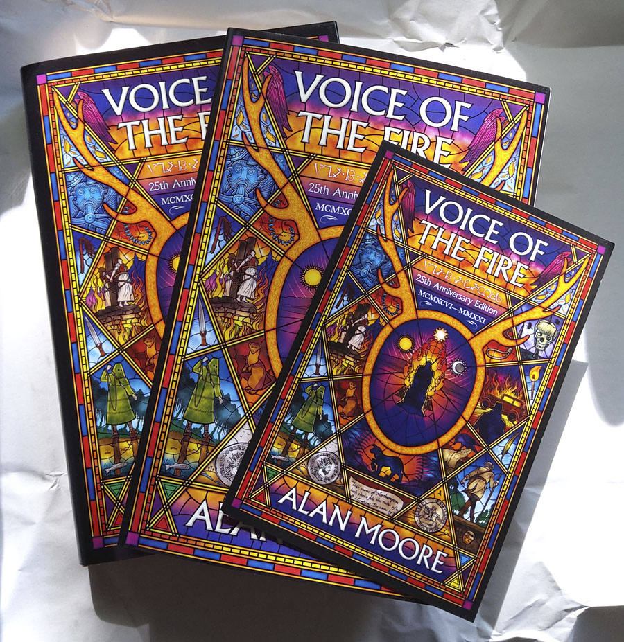
Glowing in the intermittent spring sunshine, the new hardback, paperback and bonus postcard of Alan Moore’s Voice of the Fire from Knockabout. The postcard is signed by the author, and only available with the hardbacks which are a limited run of 300 copies. Top Shelf will be publishing the book in the US (and also using my cover art) but I don’t know whether they’ll be following suit with signed cards. Anyone wanting more information about both editions is advised to check the publishers’ websites.

Previously on { feuilleton }
• Voice of the Fire by Alan Moore

32 Short Lucubrations Concerning Alan Moore

am.jpg

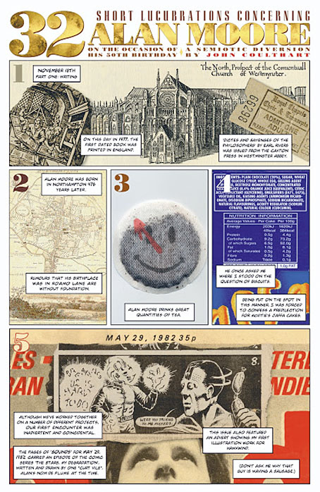
One of my few comic strips that isn’t either a Lovecraft adaptation or part of the Lord Horror mythos is a five-page piece I produced in 2003 for Alan Moore: Portrait of an Extraordinary Gentleman. This was a book compiled by Smoky Man to honour Alan’s 50th birthday, for which my strip was one of many other comics, one-off portraits and contributions by different artists and writers. The book is out of print so Smoky has been posting extracts (with permission) on his blog. My strip may now be seen in full here.

I got the idea for this one from Thirty Two Short Films About Glenn Gould (1994), a feature-length portrait of the celebrated pianist which evaded the clichés of the biopic by addressing its subject through self-contained sequences in a variety of modes: dramatic reconstruction, interviews with Gould’s friends, documentary material, a spectrographic display from the playback of one of his Bach recordings, even a short piece of animation. My strip is less ambitious but it combines factual trivia about Alan Moore with personal reminiscences plus significant historical details connected with his birth date, 18th November, 1953. It was fun to put together, and a reminder that comic strips can be used for more than just telling stories.

Previously on { feuilleton }
• Voice of the Fire by Alan Moore
• The Blake Video
• The Cardinal and the Corpse
• Mapping the Boroughs
• Art is magic. Magic is art.
• Alan Moore: Storyteller
• Alan Moore: Tisser l’invisible
• Dodgem Logic #4

Voice of the Fire by Alan Moore

votf1.jpg

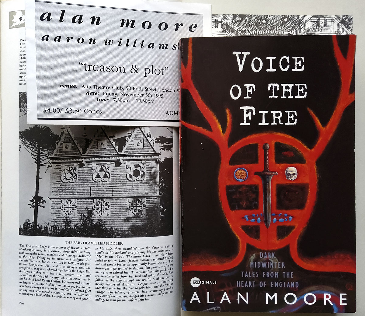
“History is a heat,” says Alan Moore at the end of his first novel, Voice of the Fire, when the author takes centre stage to add his own voice to those of his characters. History is a heat, and fire is its agent, the element that provides a connecting thread between the twelve people whose voices comprise the text of the book. Late last year I was asked to design a new cover for Voice of the Fire which will be published by Knockabout in a 25th anniversary edition later this year. I’d read the book when it was first published, and even saw Alan read some of the opening chapter in 1993 at an event at the Arts Theatre Club in Soho. That event, which took place on November 5th, was titled “Treason and Plot”, and the pages from the work-in-progress novel had been collected from the offices of Gollancz after Alan left the unfinished manuscript of Yuggoth Cultures—which he was supposed to be reading from that evening—in the back of a cab. I was in London that day to talk to Alan about illustrating Yuggoth Cultures, so to find myself illustrating Voice of the Fire many years later feels a little like being caught by one of the acausal connecting threads that he weaves through his novel.

votf3.jpg

The first edition: design by Gary Day-Ellison, illustration by Robert Mason. The photo on the left shows Thomas Tresham’s Triangular Lodge, a folly outside Northampton encoded with references to the Holy Trinity via a profusion of triangles and tripartite details. Tresham’s Lodge is described in the Gunpowder Plot chapter of Alan’s novel; the triangles on my cover may be taken as a reference to this.

November is the dominant month in Voice of the Fire, and the ritual fires of November 5th are one of many recurrent motifs. The novel’s twelve characters live in Alan’s home town of Northampton at different periods of history, from 4000 BC to 1995, a span of time that charts the town’s foundation and growth, taking in the Viking invasions, the Roman occupation, the Crusades, the treason and plot of Guy Fawkes and his conspirators, witch trials, the poet John Clare, and Alan himself. A lot of history and a wealth of incident to try and symbolise in a cover design. Author and publisher both liked the stylised outline of a horned head that Robert Mason painted on the cover of the first edition, a reference to the opening chapter of the novel in which a Neolithic shaman performs a ritual that marks the land as the site of the future town. I liked the original cover but felt it made the novel seem too much like something by Henry Treece or Alan Garner, with no indication of more recent history. A stained-glass window seemed like a good solution to the problem of how to bring together so many disparate elements into a single design. Stained-glass windows are often things from the distant past still visible in the present day, and they have the additional convenience of being a single container for many small pictorial details.

votf2.jpg

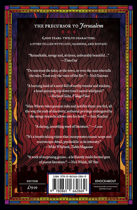
It’s Bonfire Night on the back cover.

My design doesn’t attempt to illustrate all the characters or events from the novel but shows the more salient moments together with smaller details, some of which (the noose, for example) appear in multiple chapters. The horned shaman is at the centre of the design which radiates out from his ritual fire. I avoided making the window design too much like a church window; the book contains many references to churches and Christian history but there’s also a strong pagan element in many of the chapters. Magic, in the occult sense, is a recurrent thread, and Alan’s favourite Elizabethan magus, Dr. John Dee, is present (albeit offstage) in the Angel Language chapter. To acknowledge this I placed an inscription in Enochian—Dee’s “Angel Language”—underneath the title. There’s more magic in the font used for the title and author’s name, Albertus, which was named after Albertus Magnus, a philosopher and theologian often described as an alchemist. The main reason to use Albertus is for its timeless styling and its readability, an important quality for such a busy cover design; the font is a common one on London street signs.

The creature with the floppy ears in the lower centre is another recurrent motif, the sinister “shagfoal”, or Black Dog, whose presence is a sign of the darker energies that seem to thrive in that part of the world. Black Dogs appear in folklore all over Britain but there are few pictorial examples to be found in old texts. I based my hound on the “Straunge and terrible Wunder” depicted in 1577 on the title page of Abraham Fleming’s account of the Black Dog of Bungay. Other details are more obvious for those who read the novel so I won’t spell out everything here. If you haven’t read it then I’d urge you to do so, it’s one of Alan Moore’s major works, and a book I’m hoping might receive more attention than it did in 1996 when Gollancz only saw fit to publish it in paperback. Voice of the Fire will be published by Knockabout in May in paperback and a limited edition hardback which will include a card signed by the author. Top Shelf will be doing something similar for the US but I don’t think they’ve announced any dates or other details as yet. Anyone looking for further information is advised to keep an eye on the Knockabout news page or the publisher’s social media accounts.

Previously on { feuilleton }
• The Blake Video
• The Cardinal and the Corpse
• Mapping the Boroughs
• Tresham’s Trinities
• The Triangular Lodge again
• Art is magic. Magic is art.
• Alan Moore: Storyteller
• Alan Moore: Tisser l’invisible
• Dodgem Logic #4
• The Triangular Lodge

David Britton, 1945–2020

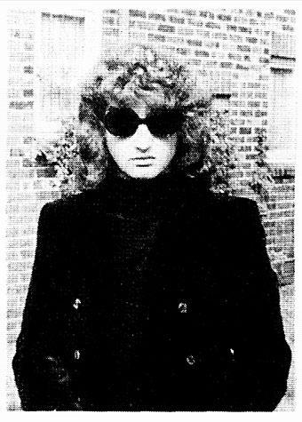
db.jpg

Mister Rock’n’roll, 1969.

David Britton, author, artist and publisher, died on 29th December. I wrote this for the Savoy Books news announcement:

My closest artistic collaborator from 1989 to 1999, and a close friend for longer than this: capricious, determined, fearless, funny, generous and inspirational. No David Britton, no Lord Horror; no Lord Horror, no Reverbstorm. He changed my life.

He’d been increasingly ill for several years so this came as less of a surprise to those of us close to him than to others. Dave and I used to talk at least once a week, and on the last occasion he’d sounded worse than usual. Those talks were episodes in a conversation about art that ran for over 30 years, beginning in the mid-1980s at the counter of the Savoy bookshop in Peter Street, Manchester, continuing in the Savoy offices with co-publisher and collaborator Michael Butterworth, and resuming on the phone; art in all its forms and in any medium, with no attention paid to categories of “high” and “low”.
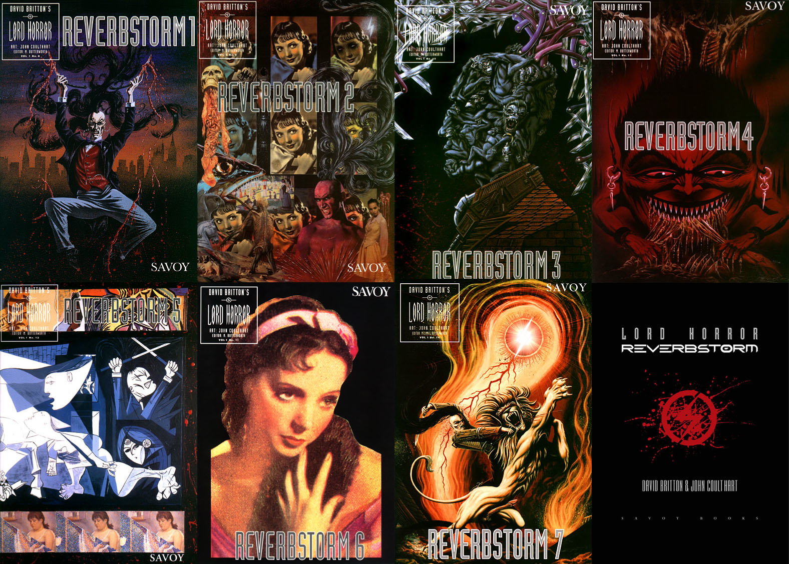
reverbstorm-covers.jpg

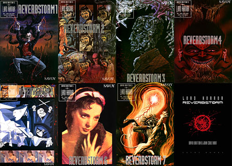
Reverbstorm, the Lord Horror comic series that we created throughout the 1990s, was the product of those conversations, and was also produced mostly through conversation, working by instinct without a script. The series, which was compiled into definitive book form in 2012, is testament to a pooled breadth of interest, encompassing/quoting/appropriating/reworking Pointillist, Cubist and Expressionist painting, Modernist poetry, pop songs, Sondheim musicals, Finnegans Wake, Tom Phillips’ Humument, Burne Hogarth’s Tarzan comics, Joel-Peter Witkin’s photographs, voodoo chants, Piranesi, King Kong, Bauhaus graphic design, Hugh Ferriss architecture, and illustration of all kinds, from fairy tales to cosmic horror via Aubrey Beardsley and Harry Clarke; there’s even ballet in the mix if you look closely. Dave always liked the idea of Lord Horror leaping and pirouetting like a dancer. More than anything, Reverbstorm is rock’n’roll, and this is partly what the title refers to: a thundering rhythm.
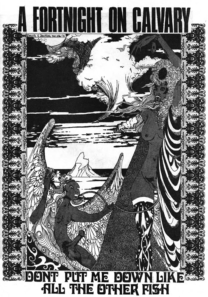
wf2.jpg

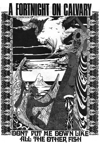
Britton art from Weird Fantasy #2, 1971. This is the drawing that caught the attention of William Burroughs when Britton and Butterworth visited Burroughs in New York City in 1979.

The term “rock’n’roll” always requires qualification when considering the Britton oeuvre, he used it with regularity while remaining bitterly aware that the original charge of the words had been degraded by over-use, reduced to a caricature by too many mediocre music acts and lazy journalists. I chided him a couple of times that his use of the term was functionally meaningless, a synonym for “my favourite things”. But the application was always a serious one, a label for any work that he found sufficiently thrilling, wild, original, excessive, anarchic, flamboyant, boundary-breaking or confrontational. Little Richard, Larry Williams, Howlin’ Wolf and Bo Diddley were Dave’s kind of rock’n’roll, as were Captain Beefheart and His Magic Band, PJ Proby, Iggy Pop, the Sex Pistols, The Cramps, The White Stripes and the Wu-Tang Clan. No surprise there, but Burne Hogarth was also rock’n’roll, although Hogarth would no doubt have disputed this. Another favourite artist, James Cawthorn, was given the label because Dave had discovered Cawthorn’s work when his teenage rock’n’roll obsession was at its height; two forms of art were permanently bound together, with sword & sorcery recast as the literary equivalent of a delinquent musical idiom. Dave’s other artist collaborator, Kris Guidio, was rock’n’roll for having served time as a peerless portraitist of The Cramps. LaVern Baker was rock’n’roll, as was CL Moore. Aubrey Beardsley was rock’n’roll and Harry Clarke was rock’n’roll; William Burroughs and William Hope Hodgson were rock’n’roll, so were Michael Moorcock and Harlan Ellison. Francis Bacon and Paula Rego were rock’n’roll; Alan Clarke was rock’n’roll and so was David Lynch. The quest for more of this rare commodity was relentless and unceasing. Many of our conversations were little more than enthusiastic discussions of shared favourites, or recommendations to watch/read/listen to something new.
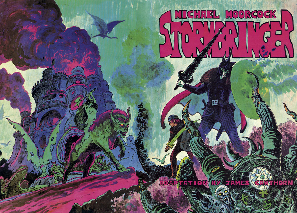
stormbringer.jpg

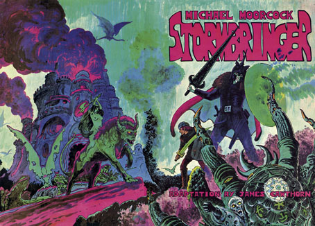
The first Savoy publication from 1976—Cawthorn adapting Moorcock’s apocalyptic Elric novel—was a declaration of intent: maximum rock’n’roll.

The photo at the head of this post is one that Dave had reused in recent years, one of the few portraits he seemed to like. It first appeared inside his debut publication, Weird Fantasy #1, a genre fanzine that was also enough of an underground publication to receive a passing mention in Oz magazine. The picture is emblematic of the Britton character, dressed in a manner at odds with the north Manchester surroundings he grew up in, and where he was still stuck at the time, a world of back-to-back housing and squalid ginnels. Rock’n’roll in all its forms was the great escape from a world of severely limited horizons and circumscribed lives, where all you could look forward to after a few years of poor education was a job in the local mill or factory. People who dismiss the gaudier forms of entertainment as “escapist” are usually middle class and blessed with comforts and opportunities that reinforce their condescensions; people who never had to consider a life so lacking in promise that a song heard on the radio, a vinyl record, a comic book, a paperback found on a market stall, might be the key to a wider world, an affirmation that there was more than the brick walls of your immediate environment, and there could be even more than this. “Escapist” suggests a hiding away but it also means breaking free. In later years Dave maintained a sporadic correspondence with Alan Moore; they never met but were mutually supportive, thanks in part to a shared background as bright boys from working-class backwaters with no encouragement to try and transform their lives through their escapist enthusiasms. Alan maintained an affection for his background, but Dave seldom spoke of his without a shudder, as though he’d evaded a fate worse than death. One thing he retained from north Manchester was an ebulliently vulgar sense of humour. He agreed with Picasso that good taste is the enemy of creativity.
lh.jpg

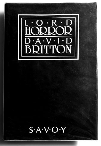
David Britton’s first novel wasn’t one he considered his best but it remains the most notorious thanks to the conscientious literary assessments of the Greater Manchester police.

I’ll miss Dave’s infectious humour, just as I’ll miss the conversations that so often provoked it, the quest for better art, some new kind of kick, more rock’n’roll. I’ll miss being able to show him something I know he’ll enjoy. He always liked quotations so I’ll end this with a lengthy one from Walter Pater, the aesthetic theorist whose ideas energised the Decadents and the founders of The Savoy, the magazine from which Savoy Books took its name. It summarises Dave’s attitude to life even if he’d never discuss things in such a grandiloquent manner:

…we are all condamnes, as Victor Hugo says: we are all under sentence of death but with a sort of indefinite reprieve—les hommes sont tous condamnes a mort avec des sursis indefinis: we have an interval, and then our place knows us no more. Some spend this interval in listlessness, some in high passions, the wisest, at least among “the children of this world,” in art and song. For our one chance lies in expanding that interval, in getting as many pulsations as possible into the given time. Great passions may give us this quickened sense of life, ecstasy and sorrow of love, the various forms of enthusiastic activity, disinterested or otherwise, which come naturally to many of us. Only be sure it is passion—that it does yield you this fruit of a quickened, multiplied consciousness. Of this wisdom, the poetic passion, the desire of beauty, the love of art for art’s sake, has most; for art comes to you professing frankly to give nothing but the highest quality to your moments as they pass, and simply for those moments’ sake.

Previously on { feuilleton }
• James Cawthorn: The Man and His Art
• A Reverbstorm jukebox
• Reverbstorm: an introduction and preview