Design as virus 12: Barney’s faces

lowe.jpg

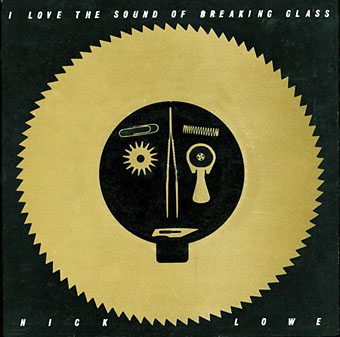
Sleeve for I Love The Sound Of Breaking Glass (1978), a 7″ single by Nick Lowe. Design by Barney Bubbles.

Continuing an occasional series. Designer Vic Fieger had a guest post at Reasons To Be Cheerful earlier this week examining Barney Bubbles’ use of the human face in his graphic designs. This is one side of the Bubbles work I really enjoy, he had a remarkable facility for demonstrating a versatility with abstract shapes—or found objects, as in the piece above—while playing games with our pattern recognition. A recurrent playfulness was one of the many notable things about his approach to design.

colour.jpg

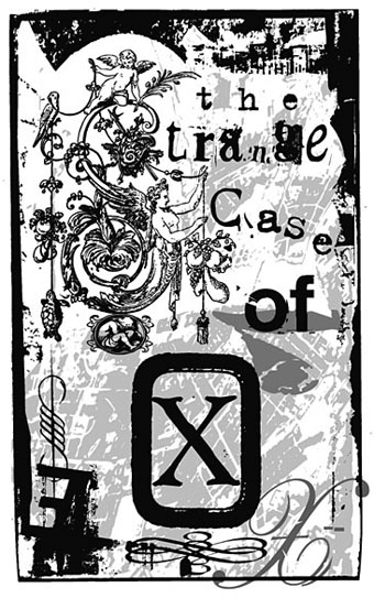
Story title from The Best of Michael Moorcock (2009).

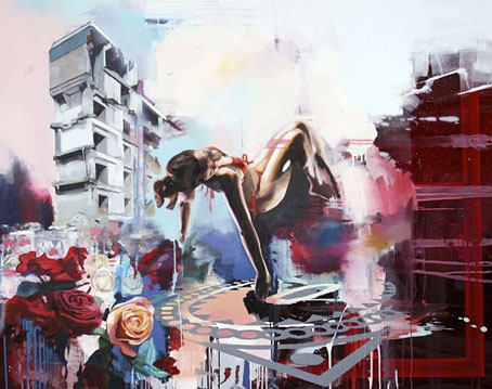
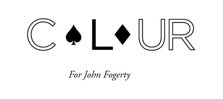
Fieger’s focussing on the faces in Barney’s work struck a chord for me since I’d deliberately tried something similar last year, taking a cue from Barney’s example. The Colour piece above is one of the story titles from The Best of Michael Moorcock published by Tachyon. For each story I designed a different title in a style which complemented the subject; Colour is a science fiction piece in which card games figure, hence the symbols. Mike Moorcock was friends with Barney during the 1970s so there was an additional reason for the reference.

booklife.jpg

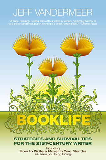
I don’t know whether anyone has noticed the face on the cover of Booklife but it is there, with the two flowers at the top forming the eyes and the book’s title standing for the mouth. Once again, this wasn’t strictly necessary for the success of the design but it gave a rationale for the arrangment of the flowers. There’s also the hope when something is this subtle that the attraction of the pattern impells a browser to pick up the book in a shop without quite knowing why.

Booklife and The Best of Michael Moorcock are both available from Tachyon. Paul Gorman’s Barney Bubbles book, Reasons To Be Cheerful: The Life & Work Of Barney Bubbles, will be relaunched later this year in a new edition.

Previously on { feuilleton }
Into the Media Web by Michael Moorcock
Design as virus 11: Burne Hogarth
Design as virus 10: Victor Moscoso
Design as virus 9: Mondrian fashions
The Best of Michael Moorcock
Design as virus 8: Keep Calm and Carry On
Designing Booklife
Design as virus 7: eyes and triangles
Design as virus 6: Cassandre
Design as virus 5: Gideon Glaser
Design as virus 4: Metamorphoses
Design as virus 3: the sincerest form of flattery
Design as virus 2: album covers
Design as virus 1: Victorian borders
Barney Bubbles: artist and designer

Weekend links 24

early.jpg

Delta-Wing (2009) by Chloe Early.

• “Feted British authors are limited, arrogant and self-satisfied, says leading academic”. Stating the bleeding obvious but it still needs to be said, apparently, especially when the announcement of the Booker list this year caused the usual confusion when Amis Jr. and McEwan weren’t included, as though the mere existence of their novels makes them prize-worthy. And as someone pointed out, the word “male” is missing from that headline.

Hero of Comic-Book World Gets Real: Alan Moore again, in the NYT this time. Related: a review of Unearthing live.

• Announcing The Hanky Code by Brian Borland & Stephen S Mills, a 40-poem book to be published next year by Lethe Press. For an explanation of the Hanky Code there’s this, and there’s also an iPhone app.

Folk—the ‘music of the people’—is now hip again, says (who else?) Rob Young who can also be heard on the archived podcast here. Related: the folk roots of Bagpuss. Related to the latter: The Mouse Mill.

zvorykin.jpg

An endpiece from The Firebird and other Russian Fairy Tales by Boris Zvorykin.

‘Yes’ to Catastrophe: Roger Dean, Prog and SF. A lengthy and thoughtful analysis of Roger Dean’s early work.

Into the Media Web, the enormous Michael Moorcock book which I designed, is officially published this week.

Cassette playa: in praise of tapes. I’ve complained about tapes in the past but people continue to find them useful. Some technologies die harder than others.

Boy BANG Boy: “Quiet moments made suddenly very loud with the attitude and opinion of what it means to be a young male in an impossibly diverse world.” An exhibition opening at Eastgallery, London, on August 5th.

Empty your heart of its mortal dream: Alfred Kubin’s extraordinary novel, The Other Side.

Ghostly and Boym Partners devise a new way to deliver digital music.

Besti-mix #27: a great selection by producer Adrian Sherwood.

Agnostics are troublemakers. Amen to that.

• RIP Harry Beckett.

Acousmata.

Let Us Go In To The House Of The Lord by Pharoah Sanders (live, 1971): Part 1 | Part 2

Portuguese Diseases

disease1.jpg

This volume appears to be in print now, the Portuguese edition of The Thackery T Lambshead Pocket Guide to Eccentric and Discredited Diseases, a unique fantasy anthology compiled in 2003 by Jeff VanderMeer and Mark Roberts. The new edition is published by Saida de Emergência and translated by Luís Rodrigues, João Seixas and Vítor Morta. I didn’t design this cover with its eccentric kerning but I did design the original edition for Night Shade, to date still one of my most elaborate and detailed book designs, too elaborate for the larger publishing houses, in fact, who either dropped or amended the deliberately diseased title spread for their paperback editions. You can see some of the original pages below. I sent the Portuguese publishers all the artwork and layouts but since I haven’t seen a printed copy of the book I don’t know how the interior looks. I don’t even know whether my name appears on the cover as it does here since other examples online show a different design. However, it’s often the case these days that cover designs get sent out prematurely for marketing purposes before things have been finalised.

disease2.jpg

Title spread.

disease3.jpg

Contents spread.

Previously on { feuilleton }
Pasticheur’s Addiction

Johann Theodor de Bry’s Neiw Kunstliches Alphabet

debry.jpg

A page from Johann Theodor de Bry’s Neiw Kunstliches Alphabet (1595) which can be found in a free PDF version here, the scans being taken from a Victorian reprint. The late, lamented Giornale Nuovo featured some of these curious letter designs in 2005. Each capital is embellished with various symbolic figures—Moses appears perched on the letter M, for example—whilst also being draped with fruit, lobsters and even insects. I used a smaller redrawing of De Bry’s letter S for one of the page designs in Jeff VanderMeer’s City of Saints and Madmen in 2002. Probably not the use that De Bry intended but then I expect he’d be surprised that his work was still being used at all after four hundred years. Via BibliOdyssey.

strange.jpg

Previously on { feuilleton }
The Book of Ornamental Alphabets
Paul Franck’s calligraphy
Gramato-graphices
John Bickham’s Fables and other short poems
Letters and Lettering
Studies in Pen Art
Flourishes

Weekend links: Ghosts, Spooks and Spectres edition

spectres.jpg

Cover design by Philip Gough.

Ghosts, Spooks and Spectres (1972 reprint). Editor Charles Molin collected nineteen ghost stories by writers including Oscar Wilde (The Canterville Ghost), Charles Dickens (The Signal-Man), J. Sheridan Le Fanu (Madame Crowl’s Ghost) and HG Wells (The Inexperienced Ghost). This was one of my favourite books when I was ten-years old. There’s nuffin like a Puffin. Puffin Books’ parent company, Penguin, is 75 this year.

• The good people at the Outer Alliance have posted an interview with me here in which I talk about the subversive sexualities of sf in the 1970s and also admit to writing fiction.

• There’s just time to mention It Came From Pebble Mill, an event which includes another screening of David Rudkin’s Penda’s Fen.

• “In our society, there has tended to be a very strong compartmentalization of different experiences, different cultural forms, different genres. We can talk in a very broad sense and say art is separate from science, for example, or body is separate from mind, or we can talk in a specific sense and say one certain form of dance music is separate from one form of, say, heavy metal. I don’t really buy those compartmentalizations. I understand why they exist, how they’ve come into being and why they’re convenient, but it’s not the way I think, it’s not the way I experience the world, it’s not the way I believe things should be.” From an interview by Colin Marshall with David Toop at 3QD. Toop’s latest book is Sinister Resonance: The Mediumship of the Listener.

The Kingdom of the Pearl by Léonard Rosenthal, illustrated by Edmund Dulac.

Ghost Stations by Dollboy, a CD package. And then there’s the Ghostly Bento.

7 Inch Cinema are Birmingham-based cultural historians.

• Mark Pilkington’s Mirage Men now has its own site.

Borges on Pleasure Island: JLB and his love of RLS.

• RIP Arne Nordheim, Norwegian composer.

• Charlie Visnic’s Modular Ghost Synth.

On the trail of Tutankhamen’s penis.

Photos by Thom Ayres.

Ghosts by Japan | Spooky Rhodes by Laika | Purple Dusk by Spectre.