Will Bradley posters

bradley01.jpg

More from American illustrator and designer Will Bradley (1868–1962) from the height of his Beardsley period circa 1894–95. These are from a collection by Edward Penfield entitled Posters in Miniature (1897) in which Bradley’s work receives more attention than some of his better-known contemporaries. Half of these designs are familiar, the rest I hadn’t seen before, including the peacock piece below. Even though Bradley was trying out various Beardsley moves at this stage, his work was always a lot more versatile than the lesser imitators. More of Bradley’s designs, and work by other artists, can be found in the scanned edition of Penfield’s book at the Internet Archive.

bradley02.jpg

bradley03.jpg

Continue reading “Will Bradley posters”

Soft machines

smseven.jpg

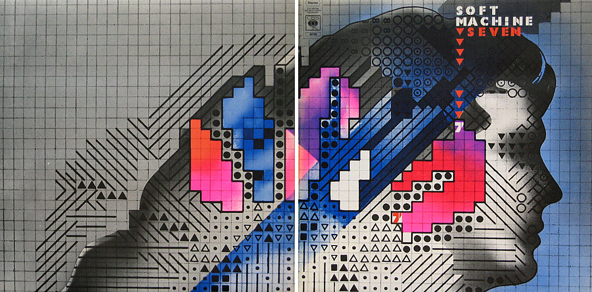
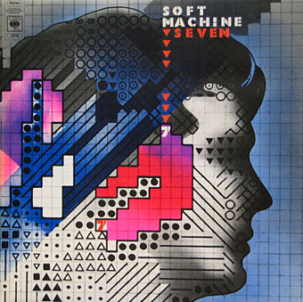
Seven (1973) by Soft Machine. Design by Roslav Szaybo.

You’re the great, grey man whose daughter licks policemen’s buttons clean,
You’re the man who squats behind the man who works the soft machine.

Mick Jagger, Memo From Turner (1968)

By coincidence this month I’d been re-reading some William Burroughs when I picked up a nice box set of five Soft Machine albums, part of a series of reissues that Sony have been doing recently. They’re very cheap and sound excellent, and also have the additional benefit of being a card slipcase holding the discs in card sleeves so there’s no nasty plastic packaging. The set comprises the Third (1970), Fourth (1971), Fifth (1972), Six (1973), and Seven (1973) albums. I have the band’s first two studio albums already so this has been an opportunity to get fully acquainted with the rest of their output up to the point where the machine started to run out of steam.

smone.jpg

The Soft Machine (1968) with die-cut sleeve. Design by Byron Goto, Eli Allman, Henry Epstein.

Third and Fourth are freaked-out jazz fusion recorded when Robert Wyatt was still on drums; Fifth, which I had for years on vinyl, is post-Wyatt fusion of a more polite variety, great compositions but it sounds lightweight compared to Miles Davis’s On The Corner which was released the same year. Six, which I’d hardly heard at all, is a set of live recordings and four superb studio tracks. Seven is the weakest of the lot but it prompts this post on account of the cover which I always liked the look of when flicking past it in record shops. Seen today it still looks surprisingly advanced for 1973, and the intention behind the design is still mysterious. I used to regard it as vaguely “futuristic” despite knowing that the music was nothing of the sort. The accumulation of abstract symbols contained by a human head implies either a score for some aleatory composition (which again is belied by the short jazzy pieces within), or can perhaps be read as a “soft machine”, especially if one considers that the popular idea of electronics at this time involved patch-boards and banks of flashing lights. Ten years later with synthesizers in common use this kind of semi-cybernetic imagery was a lot more topical.

smtwo.jpg

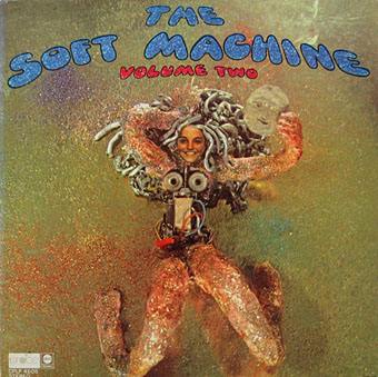
The Soft Machine Volume Two (1969). Design by Byron Goto, Henry Epstein.

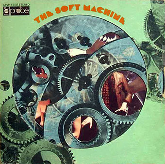
The first two Soft Machine albums both showed literal renderings of Burroughs’ “soft machine” idea albeit couched in the naked-woman-as-decoration style of the late 60s. Six has a horrible cover with an airbrushed attempt at a soft machine, one of those pictures common to the 1970s that you’re amazed was approved by band and record company.

v2.jpg

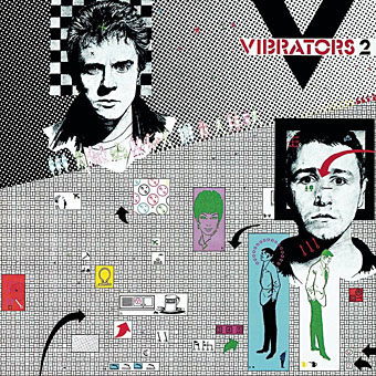
V2 by The Vibrators (1978). Design by Roslav Szaybo.

The design for Seven is credited to Roslav Szaybo, an in-house designer at CBS. Looking through Mr Szaybo’s other credits there’s little that resembles his Soft Machine cover until you arrive at the sleeve for V2, the second album by British punk band The Vibrators. This was another cover I always liked for similar graphical reasons to the Soft Machine sleeve; they also share a similar stencil typeface. Musically they’re worlds apart, of course, although William Burroughs’ influence on music carried on into the punk era (another Brit punk band named themselves Dead Fingers Talk) and beyond. It’s an influence reaching from the mid-60s with Soft Machine and his appearance on the cover of Sgt Pepper, into the 1990s with the many recordings he collaborated on or inspired from Bill Laswell, Hal Willner and others. His influence generally may have fallen off since his death in 1997 but it’s still a remarkable achievement for someone who never seemed to care much for music beyond the popular tunes he heard as a boy.

Elsewhere on { feuilleton }
The album covers archive
The William Burroughs archive

Index, fist or manicule?

index5.jpg

Third revised specimen book and price list of printing material (1887), Palmer & Rey, San Francisco.

Browsing through old type foundry catalogues recently reminded me of a question posed by Callum James a few years ago over at Front Free Endpaper, namely: what is the official description of those pointing hands favoured by pre-20th century typesetters? Writer Mark Valentine in a follow-up post mentions a term invented by William H Sherman—”manicules”—since Sherman also believed that the pointing hands were nameless. That’s not quite the case, however, as these pages show, with two descriptors being used: “indexes” and “fists”. Just to confuse matters both terms are used on different pages of the same catalogue which implies that the names may have been a convenience term to avoid having to repeatedly discuss “those pointing hand things” with customers. “Manicule” seems a better choice since “index” already has a standard meaning in printing, while “fist” doesn’t suit at all.

These catalogues contain many pages of similar type decorations and embellishments. All can be downloaded at the Internet Archive, just follow the links.

index2.jpg

Third revised specimen book and price list of printing material (1887), Palmer & Rey, San Francisco.

index4.jpg

Catalogue and book of specimens of type faces and printing material and machinery (1895), Cleveland Type Foundry.

index1.jpg

Copper alloy type book (1901), Pettingill & Co., Boston.

index3.jpg

Copper alloy type book (1901), Pettingill & Co., Boston.

Update: Thanks to Alan in the comments for pointing the way (so to speak) to William Sherman’s Toward a History of the Manicule.

Update 2: See this manicule Flickr group for many contemporary examples.

Previously on { feuilleton }
Victorian typography

The art of Robert Venosa, 1936–2011

venosa.jpg

A few years back, while experimenting with the hallucinogens, I experienced visions of a dynamic energy in constant high-velocity motion, crystallizing and manifesting in a form which could only be described as angelic. Potential energy, crystallizing energy and structured energy were all visible in the same instant…time and space transcended. These visions, and a new-found awareness of spirit brought about through worship and meditation, were too powerful not to be expressed: a translation had to be attempted.

Robert Venosa, Manas Manna, 1978.

I only discovered a few days ago that American artist Robert Venosa had died last month. As with the late Sibylle Ruppert there’s the inevitable wish for some wider acknowledgement of the passing of these unique talents.

santana.jpg

Millions of people have seen one of Venosa’s creations without being aware of it: in 1970 he designed the logo/title for Santana’s Abraxas album (the one with the amazing Mati Klarwein cover), a design which is still in use today. But it’s as a painter that he ought to be remembered. Manas Manna was the first collection of Venosa’s art published by Peter Ledeboer’s Big O imprint in 1978, and could be found on bookshelves that year with a pair of equally remarkable auto-monographs: Mati Klarwein‘s God Jokes and the first English edition of HR Giger‘s Necronomicon. All three artists were aware of each other (Venosa was friends with the other two), and all had managed the difficult feat of having their work sold in art galleries whilst also being visible to a much larger audience on album covers. All three books were eagerly plundered that year by the art team of OMNI magazine whose early issues made heavy use of paintings by Klarwein, Giger, Venosa, De Es Schwertberger and others. Of this Venosa has said:

OMNI was the first to give the artist equal credit with the author…something that to this day is still not seen in any other newsstand magazine. OMNI also put Fantastic Realism, Surrealism, Visionary, and every other type of ‘Fantasy’ art, square into the public’s eye. I and my colleagues owe OMNI a large measure of gratitude for its uncompromising stance and visionary concepts.

Venosa had been an art director at Columbia Records in the 1960s, a job he abandoned after he met Mati Klarwein and decided he’d rather devote his time to painting. Despite describing Klarwein in his book as his painting master, only a couple of his pictures are reminiscent of Klarwein’s distinctive style. Many of Venosa’s works are more loose and abstract than Klarwein’s tableaux, extending the processes of decalcomania which Max Ernst refined in works such as Europe After the Rain (1942) and The Eye of Silence (1944) to create stunning views of cosmic eruptions and vistas of crystalline beings rendered in a meticulous, hyper-realist manner. Many of his pictures could serve as illustrations for the later chapters of JG Ballard’s The Crystal World.

If the lazy definition of psychedelic art refers merely to shapeless forms and bright, clashing colours, Venosa’s art is psychedelic in the truest sense, an attempt to fix with paint and brush something revealed by a profound interior experience. This was deeply unfashionable by 1978, of course, but he carried on working anyway, and there are further book collections for those interested in his paintings. The Venosa website has a small selection of his extraordinary pictures although they really need to be seen at a larger size.

Elsewhere on { feuilleton }
The album covers archive
The fantastic art archive

Weekend links 76

aftertime.jpg

Despite appearances I’m still doing bits of design and layout work for various musicians. In the past week I’ve been trying to reorganise this sprawling website a little so it’s easier to add new work quickly and easily. One recent job was more layout than design, a CD and vinyl package for a Roly Porter collection of instrumentals entitled Aftertime. Each track on the album is named after a different planet from Frank Herbert’s Dune books although the music isn’t as illustrative as that implies. Porter’s use of an Ondes Martenot and various acoustic instruments which he subjects to degrees of distortion is just the kind of thing I like hearing. One track can be heard at FACT where Porter is interviewed about his work. Aftertime is released this month on the Subtext label.

It is a rollicking saga that involves all sorts of things not normally associated with think tanks – chickens, pirate radio, retired colonels, Jean-Paul Sartre, Screaming Lord Sutch, and at its heart is a dramatic and brutal killing committed by one of the very men who helped bring about the resurgence of the free market in Britain.

Adam Curtis on the strange history of Britain’s think tanks and their hidden agendas.

• Other assorted music business: Getting down to the Cabinessence: “This is the first of what may become an intermittent series of observations about Smile, and how Brian Wilson tried to put his dream on this planet.” | After The Flood: Talk Talk’s Laughing Stock 20-Years On: a lengthy and detailed Quietus piece on one of the best albums of the 1990s. | Jonathan Barnbrook uses an old analogue video synth to create a visual accompaniment for Interplay by John Foxx & The Maths. The HD version is an eye-searing delight.

Meredith Yayanos favours the sister instrument of the Ondes Martenot, the theremin, which she uses to provide a spooky score for a new film, Empty Rooms. There’s more spectral ambience at her SoundCloud page.

giovani.jpg

A Jules Verne cover by Carlo Giovani for Editora Ática.

• Sculptor and writer Josiah McElheny transforms the Whitechapel Gallery into a hall of mirrors.

Jacob’s Lament, an animated collaboration between illustrator Ian Miller and Stijn Windig.

Pornographic Poem (1967) by John Giorno.

Oscar Wilde grandson scorns “new” play.

• Manhattan in marble by Yutaka Sone.

Paul Atreides pt. 1 (1978) by Richard Pinhas | Harkonnen (1979) by Zed (Bernard Szajner) | Prophecy Theme (1984) by Brian Eno.