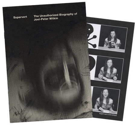
Arriving in the post this week, a Christmas gift from Supervert, a chapbook featuring a new piece of writing that purports to be the unauthorised biography of American artist/photographer Joel-Peter Witkin. The premise is that the facts of the real Witkin’s life are far too mundane to account for his extraordinary photo tableaux so Supervert supplies details such as “Mary Witkin [his mother] worked as a bookkeeper in a DDT plant, slowly saving to enrich the unfathomable reservoirs of the absurd.” A metaphysical portrait of the artist, then, with echoes of David Lynch or Bruno Schulz. Inside the chapbook was a promo postcard bearing pictures of the delightful Ms. Stoya whose reading of Necrophilia Variations has now gained over four million YouTube views.
The Witkin book isn’t for sale but copies are available to those who enter the Supervert contest which is running throughout December. All you need do is enter an email address here then keep your fingers crossed.
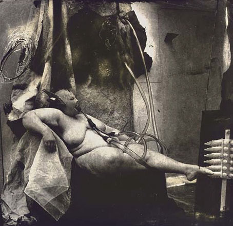
Sanitarium, New Mexico (1983) by Joel-Peter Witkin.
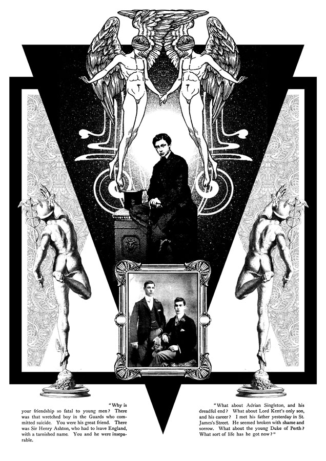
Witkin’s tableaux made an immediate impression circa 1993 when I bought a copy of PhotoVision, a Spanish photography journal which had devoted an entire issue to his work. This arrived at a point when I was halfway through drawing the Reverbstorm comic series, and Witkin’s parade of unorthodox humanity, crucified apes and sundry body parts seemed an ideal complement for the parade of similar grotesqueries (and sundry body parts) we were putting into the comic pages. I also liked the way Witkin worked his own variation on familiar scenes from art history, something we were doing throughout Reverbstorm (Witkin’s Vase: Study For the Base of the Crucifix just happens to combine a partly dissected human skull with Picasso’s Guernica, a recurrent motif throughout the series).
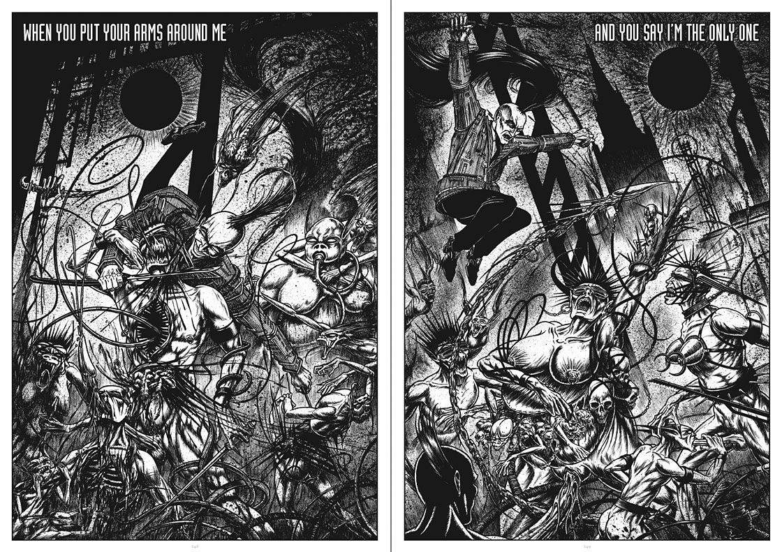
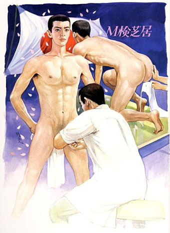
Above and below, some of the more Witkinesque details from part seven of Reverbstorm. The main figure above was a direct reference to Witkin’s Sanitarium, New Mexico. Many figures in other drawings are given Witkin-like blindfolds.