Summer

mucha.jpg

Summer (1896) by Alphonse Mucha.

With the temperature rising inexorably throughout the week—today it hit 30C—it’s been easy to identify with Alphonse Mucha’s languid spirit of summer, and the urge to drape yourself on a branch beside some water. Mucha produced many picture series on different themes, with several attempts at depicting the seasons. This is from the first series in 1896, and is the one I prefer over all the others. The 1903 version deploys all the traditional harvest iconography but also looks much too sedate and overdressed for warm weather; Summer 1896 is suitably enervated and dishevelled. She even looks as though she may be a little horny although it’s unlikely she’d want to do much about that. Her sister spirits may be seen here.

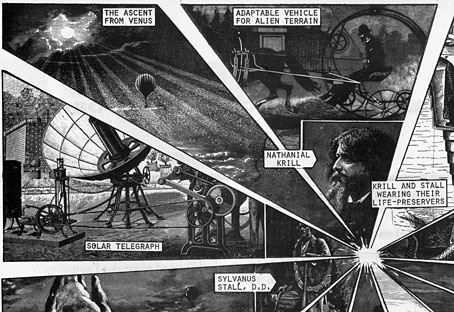
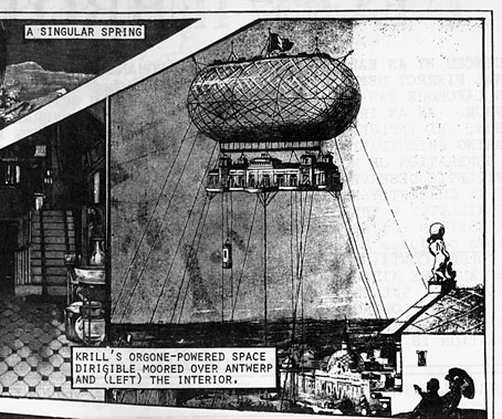
Nathanial Krill at the Time Node

krill.jpg

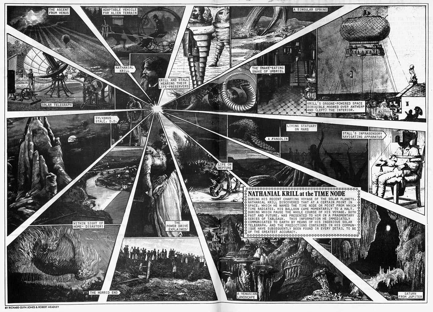
Nathanial Krill at the Time Node (1978) by Richard Glyn Jones and Robert Meadley.

Michael Moorcock’s New Worlds magazine resumed publication in 1978 after a hiatus of two years following the end of its New Worlds Quarterly paperback format. The issues for the years 1978 and 79 are the oddest in the entire run of the magazine. Issue 214 had the magazine title in Russian, a cover illustration of Union Jack anti-hero Zenith the Albino, and promised to deliver “Politics—Sport—Science”; issue 213 had an Empire-era cover, and contents which mostly dispensed with written fiction in favour of visual features such as newspaper pages from parallel time streams, or satirical collage.

krill2.jpg

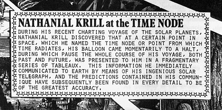
Among the satire there was this two-page piece by Richard Glyn Jones and Robert Meadley which is probably the closest the magazine came to what people now call steampunk. I say probably because many of Moorcock’s alternate histories were doing in the late 60s and early 70s what steampunk does today, although not all of these appeared in NW. Nathanial Krill at the Time Node has the additional interest for me in being another example of the use of period engravings for fantastic or satirical ends, and one that few people will have seen. Richard Glyn Jones was a regular illustration contributor to New Worlds; Robert Meadley had four short stories in New Worlds Quarterly. Ten years ago I designed Meadley’s essay collection, A Tea Dance At Savoy. He’s a great writer, I keep hoping we’ll see more of his work one day.

krill3.jpg

krill4.jpg

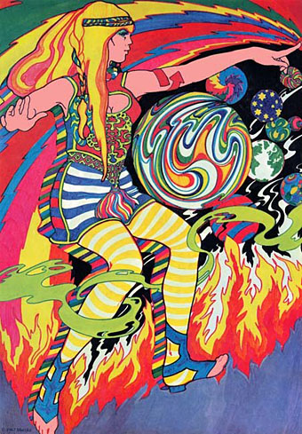
The art of Marijke Koger

koger1.jpg

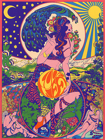
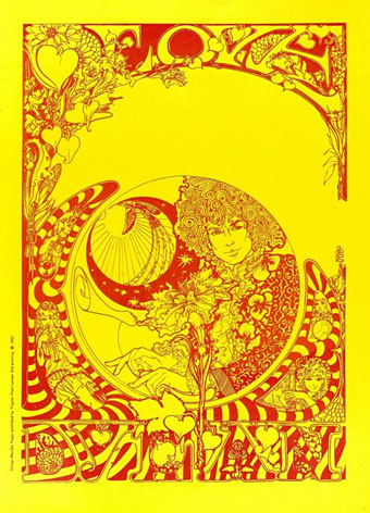
Love Life (1966).

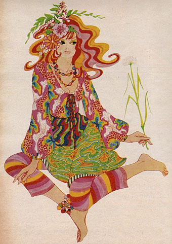
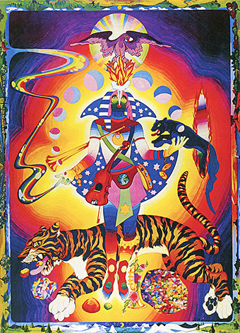
A slight return to The Fool, and specifically the work of Marijke Koger. Since The Fool was a collective it can be difficult separating out the work of individuals but all of these examples are credited as hers in Norman Hathaway & Dan Nadel’s excellent Electrical Banana (2011) book. The nature of the collective also tends to downplay the contribution of women to psychedelic art, with Koger tending to receive less individual credit than Bonnie MacLean does for her US concert posters. Koger’s Love Life design is very advanced for 1966, and could easily have been created at almost any time in the next decade. The Bob Dylan poster below is the most florid representation of Mr Zimmerman I’ve seen, an image that fits the times more than Dylan’s persona which remained resolutely untouched by acid culture.

It’s no surprise with this subject that Sweet Jane has already looked at the work of The Fool. There’s more photos and designs to be found at A Dandy in Aspic (many of them from the Electrical Banana book) while Bang The Drum All Day has some of the graphics produced for Brian Epstein’s Sunday Night at the Saville concerts.

koger3.jpg

Fashion drawing (1966).

koger4.jpg

Lucy (1966).

koger5.jpg

Love Bob Dylan (1967).

koger2.jpg

Tiger Man (1970).

Previously on { feuilleton }
The Fool album covers
Through the Wonderwall

The Fool album covers

fool.jpg

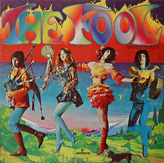
The Fool (1968).

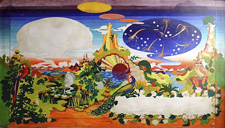
Many people know the work of design collective The Fool even if they couldn’t tell you the name or the names of any of the individuals involved.  The accelerated career trajectory of Dutch artists Marijke Koger and Simon Posthuma took them from a hippie enclave on the isle of Ibiza in 1966, to London and work for The Beatles throughout 1967 thanks to their distinctive brand of rainbow-hued psychedelia. Marijke Koger says the name The Fool was chosen after they met Crowley-obsessed blues singer Graham Bond who introduced them to the Tarot deck. Barry Finch and Josje Leeger later joined Koger and Posthuma. For The Beatles the group created the short-lived mural for the Apple boutique in Baker Street (removed after complaints), the decoration on John Lennon’s piano, and the inner sleeve for the Sgt Pepper album. The gatefold interior of the album was going to incorporate a Fool painting but Robert Fraser apparently persuaded the band to replace this with a group photo. The Fool themselves (and their decor) appear in the Beatles-produced feature film, Wonderwall (1968).
beatles.jpg

Proposed interior for the Sgt Pepper album (1967).

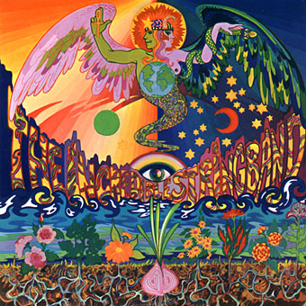
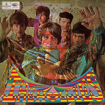
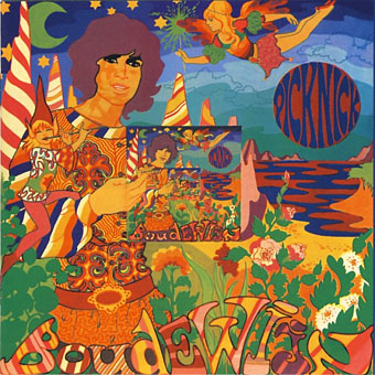
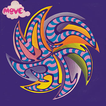
Given all this sudden visibility it’s surprising they weren’t more in demand for album cover designs although they were also busy producing florid outfits for other groups. The Beatles clothes on the All You Need is Love broadcast are Fool creations. Of the album covers, the one for The Incredible String Band is probably the most well-known. This small collection reminds me I still haven’t heard Evolution by The Hollies. The work on that cover led to a collaboration with Graham Nash on an album by The Fool (and session musicians) in 1968. The collective split up in 1969 with Marijke Koger and Simon Posthuma relocating to California.

Marijke Koger-Dunham’s site
Simon Posthuma’s site

beatles2.jpg

Sgt Pepper inner sleeve.

incredible.jpg

The 5000 Spirits Or The Layers Of The Onion (1967) by The Incredible String Band.
hollies.jpg

Evolution (1967) by The Hollies. Clothes and design by The Fool, photo by Karl Ferris.
degroot.jpg

Picknick (1967) by Boudewijn De Groot.
move.jpg

Move (1968) by The Move.

Elsewhere on { feuilleton }
The album covers archive

Previously on { feuilleton }
Through the Wonderwall

Weekend links 168

bell.jpg

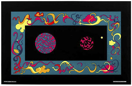
Window to the Universe (1967) by Roberta Bell. From Summer of Love: Psychedelic Posters from SCMA currently showing at the Smith College Museum of Art, Northampton, MA.

Sympathy for the Shoggoth: China Miéville’s Revolution of the Weird Tale, an essay by Christina Scholz which features one of my Cthulhu pictures among its embellishments. Related: “‘New Strange’ stories hold a chilling mirror to life” says Rick Kleffel discussing Robert Aickman and others. And speaking of Aickman (so to speak), Reese Shearsmith has recently recorded Aickman’s Cold Hand in Mine for Audible.

• An erotic alphabet book from the Soviet Union circa 1931, created to promote adult literacy. Who says porn can’t be educational?

Angelystor is a new 39-minute composition by Phil Legard which he describes as “often heavy, Saturnine and melancholic”.

• James Ward’s postcards of the Post Office Tower. Related: film of the revolving restaurant at the top of the Tower in 1967.

•You Might Never Find Your Way Back: Shirley Jackson’s Hangsaman by Nicholas Rombes.

satty.jpg

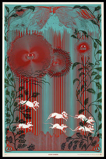
Stone Garden (1967) by Wilfried Sätty.

High Over Blue is “a mind-warping 20-minute freakout” by Moon Duo.

• Queer Visual Splendour: Jon Macy discusses his erotic comics.

The Origin of the Pilcrow, aka the Strange Paragraph Symbol.

• Mix of the week: the Kranky 20th Anniversary Mixtape.

Ten Amazing Cheeses and their Literary Counterparts.

PingMag looks at the past and present of Ginza.

Mind Gardens (1967) by The Byrds | The Garden (1981) by John Foxx | The Toy Garden (2006) by Helios