Jugend, 1899

jugend-99-01.jpg

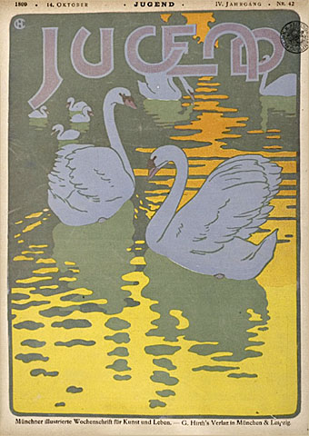
Continuing the delve into back issues of Jugend magazine, the German fin de siècle periodical of “art and life”, this post covers the year 1899. The earlier years of the magazine are replete with a variety of elegant and often bizarre graphics, as well as some classic examples of Art Nouveau graphic design. 1899 is the point in the magazine’s history that the variety (and, for me, the interest) begins to diminish. The covers lose their earlier inventiveness while the Art Nouveau stylings within are being replaced by drab illustrations of the German middle classes and patriotic depictions of country folk. There are still gems to be found, however, some of which follow below. As before, anyone wanting to see more of these graphics is advised to explore the bound volumes at the Heidelberg University archive. The two books for 1899 can be found here and here.

jugend-99-02.jpg

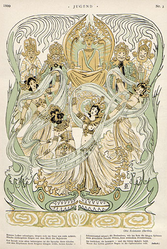
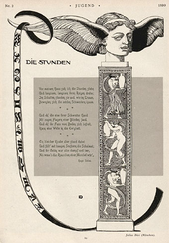
Otto Eckman (above) and Julius Diez (below) were heavily featured in the earlier years of the magazine and Diez in particular produces some of the best work in this year’s run.

jugend-99-03.jpg

Continue reading “Jugend, 1899”

Weekend links 10

harlequin.jpg

One of a number of vintage ads and ephemeral items at this Flickr set.

• From 1971: The Anthony Balch/William Burroughs/Jan Herman video experiment.

• The NYT reports on World on a Wire, a neglected science fiction drama by Rainer Werner Fassbinder.

• “While some of the technology industry’s brightest minds were inventing the first PCs and developing groundbreaking software, they were also feeding their heads with LSD.”

• The archive of author and illustrator Mervyn Peake has been acquired by the British Library for £410,000.

• Thames & Hudson are publishing I Wonder, a book by the wonderful Marian Bantjes, later in the year. Her site has a preview. I want.

• The gays: It’s election season in the UK so My Gay Vote looks at how the three main parties have supported LGB issues. (No data for the graphs, however.) Is theatre finally glad to be gay? Yet more Tumblrs: I heart skinny boys & Cute boys with cats.

• Trend-spotter, “svengali”, Situationist and the man who named the Sex Pistols: RIP Malcolm McLaren. The Guardian ran a number of memorial pages. Related: Anarchy in Gardenstown.

• Dublin’s One City, One Book choice for April 2010 is The Picture of Dorian Gray.

The Catastrophist: Christopher Hitchens on JG Ballard.

Steampunk Taxidermy by Lisa Black.

• LIFE looks back at Aleister Crowley.

• Groovy songs of the week: Julie Driscoll (with Brian Auger & The Trinity), a pair of songs by Bob Dylan—This Wheel’s On Fire—and Donovan—Season Of The Witch—and sets which look like a collaboration between Verner Panton and Marcel Duchamp. Amazing.

Mayuri lute

lute.jpg

Mayuri means “peacock” and although this splendid instrument doesn’t look like a European lute, a lute it is, albeit styled for Indian court performances. Via Wunderkammer.

Popular at nineteenth-century Indian courts, this bowed lute borrows features of other Indian stringed instruments, such as the body shape of the sarangi and the frets and neck of the sitar. There are four melody strings and fifteen sympathetic strings, which sound when the instrument is played to accompany popular religious song. The peacock is the vehicle of Sarasvati, the goddess of music, and it appears in Indian poetry as a metaphor for courtship. (More.)

peacock-crane.jpg

As a complement, here’s something I’m still hoping to find in a good colour reproduction, all one usually sees are details. The Peacock Garden (1889) was one of a number of wallpaper designs created for William Morris by Walter Crane. This copy showing the full pattern is from an 1897 issue of the German arts periodical Pan, part of a section highlighting arts and crafts in England. Walter liked his peacocks, here’s Juno and her birds from The Baby’s Own Aesop (1887).

Previously on { feuilleton }
Jaipur peacocks
Maruyama Okyo’s peacocks
Louis Rhead’s peacocks
The White Peacock
Peacocks
Whistler’s Peacock Room
Beardsley’s Salomé

Weekend links 9

arthur7.jpg

Own a copy of Arthur #7 (October 2003) with my swirling cover pic featuring cosmic jazz maestro Sun Ra. Lots of good stuff inside, details here.

Spinetingler Magazine announced their nominees the 2010 Spinetingler Award this week. Jeff VanderMeer’s Finch is one of the titles in the Best Novel category while my cover for Jeff’s book is in the Best Cover category.

• A Journey Round My Skull posted the results of the Raymond Roussel illustration contest. Entrants were asked to read Roussel’s story Bertha, The Child-Flower then create a picture based on that.

Has Dottie got legs? The New Criterion on the poetry of Dorothy Parker.

• The gays: Fuck Yeah Hot Weird Guys, more from the Tumblr hall of mirrors; Simon Callow reviews Gay Icons Through the Ages by Tom Ambrose; Wessel + O’Connor Fine Art is open again with a new exhibition at a new location in Lambertville, NJ; some things never change: “Secret tape reveals Tory backing for ban on gays.”

• “Make the inaccessible exciting.” Colin Marshall interviews Chris Bohn, editor of music magazine The Wire.

• More music: Jon Savage’s brief history of Krautrock. The new Soul Jazz compilation, Deutsche Elektronische Musik, is released next week.

Sage of the Apocalypse; Samuel R Delany’s Dhalgren comes to the stage in New York.

• Further Penguin fetishism: “Penguin Decades bring you the novels that helped shape modern Britain.”

• Yes, they’re out there, the Clients From Hell. For a palliative there’s Herbert W Kapitzki’s elegant poster designs from the 1960s.

• Song of the week: House of Glass (1967) by The Glass Family.

Robert Anning Bell’s Tempest

bell1.jpg

British artist and designer Robert Anning Bell (1863–1933) illustrates Shakespeare in this 1901 edition at the Internet Archive and the work seemed to give him an excuse to embellish many of the pages with writhing mer-folk. His adaptation isn’t as striking as William Heath Robinson’s Midsummer Night’s Dream from 1914 but then few books are. In style Bell is closer to his contemporary Charles Ricketts with very open line work and no heavy black areas. Ricketts produced his own version of Ariel’s Song to Ferdinand for The Magazine of Art in 1895 but doesn’t seem to have illustrated much more of The Tempest as far as I’m aware, although his Vale Press did issue an edition of Shakespeare’s complete works. It hadn’t occurred to me before how few illustrated editions there are of The Tempest; this seems surprising given the fantastic nature of the story. It might be that illustrated plays have never sold so well despite there having been a number of illustrated Midsummer Night’s Dreams. I’d love to have seen Harry Clarke tackling Ariel and Caliban.

bell2.jpg

bell4.jpg

Also at the Internet Archive is a 1902 edition of Shelley’s poems illustrated by Bell (above) and an 1897 edition of Keats in the same series (below). Great poetry doesn’t necessarily lend itself to illustration so it’s no surprise that these books are less interesting than the Shakespeare.

bell3.jpg

Bell later reworked his illustration for Keats’s Ode to Psyche as a painting which he called Cupid’s Visit. I much prefer the drawing to the painting.

bell5.jpg

Cupid’s Visit (1912).

Elsewhere on { feuilleton }
The illustrators archive

Previously on { feuilleton }
Charles Ricketts’ Hero and Leander
Another Midsummer Night
Arthur Rackham’s Midsummer Night’s Dream
The art of Charles Robinson, 1870–1937
William Heath Robinson’s Midsummer Night’s Dream