The Time Machine

ttm01.jpg

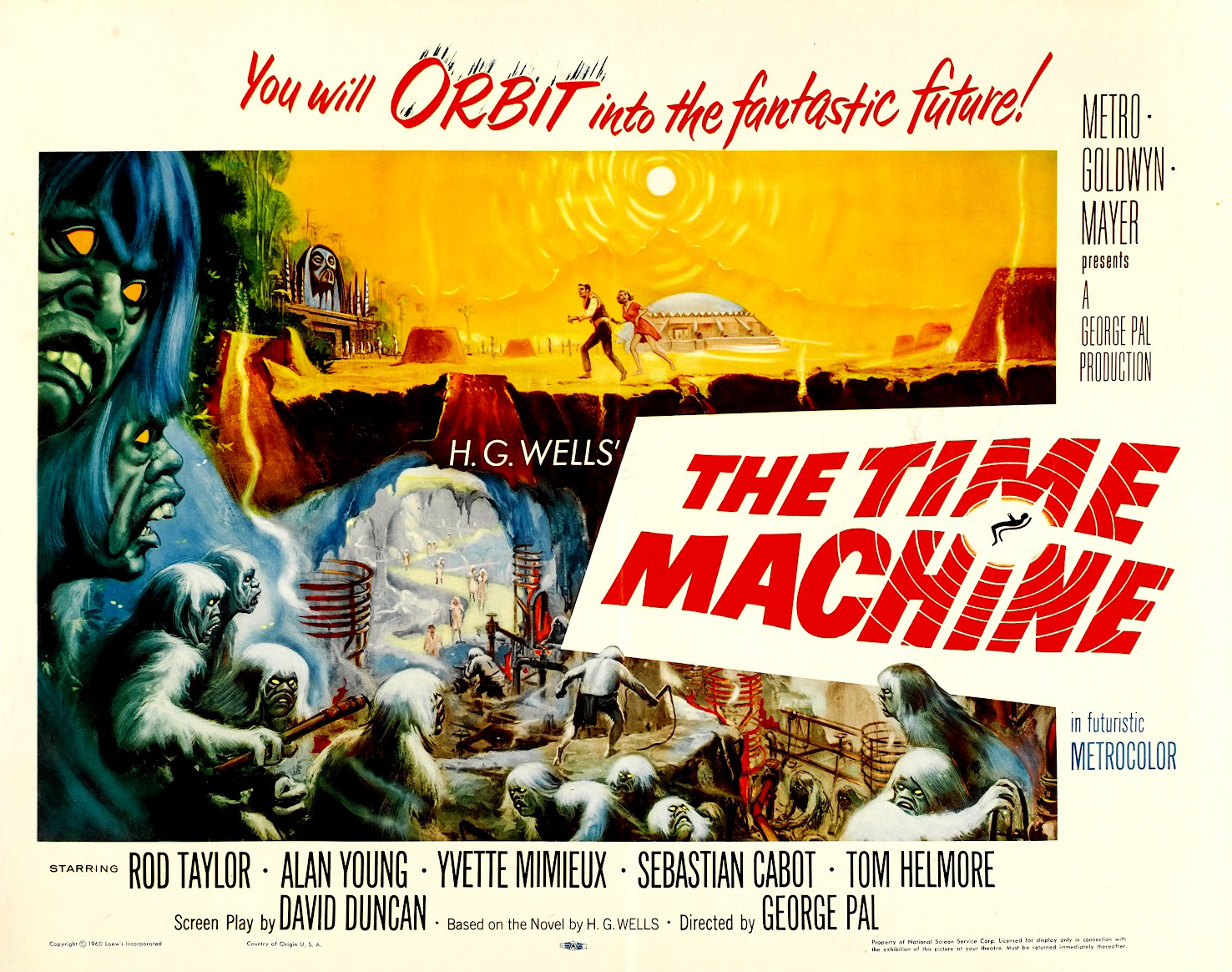
The Time Machine (1960).

The turning over of the calendar from one year to the next makes this day the ideal moment to write something about HG Wells’ celebrated story. Having re-read The Magic Shop before Christmas I decided to refresh my reading habit—lapsed these past months due to pressure of work—by revisiting more of Wells’ short stories, many of which I haven’t looked at for years.

As I said in that earlier post, it was The Time Machine that led me to Wells’ written work after being excited at an early age by George Pal’s 1960 film adaptation. Reading the story again I’m still astonished by how advanced it is compared to everything else being published in 1895. Michael Moorcock’s excellent introductory essay, The Time of ‘The Time Machine’ (1993), notes that time travel per se wasn’t a new idea for Victorian readers, there were many novels and stories using the theme, most of them merely displacing a character from one age to the next in a very simple manner. Wells’ innovation was the idea of a machine which would give the user mastery of Time itself. Moorcock also notes that Wells considered this to be his one great idea which he always felt he never exploited as fully as he wished. The need to make a living forced him to set down the story in some haste when it was accepted for serialisation in WE Henley’s New Review. (Moorcock’s introduction can be found in a recent collection London Peculiar and Other Nonfiction).

ttm11.jpg

The other notable feature this time round—and this means more to me than it would to many other readers—was being struck by the way Wells’ story prefigures so much of the fiction William Hope Hodgson would be writing a decade or so later. It’s a commonplace among Hodgson scholars that The Night Land (1912) owes something to the scenes when the Time Traveller journeys beyond the age of the Eloi and Morlocks to a period when the Earth is dead and the Sun has swollen to a baleful giant. Some of the more cosmic moments of The House on the Borderland (1908) can also be traced back to these scenes. I’d argue that the Time Traveller’s earlier battles with the Morlocks prefigure and possibly influence similar battles in The Night Land, and the attacks of the Swine-Things in Borderland. There’s even a moment near the end of Wells’ story when the Time Traveller is menaced by giant crustaceans like those which infest Hodgson’s Sargasso Sea. This may not be a fresh observation but it’s not one I’ve seen elaborated before.

Regular readers will know it’s a habit here to seek out illustrations of favourite stories. In the case of The Time Machine there are hundreds to choose from so the following selection barely scratches the surface. Something I’d not noticed before when looking at comic strip adaptations is that none of the works derived from Wells’ story (George Pal’s film included) seem able to countenance the Time Traveller’s abandoning of Weena to the Morlocks when the pair become trapped outdoors at night; all show the Time Traveller doing his best to rescue her. William Hope Hodgson’s fiction is filled with rescues, sieges and the defence of the weak against marauding and inhuman forces; The Night Land concerns an epic and apparently suicidal rescue mission across the most inhospitable terrain imaginable. It may be stretching a point but it’s possible to see much of Hodgson’s fiction as being a riposte to this incident in Wells’ story.

ttm02.jpg

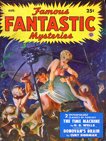
Illustration by George Saunders (August, 1950).

Recurrent points of interest in illustrations of Wells’ story are i) How is the Time Machine itself depicted? (The author’s descriptions are evasive), and ii) How are the Morlocks depicted? Wells describes them thus:

‘I turned with my heart in my mouth, and saw a queer little ape-like figure, its head held down in a peculiar manner, running across the sunlit space behind me. It blundered against a block of granite, staggered aside, and in a moment was hidden in a black shadow beneath another pile of ruined masonry.

‘My impression of it is, of course, imperfect; but I know it was a dull white, and had strange large greyish-red eyes; also that there was flaxen hair on its head and down its back. But, as I say, it went too fast for me to see distinctly. I cannot even say whether it ran on all-fours, or only with its forearms held very low.

George Saunders’ small Gollum-like creatures are closer to Wells’ conception than many later depictions. Saunders’ Weena, on the other hand, is far too tall for the equally diminutive Eloi.

ttm03.jpg

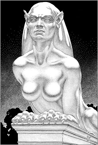
Virgil Finlay (1950).

This is still my favourite Time Machine illustration but then Finlay has a tendency to beat everyone when it comes to these assignments. His illustrations appeared inside the August, 1950 issue of Famous Fantastic Mysteries. Wells’ sphinx has wings which I imagine Finlay might have included if he wasn’t restricted by the space allowed for his illustration. He also provided the illustration of a Morlock below.

Continue reading “The Time Machine”

The weekend artists, 2012

barnes.jpg

Lucy in the Sky with Diamonds (2012) by Lesley Barnes. She also has peacock wrapping paper.

The most popular post of the year was one I made last December featuring all the artists whose work had appeared throughout 2011 in the weekend links posts. (The surge of views occurred early in January when it was linked on Stumbleupon.) Since I’ve been away this week there aren’t any links so here’s a retrospective of things that caught my eye in 2012.

durette.jpg

Heartsick (2011) by Kelly Durette.

jacobsen.jpg

Self-portrait by Jon Jacobsen from his Home series.

tintenfisches.jpg

Der Triumph des Tintenfisches from Meggendorfer-Blätter (c. 1900). Via Beautiful Century.

kuhlman.jpg

Two Grove Press covers by Roy Kuhlman. From Arden Kuhlman Riordan’s Pinterest page collecting her father’s cover designs.

ulian.jpg

Technological mandala 02 (The beginning) (2012) by Leonardo Ulian.

Continue reading “The weekend artists, 2012”

Xenis Emputae Travelling Band

xenisemputae.jpg

The Old Weird Britain of folk tales, folk songs and pagan ritual has been a recurrent theme for the past couple of months so here’s another post on the subject. The music of Phil Legard’s Xenis Emputae Travelling Band is steeped in British folklore but mostly sidesteps songs in favour of drones and improvised soundscapes. Early pieces feature electronic sounds which are substituted in the later works by bells and accordion tones. A number of Legard’s recordings are made in response to locations with a weight of history and ritual association, a process elaborated in a chapbook entitled Psychogeographia Ruralis.

xenisemputae2.jpg

The past decade has seen the emergence of a cottage industry of micro-label music production, mostly people offering limited run CD-Rs via mail order. Many of Legard’s recordings were released in this fashion on his own Larkfall label but you can now explore them as free downloads at the Internet Archive. (Thanks to Warren Ellis for pointing this out). Among the few songs there’s a setting of Moly, a poem by Clark Ashton Smith. If you need a respite from unavoidable seasonal torment then this is a good place to start.

As usual I’ll be away for a few days so the { feuilleton } archive feature will be activated to summon posts from the past below this one. Enjoy your wassail.

Weekend links 140

cards.jpg

Thanks to Callum for pointing the way to a beautiful set of playing cards designed by Picart le Doux.

Of cigars and pedants by Houman Barekat, in which Vladimir Nabokov has a problem with Henry James. Tangentially related: Post-Punk’s Nabokov: Howard Devoto and Magazine, live from Berlin, 1980. (Given A Song From Under The Floorboards, and lines like “I could have been Raskolnikov / But mother nature ripped me off”, I’d say it’s more accurate to describe Devoto as Post-Punk’s Dostoyevsky.)

• “I was introduced to Kneale’s work like most kids: by a fifty-foot hologram of a psychic locust and a British colonel deliquesced by five million years of bad Martian energy.” In Keep Me in the Loop, You Dead Mechanism Dave Tompkins looks back at Nigel Kneale’s TV play The Stone Tape. I reported my own impressions at the end of October.

• At The Quietus this week, Carol Huston on Lord Horror: A History Of Savoy Publishing. Michael Butterworth is interviewed, and the piece includes some quotes from earlier interviews by yours truly.

As the Massachusetts minister Increase Mather explained in 1687, Christmas was observed on Dec. 25 not because “Christ was born in that Month, but because the Heathens Saturnalia was at that time kept in Rome, and they were willing to have those Pagan Holidays metamorphosed into Christian” ones. So naturally, official suppression of Christmas was foundational to the godly colonies in New England.

Rachel N. Schnepper on the Puritan War on Christmas.

• Maxine Peake and the Eccentronic Research Council have a seasonal song for you. Take the title, Black ChristMass, as a warning. The group recently played live on The Culture Show.

• Clive Hicks-Jenkins’ Artlog is currently hosting Alphabet Soup, an online exhibition by different artists each depicting the letters of the alphabet. Start here and click forward.

Ornate Typography from the 19th Century featuring samples from the King George Tumblr. Related: Sheaff ephemera.

saturn.jpg

Saturn at Saturnalia. A Cassini image of the planet’s nightside.

Kenneth Anger interviewed by P. Adams Sitney. A 53-minute tape recording from 1972.

• At The Outer Church: James Ginzburg of Emptyset posts a winter music mix.

When Candy Darling met Salvador Dalí.

The psychedelic secrets of Santa Claus.

• At Pinterest: Camp as…

Saturn (1956) by Sun Ra | Permafrost (live, 1980) by Magazine | Uptown Apocalypse (1981) by B.E.F.

Hipgnosis turkeys

turkeys.jpg

Here in Britain there’s no Thanksgiving so turkey as a seasonal meal is a Christmas dish. Turkey also has another meaning which the OED can supply:

6.6 U.S. slang. a.6.a An inferior or unsuccessful cinematographic or theatrical production, a flop; hence, anything disappointing or of little value.

This post concerns the latter—turkeys for the turkey season—being a series of bad or merely lacklustre album covers produced by the Hipgnosis design partnership throughout the 1970s. If the label seems unfair it should be emphasised that “turkey” is the designation applied by Storm Thorgerson himself in the appendix to the third Hipgnosis book, For the Love of Vinyl: The Album Art of Hipgnosis (2008). The following are all covers that he says Hipgnosis disliked, although not necessarily because they were bad designs:

There are some designs we would rather like to forget altogether and have been awarded turkeys to denote — no disrespect is intended for the blame lies mostly with us, save for the twin spectres of release schedules and rock egoism — “That’s a jolly interesting idea chaps but… hmm… actually we’d rather have a picture of our good selves.”

A consistent feature of the Hipgnosis books is a refusal to adopt the Olympian attitude that radiates from many design monographs. Thorgerson has always been happy to describe the history of Hipgnosis, and the practice of album cover design, in warts-and-all anecdotal detail, so it’s no surprise if he also admits to failings. You’d be hard-pressed to find other designers who would draw attention to poor work in this manner, especially in a book dedicated to the highlights of a lauded career. Most designers are self-conscious types who can be relied upon to bury their mistakes as thoroughly as possible.

I wrote a brief post years ago about bad cover design but I usually try to avoid such things, there’s already enough junk in the world without compiling lists of it. But this post is instructive for showing that not everyone gets things right however good they might be, and also that everyone has to start somewhere. Most of my early album covers are various degrees of terrible so I try to spare others the accusatory finger. That said, you have to wonder what on earth Thorgerson and partner Aubrey Powell were thinking of with some of these designs.

01gods.jpg

Genesis (1968) by The Gods.

Thorgerson’s introduction to For the Love of Vinyl explains the haphazard beginnings of Hipgnosis, pretty much two guys and a couple of cameras. They had no design training but a lot of luck (not least having Pink Floyd as friends), and were learning on the fly, something you can see happening with these early covers. It’s unfair to compare a design like the Gods sleeve to work they were producing a few years later when they had access to a range of professional illustrators, retouchers and models, and also budgets from record companies that paid for flights to exotic locations.

02gun.jpg

Gun Sight (1969) by Gun.

This was Gun’s second album. The cover for the first happened to feature the first album cover art by Roger Dean whose career in the music business would run parallel with that of Hipgnosis. Most of the early Hipgnosis covers are simple photos that are occasionally processed in some way. This one didn’t really work out, however, the Roger Dean cover is better.

03prettythings.jpg

Parachute (1970) by The Pretty Things.

But at least the Gun cover doesn’t look like this bizarre attempt at Surrealist collage. Hipgnosis often tried to illustrate the album title but I can’t see how you get “parachute” from this one. The collage approach worked a lot better on the Quatermass album produced the same year.

04pepejaramillo.jpg

Till There Was You (1970) by Pepe Jaramillo.

This was the only cover singled out in the first Hipgnosis book, Walk Away René (1978), as something they didn’t like:

…straight down the line and utterly tasteless as a result — it doesn’t even work as a genteel piece of middle class tweeness.

Continue reading “Hipgnosis turkeys”