Mervyn Peake at Maison d’Ailleurs

peake.jpg

I should have mentioned this a lot sooner considering the museum sent me a copy of the exhibition prospectus. Maison d’Ailleurs is the Museum of Science Fiction, Utopia and Extraordinary Journeys in Yverdon-les-Bains, Switzerland, and their current exhibition is Lines of Flight—Mervyn Peake, the Illustrated Work. Yverdon-les-Bains is too out of the way for most of us but the event gives me another excuse to draw attention to Peake’s illustrations for Lewis Carroll; some of the drawings from Alice’s Adventures in Wonderland, Through the Looking-Glass and The Hunting of the Snark are among the works on display until February 14, 2010.

Mervyn Peake (1911–1968) is celebrated today as the writer of the extraordinary series of novels about Titus Groan (often referred to as the Gormenghast books). Yet, during his lifetime he was more known for his graphic work.

From 1939 and for almost two decades, Peake produced illustrations both for his own work (Captain Slaughterboard; Rhymes without Reason) and for classics (Household Tales by the brothers Grimm; Alice in Wonderland; Treasure Island). His mastery of the pen and the pencil were unrivalled. Visually, his style could be disarmingly economical, using very pure and clean single lines to create a striking sense of volume. But with cross-hatching and dots Peake could also make his drawings look like engravings, providing the characters and objects he depicted, or the background to them, with rich and varied textures and a wide range of shades. (More.)

For more of Peake’s illustration work, see Mervynpeake.org.

Elsewhere on { feuilleton }
The illustrators archive

Previously on { feuilleton }
Charles Robinson’s Alice’s Adventures in Wonderland
Humpty Dumpty variations
Alice in Wonderland by Jonathan Miller
The art of Charles Robinson, 1870–1937
Lovecraftian horror at Maison d’Ailleurs
The Illustrators of Alice

The Great God Pan

pan_daphnis.jpg

Pan teaching Daphnis to play the panpipes; Roman copy of a Greek original from the 3rd-2nd centuries BCE by Heliodoros.

“The worship of Pan never has died out,” said Mortimer. “Other newer gods have drawn aside his votaries from time to time, but he is the Nature-God to whom all must come back at last. He has been called the Father of all the Gods, but most of his children have been stillborn.”

So says a character in The Music on the Hill, one of the slightly more serious stories from Saki’s The Chronicles of Clovis (1911). Saki’s Pan is a youthful spirit closer to a faun than the goatish creature of legend. But being a gay writer whose tales regularly feature naked young men (surprisingly so, given the time they were written) I’m sure Saki would have appreciated the Roman statue above. There’s nothing chaste about this Pan with his “token erect of thorny thigh” as Aleister Crowley put it in his lascivious 1929 Hymn to Pan, a poem which caused a scandal when read aloud at his funeral some years later. The Roman statue was for a long while an exhibit in the restricted collection of the Naples National Archaeological Museum where all the more scurrilous and priapic artefacts unearthed at Pompeii were kept safely away from women, children and the great unwashed. These are now on public display and include the notorious statue of a goat being penetrated by a satyr.

Continue reading “The Great God Pan”

Peake’s Pan

pan1.jpg

Another charity shop book-raid this week netted me a copy of Ian Fleming’s On Her Majesty’s Secret Service in its 1965 Pan Books edition, one of the Bond series with great covers designed by Raymond Hawkey. The sight of the tiny Pan silhouette above reminded me that this logo was based on drawings commissioned from Mervyn Peake when the company was launched at the end of the Second World War. The design persisted for many years, usually printed on a yellow background.

pan2.jpg

I wasn’t sure I had a copy of Peake’s original version to hand but G Peter Winnington‘s Peake biography, Vast Alchemies (2000), includes a reproduction, one of two drawings Peake produced for the publisher. The other can be seen on this Pan Books site which also reveals that Peake’s Pans were printed at quite large size on the initial run of books. The design model may have been the early Penguin style which nearly always had the famous bird prominently placed in the lower third of the cover. In book terms at least, the Penguin has proved to be the more powerful god, having survived virtually unchanged since 1935. Peake’s Pan is long gone, dropped in favour of two red squiggles.

Elsewhere on { feuilleton }
The illustrators archive

Previously on { feuilleton }
Buccaneers #1
Recovering Bond
Mervyn Peake in Lilliput
James Bond postage stamps
Wanna see something really scary?
T&H: At the Sign of the Dolphin

Buccaneers #1

silver1.jpg

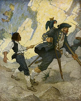
“For all the world I was led like a dancing bear” by NC Wyeth (1911).

This year’s reading began with a desire to explore some of the Robert Louis Stevenson volumes in my collection which I’ve so far neglected. At the moment I’m thinking of maybe reading everything I have by RLS, having begun with a return journey to Treasure Island, a book which seems to improve every time I revisit it. Setting out with Stevenson’s pirate tale was partly a result of having watched all three Pirates of the Caribbean films over Christmas, a series I’m probably in the minority in enjoying wholeheartedly, flaws, preposterousness and all. Much as I’d like to see a fourth film (there’s a hint of a sequel at the end), I’d prefer the makers to leave things be. The three films taken together can be watched as a single nine-hour ramble across the high seas and the tidy conclusion would be better left as it is.

My pocket-sized copy of Treasure Island from the Tusitala edition of Stevenson’s collected works is fine apart from the very small and poorly-printed map, something to which the reader is compelled to refer as we follow Jim Hawkins on his journey around the island. Happily the web provides many examples which can be printed out for viewing while reading. The web is also a resource for some of the numerous illustrated editions of the novel. The version by American illustrator NC Wyeth is one of the more well-known and more successful and his Long John Silver is a suitably powerful figure. Wyeth’s depiction of Billy Bones waiting on the cliff top was featured in a set of US stamps in 2001. The Internet Archive has scans of the Wyeth book (and a version with illustrations by Louis Rhead) although one of these, with better scans of Wyeth’s paintings, has some of the plates missing.

silver2.jpg

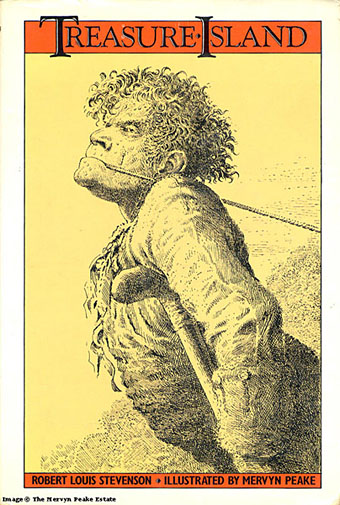
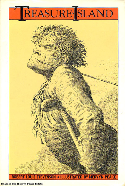
Long John Silver by Mervyn Peake (1949).

Far stranger—weirder, even—is Mervyn Peake’s Long John Silver, seen here on the cover of a more recent edition. Peake’s illustrations are probably my favourites but then I’m biased towards Peake as an author and illustrator so the preference is unavoidable. Even so, his depiction of Israel Hands brings to the fore the malevolent duplicity of that character in a way I’ve not seen any other illustrator attempt. It’s a shame the Peake site doesn’t have another of the artist’s renderings of Silver showing the sea cook posed on his single leg in an attitude more like a ballet dancer than a pirate. That drawing and his ogre-like Blind Pew show how original Peake could be as an illustrator. And lets not forget his own pirate creation, also his first book, Captain Slaughterboard.

silver3.jpg

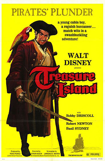
It’s asking too much but it’s a shame that Walt Disney couldn’t have taken a look at Peake’s drawings instead of diluting Stevenson’s cunning buccaneer into the gurning caricature portrayed by Robert Newton in 1950. The less said about Byron Haskin’s film (and its sequels), the better. It has its moments visually but Newton’s portrayal has blighted all those that follow (Geoffrey Rush tips the hat in the Pirates films) and is single-handedly responsible for all subsequent pirate clichés.

davy_jones.jpg

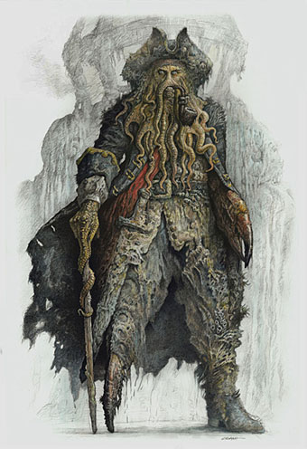
Davy Jones from Pirates of the Caribbean, on the other hand, could almost have been designed specifically to please me alone, looking like the offspring of some unwholesome ménage between Long John Silver and the Great God Cthulhu. For the time being Davy Jones is probably my favourite screen villain, his tentacled face—and the fishy caste of his crew—is a wonder to behold. God knows what Stevenson would have made of this transfiguring of his creation but it suits me fine.

More buccaneers tomorrow.

Elsewhere on { feuilleton }
The illustrators archive

Previously on { feuilleton }
Mervyn Peake in Lilliput
Stevenson and the dynamiters
Howard Pyle’s pirates
Druillet meets Hodgson
Rogue’s Gallery: Pirate Ballads, Sea Songs, and Chanteys
Davy Jones

Ronald Searle book covers

searle.jpg

Lilliput issue no. 150, December 1949.

A nice selection of Ronald Searle book covers and illustrations turns up at Caustic Cover Critic. The Lilliput cover above isn’t among them, I just happened to have it lying around as a result of putting together a new edition of Maurice Richardson’s The Exploits of Engelbrecht earlier this year. That volume is still in a holding pattern at Savoy Books but plans are afoot to see it published in the next few months. Searle produced a number of illustrations for the Engelbrecht stories, of course, although not for this particular issue.

Lilliput #150 featured Richardson’s story Engelbrecht and the Mechanical Brain as well as a St Trinian’s Christmas story by Searle and Arthur Marshall, hence the cover. It’s good to see some of the original covers for the Molesworth books on the CCC page. Geoffrey Willans’ Nigel Molesworth was the delinquent male equivalent of the St Trinian’s schoolgirls and I read all the books when they were reprinted in the early Seventies.

Via Coudal.

Elsewhere on { feuilleton }
The book covers archive
The illustrators archive

Previously on { feuilleton }
Engelbrecht again
Mervyn Peake in Lilliput