Weekend links 29

dancer.jpg

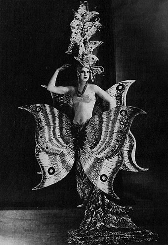
A Folies Bergère dancer, c. 1909.

Six Novels in Woodcuts: The Library of America publishes a boxed set of Lynd Ward’s works: Gods’ Man, Madman’s Drum, Wild Pilgrimage, Prelude to a Million Years, Song Without Words and Vertigo.

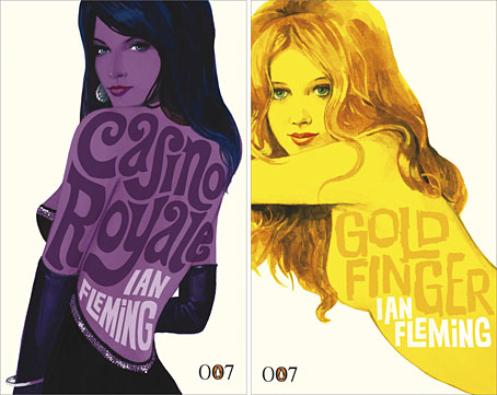
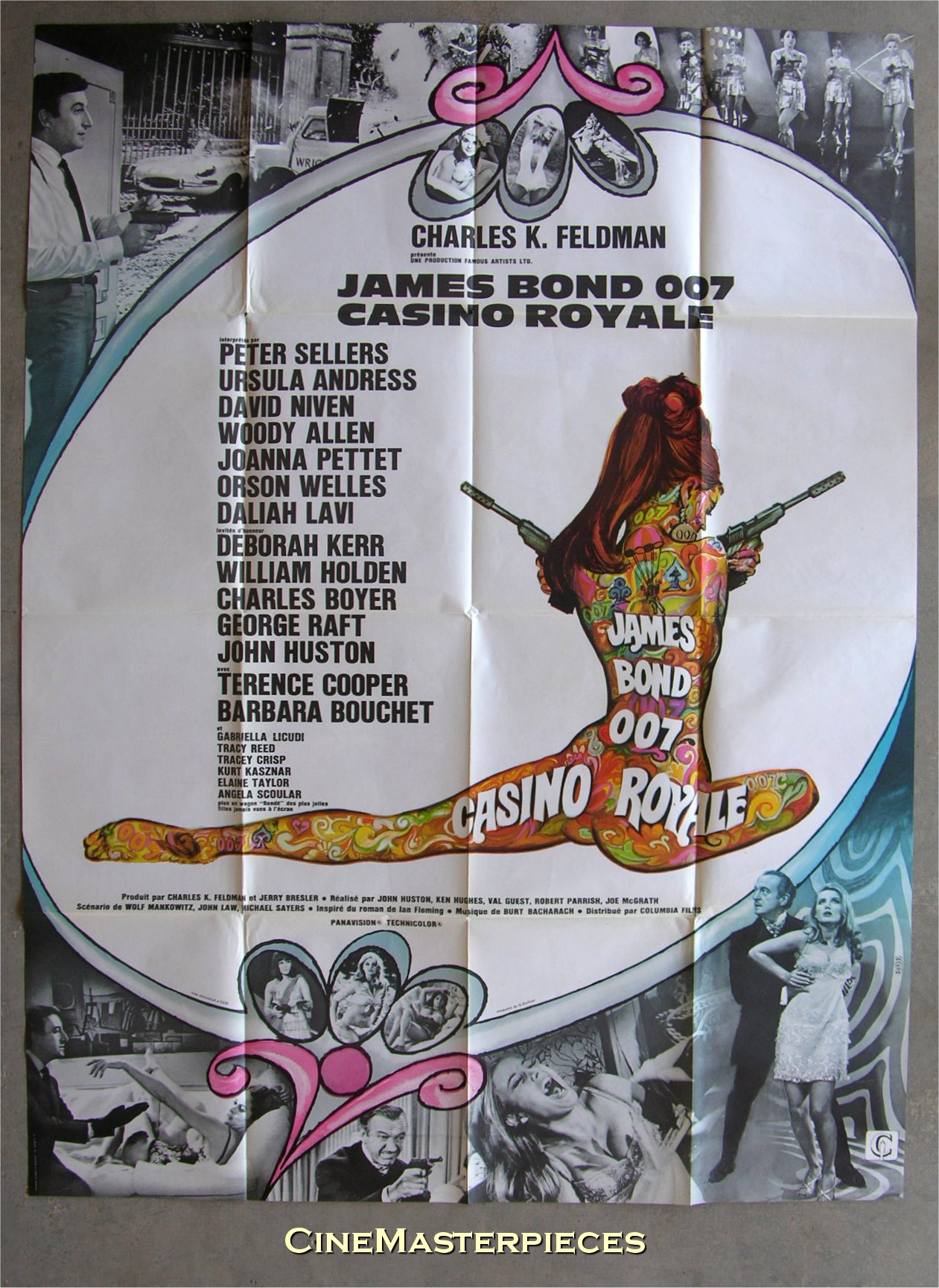
• RIP ace graphic designer Raymond Hawkey. Related: Raymond Hawkey: An eye for detail, and Hawkey’s James Bond cover designs from the mid-60s.

The Record: Contemporary Art and Vinyl, an exhibition at Duke University, North Carolina, features work by 41 artists from around the world, from the 1960s to the present, using vinyl records as subject or medium.

decaris.jpg

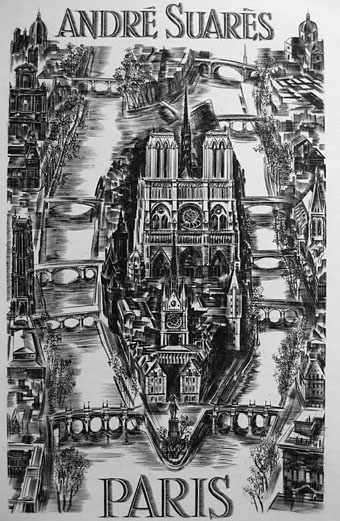
The Île de la Cité, a steel engraving by Albert Decaris (1950).

Fred Tomaselli will have a new exhibition of his work at the Brooklyn Museum next month.

Socialist Monuments in Bulgaria photographed by Linda Ferrari.

• What would Howard think of the Mythos Art Dildo?

Space is Process, a film about Olafur Eliasson.

Thurston Moore’s Indie Books.

Chris Colfer in a leather bar.

Ephemeral New York.

• Chrome! Helios Creed’s YouTube channel.

Peake’s Pan

pan1.jpg

Another charity shop book-raid this week netted me a copy of Ian Fleming’s On Her Majesty’s Secret Service in its 1965 Pan Books edition, one of the Bond series with great covers designed by Raymond Hawkey. The sight of the tiny Pan silhouette above reminded me that this logo was based on drawings commissioned from Mervyn Peake when the company was launched at the end of the Second World War. The design persisted for many years, usually printed on a yellow background.

pan2.jpg

I wasn’t sure I had a copy of Peake’s original version to hand but G Peter Winnington‘s Peake biography, Vast Alchemies (2000), includes a reproduction, one of two drawings Peake produced for the publisher. The other can be seen on this Pan Books site which also reveals that Peake’s Pans were printed at quite large size on the initial run of books. The design model may have been the early Penguin style which nearly always had the famous bird prominently placed in the lower third of the cover. In book terms at least, the Penguin has proved to be the more powerful god, having survived virtually unchanged since 1935. Peake’s Pan is long gone, dropped in favour of two red squiggles.

Elsewhere on { feuilleton }
The illustrators archive

Previously on { feuilleton }
Buccaneers #1
Recovering Bond
Mervyn Peake in Lilliput
James Bond postage stamps
Wanna see something really scary?
T&H: At the Sign of the Dolphin

Recovering Bond

new_bonds.jpg

Penguin is really coming up with the goods these days, living up to their reputation as a house with high standards of cover design, unlike Picador and the shabby way they treated Cormac McCarthy recently.

Ian Fleming’s Bond novels are the latest to receive a makeover with some fabulous art from illustrator Michael Gillette. 2008 is Fleming’s centenary so the books have been republished as demi-format hardbacks with these new designs adorning the jackets. Each cover features a different girl matched to the theme of the book (yes, I know they’re women but in Bond’s world women are always girls unless they’re Miss Moneypenny); each cover also features groovy period type which alludes to the hand-drawn elaborations of the Sixties and Seventies. The effect is reminiscent of the poster art for the 1967 film of Casino Royale (below) which used a naked girl as the focal point; all Bond posters before and after this place oo7 himself centre stage. Penguin even dare to push the level of pastiche by making On Her Majesty’s Secret Service look rather like an old romance novel, not such a surprising decision since this is the book where Bond gets married.

casino.jpg

My favourite Bond covers remain the old Pan paperbacks from 1963 but that’s just me; these look great. There’s been a persistent moan recently from authors and publishers worrying about file sharing as they foresee the publishing world going the same way as the music business. The solution is obvious: you can’t stop texts being copied and distributed but you can make the books themselves desirable objects so make them worth buying and owning. Penguin has numbered the spines of the new Bond books as they did with their recent Sherlock Holmes reprints, a smart appeal to book collectors as well as a tip to read them in the order they were written. “Smart” is the key word here; Picador take note.

Update: The Pan covers mentioned above were designed by Raymond Hawkey. Bond site MI6.co.uk has some details about the designer.

Elsewhere on { feuilleton }
The book covers archive

Previously on { feuilleton }
Repackaging Cormac
The World’s Greatest Detective
James Bond postage stamps
Boys Own Books