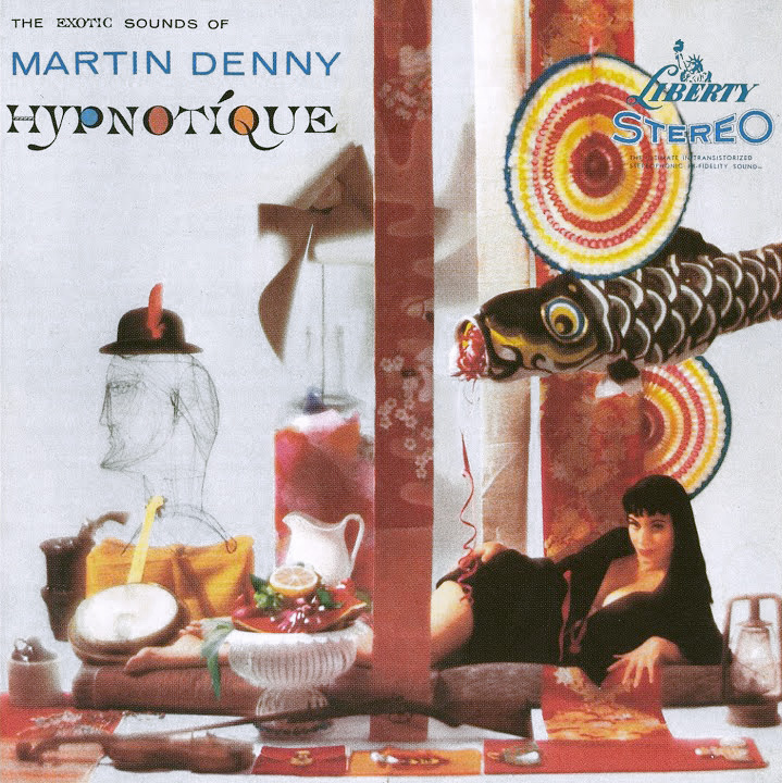
Hypnotique by Martin Denny (1959).
In Waikiki, where I live whenever I get the chance, a bistro known as the Daggar Bar and its accompanying Bora Bora Lounge has for some time been the mecca of people who enjoy a new type of music. I’m one of the gang that gathers there to hear the fresh, clean tropical sounds of Martin Denny and his group.
By the time James Michener wrote the sleeve notes for Hypnotique, Martin Denny‘s fifth album, the composer was attempting to broaden his horizons and outpace his imitators by introducing strings and vocals to augment his “fresh, clean tropical sounds”. This perhaps explains the curious jumble of objects on the album sleeve (a rifle?), my favourite among the wonderful covers Liberty Records’ art department supplied for Denny’s work. The best of these feature model Sandy Warner who appears in a variety of guises, shown here as a cross between a Japanese temptress (if we take the paper mobiles as a cue) and a precursor of Carolyn Jones as Morticia Addams. The art direction was by Bill Pate with photography by Garrett-Howard.
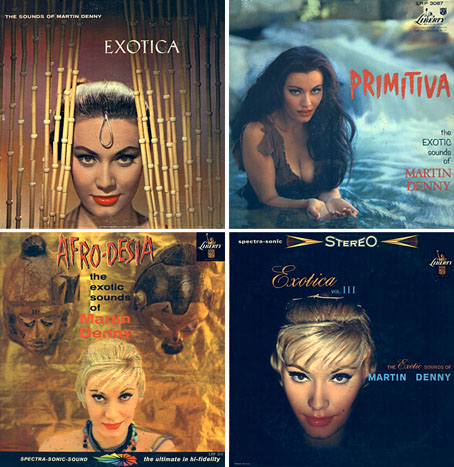
top left: Exotica (1957); top right: Primitiva (1958).
bottom left: Afro-Desia (1959); bottom right: Exotica vol. III (1959).
Sandy Warner appeared on 16 album sleeves for Denny and was even persuaded to record an album of her own to capitalise on her renown as “Miss Exotica”. In design terms, these sleeves are some of the more successful products of the late Fifties’ fad for tribal kitsch. Other covers were crazier or more garish—and few could resist flaunting a bikini-clad woman—but Bill Pate showed more care with his layouts and Sandy Warner’s alluring presence went a long way towards conjuring the required mystique. Denny’s records aren’t too bad either although when it comes to tiki-fuelled easy listening I tend to prefer his rival Arthur Lyman, especially Taboo from 1958.
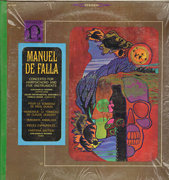
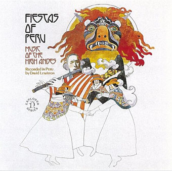
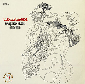
Large copies of the covers shown here can been seen at Shellac.org. There are many more sites with galleries devoted to this style of music and sleeve art; Space Age Pop A Go-Go and 317x are two of the better ones. And let’s not forget Dana Countryman’s Virtual Museum of Unusual LP Covers or LP Cover Lover (check the great blogroll) or the Retro Records Flickr Pool…
Elsewhere on { feuilleton }
• The album covers archive