Tonto’s expanding frog men

tonto.jpg

I wasn’t going to write about album cover art three times in a row but things keep catching my attention this week. Anyone interested in the history of electronic music knows the name Tonto’s Expanding Head Band, the duo formed by Malcolm Cecil and Robert Margouleff to create music with Cecil’s huge, custom-built TONTO (The Original New Timbral Orchestra) synthesizer. Cecil and Margouleff recorded two albums together: Zero Time (1971) and It’s About Time (1974), the latter credited to Tonto only. Zero Time was incredibly advanced for 1971, not classical adaptations like those being produced by Wendy Carlos and her many imitators, but all-original pieces created polyphonically, a feat that only the TONTO synth could easily achieve.

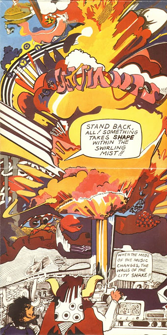
Given how successful the album is musically I’ve always thought it a shame that the sleeve art, inside and out, was the kind of amateurish “psychedelic” doodling that you find on many albums of this period. The design above was for a 1975 reissue, something I’d not seen before. The artist was illustrator Jeffrey Schrier who has a small, and no doubt incomplete, listing at Discogs with nothing similar to this in evidence. At a guess I’d say the evolving frog men are derived from the lyrics of Riversong, a meandering piece with singing processed via early vocoder-style technology, something that Wendy Carlos was also experimenting with. It’s not all hippy ambience: Jetsex sounds like an outtake from Kraftwerk’s Autobahn (albeit three years early) while Timewhys wouldn’t have been out-of-place on The Human League’s Travelogue album almost a decade later. Easy to see why Stevie Wonder and others were eager to work with Malcolm Cecil throughout the 1970s.

Elsewhere on { feuilleton }
The album covers archive

Previously on { feuilleton }
A Clockwork Orange: The Complete Original Score

Newspaper record covers

paper06.jpg

Gazette Vol. 2 (1961) by Pete Seeger.

More elaborate record sleeve design. Was Pete Seeger the first artist to have a fake newspaper as a cover design? Gazette Vol. 2 is the earliest example I can find. Some of these examples were suggested by this earlier overview. If anyone knows of any omissions then please leave a comment.

Newspaper covers offered understandable attractions to a musician: a vinyl sleeve is almost the same width as a newspaper, and, for the more verbose artist, they give an opportunity to wax satirical at the expense of print media and newspaper readers. Disadvantages would include increased production costs, more design and copywriting, and sleeves that don’t always last very long, especially if actual newsprint is used for the paper. Given the recent resurgence of vinyl I wouldn’t be surprised if we soon see further examples of this kind of design.

paper05.jpg

The Genuine Imitation Life Gazette (1968) by The 4 Seasons. Design: Desmond Strobel.

The 4 Seasons album is a surprise since it’s not so well-known yet features a very detailed newspaper sleeve. An 8-page insert continues the theme, and even includes a colour comic strip.

paper07.jpg

Volunteers (1969) by Jefferson Airplane. Design: Gut (Allen Turk).

Did Jefferson Airplane copy the 4 Seasons album? Seeing the progression of these designs you have to wonder who was imitating who. The Airplane album also had an insert with more newspaper pages.

paper03.jpg

Thick As A Brick (1972) by Jethro Tull.

Jethro Tull went further than everyone by making their album a 12-page newspaper which wraps around the vinyl. The content of the pages is filled with a satirical jab at concept albums and numerous in-jokes. Even if you don’t like the band’s music very much (I’ve never been keen) you have to admire the amount of work that went into this.

Continue reading “Newspaper record covers”

Ptooff!

ptoof1.jpg

There’s a sub-genre of the psychedelic album cover in which florid, unfocused and vividly polychrome doodles by friends of the band are used as the principal artwork. (The cover of The Parable Of Arable Land [1967] by The Red Crayola is a typical example.) The art which decorates the fold-out sleeve of Ptooff! (1967), the debut album by British group The Deviants, isn’t quite in the doodle league but it treads a narrow divide between drug-addled scribbles and American comic-strip art à la Jack Kirby. Someone named “Kipps” receives the art credit. Viewed today the swirls and explosions on the sleeve’s outer panels also seem to predict the graffiti art which would flourish a decade later.

ptoof2.jpg

The Deviants were the first musical vehicle for writer and singer Mick Farren who died last week. At the time Farren was known as a journalist for International Times which explains the disembodied head of Theda Bara (from the paper’s logo) floating in the top right-hand corner of the front cover. The lysergic wildness continues inside with an incoherent scene and the promise that “APSARAS—is an Epic forthcoming—a marvel of the Universe—an illustrated saga of a Godwoman. On sale soon.” John Peel provided some sleeve notes. See the artwork at larger size here.

ptoof3.jpg

Charles Shaar Murray penned a memorial note for Mick Farren last week. My favourite track from Ptooff! is the opening song I’m Coming Home, a number that demonstrates the group’s ability to combine humour with hard-rock freakout.

Elsewhere on { feuilleton }
The album covers archive

Previously on { feuilleton }
International Times archive

Valerie and Her Week of Wonders

valerie1.jpg

First English translation, 1970. Faux-Penguin edition by gregoreverb.

1: A Surrealist novel (1932) by Vítezslav Nezval.

valerie2.jpg

Design by Rudolf Nemec.

2: A feature film (1970) by Jaromil Jires (director), Ester Krumbachová (screenplay) and Jirí Musil (dialogue). (Region 2 DVD from Second Run.)

valerie3.jpg

Design by Josef Vylet’al. Figure originally by Aubrey Beardsley from The Comedy Ballet of Marionettes III (1894).

valerie4.jpg

3: Valerie: A song (2003) by Broadcast.

valerie5.jpg

4: The Valerie Project: A musical group and album (2007).

Previously on { feuilleton }
The Robing of The Birds

Weekend links 171

bossi.jpg

Jeune moine à la Grecque (1771) by Benigno Bossi. Via Monsieur Thombeau.

Victoriana: The Art of Revival is an exhibition which will run throughout the autumn at the Guildhall Art Gallery, London. Some of my steampunk work will be included. Related: Rick Poynor on Soft Machine’s Dysfunctional Mechanism.

• “The egg glows and hovers in the middle of a field of mesmerizing color. The spell is broken when the guard finally says, “Everybody up off the floor.'” Morgan Meis on Aten Reign by the amazing James Turrell.

• Mix of the week: a “heatwave mix” of psychedelic songs compiled by Jaime Williams. Anything that includes Vacuum Cleaner by Tintern Abbey gets my vote.

Because sex is so compartmentalized — it’s often considered separate from the rest of life and hidden away — porn performers, who have sex publicly, are in a unique position to consider and talk about integrating private and public aspects of life.

Writer and porn performer Conner Habib on the issue of nomenclature in the porn business.

• Still Hopscotching: Peter Mendelsund posts some unused cover designs for Julio Cortázar.

A Hymn For Megatron, an hour-long drone work, and a free download, by The Black Dog.

• Vagrancy and drift: Sukhdev Sandhu on the rise of the roaming essay film.

• A Flickr set of Peter “Sleazy” Christopherson’s musical instruments.

mwc.jpg

“Whether flower-pressing in the garden, hallucinating in the summerhouse, fainting inside stifling sites of historical interest, pirouetting along the promenade, or even sea-cruise thalassophobia complications, barely a moment will pass that isn’t made all the sweeter by obsessively listening to Down to the Silver Sea.”

The TM Research Archive: sate yourself on Swiss graphic design.

• A Lecture on Johnson and Boswell by Jorge Luis Borges.

• Words, sounds and robots from Sarah Angliss.

Never Built Los Angeles

Nautilus (2012) by Anna Meredith | Nature Of Light (2012) by Isnaj Dui | Popcorn (Ealing Feeder Mix) (2012) by SpacedogUK (Sarah Angliss)