Jarman (all this maddening beauty)

jarman1.jpg

February 2014 will see the 20th anniversary of the death of Derek Jarman. Between then and now I expect we’ll see some retrospectives, although we’ve already had an excellent cinematic one, Isaac Julien and Tilda Swinton’s memorial/documentary Derek (2008). I’d be pleased to see more of Jarman’s films given a decent release on disc: In the Shadow of the Sun has never been available on DVD, and Sebastiane has yet to be released in an uncensored print. When the BFI is releasing Peter de Rome’s gay porn uncut on DVD there’s no longer any excuse for this.

jarman2.jpg

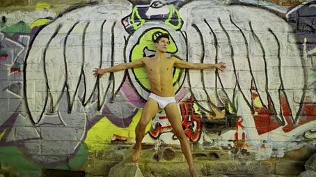
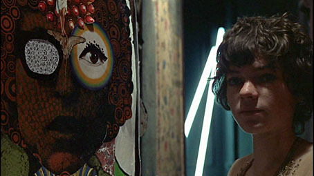
Stephen Benedicto filmed by Ben Carver.

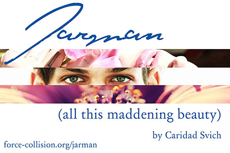
Jarman (all this maddening beauty) is a multimedia solo performance work by playwright Caridad Svich currently in production, with plans for performance in the US later next year. Most of us are unlikely to see this but there is a short promo/trailer by Ben Carver featuring some Jarmanesque imagery, albeit a lot more high-def than Derek was usually allowed. I’d have been tempted to use slowed-down Super-8 if you can still find the cameras or film stock. Production company force/collision has more information about the project in pdf form. Via Towleroad.

jarman3.jpg

jarman4.jpg

Previously on { feuilleton }
Sebastiane by Derek Jarman
A Journey to Avebury by Derek Jarman
Derek Jarman’s music videos
Derek Jarman’s Neutron
Mister Jarman, Mister Moore and Doctor Dee
The Tempest illustrated
In the Shadow of the Sun by Derek Jarman
Derek Jarman at the Serpentine
The Angelic Conversation
The life and work of Derek Jarman

Martin Sharp, 1942–2013

sharp1.jpg

Oz magazine no. 15, October 1968.

The psychedelic art of Australian artist Martin Sharp has featured here on several occasions. Unlike his British and American contemporaries who maintained a single graphic style, Sharp was a versatile artist whose work could range from loose, often cartoony drawing and painting to very detailed collage designs; he was also as happy as any other artist of the period to plunder art history, as the cover for issue 15 of Oz demonstrates. The Mick Jagger figure from that cover was later reworked as a poster for “Turner’s Purple Orchestra”, one of a number of pieces of Sharp art which can be glimpsed throughout Donald Cammell & Nicolas Roeg’s Performance (1970).

sharp7.jpg

Performance (1970): Michele Breton and a Martin Sharp collage.

Sharp’s involvement with Oz magazine, and the creation of a handful of endlessly reproduced designs—the Bob Dylan Mr Tambourine Man poster, Jimi Hendrix in a Jackson Pollock explosion, the sleeve art for Cream’s Disraeli Gears—makes his art some of the most visible of the period. People may not necessarily know the name but they’ll recognise the work.

In 2009 Sharp’s Oz colleague Germaine Greer wrote a warm appraisal of the artist and his work. A few more examples follow. There’s a great selection of posters and other art and design here.

The GuardianMartin Sharp, Australian artist who came to symbolise the ’60s | Martin Sharp in pictures

sharp2.jpg

Mister Tambourine Man (1966).

Continue reading “Martin Sharp, 1942–2013”

Weekend links 188

blackwell.jpg

The Baron in the Trees (2011), a book-cut sculpture by Su Blackwell.

Kurt Andersen at Vanity Fair examines the latest claims that Vermeer used a combination of lenses and mirrors to aid the creation of his remarkable paintings. David Hockney caused a considerable fuss in 2006 when he made similar assertions. Andersen recounts how Tim Jenison (who isn’t an artist) decided to test the hypothesis by building a replica of the room from Vermeer’s The Music Lesson (1662–65) which he then painted with the assistance of a lens-and-mirror apparatus. I’m agnostic on this issue, and don’t regard it as a devaluing of the work of Vermeer (or any other artist) if some special apparatus was used to help create the paintings; artists for centuries have been using whatever technology was available.

One point which isn’t mentioned in the article: lens optics were being developed to a high standard in the Netherlands during Vermeer’s time. One of the developers of the microscope, Antonie van Leeuwenhoek, was a contemporary of Vermeer’s in Delft, and is even alleged to be portrayed in some of the artist’s paintings.

• Before Alfred Hitchcock’s film and Daphne Du Maurier’s short story, The Birds was an “eerie yet satirical and rather metaphysical novel” by Frank Baker, inspired in part by Arthur Machen. Michael Dirda reviews a new edition. Related: “The Day of the Claw: A Synoptic Account of Alfred Hitchcock’s The Birds“, an essay by Ken Mogg examining avian menace through the ages.

Kevin Brownlow and Carl Davis on how they brought Abel Gance’s 270-minute silent masterwork, Napoleon (1927), back to the screen.

Finally, he was asked about the growth of surveillance and the militarization of the police.

“The phenomenon itself shouldn’t be surprising—the scale was surprising—but the phenomenon itself is as American as apple pie,” Chomsky said. “You can be confident that any system of power is going to use technology against its enemy: the population. Power systems seek short-term domination and control, not security.”

Matthew Robare on “American Anarchist” Noam Chomsky in (of all places) The American Conservative.

• “Why the hell wouldn’t I?” Evan J. Peterson on reading/performing his poetry in public, and his new book, The Midnight Channel.

The adversaria of Google Books: captured mark of the hand and digitization as rephotography.

• No surprise that the rabies-haunted town of Scarfolk is soon to have its history fixed in print.

Mazzy Star made a rare TV appearance last week, playing a song from their recent album.

The Sorcerer Blog is obsessively devoted to William Friedkin’s cult film.

• Unexpected Artefacts: Pushing the envelope with Bristol’s Emptyset.

• Mix of the week: Secret Thirteen Mix 097 by Lee Gamble.

• At PingMag: Ryokudo—Tokyo’s Green Roads.

Norman Records’ Top 50 albums of 2013.

Birds Of Fire (1973) by Mahavishnu Orchestra | Attack Of The Killer Birds (2006) by Émilie Simon | One Thousand Birds (2012) by Six Organs of Admittance

Salomé: the font

salomefont01.jpg

This isn’t the first font that’s been named after Salomé but Salome (without accent) by Rebecca Alaccari and Patrick Griffin was a revival of an earlier design, Cantini, from 1972, whereas Salomé is an original creation by Spanish design studio Atipo. The Atipo design itself owes something to the 1970s being reminiscent of François Boltana’s Stilla (1973), albeit without the eccenticities that make Boltana’s typeface so redolent of the period. Salomé comes in four styles, all of them variations on the extra-bold weights of Didone typefaces.

salomefont02.jpg

Having a predilection for this look the design appeals to me even without its associations. Atipo add to the attraction by promoting their font family with some gorgeous illustrations juxtaposed against quotes from Oscar Wilde’s play. None of the poster designs or the booklet pages below are credited on the website. The on-screen booklet highlights significant moments from the play with illustrations that manage to be Beardsley-like without going down the pastiche route. This is the way to show off a new font design, it’s just a shame the booklet isn’t available as a pdf. The icing on the cake is that the regular style of Salomé is available for free so long as you help promote it via Twitter or Facebook. The complete family is available for a very reasonable price. Now I have to find something to create that’s worthy of the design.

salomefont03.jpg

salomefont04.jpg

Continue reading “Salomé: the font”

Ulysses versus Maldoror

covers.jpg

Ulysses (1934), designed by Ernst Reichl; Complete Works of Isidore Ducasse (1967), designed by Pierre Faucheux.

On the design front, that is, not the writing one. Ernst Reichl’s design for the 1934 Random House edition of James Joyce’s Ulysses (the first US edition) has a cover which isn’t so different to the many Art Deco-style bindings from around this time. Inside, however, there’s a significant innovation with his title spread, and the dramatic imposition of a huge capital letter. Random House was presenting Ulysses as a major artistic statement, a quality which Reichl’s design reinforces when the page-filling capitals recur at the openings of each of the novel’s three sections.

ulysses1.jpg

I encountered the huge S on the opening page in a book about Joyce shortly after I’d started reading the novel for the first time, and for years was under the impression that this had been a specific instruction of the author’s, a typographic flourish to add to the rest of the formal manipulations. I’d suggest—insist, even—that all editions of Ulysses should adopt Reichl’s design. Martha Scotford at Design Observer looks at the book in more detail.

ulysses2.jpg

maldoror1.jpg

Les chants de Maldoror-Poésies-Lettres (1950) by Lautréamont. Le club français du livre.

Pierre Faucheux went one further with his grandiose opening for Les chants de Maldoror-Poésies-Lettres by filling the opening of the book with Didot capitals which spell out M-A-L-D-O-R-O-R on each page before the title is reached. This is the design equivalent of shouting in the reader’s face when the book is opened; given the nature of the text I can imagine the author approving. I’ve no idea whether the idea was borrowed from Reichl but Faucheux was a very inventive designer who was quite capable of arriving at such a layout on his own. His cover for a 1967 reprint of the book (above) spells out the title by tearing up the earlier Didot capitals. Rick Poynor at Design Observer (again) looked at more of Faucheux’s covers for the Livre de Poche imprint, while at Eye magazine there’s an essay by Richard Hollis about Faucheux’s innovations.

Continue reading “Ulysses versus Maldoror”