Last year I decided that rather than watch the new series of Twin Peaks via whatever dubious downloads were available, I’d wait until the whole thing was released on disc. Last weekend I finally pressed “play” on the first episode, but prior to this I’d spent the past couple of months working through David Lynch’s filmography, from his earliest shorts to Inland Empire. I also watched a couple of episodes from the first two seasons of Twin Peaks (the pilot and the final episode of season two).
Watching a director’s collected works used to be a difficult thing without an obliging repertory cinema or TV channel. In the days when the BBC and Channel 4 (UK) still treated cinema as an art form we were given seasons of films by Orson Welles, François Truffaut, Ingmar Bergman, Robert Altman and many others. When was the last time a (non-Swedish) television channel showed all of Bergman’s films, I wonder? It was memories of watching an Altman season that led me to spend the summer of 2016 watching all of the director’s films from That Cold Day in the Park (1969) through to A Prairie Home Companion (2006), 33 films in all. I followed this with a viewing of nearly all the Hitchcock films that are currently available on blu-ray. Watching a director’s oeuvre in this manner makes you notice things that seem less obvious when the same films are viewed in isolation: the recurrent use of actors becomes more notable, while themes, obsessions and directorial tics make themselves more apparent.
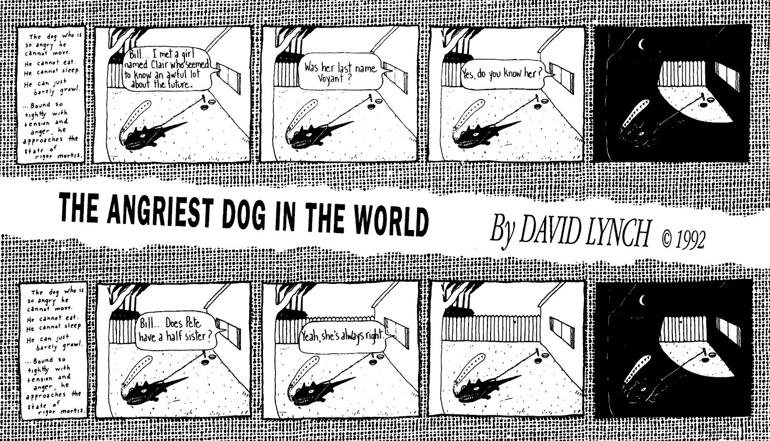
David Lynch shares with Altman and Hitchcock a compulsion for using the same actors from one film to the next, but I’d not noticed before how often dogs appear in his films. So that’s what this post examines, some of the canine moments from his feature films. Since I didn’t watch the whole of the first two seasons of Twin Peaks they’re omitted from this listing (unless you know of a dog in any of the episodes) while some of Lynch’s minor works such as the short-lived On the Air series, and one-offs such as The Cowboy and the Frenchman (1988), I either haven’t seen for years or haven’t seen at all.
The Grandmother (1970)

The Grandmother not only introduces the elderly woman/suited boy pairing that recurs later in the Twin Peaks mythos, but it also establishes the canine theme when the boy’s parents are shown mewling and barking like dogs. Whatever other qualities dogs may possess, Lynch is drawn to the disturbing and often threatening nature of the sounds they make.
Eraserhead (1977)
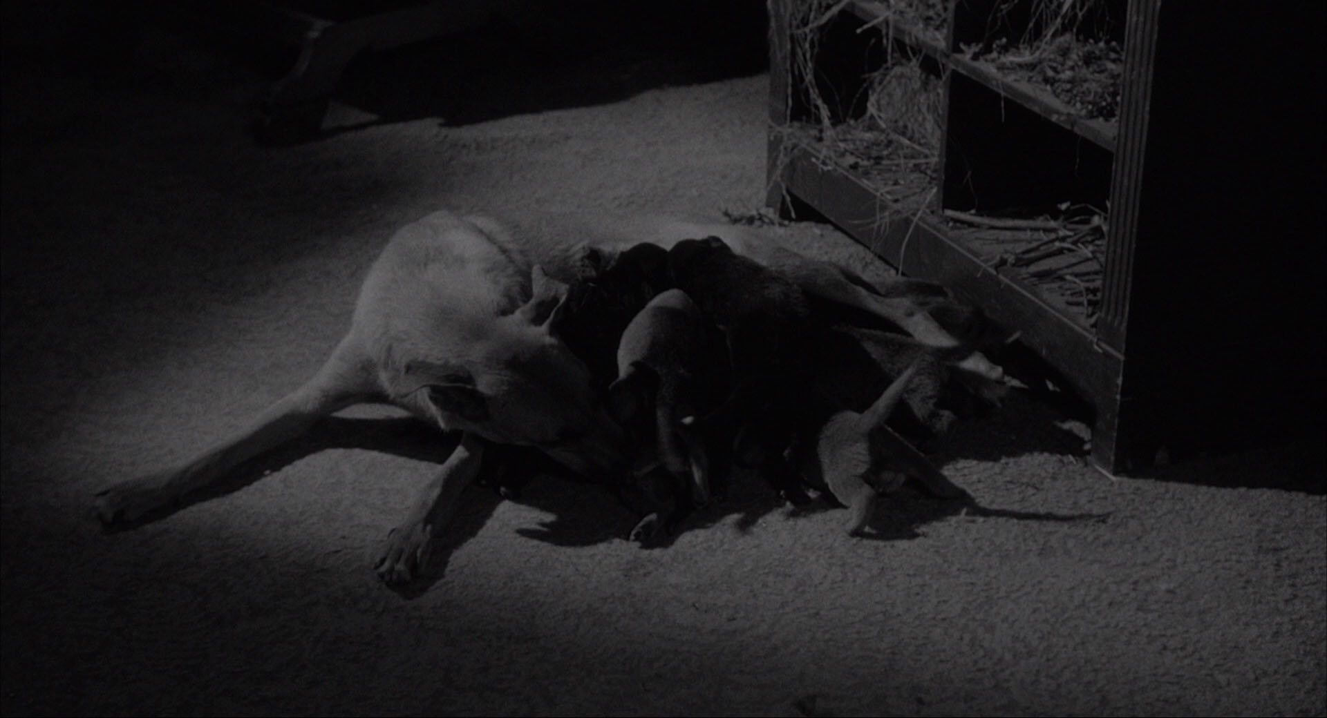
The potential for threat is reinforced in Eraserhead when Henry is startled by barking dogs on his way to visit Mary. The only dogs that appear before the camera are the puppies and their mother on the floor of Mary’s home.