Petulia film posters

petulia1.jpg

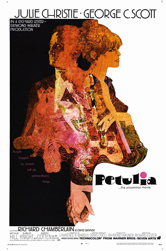
Illustration by Bob Peak.

Further examples of those things you find when you’re searching for something else, these posters for Richard Lester’s Petulia (1968) are a good example of just how differently the same film can be presented by its advertising materials. Petulia (“the uncommon movie”) is a fascinating, unjustly neglected gem, a serious adult drama quite unlike the comedies (or comic dramas) Lester was making before and after. Nicolas Roeg photographed Petulia shortly before embarking on his own directing career, capturing San Francisco just after the Summer of Love in a more documentary fashion than the exploitation films of the period. There are nods to the psychedelic scene with party appearances by Big Brother and the Holding Company, and the Grateful Dead, but the narrative concerns the flipside of hippiedom with a group of middle-class professionals ensnared in adultery and marital failure.

A commonly remarked feature of Petulia is Antony Gibbs’ fragmented editing style which flashes backwards and forwards throughout, even showing events that never happen. The technique is usually taken to be derived from Alain Resnais although Gibbs had earlier edited The Knack…and How to Get It for Lester which is often as fragmented, albeit for a more comic effect. What’s notable about the technique is that Gibbs went on to edit Nicolas Roeg’s first two features, Performance (co-directed with Donald Cammell) and Walkabout, both of which take the fragmentation even further, creating the style which Roeg made his own.

petulia4.jpg

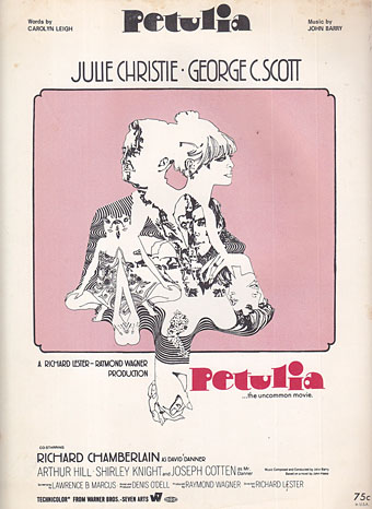
The poster that caught my attention was the marvellous one by Bob Peak who manages to depict the awkward relationship between the two leads—holding hands yet facing away from each other—whilst alluding to the psychedelic backdrop in the details. It’s difficult to tell at a small size but the sheet music design above shows that Peak’s drawing is a complex arrangement of blended faces, the reflected figure of a woman and a pattern of Bridget Riley swirls. If I was still collecting film posters I’d be sorely tempted to buy one of these.

petulia2.jpg

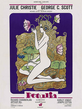
Illustration by Jean Fourastié.

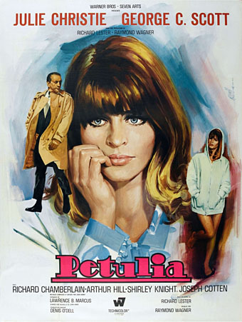
Compared to which this pair of French designs veer off in opposite and unsatisfying directions. Jean Fourastié seems to have been under the impression that the story concerned a San Francisco flower child not a bored housewife, while Jean Mascii’s painting isn’t inaccurate but is more suited to a romance paperback. Big heads were apparently Mascii’s métier even if there were no people in the film.

petulia3.jpg

Illustration by Jean Mascii.

Petulia has been available on DVD for a while now, it’s well worth seeking out. Watch the trailer here.

Previously on { feuilleton }
Lucifer Rising posters
Wild Salomés
Druillet’s vampires
Bob Peak revisited
Alice in Acidland
Salomé posters
Polish posters: Freedom on the Fence
Kaleidoscope: the switched-on thriller
The Robing of The Birds
Franciszek Starowieyski, 1930–2009
Dallamano’s Dorian Gray
Czech film posters
The poster art of Richard Amsel
Bollywood posters
Lussuria, Invidia, Superbia
The poster art of Bob Peak
A premonition of Premonition
Metropolis posters
Film noir posters

Salomé by Upside Down House

salome1985.jpg

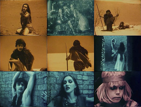
Big thanks to Mr. Kenneth at Radio Shirley for drawing my attention to this 1985 music video by Australian group Upside Down House. From their brief listing at Discogs the group don’t seem to have lasted long or released a great deal, Salomé being their second and final single. Given the quality of the music that’s not too surprising, you need someone like Jarboe to do justice to this theme. But the video is remarkably good for a low-budget imitation of silent cinema. The verisimilitude is no doubt a result of director Bob Eagle having used a hand-cranked camera which gives that distinctive flickering effect, a common feature of silent films which sound cameras and digital filters seldom replicate with any accuracy. The wildly emoting femme fatale is Kathleen Stewart, now better known as a novelist.

Elsewhere on { feuilleton }
The Salomé archive

Design as virus 15: David Pelham’s Clockwork Orange

clockworkbook.jpg

Design by David Pelham (1972).

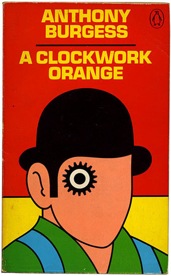
Continuing an occasional series. Pity the poor designer who has to create a new cover for Anthony Burgess’s novel when David Pelham’s Penguin cover—created in haste forty years ago—is more visible than ever. Pelham’s design is a familiar sight on these pages but it’s also an increasingly familiar sight elsewhere, having become the primary visual signifier not only of the novel itself but also the novel’s entanglement with Stanley Kubrick’s film. Burgess came to resent the cult power of the film and the way it inflated the status of one of his early novels whilst overshadowing the rest of his work. The book still overshadows his other novels but what’s interesting now, fifty years after it was published, and forty years on from Pelham’s cover design, is seeing the novel clawing back some of the territory ceded to the film, in part because of that memorable cog-eyed face. What follows is a look at some of the subsequent reworkings of Pelham’s design.

clockworkposter1.jpg

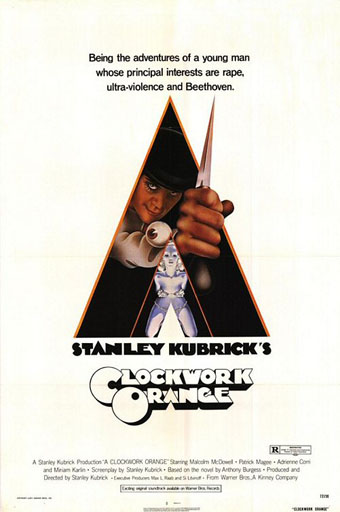
Artwork by Philip Castle, design by Bill Gold (1971).

It’s necessary to mention the original poster art first since the fat title typography gets reused more than any other part of the film’s publicity. The poster was also indirectly responsible for Pelham’s cover design when Kubrick denied Penguin any use of his promotional material:

Barry Trengove had designed a delightful cover for the Penguin edition of A Clockwork Orange and then the movie came along. While the Penguin marketing department was desperate to tie in with the film graphics, the director of the movie Stanley Kubrick wasn’t at all interested in tying in with the book. Consequently I was given the task of commissioning an illustration that gave the impression of being a movie poster. Sadly I was subsequently let down very badly by an accomplished airbrush artist and designer (whose name I will keep to myself), who kept calling for yet more time and who eventually turned in a very poor job very late. I had to reject it which was a hateful thing to have to do because we were now right out of time.

[…]

Well there I am, late in the day and having to create a cover for A Clockwork Orange under pressure. Already seriously out of time I worked up an idea on tracing paper overnight, ordering front cover repro from the typesetter around 4.00 am. I remember that my type mark-up was collected by a motorcycle messenger around about 5.00 am. Later that morning, in the office, I drew the black line work you see here on a matt plastic acetate sheet, specifying colours to the separator on an overlay while the back cover repro was being pasted up by my loyal assistants who had the scalpel skills of brain surgeons. I had wonderful assistants, absolutely wonderful.

Then more motorcycle messengers roaring around London in large crash helmets; and some days later I would see a proof. In those days, that was quick! Since those times I have often been amused to notice that my hurried nocturnal effort of so long ago appears to have achieved something of iconic status, for I’ve seen this cog-eyed image on fly-posters in Colombia, on t-shirts in Turkey, and put to a variety of uses in Canada, Los Angeles and New York. Because I did it, I spot it. Its like walking into a room where a party’s going on and, although the room is buzzing with conversation, if somebody simply mentions your name in conversation you immediately pick it up because it’s so familiar.

Penguin by Designers: David Pelham

clockworkposter2.jpg

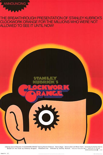
A scarce item, allegedly from 1972 (although it may be from a year later), which surprisingly uses the book design with the film poster titles. According to a film memorabilia site “This rare alternate style R-Rated poster was designed for wild posting exclusively in New York and Los Angeles”. In the US the film was given an X rating on its first release meaning that many theatres wouldn’t have shown it. Following a few edits it was reissued with an R rating. On the back of the 1972 Penguin paperback there’s notice of a copyright restriction against selling that edition in the US so Pelham’s design wouldn’t have been familiar there until much later.

Continue reading “Design as virus 15: David Pelham’s Clockwork Orange”

Weekend links 129

proffer.jpg

Daughters of Maternal Impression by Arabella Proffer.

A genre’s landscape should be littered with used tropes half-visible through their own smoke & surrounded by salvage artists with welding sets, otherwise it isn’t a genre at all.

M. John Harrison, incisive as ever, on what he memorably labels “Pink Slime Fiction”. Elsewhere (and at much greater length) Cowardice, Laziness and Irony: How Science Fiction Lost the Future by Jonathan McCalmont, and a two-part Paul Kincaid interview here and here.

• “Once upon a time, in almost every city, many rivers flowed. Why did they disappear? How? And could we see them again? This documentary tries to find answers by meeting visionary urban thinkers, activists and artists from around the world.” A trailer for Lost Rivers, written and directed by Caroline Bâcle. Related (and mentioned here before), London’s Lost Rivers: A Walker’s Guide by Tom Bolton.

Ghosts in the Machine: “Curated by Massimiliano Gioni and Gary Carrion-Murayari, a recent exhibition was imagined as a Wunderkammer simultaneously tracing and questioning the relationship between people and technology.” And in Istanbul a Wunderkammer of a different kind: Rick Poynor looks at Orhan Pamuk’s Museum of Innocence.

• “There’s a vast territory still to be explored…” Bristol duo Emptyset (James Ginzburg & Paul Purgas), many of whose releases I’ve designed, talk about their music. Tracks from their new EP on the Raster-Noton label can be heard here. You’re going to need bigger speakers.

• “I liked doing it one time but I don’t want to become the gay porn soundtrack guy.” Ben Chasny of Six Organs of Admittance talking to Sir Richard Bishop about one of his more unusual commissions.

durham.jpg

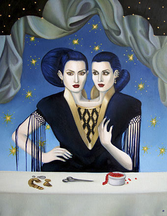
Double Vision (2009) by Bonnie Durham.

FACT mix 349: Silent Servant puts together a great selection of music old and new with the emphasis on the grit of the early Industrial era.

• Read Joyce’s Ulysses line by line, for the next 22 years, with Frank Delaney’s podcast.

Borges and the Plain Sense of Things, an article from 2006 by Gabriel Josipovici.

Clive Hicks-Jenkins on Equus and seeing your inspirations come full circle.

• At Pinterest: A few nice paintings of men

Spunk [arts] magazine

Derelict London

• Ritualistic Bug Use (2009) by Pink Skull | Demiurge Variations (2012) by Emptyset | Utopian Disaster (End) (2012) by Silent Servant.

The Horse of the Invisible

carnacki1.jpg

Can Carnacki make any claim to be taken seriously as a detective? If he solves anything it is by force of will, rather than the application of deductive powers. He is no Sherlockian ironist, no high-domed mental traveller. He stands as close to Holmes as Mike Hammer does to Philip Marlowe. His methods are enthusiastic but basic: good old-fashioned head-in-the-door stuff. He is not so much a “ghostbuster” as a self-starting lightning rod for psychic phenomena that has not yet been housebroken.

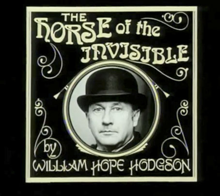
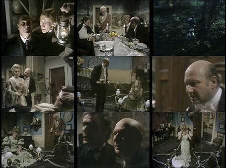
Thus Iain Sinclair in a typically acerbic afterword to the 1991 Grafton paperback of Carnacki, the Ghost-Finder by William Hope Hodgson. Holmes would indeed look askance at Carnacki’s methods but that didn’t prevent the occult investigator being drafted as one of The Rivals of Sherlock Holmes in the first television series of that name in 1971. I was reminded of this dramatisation following last week’s discussion of Hodgsonian cinema; I’ve known about the episode for years—notable for having Donald Pleasence in the role of Thomas Carnacki—but hadn’t watched it until this week courtesy of YouTube.

Philip Mackie wrote the script for The Horse of the Invisible, and Alan Cooke was the director. Their adaptation is interesting mostly for seeing a Hodgson story dramatised; as a piece of television the presentation is serious and well-acted but looks rather creaky today, suffering from the over-lit artificiality that always blighted studio-shot productions attempting to create any kind of atmosphere. Donald Pleasence is his typical lugubrious self which doesn’t really suit Carnacki’s bull-headed enthusiasm but I don’t mind that, Pleasence was a good actor so it’s a treat to see him play the part. And we do get to see Carnacki’s “electric pentacle” in action (Carnacki enjoys his Edwardian gadgets) in the midst of which the beleaguered Michele Dotrice is forced to spend the night. The most successful Carnacki stories are those that play to Hodgson’s strengths as a writer of supernatural dread, stories such as The Gateway of the Monster or The Hog. The Horse of the Invisible doesn’t attain the heights of those tales but then it would be a doomed venture trying to conjure Hodgson’s cosmic horrors on a limited budget. With this story you get a taste of the supernatural, which no doubt sets it apart from the other “Rivals”, whilst staying within the bounds of credibility.

carnacki2.jpg

There’s one curious detail worth mentioning: in both the story and the dramatisation the character of the fiancé is named “Charles Beaumont”. There was a real Charles Beaumont, a screenwriter responsible for many scripts for The Twilight Zone TV series, as well as for some of the superior American horror films of the 1960s, including Night of the Eagle, The Haunted Palace (Roger Corman’s adaptation of The Case of Charles Dexter Ward) and The Masque of the Red Death. In last week’s discussion I mentioned John Carpenter’s The Fog as a good example of Hodgsonian cinema on account of its ghost pirates. My memory may be playing tricks but I’m sure that Carpenter has a reference to a “Charlie Beaumont” in either The Fog or Halloween, both films being littered with significant character names. (There’s a “Mr Machen” in The Fog). Donald Pleasence was in Halloween, of course, playing a doctor with a name lifted from Psycho. I’ve searched in vain for the Beaumont reference; does this ring a bell for any Carpenter-philes?

Both series of The Rivals of Sherlock Holmes are available from Network DVD.

Previously on { feuilleton }
Tentacles #2: The Lost Continent
Tentacles #1: The Boats of the ‘Glen Carrig’
Hodgson versus Houdini
Weekend links: Hodgson edition
“The game is afoot!”
Druillet meets Hodgson