Icarus Descending

tmwfte02.jpg

UK, 2009.

Newton leaned forward, putting his elbows carefully on the table. “Nathan. Nathan. I was afraid of you then. I am afraid now. I have been afraid of all manner of things every moment I have spent on this planet, on this monstrous, beautiful, terrifying planet with all its strange creatures and its abundant water, and all of its human people. I am afraid now. I will be afraid to die here.”

Before my recent rewatch of The Man Who Fell to Earth I decided to read the novel in order to spice up yet another viewing by comparing the film with its source. And as is often the case when reading books of a certain vintage, curiosity had me wondering how the book has been cover-designed over the years.

The Man Who Fell to Earth was published in 1963. Prior to this Walter Tevis had only published one other book, The Hustler, his first novel about pool-player “Fast Eddie” Felson. Such a debut wouldn’t have marked Tevis as a putative writer of science fiction although he had written a handful of stories for SF magazines before attempting anything at novel length. The Man Who Fell to Earth is artistically satisfying science fiction, and a good novel in a literary sense, something you can’t always expect from those writers of Tevis’s generation who seemed to read nothing but technical reports and fiction by other SF writers.

The story opens in 1985, presenting a future which isn’t too different to the 1985 that many of us lived through. Speculation is minor and mostly relegated to the background, with occasional mentions of monorails, food shortages and warring African nations who threaten each other with nuclear weapons. Into this world there arrives the alien who calls himself Thomas Jerome Newton (we never learn his original name), a clandestine emissary from the dying planet his people know as Anthea. Newton has been sent to Earth with plans to build a financial empire using his advanced technical knowledge. This will, he hopes, enable him to build a craft in order to ferry the remaining Antheans to a world where they can survive. Once they’re secure, the Antheans also plan to rescue the inhabitants of Earth from imminent nuclear destruction.

tmwfte22.jpg

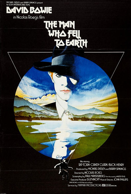
The US one-sheet of Vic Fair’s poster. After decades of illustrators and designers working with both the book and the film, Fair’s poster is still the most successful condensation of the story into a single, memorable image.

If you’ve seen the film then the broad strokes are all very familiar. Nicolas Roeg’s direction and Paul Mayersberg’s script treat the material elliptically but the film stays closer to the novel than you might expect, with Mayersberg even reusing some of Tevis’s dialogue. Both novel and film are very much concerned with portraying the Earth itself as an alien planet. For the first half of the novel, “1985: Icarus Descending”, we see our world through Newton’s eyes while he makes his way among the clever but dangerous primates. The second half, “1988: Rumpelstiltskin”, concentrates equally on Newton’s attempts to retain his sanity in a world that must never discover his real intentions or his true nature; and on the curiosity of Nathan Bryce, the chemist helping to construct Newton’s spacecraft, whose suspicions about his employer are eventually confirmed. Bryce believes that Anthea must be the planet Mars, but when asked about this directly Newton simply replies “Does it matter?”

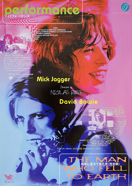
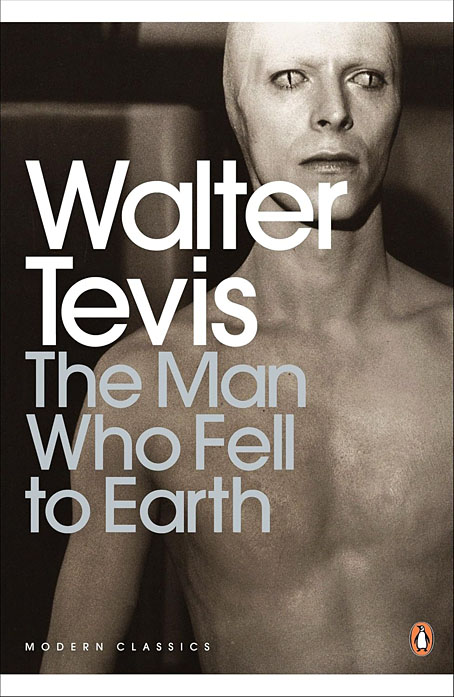
Roeg and Mayersberg’s film received mixed reviews in 1976 but its cult status has grown thanks to its connection with David Bowie’s person and career. Bowie’s Newton has become a dominant motif for book covers even though Tevis’s Newton is a negative inversion of the screen alien, being six-and-a-half feet tall, with tanned skin and pure white hair. For art directors and illustrators the challenge since 1976 has been to present the novel in a manner which does more than merely repeat the imagery of the film. Not everyone succeeds in doing so.

tmwfte12.jpg

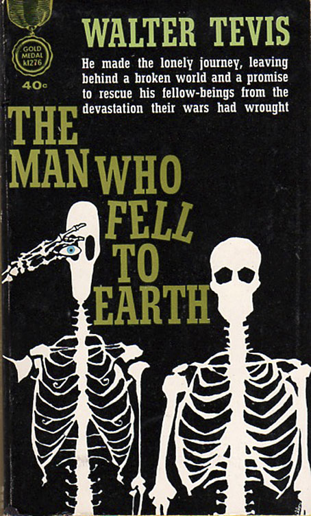
USA, 1963. Cover art by Leo and Diane Dillon.

The first printing was as a paperback original with untypical cover art by Leo & Diane Dillon. Without reading the novel it’s hard to tell what this is about at first glance, but the figure on the left is supposed to represent Newton’s unusual lightweight skeleton whose height and shape are contrasted with its human counterpart. The eye presumably refers to the contact lenses that Newton wears to disguise his cat-like pupils.

tmwfte07.jpg

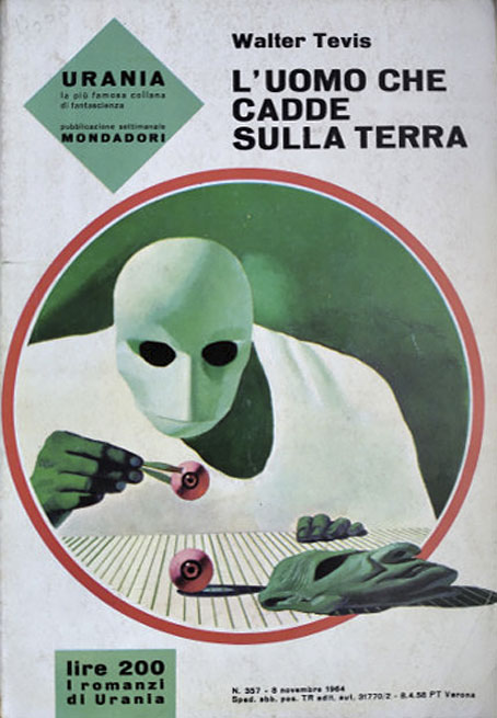
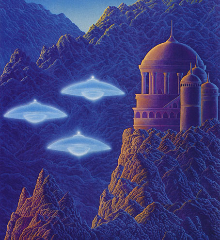
Italy, 1964. Cover art by Karel Thole.

The few covers that pre-date the film are what you might call the innocent ones, free of David Bowie’s face or Bowie-like figures. Here the prolific Karel Thole also favours Newton’s diguises over any other imagery.

tmwfte03.jpg

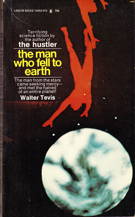
USA, 1970. Cover art by Howard Winters.

Continue reading “Icarus Descending”

Roeg abroad

roeg01.jpg

Japan, 1998.

I’m currently in the middle of a Nicolas Roeg rewatch season after acquiring a blu-ray of the recently reissued Castaway, Roeg’s 1986 adaptation of Lucy Irvine’s memoir (which shouldn’t be confused with 2000’s Cast Away). In the early 1980s when I was becoming more acquainted with his films I went through a phase of buying film posters, and managed to pick up copies of the UK quad sheets for Don’t Look Now and Bad Timing. I would have preferred the one for The Man Who Fell to Earth but Bowie-obsessives have made that particular item very collectible, and it never crossed my path. Foreign posters for Roeg films also tend to be uncommon since his films have never been really popular, and some, like Eureka, were plagued with distribution difficulties which made them difficult to see at all. Eureka is missing from this small collection of foreign posters due to a lack of suitable candidates.


Performance

roeg02.jpg

Italy, 1971.

One thing you notice when you look for details of foreign releases is how often a film title is changed to suit local tastes. The Italians changing Performance to Sadismo is one of the more ridiculous examples, picking out a minor detail—Joey’s whipping of Chas at the beginning of the film—while ignoring the rest of the film’s kaleidoscope of images and references.


Walkabout

roeg03.jpg

Japan, 1971.

Similar changes occur in poster art, when the movement to another country prompts the local designers to over-emphasise a film’s sensational elements. In the UK and US the posters for Walkabout stressed the story as being one about survival in a wilderness, and the differences between the Indigenous boy and the English girl and her brother. Elsewhere the posters were more concerned with Jenny Agutter’s skinny-dipping scene while telling you little else about the rest of the film.


Don’t Look Now

roeg04.jpg

Poland, 1973. Art by Maria Mucha Ihnatowicz.

I was hoping there might be more Polish posters for Roeg’s films but this was the only one which turned up. Japanese posters can at times be as elusive as the celebrated Polish designs, with an approach to design that’s very different to the Western standard. The Japanese poster for a reissue of Don’t Look Now is one of the best I’ve seen for that particular film, condensing into a single image the two threads of the story—the dead girl and the murder mystery—while emphasising the film’s persistent use of the colour red.

roeg05.jpg

Japan, 1983.

Continue reading “Roeg abroad”

Weekend links 828

williams.jpg

Visitation (1976) by Gilbert Williams.

• “It’s the perfect storm of a UFO case.” Daniel Lavelle explores the Rendlesham Forest mystery of 1980, Britain’s own answer to the Roswell Incident. The case has more substantial documentation than most close encounters but it also has its share of conflicting reports, claims and interpretations. The truth is out there but it’s not evenly distributed.

The Science of Spooky Sounds: Kristen French talks to researcher Rodney Schmaltz about his theory that infrasound may be responsible for the haunted feelings people experience in some buildings.

• New music: Six Organs of Admittance featuring The Six Organs Olive Choir by Six Organs of Admittance; Blue Loops by Kevin Richard Martin; Passage of Time: The Music of Michael F. Hunt by Michael F. Hunt.

• At The Daily Heller: Steven Heller on The Complete Zap Comix, an expensive reprint of the pioneering underground title coming soon from Fantagraphics.

• Coming soon from Strange Attractor: A Walking Flame: Selected Magical Writings of Ithell Colquhoun edited by Amy Hale.

• At Colossal: Linocuts by Eduardo Robledo celebrate Mexican heritage and community.

• Object of the week at the BFI is Vic Fair’s poster for The Man Who Fell to Earth.

• The Strange World of…Hildur Guðnadóttir.

Wide-band WebSDR in Enschede, NL

Lights At Rendlesham (2012) by Time Columns | Rendlesham Forest (1980) (2019) by Grey Frequency | Lights Over Woodbridge (2021) by A Farewell To Hexes

Dell Mapbacks

mapback08.jpg

Dell 5, Four Frightened Women by George Harmon Coxe, was the first of the mapbacks. On the back cover of each of these books is, naturally, a map—a cutaway bird’s-eye view of the apartment building, house, hotel or city-section in which the events of the book take place. These drawings were generally quite faithful to the books; the most careful one was probably the map sketched by author Hake Talbot for his own book, Rim of the Pit (Dell 173), and executed, as were most of the mapbacks, by Ruth Belew.

Almost all Dell Books published until 1951 were provided with a mapback; beginning in that year, the practice was gradually abandoned. Dell’s sales department hated the idea; they found the maps unnecessary and noncommercial, and felt that back covers could better be reserved for advertising blurbs.

The Book of the Paperback: A Visual History of the Paperback Book (1982) by Piet Schreuders

I’ve long been fascinated by the Dell Mapbacks even though I’ve only ever seen pictures of them. (And to stave off the inevitable emails: no, I don’t want to buy any.) They form a truncated path in the evolution of the paperback book, one where the gimmick of creating a map for each title was globally applied, regardless of whether the contents warranted such a thing. Dell began life as a publisher of mysteries, hence the logo of an eye peeping through a keyhole. Maps are more justifiable if applied to a detective story, where a map may help the reader picture the layout of a location or trace the movements of a character. But once Dell branched out into other areas of fiction the maps seemed increasingly superfluous, especially those that limit themselves to the plan of an office or apartment. For some there’s also the question of accuracy. The novelisation of Alfred Hitchcock’s Rope shows a map of the apartment that doesn’t correspond to the layout of the rooms as they’re seen on the screen, something that readers who’d seen the film would have been quick to recognise.

mapback04.jpg

For this post I went looking for a few of the more unusual mapbacks, prompted by the discovery of Invasion from Mars. I’d been watching an Orson Welles’ question-and-answer session from 1982 which was recorded after a screening of Welles’ adaptation of The Trial. Welles declares at one point that he “used to write for the pulps, as we called them then”. The claim surprised me. I knew that Welles had been writing newspaper columns in the 1940s; he’s also credited as the author of a novel, Mr Arkadin (1955), which was actually written by a Frenchman, Maurice Bessy, whose serialised adaptation of Welles’ Mr Arkadin screen story was published in novel form. Invasion from Mars seems to be Welles’ sole encounter with pulp-land unless you include the pulpy origins of The Lady from Shanghai and Touch of Evil. Invasion from Mars collects a handful of Mars-related SF stories, together with the Howard Koch script for the Mercury Theatre radio broadcast of The War of the Worlds. The superfluous map on this occasion is for The Million Year Picnic, one of Ray Bradbury’s Martian Chronicles stories. Dell didn’t publish very much science fiction so the Mars book and First Men in the Moon are the only titles I’ve seen with maps showing extraterrestrial locations. Would-be collectors may like to know that after writing a history of the paperback book Piet Schreuders put together a short guide to collecting this series, The Dell “Mapbacks”, which was published in 1997.

• Further reading: Dell Mapbacks: A History.
Dell Mapbacks (sorted). An extensive cover collection at Flickr.

mapback03.jpg

mapback06.jpg

Another film tie-in, published for the US release of Powell & Pressburger’s Gone To Earth (1950).

mapback01.jpg

Continue reading “Dell Mapbacks”

Weekend links 824

earth.jpg

“A view of Earth taken by NASA astronaut and Artemis II Commander Reid Wiseman from one of the Orion spacecraft’s windows after completing the translunar injection burn on April 2, 2026. The image features two auroras (top right and bottom left) and zodiacal light (bottom right) is visible as the Earth eclipses the Sun.”

• I was surprised this week to find myself quoted by David Hudson at Criterion Current in an overview of the schedule for Cold War Visions: Nuclear Anxiety in Eastern Bloc Cinema, a short season of films that will be showing at the Barbican throughout this month. One of those films is Andrei Tarkovsky’s Stalker, a cult film round here, which a handful of lucky Londoners will be able to see on a big screen.

邪神三十六景 (Thirty-six Views of the Evil Gods) is collection of drawings by Takeki Yamada that combine Hokusai’s celebrated views of Mount Fuji with beings from Lovecraft’s Cthulhu Mythos. I’m a little underwhelmed by the results but the book is out there for those who want it.

• Among the new titles at Standard Ebooks, the home of free, high-quality, public-domain texts: Last and First Men by Olaf Stapledon. (Previously)

• Coming soon at Unquiet Things: The Art of the Unknown: A Visual Treasury of the Esoteric, Uncanny, and Unexplained by S. Elizabeth.

• At Public Domain Review: Elizabeth I’s manuscript copy of Pierre Boaistuau’s Histoires Prodigieuses (1559).

• New music: Enter the Nuummite Cosmos by Brotherhood Of Sleep.

• At the BFI: Where to begin with Peter Weir.

A Brief History of the Dust Jacket.

Out Of The Unknown (1984) by Died Pretty | Brian’s Nightmare / The Unknown, Part One (2005) by Robin Guthrie / Harold Budd | A Gift Of Unknown Things (2017) by Teleplasmiste