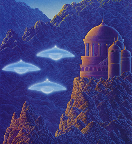
The art of Helmut Wenske

wenske19.jpg

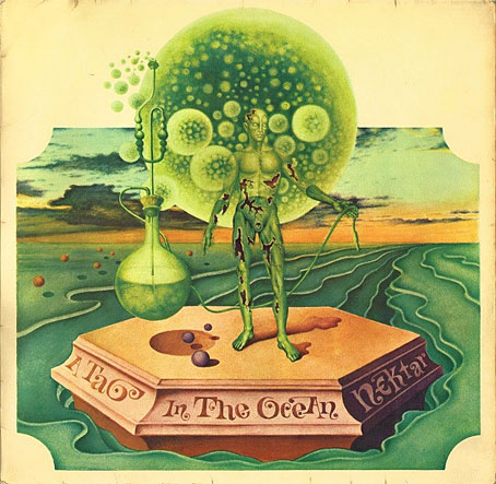
A Tab in the Ocean (1972) by Nektar.

This is another post in which I refer to Franz Rottensteiner’s The Fantasy Book: The Ghostly, the Gothic, the Magical, the Unreal (Thames & Hudson, 1978) as a source of discovery. Rottensteiner is Austrian which no doubt explains why his study of fantasy and horror in art and fiction had a broader reach than you would have found in a similar study from a British or American editor. Some of the writers whose work he discusses—Stefan Grabiński, for example—hadn’t been translated into English at that time. Among the artists whose work appeared as illustration Helmut Wenske was one of several whose paintings were seldom seen in Anglophone publications, although a few album covers that featured Wenske art—those for Nektar in particular—were a common sight in British record shops in the 1970s.

wenske20.jpg

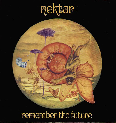
Remember The Future (1973) by Nektar.

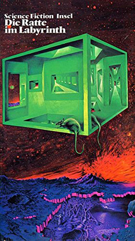
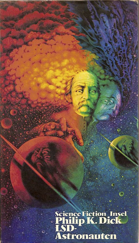
Wenske is a German artist with a penchant for Dalí-like Surrealism that might have been strained through a psychotropic filter. Most of his work in the 1970s was as an album cover designer for the Bellaphon label, and most of those covers are designs rather than paintings. There are a number of book covers, however, some of which are recycled from his album covers. From 1971 to 1975 Wenske painted the covers for a series from Insel Verlag, “Phantastische Wirklichkeit: Science Fiction der Welt”, a collection of reprints edited by Franz Rottensteiner. Wenske’s ISFDB credits list a few horror covers along with these, a small percentage of which are Lovecraft-related. In the past I’ve drawn attention to many different Lovecraft illustrators but Wenkse is one of a small number of these to have also written Lovecraftian fiction of his own (Die Krypta von Shaggay’h, 1974). He enjoys the work he’s being asked to illustrate, in other words, which isn’t something you can always expect from illustrators.

wenske22.jpg

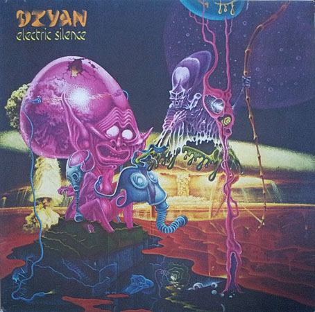
Electric Silence (1974) by Dzyan.

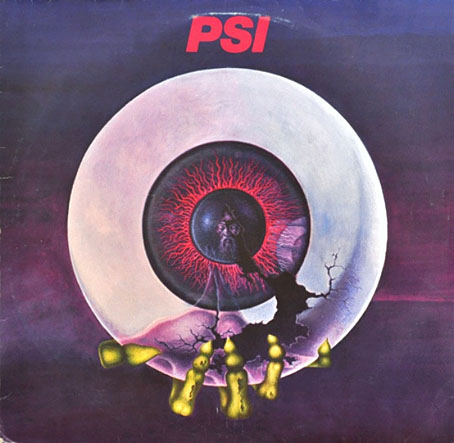
The covers below aren’t the best quality but better copies have proved hard to find. For those who’d like to see more Wenske art there’s at least one German catalogue that collects his work from the early 70s on.

• Related reading: View From Another Shore: An Interview with Franz Rottensteiner.

wenske21.jpg

Horizonte (1977) by PSI.

wenske01.jpg

wenske02.jpg

Continue reading “The art of Helmut Wenske”

Weekend links 833

hyde.jpg

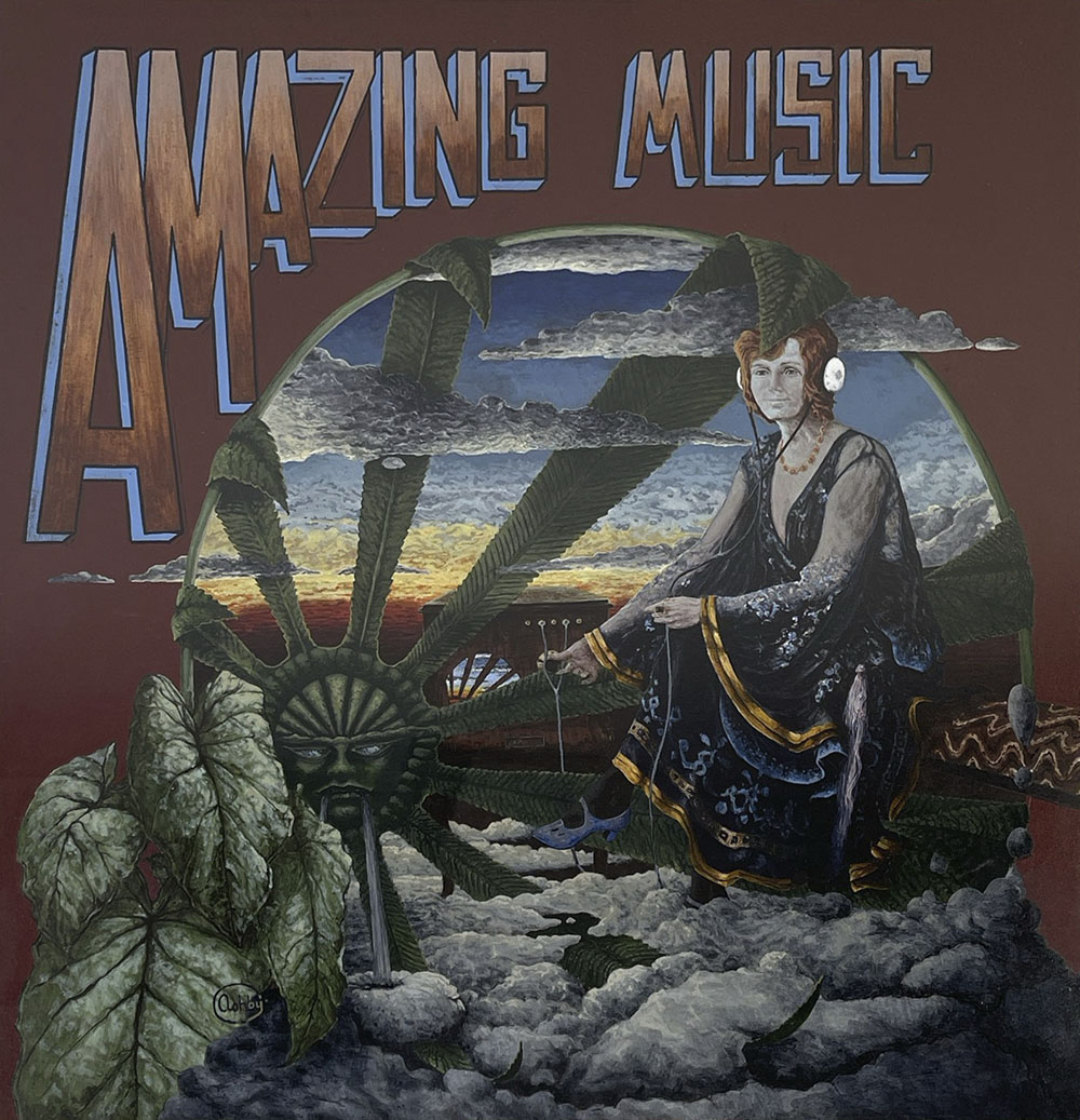
Tony Hyde’s original artwork for the front cover of Astounding Sounds, Amazing Music by Hawkwind. The painting is being auctioned later this month.

• At the Daily Heller: Steven Heller reprints his 2012 Atlantic review of The Graphic Canon, a three-volume collection of visual adaptations of works of literature. The collection was edited by the late Russ Kick, and includes my own condensation of The Picture of Dorian Gray.

• At Dennis Cooper’s: Bill Hsu presents…21st Century Nightmares: Dark Animations by Cristóbal León/Joaquín Cociña, Hugo Covarrubias, Christiane Cegavske, John Frame, Saori Shiroki, Joe Hsieh, Phil Tippett, Robert Morgan, Shengwei Zhou.

• At Colossal: In Los Angeles, 70 artists transform a vacant hospital into a sprawling art experience.

What we were doing was rooted in that specific moment, but looking back, it also seems to resonate strongly with the present—particularly in terms of how we understand media, perception, and reality itself. This is something I’ve been thinking about again recently, especially with the renewed activity around Cabaret Voltaire. It brings into focus the extent to which earlier work now reads almost as a form of prefiguration. At the time, though, much of it was intuitive. We didn’t necessarily have a fully formed theoretical framework for what we were doing—we were artists, and we were working instinctively. It’s really only in retrospect that some of those ideas begin to take on a clearer shape and meaning.

Stephen Mallinder talking to Nicolas Ballet about Cabaret Voltaire, the group’s history and working methods

• New music: The Endless Dance by Hannah Peel; Helt by Fjall; Air Signs by Anthéne.

• Adam Rowe is writing a new book about science fiction art.

• Steven Heller’s font of the month is Brutal Types.

• Mix of the week: Isolatedmix 135 by Aspetuck.

• Brute Reason (1983) by Bernard Szajner | Let’s Get Brutal (1986) by Nitro Deluxe | Brutal But Clean (1994) by Cabaret Voltaire

Icarus Descending

tmwfte02.jpg

UK, 2009.

Newton leaned forward, putting his elbows carefully on the table. “Nathan. Nathan. I was afraid of you then. I am afraid now. I have been afraid of all manner of things every moment I have spent on this planet, on this monstrous, beautiful, terrifying planet with all its strange creatures and its abundant water, and all of its human people. I am afraid now. I will be afraid to die here.”

Before my recent rewatch of The Man Who Fell to Earth I decided to read the novel in order to spice up yet another viewing by comparing the film with its source. And as is often the case when reading books of a certain vintage, curiosity had me wondering how the book has been cover-designed over the years.

The Man Who Fell to Earth was published in 1963. Prior to this Walter Tevis had only published one other book, The Hustler, his first novel about pool-player “Fast Eddie” Felson. Such a debut wouldn’t have marked Tevis as a putative writer of science fiction although he had written a handful of stories for SF magazines before attempting anything at novel length. The Man Who Fell to Earth is artistically satisfying science fiction, and a good novel in a literary sense, something you can’t always expect from those writers of Tevis’s generation who seemed to read nothing but technical reports and fiction by other SF writers.

The story opens in 1985, presenting a future which isn’t too different to the 1985 that many of us lived through. Speculation is minor and mostly relegated to the background, with occasional mentions of monorails, food shortages and warring African nations who threaten each other with nuclear weapons. Into this world there arrives the alien who calls himself Thomas Jerome Newton (we never learn his original name), a clandestine emissary from the dying planet his people know as Anthea. Newton has been sent to Earth with plans to build a financial empire using his advanced technical knowledge. This will, he hopes, enable him to build a craft in order to ferry the remaining Antheans to a world where they can survive. Once they’re secure, the Antheans also plan to rescue the inhabitants of Earth from imminent nuclear destruction.
tmwfte22.jpg

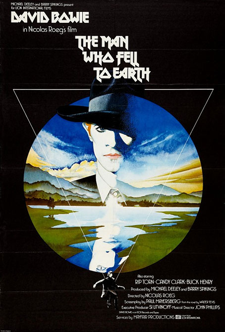
The US one-sheet of Vic Fair’s poster. After decades of illustrators and designers working with both the book and the film, Fair’s poster is still the most successful condensation of the story into a single, memorable image.

If you’ve seen the film then the broad strokes are all very familiar. Nicolas Roeg’s direction and Paul Mayersberg’s script treat the material elliptically but the film stays closer to the novel than you might expect, with Mayersberg even reusing some of Tevis’s dialogue. Both novel and film are very much concerned with portraying the Earth itself as an alien planet. For the first half of the novel, “1985: Icarus Descending”, we see our world through Newton’s eyes while he makes his way among the clever but dangerous primates. The second half, “1988: Rumpelstiltskin”, concentrates equally on Newton’s attempts to retain his sanity in a world that must never discover his real intentions or his true nature; and on the curiosity of Nathan Bryce, the chemist helping to construct Newton’s spacecraft, whose suspicions about his employer are eventually confirmed. Bryce believes that Anthea must be the planet Mars, but when asked about this directly Newton simply replies “Does it matter?”

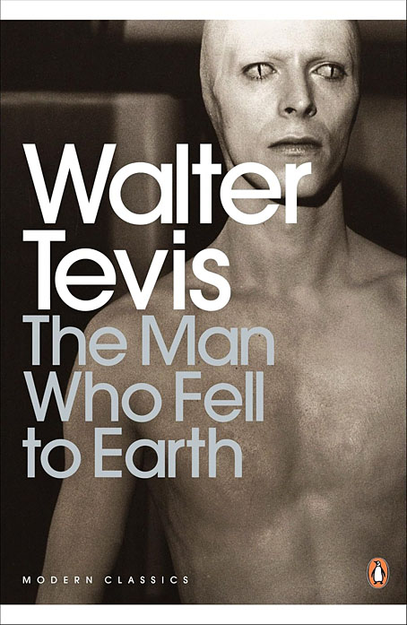
Roeg and Mayersberg’s film received mixed reviews in 1976 but its cult status has grown thanks to its connection with David Bowie’s person and career. Bowie’s Newton has become a dominant motif for book covers even though Tevis’s Newton is a negative inversion of the screen alien, being six-and-a-half feet tall, with tanned skin and pure white hair. For art directors and illustrators the challenge since 1976 has been to present the novel in a manner which does more than merely repeat the imagery of the film. Not everyone succeeds in doing so.
tmwfte12.jpg

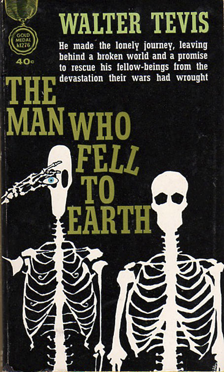
USA, 1963. Cover art by Leo and Diane Dillon.

The first printing was as a paperback original with untypical cover art by Leo & Diane Dillon. Without reading the novel it’s hard to tell what this is about at first glance, but the figure on the left is supposed to represent Newton’s unusual lightweight skeleton whose height and shape are contrasted with its human counterpart. The eye presumably refers to the contact lenses that Newton wears to disguise his cat-like pupils.
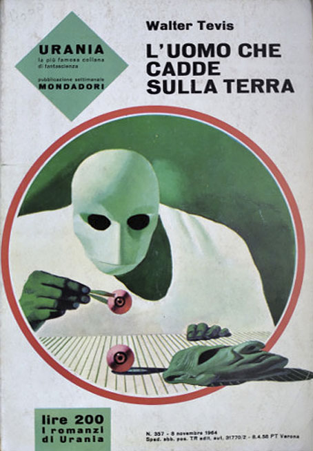
tmwfte07.jpg

Italy, 1964. Cover art by Karel Thole.

The few covers that pre-date the film are what you might call the innocent ones, free of David Bowie’s face or Bowie-like figures. Here the prolific Karel Thole also favours Newton’s diguises over any other imagery.
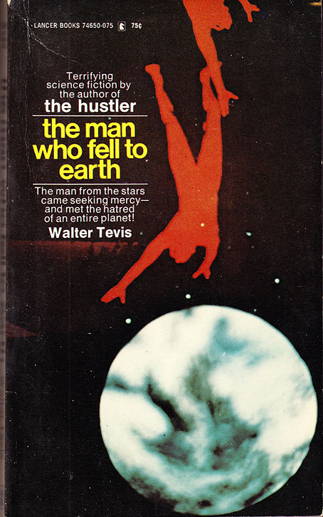
tmwfte03.jpg

USA, 1970. Cover art by Howard Winters.

Continue reading “Icarus Descending”

Roeg abroad

roeg01.jpg

Japan, 1998.

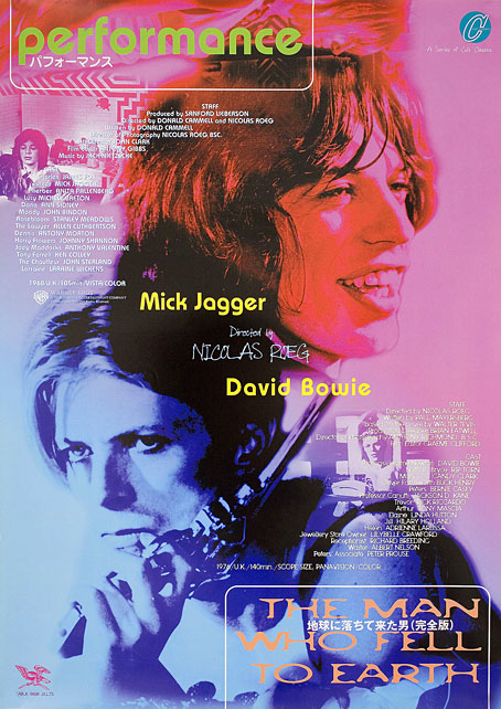
I’m currently in the middle of a Nicolas Roeg rewatch season after acquiring a blu-ray of the recently reissued Castaway, Roeg’s 1986 adaptation of Lucy Irvine’s memoir (which shouldn’t be confused with 2000’s Cast Away). In the early 1980s when I was becoming more acquainted with his films I went through a phase of buying film posters, and managed to pick up copies of the UK quad sheets for Don’t Look Now and Bad Timing. I would have preferred the one for The Man Who Fell to Earth but Bowie-obsessives have made that particular item very collectible, and it never crossed my path. Foreign posters for Roeg films also tend to be uncommon since his films have never been really popular, and some, like Eureka, were plagued with distribution difficulties which made them difficult to see at all. Eureka is missing from this small collection of foreign posters due to a lack of suitable candidates.


Performance

roeg02.jpg

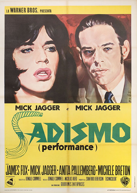
Italy, 1971.

One thing you notice when you look for details of foreign releases is how often a film title is changed to suit local tastes. The Italians changing Performance to Sadismo is one of the more ridiculous examples, picking out a minor detail—Joey’s whipping of Chas at the beginning of the film—while ignoring the rest of the film’s kaleidoscope of images and references.


Walkabout

roeg03.jpg

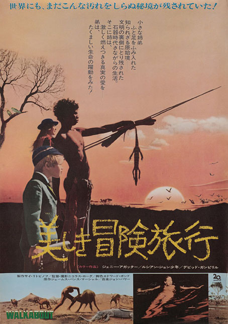
Japan, 1971.

Similar changes occur in poster art, when the movement to another country prompts the local designers to over-emphasise a film’s sensational elements. In the UK and US the posters for Walkabout stressed the story as being one about survival in a wilderness, and the differences between the Indigenous boy and the English girl and her brother. Elsewhere the posters were more concerned with Jenny Agutter’s skinny-dipping scene while telling you little else about the rest of the film.


Don’t Look Now

roeg04.jpg

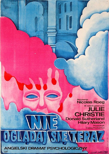
Poland, 1973. Art by Maria Mucha Ihnatowicz.

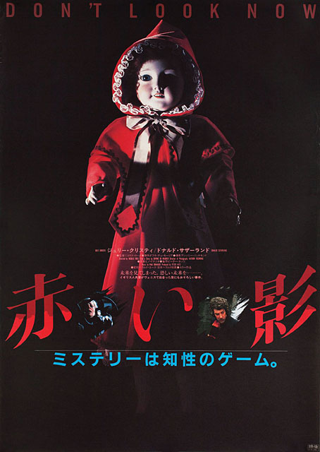
I was hoping there might be more Polish posters for Roeg’s films but this was the only one which turned up. Japanese posters can at times be as elusive as the celebrated Polish designs, with an approach to design that’s very different to the Western standard. The Japanese poster for a reissue of Don’t Look Now is one of the best I’ve seen for that particular film, condensing into a single image the two threads of the story—the dead girl and the murder mystery—while emphasising the film’s persistent use of the colour red.

roeg05.jpg

Japan, 1983.

Continue reading “Roeg abroad”

Weekend links 828

williams.jpg

Visitation (1976) by Gilbert Williams.

• “It’s the perfect storm of a UFO case.” Daniel Lavelle explores the Rendlesham Forest mystery of 1980, Britain’s own answer to the Roswell Incident. The case has more substantial documentation than most close encounters but it also has its share of conflicting reports, claims and interpretations. The truth is out there but it’s not evenly distributed.

• The Science of Spooky Sounds: Kristen French talks to researcher Rodney Schmaltz about his theory that infrasound may be responsible for the haunted feelings people experience in some buildings.

• New music: Six Organs of Admittance featuring The Six Organs Olive Choir by Six Organs of Admittance; Blue Loops by Kevin Richard Martin; Passage of Time: The Music of Michael F. Hunt by Michael F. Hunt.

• At The Daily Heller: Steven Heller on The Complete Zap Comix, an expensive reprint of the pioneering underground title coming soon from Fantagraphics.

• Coming soon from Strange Attractor: A Walking Flame: Selected Magical Writings of Ithell Colquhoun edited by Amy Hale.

• At Colossal: Linocuts by Eduardo Robledo celebrate Mexican heritage and community.

• Object of the week at the BFI is Vic Fair’s poster for The Man Who Fell to Earth.

• The Strange World of…Hildur Guðnadóttir.

• Wide-band WebSDR in Enschede, NL

• Lights At Rendlesham (2012) by Time Columns | Rendlesham Forest (1980) (2019) by Grey Frequency | Lights Over Woodbridge (2021) by A Farewell To Hexes