La Bibliothèque de Babel

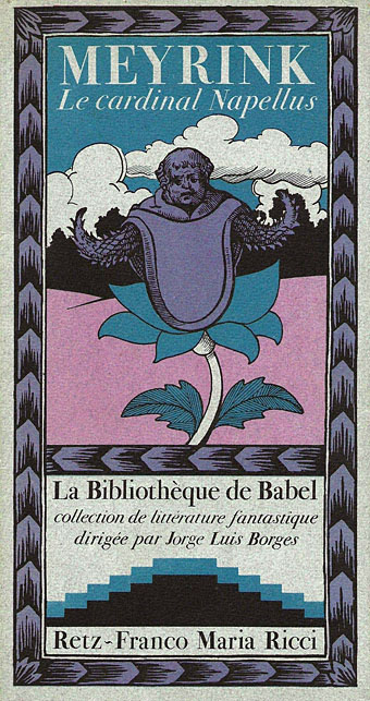
babel01.jpg

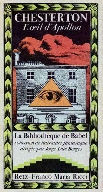
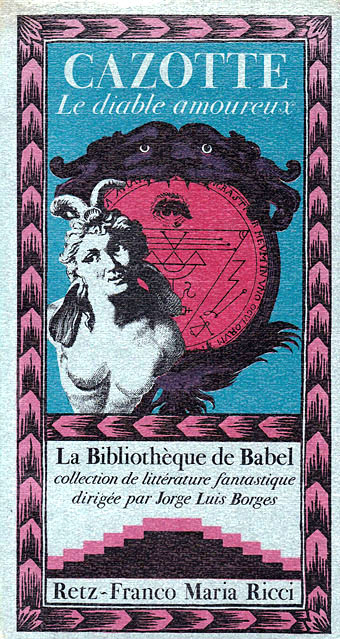
It was perhaps inevitable that this small collection of works of fantastic fiction was named after its director’s most famous creation, the Library of Babel. Jorge Luis Borges chose the titles, and also wrote introductions for each of the books. The series was published in France by Retz–Ricci, with 4000 numbered copies of each title appearing from 1977 to 1981.

Many of the selections will be familiar to Borges aficionados, others seem obscure as a result of the vagaries of translation: Jack London’s Les Morts Concentriques is The Minions of Midas, a story that Borges had earlier translated into Spanish as Las Muertas Concéntricas (The Concentric Deaths). The story of linked deaths apparently influenced the writing of Death and the Compass. I’ve never seen Borges discuss Arthur Machen at length so the inclusion of Machen in the selection is a welcome sight. In addition to The Shining Pyramid, the Machen volume also contained The Novel of the Black Seal and The Novel of the White Powder, two of the oft-anthologised sections of The Three Imposters.

The only detail that’s defeated me  is the identity of the illustrator of the series. If anyone knows who was responsible then please leave a comment.

Update: the covers are credited to publisher/designer Franco Maria Ricci and Marcella Boneschi. Thanks to herr doktor bimler and Al Diniz.
babel02.jpg

babel03.jpg

Continue reading “La Bibliothèque de Babel”

Art that transcends

ca56.jpg

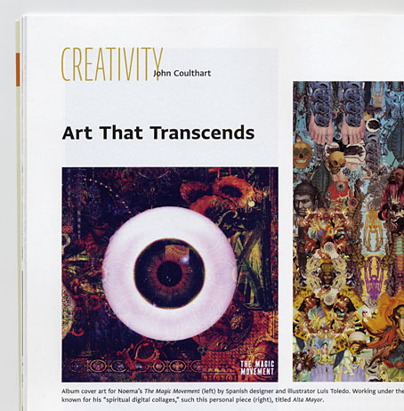
Late last year, US design magazine Communication Arts asked me to write a piece about psychedelic art, past and present. The resulting feature has been out for a couple of weeks in the May/June issue (no. 56) but I hadn’t seen it in print until a copy turned up today. Attempting to wrangle discussion of a very wide-ranging and amorphous field into 1500 words isn’t an easy task but I managed to sketch a history of psychedelic art beginning with Aldous Huxley and Humphrey Osmond’s mescaline experiments in the 1950s. Art that can be considered psychedelic goes back into prehistory but Huxley’s The Doors of Perception (1954) is the first book that considered art in general from a psychedelic viewpoint. That book, and the later Heaven and Hell (1956), are still valuable for their aesthetic meditations however much Huxley’s optimism may have been tainted by the ferment of the 1960s.

earth.jpg

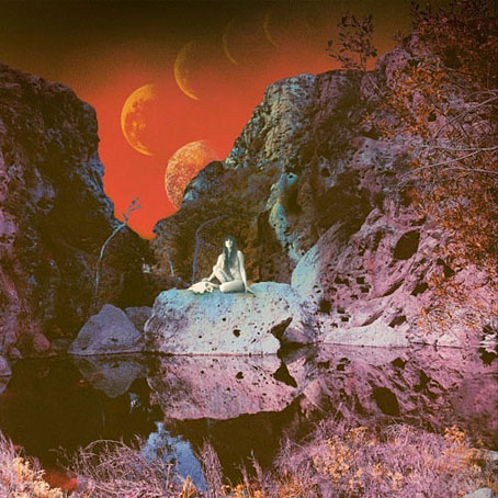
Primitive And Deadly (2014) by Earth. Art by Samantha Muljat.

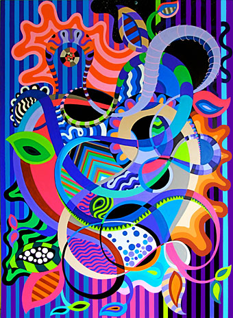
The psychedelic art of the 60s isn’t exactly overlooked so I paid more attention to tracing the influence of the psychedelic style, and also mentioning painters such as Ernst Fuchs, Alex Grey, Martina Hoffmann and Mati Klarwein. Among the more recent artists, I was pleased that Samantha Muljat‘s album cover for Earth was featured. I’ve been listening to this album a great deal over the past few months, and loved that cover as soon as I saw it. One of the other contemporary names, Brazilian artist Duda Lanna, works in a very different style: bold, vivid, and often abstract. There seems to be a lot of this kind of work around at the moment, so much so that I kept spotting new examples after the article had been delivered. It’s difficult to say whether this is a developing trend or simply a case of there being more of everything around these days. I’ll play safe and suggest it’s probably a bit of both although, as I say at the end of the article, if the movement to legalise drugs gains momentum we can expect to see a lot more psychedelic art.

lanna.jpg

Garden of Psychedelic Delights by Duda Lanna.

Owls and flowers

1: The pattern

pattern.jpg

A plate design by Christopher Dresser.


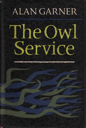
2: A novel by Alan Garner

garner.jpg

The Owl Service (1967). Cover design by Kenneth Farnhill.


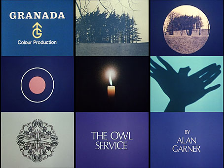
3: A Granada TV serial

granada.jpg

The Owl Service (1969). Eight episodes, written by Alan Garner, directed by Peter Plummer.


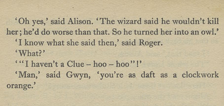
4: A diversion

clockwork.jpg

Chapter 8 of The Owl Service.

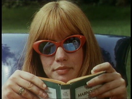
hills.jpg

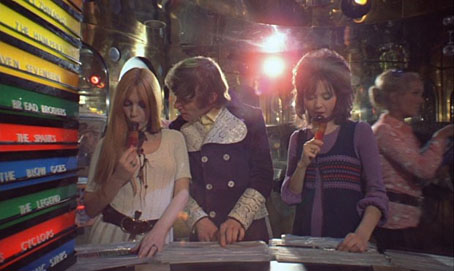
Gillian Hills as Alison in The Owl Service.

aco.jpg

Gillian Hills (left) as Sonietta in A Clockwork Orange (1971).


5: A single by Pram

pram.jpg

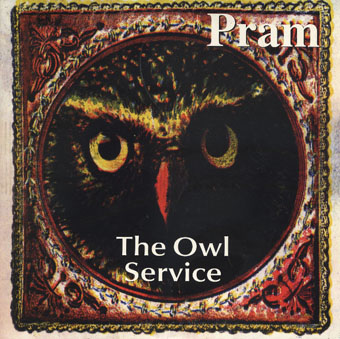
The Owl Service (2000) by Pram. Cover art by Mary Jo Bole.


6: Ghost Box

belbury.jpg

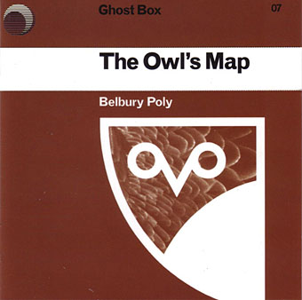
The Owl’s Map (2006) by Belbury Poly. Design by Julian House.

Track 1: Owls And Flowers

advisory.jpg

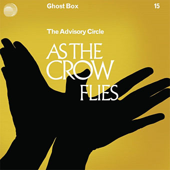
As The Crow Flies (2011) by The Advisory Circle. Design by Julian House.

Track 11: Learning Owl Reappears


7: A group

owlservice.jpg

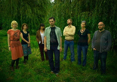
The Owl Service.


8: A Folio Society edition

hopes.jpg

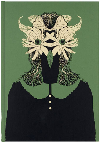
The Owl Service (2013) by Alan Garner, illustrated by Darren Hopes.


9: Twelve audiological pathways

ayitc.jpg

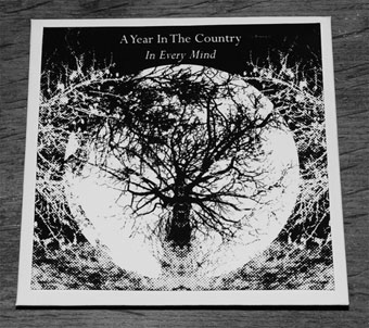
In Every Mind: Transmission Resonances, Volume 1 (2015) by A Year In The Country.

Transmission Resonances: Volume 1 takes as its wellhead the continuing reverberations of the 1969 cathode ray version of Alan Garner’s The Owl Service.

It pushes open the attic door from whence the scratching descends and travels to places that surprised, intrigued and even delighted our good selves when it was being shaped on our own particular audiological potters wheels.

Previously on { feuilleton }
• To Kill a King by Alan Garner
• Red Shift by Alan Garner

Weekend links 258

stalenhag.jpg

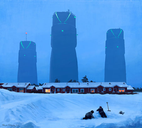
Simon Stålenhag‘s SF artwork will be published in book form if funding is secured. In the future everything will be crowdfunded for 15 minutes.

• Mixes of the week: FACT Mix 494 is a fantastic dub selection by Colleen; Secret Thirteen Mix 151 is by Sally Dige; Stephen Mallinder‘s return to the doom-laden Industrial music of the 1980s suits the post-election mood. Mallinder’s mix is helping promote Industrial Soundtrack for the Urban Decay, a documentary by Amélie Ravalec.

• “…it felt more like real life to me than the average hour-long television show.” Sopranos creator David Chase on what he enjoyed about Twin Peaks. Related: Twin Peaks Tarot cards.

• Sound & Song in the Natural World edited by Tobias Fischer & Lara Cory. A book about animal music and communication with a 60-minute CD of field recordings.

• “The psychedelic renaissance has already begun, and for the most part I welcome it,” says Erik Davis in a wide-ranging interview with Sean Matharoo.

• It rumbles on: Brown Pundits on “An Embarrassment at PEN”. A useful collection of stories, reactions and polemic from the past two weeks.

• Fanny and Stella: The Shocking True Story, a play by Glenn Chandler about Victorian London’s scandalous pair of cross-dressing men.

• Artist Charles Ray causes a problem for the Whitney Museum of American Art with his sculpture of a naked Jim and Huckleberry Finn.

• “Don’t believe Orson Welles,” says his biographer Simon Callow, “especially when he calls himself a failure.”

• A return to Adolph Sutro’s Cliff House features several photos I’d not seen before.

• More Tarot: Arcana: The Tarot Poetry Anthology is looking for funding.

• At Dangerous Minds: The ancient magic of the record label.

• Foreign Movie Posters

• Tarot (Ace of Wands theme, 1970) by Andy Bown | Distant Dreams (Part Two) (1980) by Throbbing Gristle | The Devil In Me (1982) by Stephen Mallinder

The case of the fin de siècle fleuron

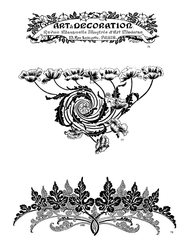
artnouveau.jpg

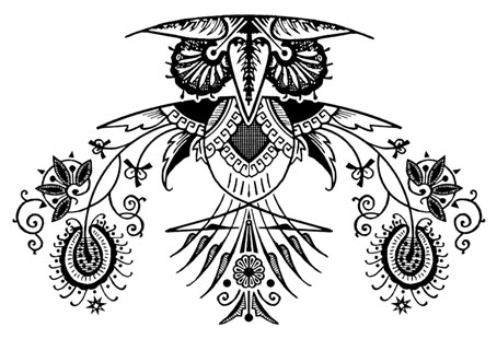
I said yesterday that poppies are a common feature of the fin de siècle magazines for the convenient way they combine long-stemmed flowers—ideal for all those Art Nouveau flourishes—with narcotic connotations that signal Decadence. The spiralling fleuron above is one example that readers of Savoy books may recognise, an occasional company logo which has been in use since the mid-1980s. David Britton chose the design from one of the Dover Pictorial Archive books, Carol Belanger Grafton’s Treasury of Art Nouveau Design and Ornament, and I later made a digital version from this page scan.

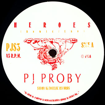
heroes.jpg

One of the earliest Savoy uses, a label design for Heroes (1986) by PJ Proby.

Having spent a great deal of time in recent years trawling through Art Nouveau magazines I was sure I was going to run into the original printing of the fleuron eventually. Some of the page decorations in Jugend are very similar but it wasn’t there or in Pan, Deutsche Kunst und Dekoration or The Studio. I don’t have a copy of the Grafton book, and Dave says his copy is lost, so I’ve no idea whether there’s a credit for the source of the designs; not all Dover books credit their source material in any detail. Earlier this week I decided to look in Art et Décoration, a magazine that was the French equivalent of The Studio, since the header at the top of the scanned page implied that the other designs might be from the same magazine. Aside from a couple of copies at the Internet Archive this means looking through the poor-quality scans at Gallica; by a fluke—because they don’t seem to have a complete run of the early issues—the January 1898 edition contained the page below showing the Savoy fleuron, an endpiece for an article devoted to another French art magazine, L’Image.

Continue reading “The case of the fin de siècle fleuron”