The Singular & Extraordinary Tale of Mirror & Goliath

mirror.jpg

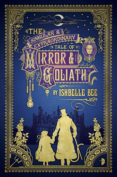
In yesterday’s post I mentioned having recently finished a cover design featuring silhouettes, not expecting the design in question to be revealed on the Barnes & Noble SF & Fantasy blog a few hours later. So here it is. The Singular & Extraordinary Tale of Mirror & Goliath is the first of two novels by Ishbelle Bee from publisher Angry Robot. Rather than attempt a précis it’s easier to swipe one from the B&N post:

1888. A little girl called Mirror and her extraordinary shape-shifting guardian Goliath Honeyflower are washed up on the shores of Victorian England. Something has been wrong with Mirror since the day her grandfather locked her inside a mysterious clock that was painted all over with ladybirds. Mirror does not know what she is, but she knows she is no longer human.

John Loveheart, meanwhile, was not born wicked. But after the sinister death of his parents, he was taken by Mr Fingers, the demon lord of the underworld. Some say he is mad. John would be inclined to agree.

Now Mr Fingers is determined to find the little girl called Mirror, whose flesh he intends to eat, and whose soul is the key to his eternal reign. And John Loveheart has been called by his otherworldly father to help him track Mirror down…

An extraordinary dark fairytale for adults, for fans of Catherynne M. Valente and Neil Gaiman.

Having spent the past few years scrutinising Victorian graphic design this was a very enjoyable assignment that didn’t feel like work at all. The title design took some time to put together, the challenge with these things being to pour on the decoration while maintaining legibility. You also need to choose the typefaces carefully. The capitals in “Mirror” and “Goliath” were drawings based on period cover designs, while the author typeface isn’t a font but is letterforms scanned from a Symbolist art book from the 1970s. Revival fonts continue to proliferate but I’ve yet to see one in that exact style. The Singular & Extraordinary Tale of Mirror & Goliath is out in June with a sequel, The Contrary Tale of the Butterfly Girl, following in August.

Refn’s reds

refn00.jpg

When you work your way through a director’s filmography, particularities of mise-en-scène often become apparent. Nicolas Winding Refn’s next film—The Neon Demon—has a title that promises more of the same. I’m looking forward to it.

Pusher (1996)

refn01.jpg

Kim Bodnia (above) and Laura Drasbæk (below).

refn02.jpg

Bleeder (1999)

refn03.jpg

Zlatko Buric (above) and Kim Bodnia (below).

refn05.jpg

refn04.jpg

Continue reading “Refn’s reds”

Weekend links 250

gebbie.jpg

Untitled artwork by Melinda Gebbie.

• “Johnny Rocket is like a Chaucerian epic retold by David Peace with music by Bruce Haack and The Focus Group for a music hall located in Hell.” John Doran talks to Maxine Peake and the Eccentronic Research Council about their “psychedelic ouija pop”.

Allison Meier looks at a new exhibition of Victor Moscoso’s psychedelic drawings. Related: Julia Bigham writing in Eye magazine in 2001 about London’s psychedelic poster scene.

• “Oh to eye the very enfilade through which that orchidaceous entity would make his stately progress…” Strange Flowers on the eccentric Count Stenbock.

Melinda Gebbie: What Is The Female Gaze? The artist is in conversation next month with Mark Pilkington and Tai Shani at the Horse Hospital, London.

Pamela Colman Smith: She Believes in Fairies. The Tarot artist and illustrator in a rare interview from 1912.

• Minimalist posters: “a lack of nuance disguised as insight,” says John Brownlee.

• Saturday night in the City of the Dead: Richard Metzger on the John Foxx-era Ultravox.

The Will Gregory Moog Ensemble plays the Brandenberg Concerto No. 3.

• “In a weird way”: a brief history of a phrase by Ivan Kreilkamp.

Die Hexe: An installation by Alex Da Corte.

• RIP Daevid Allen

Istaqsinaayok

You Can’t Kill Me (1971) by Gong | Master Builder (1974) by Gong | When (1982) by Daevid Allen

The Tidal Path by Watch Repair

tidal1.jpg

When it comes to my work for the music world, this week has ranged from one pole to the other. On Tuesday Enki , the album whose cover I designed last year for Melechesh, was released in the US on multiple formats including coloured vinyl and (if you want the expensive option) a CD with bundled T-shirt; on Wednesday local musicians Watch Repair released The Tidal Path, a hand-crafted CD-R limited to 100 copies for which I designed the Risographed insert.

tidal2.jpg

Musically you can’t compare these releases, and it would be unwise to do so, they’re both operating in very different areas. Watch Repair (who otherwise prefer to remain anonymous) have for the past two years been producing a distinct form of improvised music that combines acoustic instruments, ambient recordings and treated/processed sounds. The predominant atmosphere on The Tidal Path is winter, frozen water and icy wastes, hence the choice of an old map of the northern polar regions for the insert artwork. The map also features a few surreptitious references to related works by other artists but I’ll leave it to informed listeners to detect those. The Tidal Path is a release on Manchester’s Ono label which may be ordered from Piccadilly Records.

Previously on { feuilleton }
Watch Repair

Summerisle souvenirs

summerisle.jpg

Presenting the second in what is now a series of travel posters for the fictional regions of Old Weird Britain. In 2012 I created a poster for the village of Milbury from Children of the Stones, a design derived from the London Transport posters of the 1920s promoting destinations outside the city. At the time I had a vague idea of maybe doing more in this style but it’s taken this long to produce something new.

Summerisle is an obvious choice but not necessarily an easy one. The popularity of The Wicker Man means that a small cottage industry of Summerisle souvenirs already exists, most of the products being concerned with the events of May Day 1973. A travel poster would represent a location rather than a single date so that wasn’t a problem, but I also wanted to avoid any Wicker Man silhouettes. The appearance of the Wicker Man at the end of the film is a secret being revealed, it’s not something the islanders would broadcast to the world, hence the concentration here on the village, the manor house and the standing stones. The sole nod to the island’s customs is the group of people lurking behind a wall. Another temptation would be to use the Nuada sun as seen in the film but others have already made use of that so I took a sun face from an old Tarot card.

summerisle2.jpg

As with the Milbury poster, this is now a design available on a range of CafePress products. These are mostly paper goods for the time being; setting up new shops at CafePress becomes increasingly time-consuming as the company adds more yet clothing, phone cases and household goods. Among the new products, however, there’s a stainless steel flask which I wouldn’t usually add but which is perfect for a design promoting a Scottish island. I think I’ll have to order one for myself.

Previously on { feuilleton }
Wicker mania
Milbury souvenirs
Children of the Stones