Walter Crane’s Picture Books

crane01.jpg

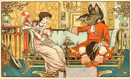
Beauty and the Beast.

British artist and designer Walter Crane never illustrated a Perrault collection but he did illustrate individual editions of Perrault’s more well-known tales. These illustrations are from collections published in 1911 of the small books of nursery rhymes, alphabets and stories for children that Crane produced in the 1870s. The clear-line drawings are unusual for their avoidance of the decor one usually sees with these stories; Crane admired the work of the Pre-Raphaelites but the settings are a lot less medieval than some of his other books, the architecture and costumes owing more to the Empire style.
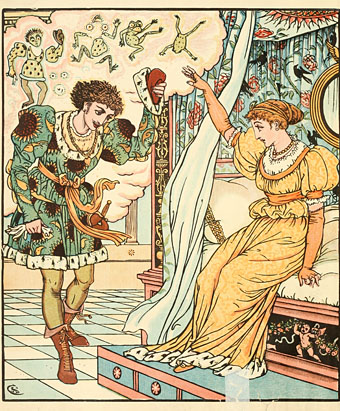
crane02.jpg

The Frog Prince.

Crane wrote several design books, including a very good one about the history of book design. His drawings for children may be simple but they’re all very precise and often contain significant details; many of the larger compositions draw the eye into the background with views through doors or windows, or into remote vistas. Crane also adapted each story into verse, and even manages to represent an act of metamorphosis in a single picture for the moment when the Frog Prince turns human. Elsewhere some of the pages are almost comic-like in their arrangement of multiple panels and text.

The samples here are taken from three different collections:

Beauty and the Beast / The Frog Prince / The Hind in the Wood
Cinderella / Puss in Boots / Valentine and Orson
The Sleeping Beauty / The Baby’s Own Alphabet / Bluebeard

crane03.jpg

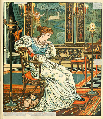
The Hind in the Wood.

Continue reading “Walter Crane’s Picture Books”

Falk-Ulrich Rogner album covers

duul00.jpg

All The Years Round (7-inch single, 1972).

I mentioned earlier that Falk-Ulrich Rogner’s cover art for Amon Düül II was worthy of a post so here you are. Amon Düül II were slightly ahead of the pack in the German music scene of the 1970s, starting earlier and (arguably) finishing their prime period earlier. They were also closer in musical style and group ethos to the psychedelic/early prog groups in Britain and America, especially Hawkwind with whom they shared a record label and a bass player. Other German groups were often psychedelic to some degree but Amon Düül II went all-out for a German take on psych rock, with extended guitar-heavy jams played against oil-on-water projections.

Falk-Ulrich Rogner was one of the longer lasting members of the group’s shifting personnel, playing organ and electronics, writing lyrics and creating artwork that’s a perfect match for what I always think of as Amon Düül II’s Gothic Surrealism: a blend of lyrics and themes running through songs titled like Max Ernst paintings: Flesh-Coloured Anti-Aircraft Alarm, Archangel’s Thunderbird, Stumbling Over Melted Moonlight, Green Bubble Raincoated Man. The cover art is generally a collage of photographs, old paintings and other graphics, a familiar technique for psychedelic album covers. What gives Rogner’s work an edge is the way he blends multiple collages together by either photographic exposure or the photographing of projected transparencies. This has the effect of softening hard edges and transitions, and makes the resulting images all the more hallucinatory and dream-like. Effects like this are easy to achieve today with Photoshop but in the early 1970s they required a considerable effort.

duul01.jpg

Phallus Dei (1969).

At first glance the cover of the gloriously titled debut album looks like a painting but it’s a photograph of a tree silhouette juxtaposed against some vague collage business. This doesn’t really communicate the lysergic intensity of the music within which may explain why the cover was changed to something more typically psychedelic for its UK release.

duul02.jpg

The back cover inaugurates a pattern of placing the band on the back of the album, a reversal of the usual state of affairs even today.

duul03.jpg

The first CD release of Phallus Dei on the Mantra label featured what may be another Rogner photomontage, one that I’ve not seen anywhere else.

Continue reading “Falk-Ulrich Rogner album covers”

Weekend links 248

baylay.jpg

The Dreamers (2013) by Kate Baylay, from Seven Gothic Tales by Isak Dinesen.

• RIP composer and musique-concrète pioneer Tod Dockstader. “I didn’t have the money for electronic sounds…I had to have things like bottles, or anything that would make a noise. It didn’t matter what it was; if it sounded interesting, or I could make it interesting, I’d go for it.” Geeta Dayal talked to Dockstader for Wired in 2012. Dockstader’s film credits included Fellini’s Satyricon and Tom and Jerry cartoons. He also wrote the story for one of the latter, Mouse into Space, in 1962. Ubuweb has some early Dockstader recordings.

• “…anyone who has ever sat in a cafe, or in the bath, with a paperback owes a debt to Aldus and the small, cleanly designed editions of the secular classics he called libelli portatiles, or portable little books.” Jennifer Schuessler on Aldus Manutius, and the roots of the paperback.

• “At Chernobyl, we made ‘the world’s first radioactive nature preserve.’ We made black rain. We made the Red Forest, which was green when the day began, and is dead.” Mary Margaret Alvarado reviews The Long Shadow Of Chernobyl by Gerd Ludwig.

Prison was often the fate of those caught circulating samizdat in the Soviet Union—not only the “high” samizdat such as Solzhenitsyn, but the crude and lowly joke books as well. The official rationale for the prohibition was in context no less reasonable than the rationale given more recently for condemning Charlie Hebdo or R. Crumb. There is always a perception that the very serious project of perfecting society is being undermined. But society will not be perfected, and it is a last resort of desperate perfecters to go after the subtle-minded satirists who understand this.

Justin EH Smith on why satire matters

• “You have to do your research, and you’ll find treasures that you couldn’t even have begun to sit down and draw until you saw them in front of your eyes,” says Annie Atkins, graphic designer behind The Grand Budapest Hotel.

The Tales of Hoffmann: exclusive materials from the making of Powell and Pressburger’s masterpiece. The film will be released on Blu-ray by the BFI later this month.

• The illustrated score for Irma, the opera offshoot of Tom Phillips’ A Humument, is now available from Lulu.

Mellifluous Ichor From Sunless Regions, a free album of Hauntological electronica by The Wyrding Module.

Kraftwerk at the controls: what the group’s live instrument setup looks like today.

• Booze, Blood and Noise: The Violent Roots of Manchester Punk by Frank Owen.

• Mix of the week: 14th February 2015 by The Séance.

Vintage logo designs

Transmission (1979) by Joy Division | Radioactivity (William Orbit mix, 1991) by Kraftwerk | Bellstomp/Pond Dance (Mordant Music remix, 2012) by Tod Dockstader

Album de la décoration

decoration1.jpg

Plates from a selection of art nouveau-styled prints for the use of artists and craftsmen. There’s more in this incomplete Flickr set; a little searching turns up further examples but the Flickr ones are the highest quality. The Four Seasons were featured here several years ago in a post about illustrator Patten Wilson. The bat-obsessed Robert de Montesquiou would no doubt have approved of the unusual conjunction of a chauve-souris with the favourite fowl of the fin de siècle.

decoration2.jpg

decoration3.jpg

Previously on { feuilleton }
The Grammar of Ornament revisited
Dekorative Vorbilder
Combinaisons Ornementales
Charles J Strong’s Book of Designs
Styles of Ornament
The Grammar of Ornament by Owen Jones

The Kosmische Tarot

geitner-tarot-box.jpg

Revelation of the weekend has been the discovery that there are two sets of (for want of a better term) Krautrock Tarot cards. The first, Walter Wegmüller’s Zigeuner Tarot, is familiar for being included in the Tarot concept album released on the Kosmischen Kuriere label in 1973. The album was credited to Wegmüller but he only advised on the symbolism and acts as MC/narrator. Wegmüller’s cards are detailed and somewhat original, but their drawing is from the enthusiasm-over-technique school which goes against the grain of the rest of the album design and the accomplishment of the musicians.

mythos.jpg

Dreamlab (1975) by Mythos. Design by Peter Geitner.

As noted a few days ago, the designer of the Tarot album was Peter Geitner working under the direction of a pair of very hands-on label bosses, Rolf-Ulrich Kaiser and Gille Lettmann. The story of Kaiser’s rise and fall has been recounted in some detail over the years (see here and here). Given the colourful saga, and the cast of notable musicians, writers and artists, I’m surprised to have seen no mention of the second Tarot set that Peter Geitner designed and illustrated in 1975 while the Kosmische Musik empire was imploding. One illustration (The Lovers) was even used as cover art for the Dreamlab album by Mythos.

geitner-tarot-back.jpg

Card back for the Sternenmädchen’s Wahrsagespiel.

Sternenmädchen’s Wahrsagespiel (Star Girl’s Fortune Telling Game) is a specialised set of the Major Arcana presented as a spin-off from Gille Lettmann’s Sternenmädchen persona as featured on the Gilles Zeitschiff album; the back of the 22 cards features the photo of Gille from the album cover. I’ve said that Geitner illustrated the cards but some of the drawings may have originated as sketches by Gille Lettmann; information is scant but I’ve seen mention of her having been a textile or fashion designer. What’s most striking to me about these designs is how psychedelic they all are, more so than any of the Kosmische Musik album covers even though they maintain the cosmic themes of the record label. Many of those involved with the Kosmische empire were taking LSD at the time so this isn’t very surprising but psychedelia of this intensity was an outmoded thing by the mid-70s. Also of interest is the renaming of the cards which push the attributions away from medieval tradition and into the cosmos. I’ve not been able to find examples of all 22 designs but a list of the cards follows, together with examples of variable quality. The set was printed by AGM Müller but has never been reissued so it now commands high prices. (Many thanks to Jeff for drawing my attention to these!)

Continue reading “The Kosmische Tarot”