Weekend links 258

stalenhag.jpg

Simon Stålenhag‘s SF artwork will be published in book form if funding is secured. In the future everything will be crowdfunded for 15 minutes.

• Mixes of the week: FACT Mix 494 is a fantastic dub selection by Colleen; Secret Thirteen Mix 151 is by Sally Dige; Stephen Mallinder‘s return to the doom-laden Industrial music of the 1980s suits the post-election mood. Mallinder’s mix is helping promote Industrial Soundtrack for the Urban Decay, a documentary by Amélie Ravalec.

• “…it felt more like real life to me than the average hour-long television show.” Sopranos creator David Chase on what he enjoyed about Twin Peaks. Related: Twin Peaks Tarot cards.

Sound & Song in the Natural World edited by Tobias Fischer & Lara Cory. A book about animal music and communication with a 60-minute CD of field recordings.

• “The psychedelic renaissance has already begun, and for the most part I welcome it,” says Erik Davis in a wide-ranging interview with Sean Matharoo.

• It rumbles on: Brown Pundits on “An Embarrassment at PEN”. A useful collection of stories, reactions and polemic from the past two weeks.

Fanny and Stella: The Shocking True Story, a play by Glenn Chandler about Victorian London’s scandalous pair of cross-dressing men.

• Artist Charles Ray causes a problem for the Whitney Museum of American Art with his sculpture of a naked Jim and Huckleberry Finn.

• “Don’t believe Orson Welles,” says his biographer Simon Callow, “especially when he calls himself a failure.”

• A return to Adolph Sutro’s Cliff House features several photos I’d not seen before.

• More Tarot: Arcana: The Tarot Poetry Anthology is looking for funding.

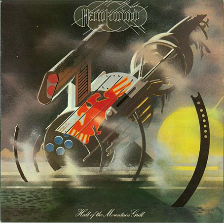
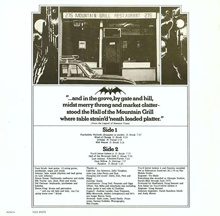
• At Dangerous Minds: The ancient magic of the record label.

Foreign Movie Posters

Tarot (Ace of Wands theme, 1970) by Andy Bown | Distant Dreams (Part Two) (1980) by Throbbing Gristle | The Devil In Me (1982) by Stephen Mallinder

The case of the fin de siècle fleuron

artnouveau.jpg

I said yesterday that poppies are a common feature of the fin de siècle magazines for the convenient way they combine long-stemmed flowers—ideal for all those Art Nouveau flourishes—with narcotic connotations that signal Decadence. The spiralling fleuron above is one example that readers of Savoy books may recognise, an occasional company logo which has been in use since the mid-1980s. David Britton chose the design from one of the Dover Pictorial Archive books, Carol Belanger Grafton’s Treasury of Art Nouveau Design and Ornament, and I later made a digital version from this page scan.

heroes.jpg

One of the earliest Savoy uses, a label design for Heroes (1986) by PJ Proby.

Having spent a great deal of time in recent years trawling through Art Nouveau magazines I was sure I was going to run into the original printing of the fleuron eventually. Some of the page decorations in Jugend are very similar but it wasn’t there or in Pan, Deutsche Kunst und Dekoration or The Studio. I don’t have a copy of the Grafton book, and Dave says his copy is lost, so I’ve no idea whether there’s a credit for the source of the designs; not all Dover books credit their source material in any detail. Earlier this week I decided to look in Art et Décoration, a magazine that was the French equivalent of The Studio, since the header at the top of the scanned page implied that the other designs might be from the same magazine. Aside from a couple of copies at the Internet Archive this means looking through the poor-quality scans at Gallica; by a fluke—because they don’t seem to have a complete run of the early issues—the January 1898 edition contained the page below showing the Savoy fleuron, an endpiece for an article devoted to another French art magazine, L’Image.

Continue reading “The case of the fin de siècle fleuron”

Cocorico graphics

graphics01.jpg

A final visit to Cocorico, the French humour magazine of the fin de siècle. Where graphics are concerned I’ve ignored the cartoons to concentrate on the Art Nouveau decoration which is plentiful in the early issues. The star here is Louis Popineau, an artist I only knew from the excessively florid page above which is reprinted sans poem in one of my design books. Popineau enjoyed foliage running riot in this manner but the magazine also features several of his excellent coloured prints. There’s a lot more of this type of work in the complete run of the magazine which may be found at the Internet Archive.

graphics02.jpg

A paean to the poppy by Jérome Doucet illustrated by Adolphe Cossard. Poppies were a very popular plant in the 1890s for obvious naroctic reasons. Cossard made them a feature of his cover for issue 32.

graphics03.jpg

Continue reading “Cocorico graphics”

Cocorico covers

cocorico01.jpg

Alphonse Mucha.

For a while now I’ve been waiting for several French journals of the fin de siècle to turn up online but humour magazine Cocorico has never been among them. I knew that Alphonse Mucha had contributed a handful of covers and some other graphics to Cocorico, notably the frontispiece (below) which ran in every issue. What I didn’t realise was that this title was effectively the French counterpart to Jugend magazine which had been running for two years when the first issue of Cocorico appeared in December 1898. Both magazines share the same mix of humorous articles, cartoons, serious art pieces and poetry, all connected by some very fine Art Nouveau graphics.

cocorico19.jpg

Alphonse Mucha.

Jugend has the edge when it comes to the graphics, some of which are very strange, but Cocorico looks much more like a humour magazine to contemporary eyes, with many cartoons that resemble those drawn today. Cocorico is also mostly free of the Jugend brand of satire which is often little more than nationalist rabble-rousing. Cocorico ran for 63 issues to 1902 by which time its format had changed and the florid graphics had been abandoned for a more sober layout. What follows is a selection of cover designs, many of which are Mucha’s work, and all of which follow the Jugend template of varying the art style and title design. There’s also one by František Kupka (or François as he was credited here) who also contributed interior illustrations in the later issues. There’ll be more about him tomorrow.

cocorico02.jpg

Alphonse Mucha.

Continue reading “Cocorico covers”

Aubrey Beardsley’s Keynotes

keynotes1.jpg

Promotional poster.

Keynotes was a series of 34 novels and short story collections published by John Lane from 1893. Aubrey Beardsley produced cover designs and embellishments for 22 of the titles in 1895 while he was working on The Yellow Book which John Lane was also publishing. Beardsley’s designs comprised a title frame with illustration or decoration which was blocked in gold on the cover and also used as a title page. For 15 of the titles he also created a series of key-shaped monograms for the authors, designs which were used on the spines and the backs of the books. Collections of Beardsley’s art often show one or two of these pieces but you seldom see them all, and even when the title frames are reproduced the type is often omitted.

keynotes4.jpg

Keynotes Series of Novels and Short Stories was a small book published in 1896 intended to gather all the Beardsley designs in one place and also promote the series in general. Two of the most celebrated works to receive the Beardsley treatment are those by Arthur Machen: The Great God Pan and The Inmost Light, and The Three Imposters. The decoration for the latter gives no indication of the horrors lurking inside that volume, while the faun on The Great God Pan is a world away from the amorphous nightmare in a story that caused considerable outrage at the time. According to Stanley Weintraub’s biography, the Keynotes series was very popular despite (or because of) the stir it caused, and helped keep Beardsley’s work visible when many of his other illustrations were out of circulation.

keynotes5.jpg

Continue reading “Aubrey Beardsley’s Keynotes”