Weekend links 122

jackson.jpg

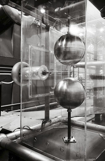
Transmitter Crowbar Discharge Unit, Bates Linear Accelerator. Photo by Daniel Jackson from his Dark Machines series.

The language we use for writing about art is oddly pornographic: We know it when we see it. No one would deny its distinctiveness. Yet efforts to define it inevitably produce squeamishness, as if describing the object too precisely might reveal one’s particular, perhaps peculiar, investments in it. Let us now break that unspoken rule and describe the linguistic features of IAE in some detail.

IAE has a distinctive lexicon: aporia, radically, space, proposition, biopolitical, tension, transversal, autonomy. An artist’s work inevitably interrogates, questions, encodes, transforms, subverts, imbricates, displaces—though often it doesn’t do these things so much as it serves to, functions to, or seems to (or might seem to) do these things. IAE rebukes English for its lack of nouns: Visual becomes visuality, global becomes globality, potential becomes potentiality, experience becomes…experiencability. […] Whatever the content, the aim is to sound to the art world like someone worth listening to, by adopting an approximation of its elite language.

International Art English by Alix Rule & David Levine

For years I’ve been calling it Artspeak: the frequently disingenuous, misleading or merely confused jargon that passes for descriptive writing in the art world. Alix Rule and David Levine apply the more neutral label of International Art English. In a lengthy essay at Triplecanopy they reveal the origins of IAE’s terminology and show why the stuff has spread like semantic kudzu.

• “What a bizarre focal point Anish Kapoor’s spiral callipers are: a Laocoönian observation platform strangled in red steel at a cost of many millions, while electricity pylons, with their austere elegance, once hymned by the poets of the 1930s, have been removed, at enormous cost, from the same site to be buried in the radioactive tilth of landfill dumps and industrial detritus.” Iain Sinclair reports on the Olympics.

• Alfred Kubin in…Nottingham! The Other Side, an exhibition of “haunting drawings of death, trauma and fantastical creatures inhabiting imaginary worlds”, running to the end of September.

• Francis Ford Coppola and Stewart Copeland discuss the making of Rumble Fish (1982). Over at The Rumpus there’s Coppola talking about his career and his latest film, TWIXT.

• Eraserhead: The Making of a Cult Classic. In the 1980s Kenneth George Godwin interviewed everyone responsible for making David Lynch’s film. Fascinating reading.

• Skin Job, the debut poetry collection by Evan J. Peterson, is twenty-one poems about monsters, horror, and science fiction. Evan made a trailer.

• Wood, brass and “the latest advances in nanotechnology”: Teka, an OLED lamp by Aldo Cibic and Tommaso Corà.

• Tonite Let’s All Make Love in London (1967): Peter Whitehead’s film of the capital at its swinging height.

• “Beam Us Up, Mr. Scott!”: Why Misquotations Catch On by Maria Konnikova.

• Hari Kunzru‘s ten favourite books about underground London.

• The Periodic Table of Heavy Metals.

• Alan Garner: A life in books.

• Fuck yeah, manuscripts!

• (HR) Giger Counter.

• This week was all about Vangelis in the 1970s: Creation du Monde (1973) | Spiral (1977) | Himalaya / Summit (1979).

Recovering Viriconium

viriconium01.jpg

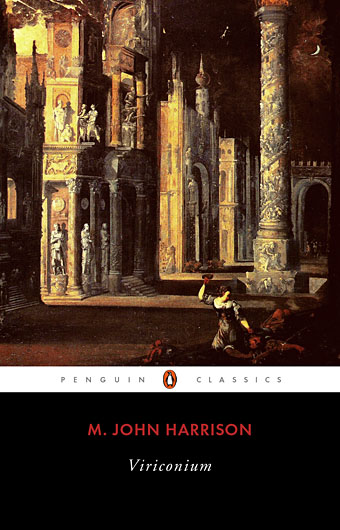
Detail from Assassination in the Night (c. 1600?) by Monsù Desiderio.

Yesterday’s post looked at some of the past cover designs for M. John Harrison’s Viriconium books. This post makes a few suggestions for how they might be presented in the future. Since these are mostly covers that I’d like to see they’re not necessarily ideal for the audience a publisher might be aiming at, cover design is usually a three-way process involving designer, author and publisher. In the end I’ve resisted the temptation to draft a range of original cover proposals—writing these posts has taken long enough—so almost everything here uses pre-existing art. If I was designing covers for all four Viriconium books, however, and the brief was to orient them towards a fantasy readership, the first thing I’d try would be a series of four imaginary Tarot designs. A peculiar pack of Tarot cards is a recurrent feature of the books so I’d create four emblematic cards that featured significant elements and characters from each. The characters wouldn’t be too well defined, they’d be stylised, maybe even silhouettes. Each card would feature a dominant presence: offhand these would be one of the geteit chemosit for The Pastel City, a locust for A Storm of Wings, the Barley Brothers for In Viriconium and a Mari Lwyd horse skull for Viriconium Nights. These presences together with the human characters would loom over a silhouette city at the foot of each card whose outlines would change appearance from book to book, evolving gradually from a fantastic outline of domes and towers to something that resembles a contemporary city. The colours and treatments would show a similar evolution from the bright and bold styles of the Pamela Colman Smith Tarot deck to something more photographic, collaged from elements closer to our world. Maybe.

That’s an idea for the four individual books. All the examples here use the convenience of the omnibus edition so a single image (or pair of images) has to somehow represent the entire series. To save time and effort I’ve taken the liberty of hijacking a couple of Penguin Books layouts. I hope Penguin doesn’t mind, and I should also apologise to Harrison’s UK publishers, Gollancz, for making one of their authors jump ship. The Viriconium omnibus is certainly good enough to be considered a modern classic. Penguin’s recent template for its Modern Classics series happens to be very easy to apply to a wide range of artwork.

viriconium04.jpg

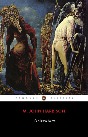
The Anti-Pope (1942) by Max Ernst.

Penguin has a long tradition of using pre-existing art on its covers, especially on those in its Penguin Classics series. You can almost make this into a parlour game: match your favourite novel with the best choice of painting. The tradition was extended to its science fiction titles in the early 1960s when the art of Max Ernst was featured several times along with the work of other Surrealists. Max Ernst is a favourite artist of mine so this is one I can’t resist. Many of Ernst’s decalcomania paintings of the 1940s would suit Viriconium but The Anti-Pope with its horse heads seems especially suitable.

Also on the Penguin sf covers was a picture by the mysterious “Monsù Desiderio” one of whose works can be seen at the top of this post. Desiderio was a 17th-century painter with a vague enough presence—works have been attributed to both François de Nomé and Didier Barra—and a line in gloomy architectural fantasias to make him an ideal Viriconium artist.

Continue reading “Recovering Viriconium”

Covering Viriconium

pennington-pastel.jpg

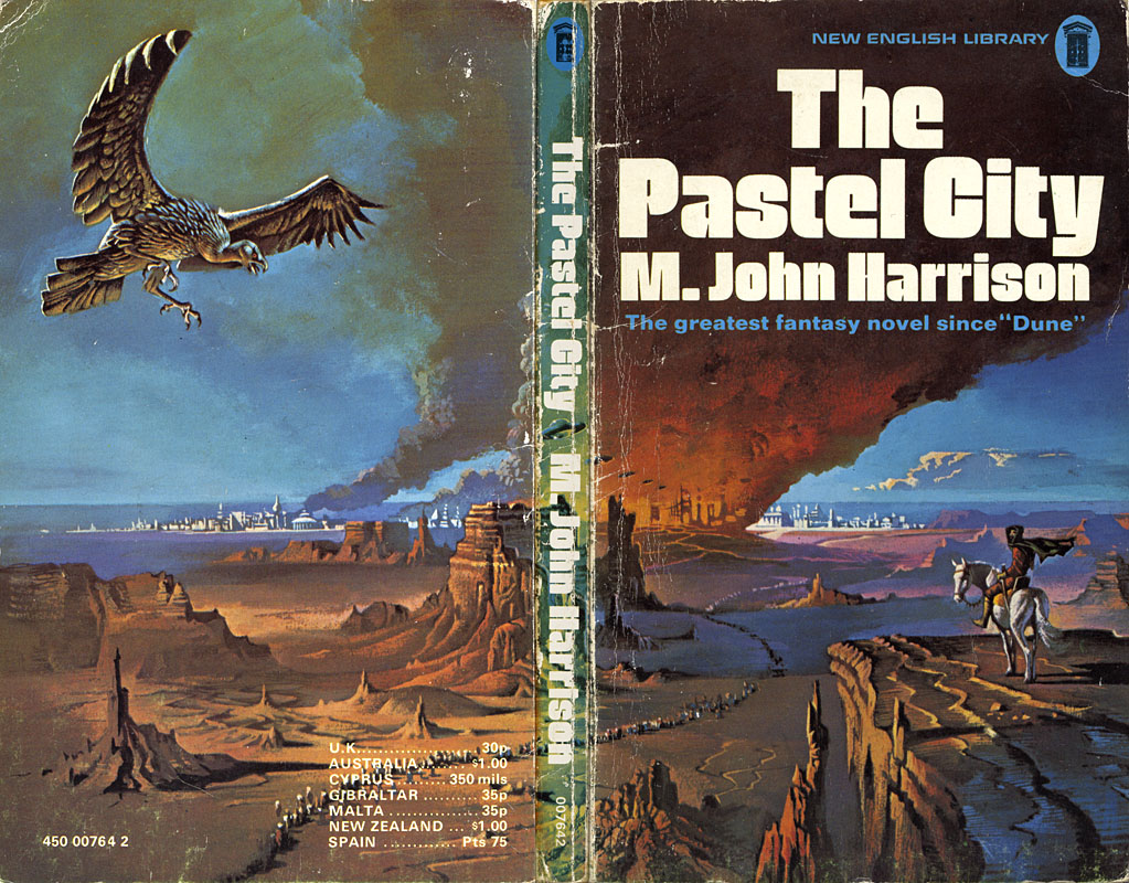
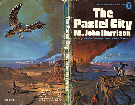
The Pastel City (New English Library, 1971). Illustration by Bruce Pennington.

There are writers’ writers, of course, and M. John Harrison is one of those. He moves elegantly, passionately, from genre to genre, his prose lucent and wise, his stories published as sf or as fantasy, as horror or as mainstream fiction. […] His prose is deceptively simple, each word considered and placed where it can sink deepest and do the most damage.

Neil Gaiman in the introduction to the Bantam/Spectra edition of Viriconium (2005)

This is a lengthy post of potentially minority interest for which I make no apologies. It’s often been a function of the writing here to think aloud while communicating an enthusiasm; as enthusiasms go this one runs deeper than usual. I love these books indecently. If they were people I’d want to sleep with them even though doing so might mean contracting some debilitating illness. When you’re employed as a book designer and illustrator it’s impossible to avoid taking a professional interest in the packaging of your favourite books. M. John Harrison‘s Viriconium books—three novels and a collection of short stories—present challenges that the illustrators and art directors of the past have invariably failed to meet. This post looks at prior cover designs while a subsequent post will suggest some solutions to the challenges. But first it’s necessary to say something about Viriconium itself.

In the distant future of the Earth, when the human race has flourished then lapsed into a state of terminal decay, only one city of note remains: Viriconium, the Pastel City, surrounded by the wastes and fens of a ruined world. Or so we’re told in the first book of a series which begins as outright fantasy and moves by an astonishing feat of authorial dexterity closer to our world and our time. (A shorthand description might describe a series that starts out reading like Jack Vance and ends up closer to Bruno Schulz.) It becomes apparent that Viriconium stands for all the cities that have ever been, and with its avenues, rues and strasses often seems to be a composite of them all. Aside from the unspecified future its fixture in time is indeterminate: one story may concern events which are in the distant past of another while the streets and quarters never remain anchored enough for any kind of map to be drawn. Areas of continuity rise like towers from a sea of vapour. Even the city’s name slips its mooring: the origin is Viroconium Cornoviorum, a Roman town in Shropshire, and Viroconium, a poem by Mary Webb. In the later books we’re told the city is also called Uriconium or Vriko but whether these variants lie in the past or future of Viriconium is unclear. The indeterminacy was deliberate, a riposte to what Harrison calls “fauxthenticity”, and the tendency of genre readers to reduce the subtleties of fiction to the schematics of role-playing games, spaceship diagrams and books with titles like The Science of Middle-Earth. It’s this indeterminacy and a refusal to offer neat resolutions (or that awful term “closure”) that no doubt explains why Harrison’s books often seem to attract more praise than actual readers.

The most remarkable aspect of the books presents the greatest problems in design terms. In the fourteen years that Harrison worked on his series he used its mutable qualities to pull the entire project to pieces without actually destroying it or turning the whole thing into a self-regarding postmodern game. The early books critique the lazy assumptions of the fantasy genre while the later books recast the earlier stories as myths or half-remembered dreams. The first two books may use the apparatus of the fantasy genre but that doesn’t mean the tired imagery of fantasy illustration necessarily suits their covers. The very last story, A Young Man’s Journey to Viriconium, is set in the north of England in our own time. Changing the name Viriconium to London throughout the text, which Harrison has done when the story has been published elsewhere, dissolves the remaining genre trappings. The process is akin to watching those Buddhist monks who construct elaborate mandalas of coloured sand only to sweep them away when the work is finished. All this makes the Viriconium books unique, it’s one of many reasons why I hold them in such high regard and it’s also why they frequently irritate those who want simpler fare. The problem of appealing to a reactionary readership may explain why many of the following covers have failed to honour the content of the books.
pastel-minor.jpg

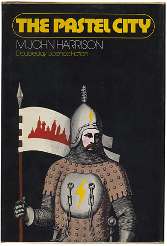
The Pastel City (Doubleday, 1972) Illustration by Wendell Minor.

Dustjacket summaries do none of the books any favours but for the unacquainted they help give a flavour of each volume. They also show how the presentation gradually shifts emphasis. Here’s the Doubleday edition:

An intriguing fantasy in which past and future blend uniquely on an Earth far different from any known to man.

There, in the Empire of Viriconium, a world of chivalry, of magic and strange powers, two Queens clash in bloody warfare for control of the Pastel City and all of its domains. The armies of the defender, Queen Methvet, are led by Lord tegeus-Cromis and the rest of a legendary band of knights, while their attackers are the vicious and cunning Northmen who serve the rival Queen Moidart.

More is involved than a struggle for a throne however, for in their lust for victory the forces of Queen Moidart have unleashed creatures from Earth’s dim past whose terrible potential they little realize until too late. And as Lord Cromis and the rest of his band seek to meet the challenge of these nightmare apparitions, their quest leads them on a perilous journey across many weird lands to a deadly climax in a buried city where a solution is revealed that is as old as time itself.

It’s apposite that a series about an indeterminate city begins with some confusion evident from the outset. The Pastel City in its first UK printing was described on the cover as a fantasy yet compared to Dune which is generally regarded as science fiction; the Doubleday edition is labelled science fiction yet the cover illustration shows a mailed and armoured warrior; the narrative is situated somewhere between the genres in what used to be called science fantasy. While the story concerns the distant future many of the props are the familiar material of heroic fantasy: horses, swords, feuding queens, an axe-wielding dwarf. What technology remains is either defunct or barely functioning. The ruin and decay of Harrison’s world is part of the pleasure, as is the vacillating and ambivalent nature of the characters, a quality which increases as the series develops. None of the publishers dare to reflect this ambivalence in the cover art. Unaware readers would be led to believe from subsequent editions that these books contain the determined and super-efficient heroes they’d find in other books. Compared to what follows the first two covers aren’t so bad; Bruce Pennington gives us one of his flying saucer apocalypses while Wendell Minor’s avoidance of a genre scene is an approach that might have been deployed a lot more often later on.

Continue reading “Covering Viriconium”

The Lumière Brothers at the Exposition Universelle

paris1900-1.jpg

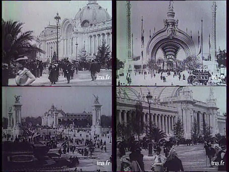
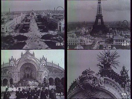
The films shot by the Edison company at the Paris Exposition Universelle of 1900 were featured here a couple of years ago. These screen grabs are from better quality footage made by Edison’s French rivals, Auguste and Louis Lumière, who had the advantage over the Americans in also having their films screened as one of the exposition attractions. The footage is nine minutes from Lumière, a French documentary compiled in 1966 by Marc Allégret, which is hosted here. The clip is still rough but not at all bad compared to the poor quality of online copies of the Edison footage, and it’s mostly projected at a speed so people don’t rush around like Keystone Cops. (On the downside, the audio track has the French speaking clock droning away in the left channel.) Great shots of the pavilions along the Seine, and the escalator. Whatever the quality, these views still strike me as miraculous for the brief impression they give of the exposition as a living event. Oscar Wilde enjoyed his last summer with these teeming crowds. He may be there somewhere among the top hats and parasols.

paris1900-2.jpg

Previously on { feuilleton }
• Le Grand Globe Céleste, 1900
• Tony Grubhofer’s Exposition Universelle sketches
• The Cambodian Pavilion, Paris, 1900
• Le Manoir a l’Envers
• Suchard at the Exposition Universelle
• Esquisses Décoratives by René Binet
• Le Palais de l’Optique, 1900
• Exposition Universelle films
• Exposition jewellery
• Exposition Universelle catalogue
• Exposition Universelle publications
• Exposition cornucopia
• Return to the Exposition Universelle
• The Palais Lumineux
• Louis Bonnier’s exposition dreams
• Exposition Universelle, 1900

Odilon Redon and Magazine

magazine1.jpg

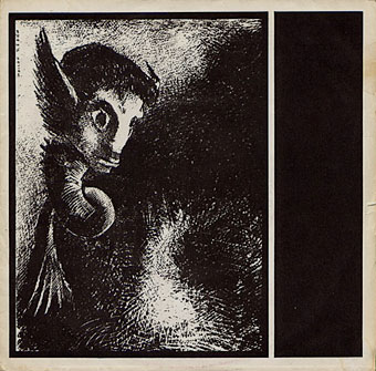
Shot By Both Sides (1978). Design by Malcolm Garrett. Art: La Chimere regarda avec effroi toutes choses (1886) by Odilon Redon.

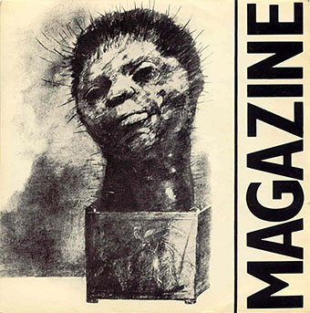
The first two albums by British post-punk band Magazine have been soundtracking the inner landscape here for the past couple of weeks. Looking at some of their cover art on Discogs reminded me that two of their early singles came dressed with drawings by Symbolist artist Odilon Redon (1840–1916) so these covers may well have been the first place I saw any of Redon’s work at all. This was an unusual choice at the time which makes it typical of a group that stood slightly apart from much of the music around them, often being regarded as too proficient and too clever. (Pop music and politics are the only places where incompetence and stupidity are virtues.)

magazine2.jpg

Give Me Everything (1978). Design by Malcolm Garrett? Art:The Cactus Man (1881) by Odilon Redon.

Magazine’s golden era runs from 1978 to 1980 and for me their music and that of fellow Mancunians Joy Division remains inextricably connected to memories of Manchester in the late 1970s, a place I visited sporadically before moving here in 1982. The city then was a lot more grimy and run-down, filled with the disused mills and warehouses of the collapsed cotton industry, blighted by the failed architecture of the 1960s and polluted by endless convoys of orange buses. This photo from 1978 fixes the mephitic ambience, as does some of M. John Harrison‘s fiction from the period, notably his short story Egnaro. Unlike Joy Divison, Magazine haven’t been burdened with an increasingly inflated reputation which makes revisiting their works all the more enjoyable. They pull you back to those gloomy times then take you off elsewhere, into the cajoling and neurotic imagination of that Nosferatu-in-a-leather-jacket, Howard Devoto.

magazine3.jpg

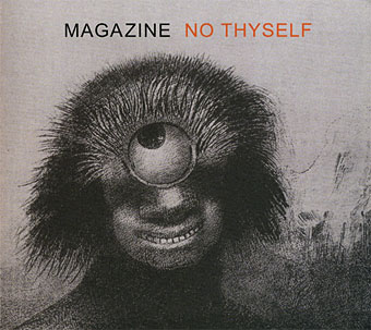
No Thyself (2009). Designer unknown. Art: Le polype difforme flottait sur les rivages, sorte de cyclope souriant et hideux, Les Origines (1883) by Odilon Redon.

The band reformed in 2009 although I’m not convinced the current incarnation is for me, I’m generally sceptical of such moves and the absence of ace guitarist John McGeogh (who died in 2004) and bassist Barry Adamson means it won’t be the same. No Thyself did refer back to their origins, however, literally so in the title of the Odilon Redon picture on the cover, while the Chimera from the first single turned up on a recent tour poster. Howard Devoto talked late last year to The Quietus about the recent album.

Elsewhere on { feuilleton }
• The album covers archive

Previously on { feuilleton }
• Odilon Redon lithographs
• The eyes of Odilon Redon