“This City” (I thought) “is so horrible that its mere existence and perdurance, though in the midst of a secret desert, contaminates the past and the future and in some way even jeopardizes the stars.”
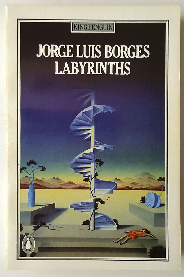
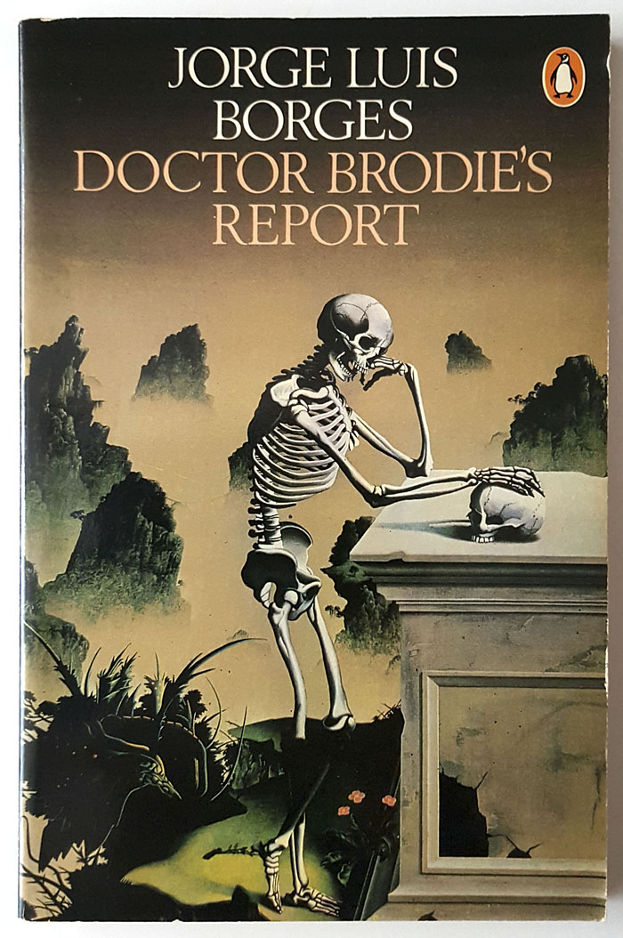
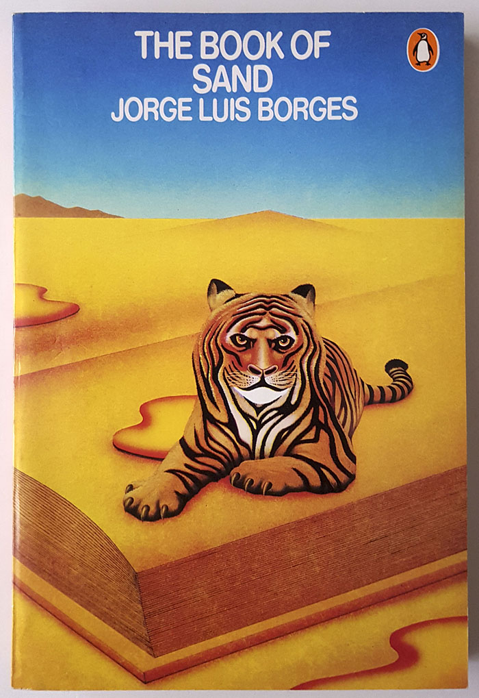
This is the kind of thing I love to find: a BBC adaptation of a story by Jorge Luis Borges which I didn’t even know existed until this week. The Immortal was written in 1947 and published in the fourth collection of the writer’s fiction, El Aleph, in 1949. Anglophone readers will be more familiar with the story from Labyrinths, the most popular Borges collection, and the book I always recommend to those curious about his work. (And with the usual nagging proviso: avoid the Andrew Hurley translations if you can.)
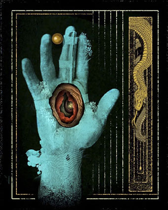
Borges’ immortal is a Roman soldier during the reign of Diocletian whose life is recounted via a manuscript discovered in 1929 inside a volume of poetry. (The volume is Pope’s translation of The Iliad; Homer is never far away in Borges-land, especially in this story.) Disappointed by his military career, the soldier leaves his legion to go in search of the legendary City of the Immortals which is reputed to lie somewhere in the African desert; he finds the city, of course, and also (inevitably) receives more than he bargained for. Borges’ other fictions are seldom as traditionally fantastic as this, although the story’s philosophical musings are enough to set it apart from similar tales, as is the author’s habit of owning up to his recondite literary borrowings, like a magician revealing the secret of a trick at the end of a performance. Even so, The Immortal was generic enough to turn up in an American paperback collection in 1967, New Worlds of Fantasy edited by Terry Carr, along with stories by Roger Zelazny, John Brunner, JG Ballard and others. The Ballard story, The Lost Leonardo, is an uncharacteristic piece about another immortal character, Ahasuerus, the Wandering Jew, cursed to roam the world until the Second Coming of Christ. Ahasuerus was a popular character in the 19th century, whose legend and predicament was enough to sustain Eugène Sue for 1400 pages in a ten-volume historical saga, Le Juif Errant. Borges alludes to Ahasuerus via the name “Joseph Cartaphilus” although this is one obscure reference that he doesn’t explain for the reader. By contrast with the logorrhoeic Monsieur Sue, Borges requires a mere 15 pages to deal with 2000 years of history.
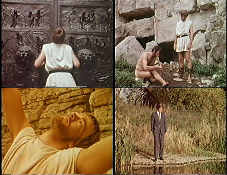
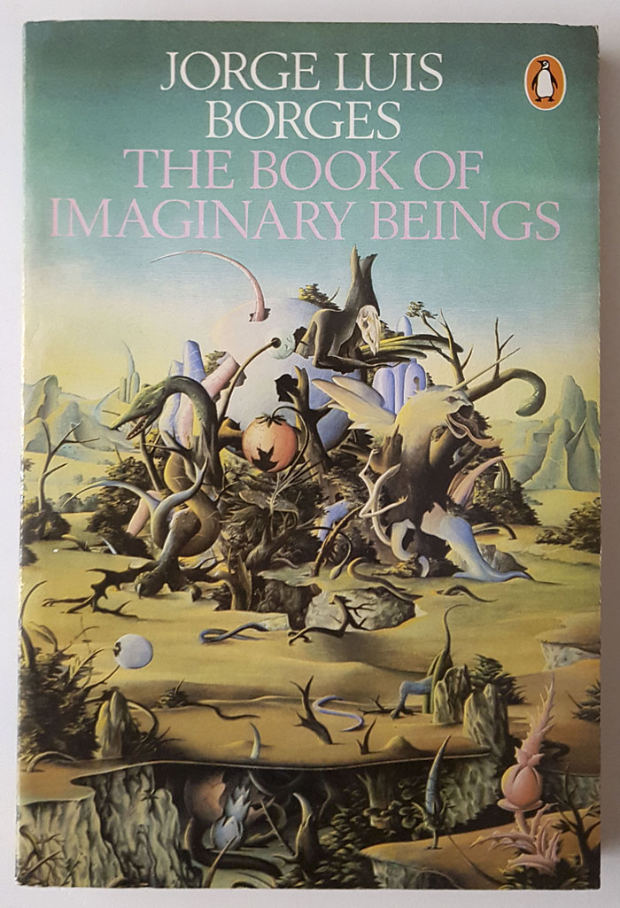
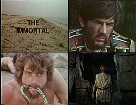
Given the challenges of staging a complex historical drama on a TV budget Carlos Pasini’s film is little more than a 22-minute sketch of its source material, but Borges adaptations are scarce enough that there’s a thrill in seeing the material presented at all, as with the brief dramatisations in the Arena documentary, Borges and I. The Immortal was given a single broadcast on 20th November, 1970, as part of a now-forgotten BBC 2 arts programme, Review, where it was intended as an introduction to the author’s writing following the UK publication of The Book of Imaginary Beings. Mark Edwards plays the Roman soldier whose narration is taken verbatim from the story. Borges’ international reputation had reached a plateau of popularity at this time, after growing steadily during the 1960s. 1970 was also the year that Donald Cammell & Nicolas Roeg’s Performance was released, a film that quotes verbally and visually Borges’ Personal Anthology while also featuring a photo of the man himself. A year later, Michael Moorcock’s first Jerry Cornelius collection, The Nature of the Catastrophe, included the dedication “For Borges”; Jerry Cornelius is another immortal (or timeless) character, one of whose progenitors may be “Joseph Cartaphilus”. Pasini’s adaptation can’t compete with these heavyweights but as a taster of Borgesian prose and ideas it serves its purpose. The director has made it available for viewing here.
Previously on { feuilleton }
• Borges on Ulysses
• Borges in the firing line
• La Bibliothèque de Babel
• Borges and the cats
• Invasion, a film by Hugo Santiago
• Spiderweb, a film by Paul Miller
• The Library of Babel by Érik Desmazières
• Books Borges never wrote
• Borges and I
• Borges documentary
• Borges in Performance