Giovanni Battista Palatino

palatino1.jpg

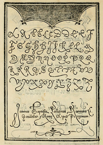
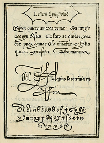
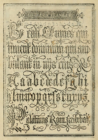
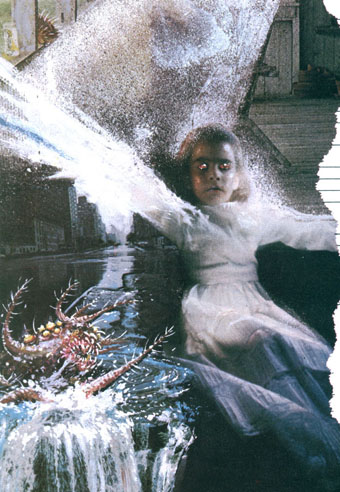
Say the name Palatino today and the only thing it brings to mind for most people is the elegant typeface designed by Hermann Zapf in 1948. Giovanni Battista Palatino (c.1515–c.1575) is the Italian calligrapher from whom Zapf took the name, and the pages here are from a 1550 reprinting of one of Palatino’s sample books, another of those volumes with a sprawling title: Libro di M. Giovambattista Palatino cittadino romano: nel qual s’insegna à scriuere ogni sorte lettera, antica, & moderna di qualunque natione. One of the fascinations for me in going through these old alphabet books is seeing the same designs reprinted down through the centuries until you arrive at the origin of a particular page or design. The third image in this post I have uncredited in a 1997 Pepin Press book of typography; I’ve seen someone wearing it at a gig on a T-shirt, and it turns up in a number of 19th century design books. But this is its origin, and for once the designer receives a credit (although he did sign some of his pages).

Also of interest in this book are the renderings of ancient alphabets. These range from familiar Greek and Hebrew letters to more obscure alphabets some of which resemble a number of occult alphabets that appeared around this time. Agrippa’s Passing the River and the Alphabet of the Magi by Paracelsus in particular look as though they might have been derived from a lettering book such as this.

palatino2.jpg

palatino3.jpg

Continue reading “Giovanni Battista Palatino”

Heavy Metal, October 1979: the Lovecraft special

hm1.jpg

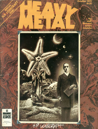
Mr Lovecraft by JK Potter.

HP Lovecraft died seventy-five years ago on 15th March, 1937. Twenty-five years ago I was halfway through drawing my comic strip adaptation of The Call of Cthulhu, conscious at the time that, yes, it was fifty years ago today… I mentioned at the weekend the special Lovecraft edition of Heavy Metal that was published in October 1979; of the many stimuli that led to the drawing of CoC, this magazine was by far the most important. Given the date, now seems as good a time as any to say something about it.

hm2.jpg

Illustration for the contents page by Stephen R. Bissette.

Heavy Metal was the US offshoot of Métal Hurlant, the sf/fantasy comics magazine founded by Jean Giraud (Moebius), Philippe Druillet and Jean-Pierre Dionnet in 1974. Copies of Métal Hurlant could be found in London but none ever made it further north. The advent of Heavy Metal provided an invaluable introduction to a generation of European artists whose work was otherwise difficult to find. Even better: their stories were being translated into English for the first time. The late 70s was a dizzying period for a Lovecraft reader: HR Giger appeared apparently out of nowhere in 1977 when Big O published the first UK collection of his art (which I couldn’t afford at the time), a book with Necronomicon in the title; a year later Thames & Hudson published Franz Rottensteiner‘s The Fantasy Book, an overview of the genre that devoted eight pages to Lovecraft and Arkham House, and which included many illustrations I’d never seen before; in 1979 Giger was all over the newspapers and magazines thanks to Alien; then in October the Lovecraft special dropped onto the shelves. I was stunned: this was that rare occasion when someone creates exactly the thing you want to see at precisely the right moment.

hm3.jpg

The Dunwich Horror by Alberto Breccia. A superb adaptation.

Looking back, the issue isn’t quite as good as it seemed at the time: many of the stories are slight, a couple have nothing whatever to do with Lovecraft, and, Breccia aside, none of the artists tackle the major works. What counted in the end was the idea of the issue, the implication that Lovecraft’s imagery was there to be seized and reworked in visual form. There were better issues of the magazine, before and after, but for the next six years this one remained for me a tantalising possibility. They hadn’t got it quite right…what if someone else did? After searching comic shop shelves in vain I eventually decided to have a go myself.

Continue reading “Heavy Metal, October 1979: the Lovecraft special”

The Beckford Journal

beckford.jpg

‘Reason’ and ‘Fancy’ are my Sun and Moon. The first dispels vapours and clears up the face of things, the other throws over Nature a dim haze and may be styled the Queen of Delusions.

William Beckford

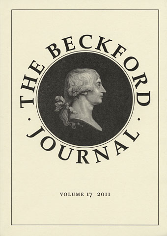
My thanks to Sidney Blackmore, Secretary of the Beckford Society, who posted me a copy of the latest Beckford Journal after seeing my recent posts about Fonthill Abbey and William Beckford’s curious fantasy, Vathek. The existence of a long-running journal and society devoted to someone few people today will have heard of isn’t so surprising—I’ve known members of the various Arthur Machen societies for years (Hi Mark!)—but the Beckfordites have an edge with their production values: volume 17 features colour views of Fonthill, inside and out. The essays are detailed and authoritative, the quote above is lifted from ‘The Poetic Sensibility of an Enfant Terrible: Beckford and the Esemplastic Power of His Imagination’ by Kazuhiko Yamaguchi.

There’s a site for the Beckford Society here but the pages are currently incomplete. The older site is located here and includes a list of earlier numbers of the journal.

Previously on { feuilleton }
Vathek illustrated
Fonthill Abbey

Weekend links 99

moebius.jpg

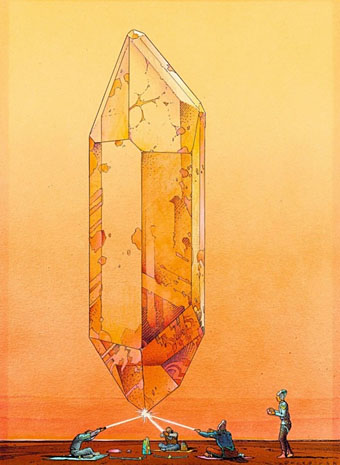
From the Crystal Saga portfolio (1986) by Moebius. Via Quenched Consciousness.

Moebius: A while ago, [science fiction] was filled with monstrous rocket ships and planets; it was a naive and materialistic vision, which confused external space with internal space, which saw the future as an extrapolation of the present. It was a victim of an illusion of a technological sort, of a progression without stopping towards a consummation of energy. But we’ve completely changed that vision. It’s been a sharp, radical change, and somewhat brutal.
HM: Why brutal?
Moebius: Because all those beautiful projects we believed in are gone. But the real sense of science fiction is the discovery that the voyage is interior, and the real energy, the rockets of the past, is what is contained in people’s spirits.
HM: One doesn’t have to read other people’s visions then, one can make the discovery oneself?
Moebius: Well, that, and also the fact that the “new planet” of old science fiction is right here: it’s the Earth.

The Moebius Interview by Diana K. Bletter, Heavy Metal, August 1980.

RIP Jean Giraud, aka Moebius, one of the great artists of the 20th century. My approach to drawing comics was almost wholly derived from the illustrational style of the French, Belgian and other artists being published in Heavy Metal magazine in the late 1970s/early 1980s. Many of the stories were appearing in English for the first time, and for me they revitalised a medium in which (undergrounds aside) I’d lost all interest. It wasn’t only the exceptional artwork that was attractive. The narratives of Moebius, Druillet, Bilal and co. presented a more sophisticated approach to science fiction and fantasy than the simple-minded fare filling the superhero titles or the pages of 2000 AD. Moebius’s work was wittier, sexier and far more imaginative than any American comics I’d seen up to that time. Some of the stories read like graphic equivalents of New Worlds-era science fiction so it came as no surprise to find Moebius drawing a strip called The Airtight Garage of Jerry Cornelius (the title was later amended at Moorcock’s request) while Druillet in his September 1980 Heavy Metal interview mentioned enjoying books by William Burroughs, Michael Moorcock and Thomas Disch, and singled-out Ballard’s Crash as a favourite novel. Without the examples of Druillet and Moebius (and the intoxicating inspiration of the October 1979 issue of Heavy Metal) I wouldn’t have spent 17 months adapting The Call of Cthulhu as a comic strip.

Hasko Baumann’s 2007 documentary, Moebius Redux: A Life in Pictures (some of which can be seen on YouTube) is a good place to start when trying to appraise Jean Giraud’s extensive career. The film is now available on DVD.

Update:
The hour-long cut of Moebius Redux has been posted to Vimeo
An obituary by Kim Thompson at The Comics Journal
The Moebius posts at But Does It Float
moebius2.jpg

From Les Yeux du Chat (1978) by Jodorowsky & Moebius. Via Quenched Consciousness.

• “Naked Lunch,” Ballard wrote later, “was a grenade tossed into the sherry party of English fiction.” The criss-crossing careers of JG Ballard and William Burroughs are examined in detail at RealityStudio. Related: The Discipline of D.E. (1982) by Gus Van Sant and The Unlimited Dream Company (1983) by Sam Scoggins.

• Dr John’s forthcoming album, Locked Down, has been produced by The Black Keys‘ Dan Auerbach. Those of us who favour the Doctor’s voodoo-inflected early albums are hoping this might mean he gets groove back after wandering for years in an MOR swamp. One of the new recordings, Revolution, sounds promising.

I don’t think sexuality is fixed anymore. I think more from the gay male side than the lesbian side, there is often a wish for things to be fixed. I heard Lady Gaga’s Born This Way and I don’t know why they like it. Maybe, they need more certainty than girls do. For me, it’s like why do you care anyway? Maybe you were, maybe you weren’t. What’s the big deal? I can’t connect to that emotionally, so it baffles me.

Jeanette Winterson talks to Sassafras Lowrey.

• “In [Jacob’s Room], [Virginia] Woolf makes the subject matter not Jacob himself but the ways in which we know and don’t know each other – the gaps in our knowledge.” Alexandra Harris on Modernism in art and literature.

• The Northwest Film Forum in Seattle hosts Magick in Cinema on 5th April, an evening of occult-themed short films which includes a rare screening of Curtis Harrington’s Wormwood Star.

• John Bertram’s Lolita cover competition from 2009 is due to appear in June as a book-length study entitled Recovering Lolita. Bertram previews the contents here.

• “Erotic fiction is having a steamy renaissance and its hottest authors are women.”

LSD helps to treat alcoholism.

• The other Moebius (Dieter): News (1980) by Moebius & Plank | Tollkühn (1981) by Moebius & Plank | Conditionierer (1981) by Moebius & Plank.
Henry Keen’s illustrated Webster

keen2.jpg

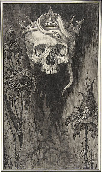
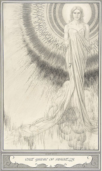
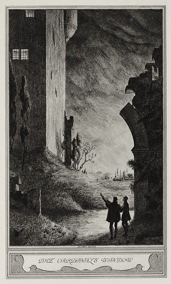
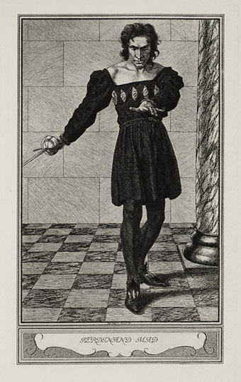
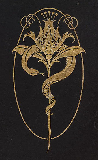
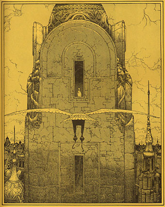
More gorgeous work from elusive British illustrator Henry Keen (1871–1935). These are some of the ink drawings Keen provided for a 1930 edition of John Webster’s Jacobean tragedies The Duchess of Malfi and The White Devil. In addition to eleven full-page illustrations there are decorative embellishments, and as usual it’s a shame there isn’t anywhere with a complete set of the artwork. I’m tempted to track down some of Keen’s books myself, this one seems especially good. That crowned skull is not only worthy of Carlos Schwabe, it makes me wonder why Webster wasn’t given more attention from earlier artists. Probably because the plays were too strong for 19th century tastes, violent revenge drama wasn’t what anyone wanted on stage at the time. Swinburne admired Webster’s work but then Swinburne wasn’t exactly a typical Victorian.

Thanks to ~Wunderkammer~ for the tip!

keen3.jpg

keen4.jpg

keen5.jpg

keen1.jpg

Elsewhere on { feuilleton }
The illustrators archive

Previously on { feuilleton }
Henry Keen’s Dorian Gray