Weekend links 659

harunobu.jpg

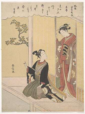
The First Day of Spring (Risshun), from the series Fashionable Poetic Immortals of the Four Seasons (c.1768) by Suzuki Harunobu. Risshun in Japan begins on the 4th of February.

• “…after centuries of imbibing alcoholic beverages as their main source of potable water, European’s new fondness for boiled drinks—coupled with the psychoactive properties of caffeine—swapped societal tipsiness with a mindstate primed for the Enlightenment’s intoxication with reason.” Hunter Dukes on A Treatise Concerning the Properties and Effects of Coffee (1792) by Benjamin Moseley.

• Steven Heller on John Wilcock, Master of the Underground: “[He] was one of the great ‘happening’ characters of midcentury America, beat myth to Hippie legend. He was founder of half a dozen underground papers, and started one of the first citizen-access cable television shows. His achievements are a dense package.”

• At Fonts In Use: Florian Hardwig explores the origin of “the Dune font” as used on the covers of Frank Herbert’s novels during the 1970s and 80s.

• At Smithsonian Magazine: “Hundreds of Frank Lloyd Wright’s designs were never built. Here’s what they might have looked like.”

• Mix of the week: Fact Mix 893 by KMRU & Aho Ssan & Sevi Iko Dømochevsky.

• New music: Hypnagogia by Martina Bertoni, and Cosmos Vol. II by Ran Kirlian & Jaja.

• “Forgotten ‘Stonehenge of the north’ given to nation by construction firm.”

• At Aquarium Drunkard: Soft Machine live at Jazz Bilzen, 1969.

• RIP Tom Verlaine.

Goofin’ At The Coffee House (1959) by Henri Mancini | Bring Me Coffee Or Tea (1971) by Can | Starfish And Coffee (1986) by Prince

Weekend links 171

bossi.jpg

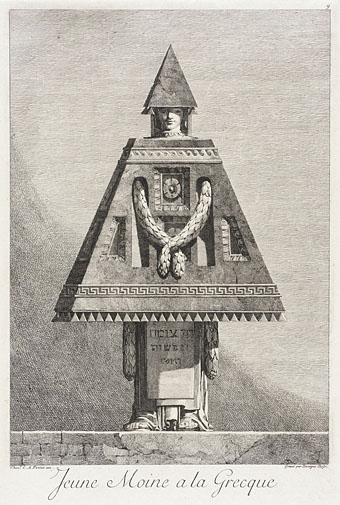
Jeune moine à la Grecque (1771) by Benigno Bossi. Via Monsieur Thombeau.

Victoriana: The Art of Revival is an exhibition which will run throughout the autumn at the Guildhall Art Gallery, London. Some of my steampunk work will be included. Related: Rick Poynor on Soft Machine’s Dysfunctional Mechanism.

• “The egg glows and hovers in the middle of a field of mesmerizing color. The spell is broken when the guard finally says, “Everybody up off the floor.'” Morgan Meis on Aten Reign by the amazing James Turrell.

• Mix of the week: a “heatwave mix” of psychedelic songs compiled by Jaime Williams. Anything that includes Vacuum Cleaner by Tintern Abbey gets my vote.

Because sex is so compartmentalized — it’s often considered separate from the rest of life and hidden away — porn performers, who have sex publicly, are in a unique position to consider and talk about integrating private and public aspects of life.

Writer and porn performer Conner Habib on the issue of nomenclature in the porn business.

• Still Hopscotching: Peter Mendelsund posts some unused cover designs for Julio Cortázar.

A Hymn For Megatron, an hour-long drone work, and a free download, by The Black Dog.

• Vagrancy and drift: Sukhdev Sandhu on the rise of the roaming essay film.

• A Flickr set of Peter “Sleazy” Christopherson’s musical instruments.

mwc.jpg

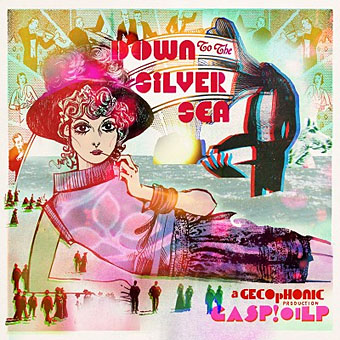
“Whether flower-pressing in the garden, hallucinating in the summerhouse, fainting inside stifling sites of historical interest, pirouetting along the promenade, or even sea-cruise thalassophobia complications, barely a moment will pass that isn’t made all the sweeter by obsessively listening to Down to the Silver Sea.”

The TM Research Archive: sate yourself on Swiss graphic design.

• A Lecture on Johnson and Boswell by Jorge Luis Borges.

• Words, sounds and robots from Sarah Angliss.

Never Built Los Angeles

Nautilus (2012) by Anna Meredith | Nature Of Light (2012) by Isnaj Dui | Popcorn (Ealing Feeder Mix) (2012) by SpacedogUK (Sarah Angliss)

Soft machines

smseven.jpg

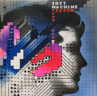
Seven (1973) by Soft Machine. Design by Roslav Szaybo.

You’re the great, grey man whose daughter licks policemen’s buttons clean,
You’re the man who squats behind the man who works the soft machine.

Mick Jagger, Memo From Turner (1968)

By coincidence this month I’d been re-reading some William Burroughs when I picked up a nice box set of five Soft Machine albums, part of a series of reissues that Sony have been doing recently. They’re very cheap and sound excellent, and also have the additional benefit of being a card slipcase holding the discs in card sleeves so there’s no nasty plastic packaging. The set comprises the Third (1970), Fourth (1971), Fifth (1972), Six (1973), and Seven (1973) albums. I have the band’s first two studio albums already so this has been an opportunity to get fully acquainted with the rest of their output up to the point where the machine started to run out of steam.
smone.jpg

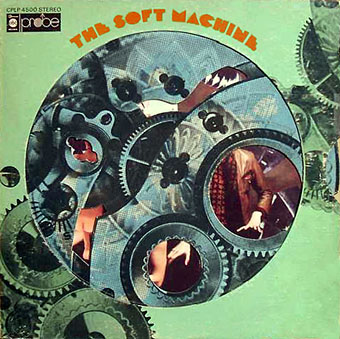
The Soft Machine (1968) with die-cut sleeve. Design by Byron Goto, Eli Allman, Henry Epstein.

Third and Fourth are freaked-out jazz fusion recorded when Robert Wyatt was still on drums; Fifth, which I had for years on vinyl, is post-Wyatt fusion of a more polite variety, great compositions but it sounds lightweight compared to Miles Davis’s On The Corner which was released the same year. Six, which I’d hardly heard at all, is a set of live recordings and four superb studio tracks. Seven is the weakest of the lot but it prompts this post on account of the cover which I always liked the look of when flicking past it in record shops. Seen today it still looks surprisingly advanced for 1973, and the intention behind the design is still mysterious. I used to regard it as vaguely “futuristic” despite knowing that the music was nothing of the sort. The accumulation of abstract symbols contained by a human head implies either a score for some aleatory composition (which again is belied by the short jazzy pieces within), or can perhaps be read as a “soft machine”, especially if one considers that the popular idea of electronics at this time involved patch-boards and banks of flashing lights. Ten years later with synthesizers in common use this kind of semi-cybernetic imagery was a lot more topical.
smtwo.jpg

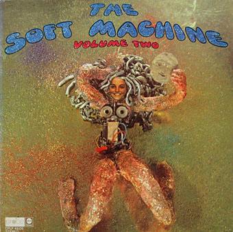
The Soft Machine Volume Two (1969). Design by Byron Goto, Henry Epstein.

The first two Soft Machine albums both showed literal renderings of Burroughs’ “soft machine” idea albeit couched in the naked-woman-as-decoration style of the late 60s. Six has a horrible cover with an airbrushed attempt at a soft machine, one of those pictures common to the 1970s that you’re amazed was approved by band and record company.
v2.jpg

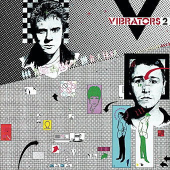
V2 by The Vibrators (1978). Design by Roslav Szaybo.

The design for Seven is credited to Roslav Szaybo, an in-house designer at CBS. Looking through Mr Szaybo’s other credits there’s little that resembles his Soft Machine cover until you arrive at the sleeve for V2, the second album by British punk band The Vibrators. This was another cover I always liked for similar graphical reasons to the Soft Machine sleeve; they also share a similar stencil typeface. Musically they’re worlds apart, of course, although William Burroughs’ influence on music carried on into the punk era (another Brit punk band named themselves Dead Fingers Talk) and beyond. It’s an influence reaching from the mid-60s with Soft Machine and his appearance on the cover of Sgt Pepper, into the 1990s with the many recordings he collaborated on or inspired from Bill Laswell, Hal Willner and others. His influence generally may have fallen off since his death in 1997 but it’s still a remarkable achievement for someone who never seemed to care much for music beyond the popular tunes he heard as a boy.

Elsewhere on { feuilleton }
The album covers archive
The William Burroughs archive
Michael English, 1941–2009

english1.jpg

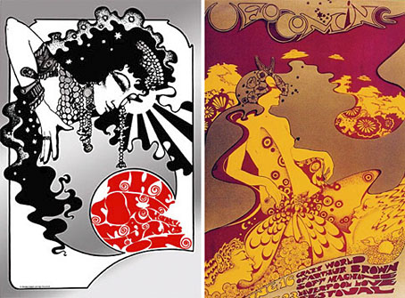
left: The Soft Machine Turns On (1967); right: UFO Coming (1967).

This was a bitter blow coming at a time when I’ve been working on something inspired in part by Hapshash and the Coloured Coat, the 1960s design duo comprised of Michael English and Nigel Waymouth. The two artists, together with associate Martin Sharp, are indelibly associated with the London psychedelic scene of the late Sixties. Whereas Sharp’s posters were often loose and dramatically bold explosions of shape and colour, the Hapshash posters were more carefully controlled in their curating of disparate elements borrowed from Art Nouveau—especially Mucha and Beardsely—comic strips, Op Art, Pop art and fantasy illustration. Their work perfectly complemented the very distinctive atmosphere of the capital’s psychedelic scene which, for a couple of hectic years, saw an explosion of new bands (or old bands in new guises) fervently engaged in a lysergic exploration of Victoriana, childhood memories and frequent silliness. UK psychedelia is generally more frivolous than its US equivalent which had the Vietnam War and civil disorder to deal with; English and Waymouth’s graphics captured the London mood.

english2.jpg

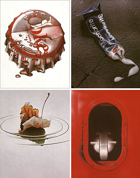
top left: Coke (1970); top right: Toothpaste (1974).
bottom left: Leaf Falls (1972); bottom right: Red no. 3 (1978).

In the 1970s English refashioned himself as a hyper-realist painter of foodstuffs and other consumer goods, and his meticulous airbrush style led to work as an advertising artist. Those paintings are beautifully rendered but often leave me feeling slightly queasy. I much prefer his work from later in the decade which depicted equally meticulous close-up views of oil-smeared buses and trains. Paper Tiger published a book collection in 1979, 3D Eye, which gathers the best of his work from the poster art on.

• Obituaries: Guardian | Times
• Hapshash poster galleries here and here

Previously on { feuilleton }
The Look presents Nigel Waymouth
The New Love Poetry

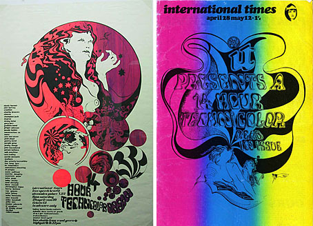
The 14-Hour Technicolor Dream revisited

it.jpg

left: event poster by Hapshash & the Coloured Coat.
right: International Times 14-Hour Technicolor Dream special issue, April 1967.

The ICA goes psychedelic, baby. Lucky Londoners get to gorge themselves on this lot next Saturday.

2007 is a year of many anniversaries: twenty years since Acid House, thirty since the release of Never Mind The Bollocks, forty since Sgt. Pepper’s and fifty since the publication of Jack Kerouac’s On The Road.

One event that gets far less publicity, but that was at the heart of everything that came both before and after it also sees its 40th anniversary this year. The 14-Hour Technicolor Dream took place on April the 29th 1967 and was the UK’s first mass-participational all-night psychedelic freakout!

Organised and in a matter of weeks, the event was held in the cavernous confines of Alexandra Palace. The vision of Hoppy Hopkins and Miles, the night saw a glorious mingling of freaks, beats, mods, squares, proto-punks, pop stars and heads come together to dance, trip, love and be.

To celebrate the anniversary, the ICA presents Our Technicolor Dream—a one-off multi-media event that features an array of cult 60s films and animation, full-on psychedelic lightshows, groovy DJs, avant-garde theatre, a Q&A session with the leading lights of the 60s underground and live music with The Amazing World of Arthur Brown, The Pretty Things, Circulus and Mick Farren!

Tell It Like It Was: The Round Table Speaks: Joe Boyd, Miles, Hoppy Hopkins & John Dunbar.
Freak Out, Ethel! An Evening of Musical Mayhem: Malcolm Boyle’s play plus The Amazing World of Arthur Brown, Circulus, The Pretty Things and Optikinetics lightshow.
Boyle Family Films With Music by The Soft Machine
Weird and Wonderful 60s Animation: Films by Jan Lenica, Jan Svankmajer, Walerian Borowczyk, Chris Marker and Ryan Larkin.
What’s A Happening? “90 minutes of rare, lost and unseen psychedelic masterpieces”.

Retrospective newspaper features: The Independent | The Times

Previously on { feuilleton }
Verner Panton’s Visiona II
The art of Yayoi Kusama
All you need is…
Sans Soleil
Summer of Love Redux
The Invasion of Thunderbolt Pagoda
Oz magazine, 1967–73
Strange Things Are Happening, 1988–1990