The Dukes declare it’s 25 O’Clock!

dukes1.jpg

25 O’Clock (1985). Andy Partridge’s great cover design.

The DUKES say it’s time…it’s time to visit the planet smile…it’s time the love bomb was dropped…it’s time to eat music…it’s time to kiss the sun…it’s time to drown yourself in SOUNDGASM and it’s time to dance through the mirror. The DUKES declare it’s 25 O’CLOCK.

It was twenty-five years today—April 1st, 1985—that Virgin Records released what was supposed to be a reissue of a lost psychedelic album from the late 1960s, 25 O’Clock by The Dukes of Stratosphear. The catalogue number was WOW 1 and the vinyl label was printed with the old black-and-white Virgin logo by Roger Dean even though Virgin Records wasn’t founded until 1972. No one was supposed to know that the album was really a pastiche project by XTC but I don’t recall anyone actually being fooled by this, all the reviews acknowledged XTC as the originators, and band members Andy Partridge and Colin Moulding were happy to give interviews enthusing about their musical obsessions. As well as being incredibly successful artistically the album was a surprising commercial success which led the bemused record label to ask for a sequel. Psonic Psunspot followed two years later, and the Dukes’ vibe infected XTC’s own work for a while, with their 1988 album, Oranges & Lemons, pitched somewhere between the pastiches and XTC’s more usual sound .

dukes2.jpg

Psonic Psunspot (1987). Design by Dave Dragon and Ken Ansell.

Continue reading “The Dukes declare it’s 25 O’Clock!”

Roger Dean: artist and designer

Kieran at Sci-Fi-O-Rama was in touch recently asking me to contribute a paragraph about a favourite Roger Dean picture for this feature about the artist. The following splurge of polemic was the result, something I’d been intending to write for a while. Since so many words would have overwhelmed the other contributions it’s being presented here while Kieran’s post has a variety of shorter appreciations and further examples of Dean’s art and design.

dean1.jpg

Pathways (1973). A slightly reworked version of the original painting.

“Science fiction is unfortunate in having a most unsatisfactory framework of existence—it’s considered literary kitsch. I believe it should be the mainstream of literature because all the books that have become important down the generations of civilisation have been books about ideas. Superficially, science fiction would seem to offer the most scope for idea content, but the promise is unfulfilled. Good ideas and good writing rarely coincide. All too often the medium is used for entertainment alone and its potential beyond this should be obvious to everyone. I don’t just mean in the sense of fantasy technology. The potential for anticipating human evolution is there and perhaps the means to bring it about and definitely the means to bring about a social evolution.”

Roger Dean, interviewed in Visions of the Future (1976).

If popularity is often a curse as well as a blessing, it’s been Roger Dean‘s curse to see his work dismissed along with many other products of a decade—the 1970s—with more than its share of cultural heroes and villains. Music journalists in Britain have for years given the impression that the arrival of the Sex Pistols in 1976 swept away all that preceded them, in particular bands such as Yes whose album covers had helped raise the visibility of Dean’s art to an international level. This is not only a lazy assumption, it’s also wrong. When Yes released Going For the One in 1977 it was their first studio album in three years, yet despite the punk explosion it went to no. 1 in the UK album charts, while a rare single release from the band made the UK top ten. Yes were playing sell-out tours in Europe and the US in 1977 and 78, as were Pink Floyd whose The Wall was massively popular worldwide in 1979. Punk didn’t sweep prog away, what happened with its advent was that progressive rock and everything associated with it—Roger Dean’s art included—became critically disreputable almost overnight, such that no music journalist would dare say anything good about it. That disrepute has persisted for thirty years despite a lasting and indelible influence. This is an old argument but some facts often need restating anew. *

dean6.jpg

Views (1975).

I was 13 in September 1975 when Roger Dean’s first collection of his illustration and design work, Views, was published. At that time, I hadn’t heard any of the music to which his paintings and drawings were attached, and I didn’t even see a copy of the book until February 1976 when I happened to be in London on a school trip and found a big pile of what I guess was the second edition in Foyle’s book shop. This appeared at exactly the right moment. I wasn’t listening to the music but I was reading a lot of science fiction, and was starting to notice and imitate the work of various paperback artists. I recognised many of the pictures in Views from the covers displayed in the window of our local record shop, Cobweb, whose shopping-bag logo was a cowled magician figure à la Dean or Rodney Matthews. It’s difficult to say what struck me about Dean’s work at the time since you rarely articulate your preferences at that age. I think I liked the consistency of vision and the invention which blended the organic and mechanical, the architecture which looked at once ancient and futuristic, and the flat landscapes which put lone pine trees into rocky terrain familiar from Japanese and Chinese prints. For a teenager his style was also relatively easy to imitate if you forgot about basic things such as imagination and finesse, and I spent a year producing a lot of badly-drawn reptiles posed against lurid watercolour skies.

Continue reading “Roger Dean: artist and designer”

Album cover postage stamps

albums1.jpg

top row: The Division Bell by Pink Floyd; A Rush of Blood to the Head by Coldplay.
bottom row: London Calling by The Clash; Tubular Bells by Mike Oldfield.

The Royal Mail follows its series of British Design Classics postage stamps with a series dedicated to what they call “classic” album covers. The design classics in the earlier series deserved the term—a  Mini motor car, a Penguin book cover, the London Underground map, etc—whereas here we have the word “classic” being used in its lazy journalist sense where it becomes a synonym for “popular” and “familiar”, two attributes which often diminish with time.

albums2.jpg

top row: Parklife by Blur; Power, Corruption and Lies by New Order.
bottom row: IV by Led Zeppelin; Screamadelica by Primal Scream.

It should be noted that the choice of cover art was limited to releases by UK artists, and the designs had to be readable at the very small size of a postage stamp. Even so, I can’t help but regard this as a missed opportunity. There was no need to feature the Beatles since they’d been given their own set of stamps in 2006, but I’ve never thought of the cover of Let It Bleed (below) as a classic, even though musically it’s one of the best Stones albums. I’d rather choose Andy Warhol’s cover for Sticky Fingers but you can imagine the upset at stamp users being forced to lick a picture of a bulging pair of jeans. As for Pink Floyd’s Division Bell, it’s a typically striking design from Storm Thorgerson but does anyone really think it’s more classic than earlier Floyd covers, not least the Dark Side of the Moon prism which even people who hate the band can instantly recognise? Nearly all these choices seem confused or compromised; the Clash cover is the token punk offering—Royal Mail wouldn’t dare choose Never Mind the Bollocks—but Ray Lowry’s design was copied from an Elvis Presley sleeve; Led Zeppelin’s IV is a great album but other releases had far better covers; Primal Scream, another great album but the whole sleeve design is perfunctory; the Blur choice is merely bewildering.

albums3.jpg

left: Let It Bleed by The Rolling Stones; right: The Rise and Fall of Ziggy Stardust and the Spiders from Mars by David Bowie.

As far as designers go, Hipgnosis (via Storm T), Peter Saville (New Order), and Stylorouge (Blur) are included here but there’s nothing from Barney Bubbles, Malcolm Garrett, 23 Envelope, Neville Brody, Designer’s Republic or any of the other pioneering British designers of the past 30 years. The trouble with those names, of course, is that many of the artists they worked for aren’t popular or familiar enough to the average British stamp purchaser so their work can’t be deemed “classic”. A best of British, then, which could have been a lot better.

Classic Album Covers will be issued on January 10th, 2010.

Elsewhere on { feuilleton }
The album covers archive

Previously on { feuilleton }
British Design Classics
Stamps of horror
Endangered insects postage stamps
James Bond postage stamps
Please Mr. Postman

Battersea Power Station

battersea.jpg

A photograph of the control room of Battersea Power Station, London, by Michael Collins, one of a series which will shortly be on display at the Royal Institute of British Architects.

The images show Battersea Power Station as what Collins describes as a “twentieth century ruined castle” – a building that was built to last, with a high quality structure and interior, including Art Deco walls and ceilings.

Giles Gilbert Scott’s enormous temple of heavy industry continues to sit decaying on the banks of the Thames while property developers come and go. The latest of these, Real Estate Opportunities, has fallen into debt which means proposals to develop the site are once again on hold. A part of me likes the idea of the building sitting there unused and purposeless year after year, like some vast Steampunk Stonehenge; Giles Gilbert Scott’s other Thames-side power station, Bankside, was successfully transformed as Tate Modern, but we know from various proposals that the fate of Battersea, whether as theme park or shopping centre, is likely to be a lot less edifying.

quark1.jpg

It took redevelopment to transform Bankside from temple of industry to temple of culture but Battersea’s unmistakable presence has a powerful cultural history of its own. Everyone knows the Hipgnosis sleeve design for Pink Floyd’s Animals (1977); less familiar is the photos of the control room which Hipgnosis used for Hawkwind’s Quark, Strangeness and Charm the same year. I tend to prefer the back cover of this sleeve to the front; that octagonal readout device is more interesting than the rather unconvincing sparks and exchanges of energy. And speaking of energy, my former employers are still active, unlike the rancorous Floyd.

quark2.jpg

There’s a page here listing other uses of the power station, including its many film appearances which date back to the 1930s. That list mentions the control room’s use as a background for the “Find the Fish” sequence in Monty Python’s The Meaning of Life (1983) but they omit an earlier Monty Python appearance when you briefly see the building in operation during And Now for Something Completely Different (1971). It was closed down a few years later. So here it is, then, belching fumes over west London on a profoundly gloomy winter afternoon.

battersea2.jpg

Elsewhere on { feuilleton }
The album covers archive

Previously on { feuilleton }
The Sonic Assassins
The Bradbury Building: Looking Backward from the Future

Memories of the Space Age

jc60s.jpg

I was a Space Age boy. John Glenn became the first American to orbit the Earth in Project Mercury’s Friendship 7 a month before I was born, and growing up in the 1960s it was impossible to be unaware of the NASA missions. The first encyclopedia I was given in 1967 had a whole chapter about the Mercury and Gemini projects which ran from the late 1950s through to 1966. A subsequent section showed an artist’s impression of how it might look when we were exploring the Moon and the planets. By the time the photo above was taken, in 1968 or ’69, I was obsessed with the Apollo missions and had the names of the astronauts memorised the way others memorised the names of football players. (Everyone knows Neil Armstrong and Buzz Aldrin landed on the Moon; I’ve never forgotten that Michael Collins was the third member of the team, waiting for them in the Command Module.) For a while there was an American boy at school of whom I was deeply jealous; his father was in the USAF and his family had actually been present during the launch of Apollo 8!

Space was everywhere, it became a dominant theme, at least while the Apollo missions lasted. Pop culture of the 1950s had its share of rockets ships and flying saucers but was predominantly filled with Westerns and other Earth-bound adventures. You can see a watershed moment occurring when the hugely popular Gerry Anderson puppet shows went from the cowboy adventure of Four Feather Falls in 1960 to the science fiction of Supercar and, immediately after that, the full-on space adventure of Fireball XL5 in 1961 and ’62. Cowboys couldn’t compete with astronauts; Supercar and subsequent Anderson shows were regularly repeated, Four Feather Falls wasn’t. As well as being enthused by the Anderson shows I enjoyed something called Space Patrol, another science fiction puppet series which few now seem to remember.

airfix.jpg

A page from a 1977 catalogue for Airfix model kits. I had the lunar module and the Saturn V. I don’t recall ever being interested in the Russian craft.

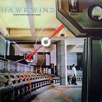
I wasn’t watching TV when Neil Armstrong first set foot on the Moon—it was 3.39 am here, I was fast asleep—but that didn’t matter, it was the event rather than the moment which counted. And there were five more landings following Apollo 11, each repeating those first moments and all accepted with the same spirit of innocent enthusiasm. What none of us kids realised at the time was that these events weren’t universally seen as a positive thing. Timothy Leary and Robert Anton Wilson later declared that going into space was the next step in human evolution but you wouldn’t know it looking through the underground press of the period. Appraisal of the NASA missions was filtered through the prisms of the Cold War and the cultural wars of the 1960s, with the entire Apollo enterprise being seen as a spin-off of the US military—the astronauts were all airforce pilots, after all—encouraged by a despised President Nixon and used as a means of embarrassing the Soviet Union. (This latter point tends to forget that the Russians were playing tit-for-tat, and had earlier embarrassed the US with Sputnik and Yuri Gagarin.) No one wanted to support men with crew-cuts who prayed in space and enjoyed country & western music. And few were prepared to concede that a President stoking the Vietnam War might have inadvertently done something worthwhile by continuing Kennedy’s space programme.

moon_it.jpg

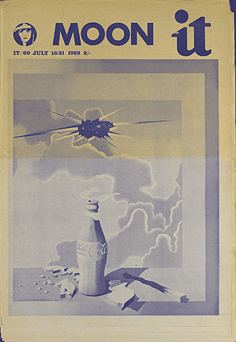
The cover of International Times for July 18, 1969, the Moon mission seen as an exploding Coke bottle which shatters the sky. An editorial within complains about the hoisting of an American flag on the Earth’s satellite.

There was a similar hostility in the attitudes of some of the younger breed of sf writers of the time who saw the Moon missions being praised and supported by the old guard of sf and, like the counterculture freaks, were disappointed by the conservative character of the astronauts. I only know this retrospectively, of course, but the complaints have always seemed rather purposeless; those men were test pilots, what else were people expecting? Equally dismaying was the amount of times throughout the 70s and 80s you’d hear black musicians only referring to the space missions in terms of a waste of money. What happened, I’d want to know, to Sun Ra’s “Space is the place”, to the elegant science fiction of Samuel R Delany, and to Parliament’s Mothership Connection? (For a more positive attitude we now have Afrofuturism.)

My own disappointment came in 1972 when it became evident that the whole show was over. As Tom Wolfe notes, after the Moon landing there was nowhere left to go. I developed a taste for written science fiction which lasted for several years but I’ve wondered sometimes whether that sense of an interplanetary future being brought to a dead stop isn’t the reason why I’ve since regarded all visions of the future as suspect. Everything in the 1960s told us that by 2009 we’d have bases on the moon and probably Mars; some of us might be living in Gerard K O’Neill‘s space colonies. When that future, which for a while seemed not only likely but inevitable, can be so easily short-circuited, why should we believe any others presented to us?

Related links:
NASA’s pages for the Apollo missions
Wired: The Moon Landings: Fact, Not Fiction
Wired: The Science of Apollo 11
Geeta Dayal on Apollo: Atmospheres and Soundtracks
by Brian Eno with Daniel Lanois and Roger Eno

Pink Floyd’s Moon-Landing Jam Session
Armstrong and Aldrin’s “lost Lunar City”
Julius Grimm’s map of the Moon from 1888

Previously on { feuilleton }
Apollo liftoff
Earthrise
East of Paracelsus