Kafkaesque

kafkaesque1.jpg

Another book design of mine (interiors only) which I completed last September for Tachyon and about which I had this to say at the time:

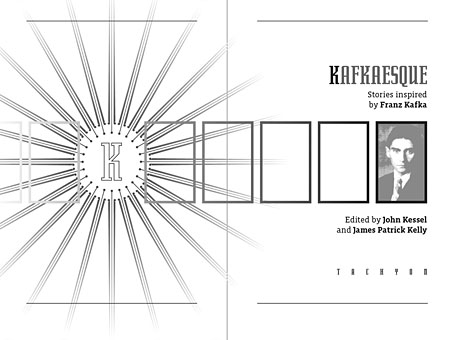
Kafkaesque [is] edited by John Kessel and James Patrick Kelly. It’s a collection of short stories either inspired by Franz Kafka, or with a Kafka-like atmosphere, and features a high calibre of contributions from writers including JG Ballard, Jorge Luis Borges, Carol Emshwiller, Jeffrey Ford, Jonathan Lethem and Philip Roth, and also the comic strip adaptation of The Hunger Artist by Robert Crumb.

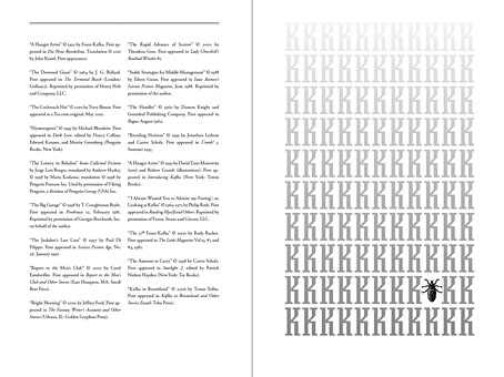
The book gained a positive review at SF Site recently, reminding me that I hadn’t written anything about the design. As with some of my other Tachyon work the interiors take their cue from a pre-determined cover by another designer, in this case Josh Beatman. I followed Josh’s type choices (Senator for the titles and headings) and also extended his use of an insect as a recurrent motif. Before I saw the contents I was fairly determined to avoid any further insect imagery but it became apparent that Kafka’s Metamorphosis is a repeated reference in many of the stories.

kafkaesque2.jpg

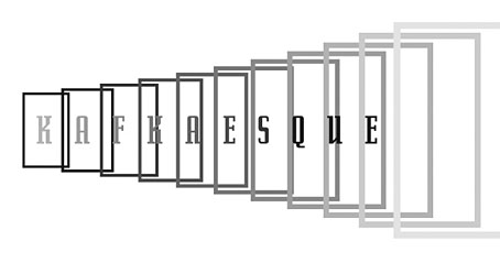
As for the recurrent “K”, that seemed inevitable given Kafka’s own use of the letter as well as its presence not only in Kafka’s own name but in the names of the editors. The frames were an idea borrowed from (and referring to) Steven Berkoff’s stage adaptation of The Trial in which portable frames serve on the stage as doorways, windows, corridors, picture frames and so on. I was hoping to do more with this idea but (as is often the case) ran out of time to develop it further.

kafkaesque3.jpg

And while we’re on the subject of Tachyon designs, I don’t seem to have mentioned my interiors for a Joe R Lansdale collection, Crucified Dreams, which also appeared last year. This is a hard-boiled anthology of Lansdale’s favourite stories for which I supplied suitably rough-and-tough graphics comprising scanned scalpel blades and lettering assembled from torn newspaper pages. I’m due to start on some new work for Tachyon this week. More about that at a later date.

Continue reading “Kafkaesque”

Screening Kafka

kafka1.jpg

Kafka (1991).

This week I completed the interior design for a new anthology from Tachyon, Kafkaesque, edited by John Kessel and James Patrick Kelly. It’s a collection of short stories either inspired by Franz Kafka, or with a Kafka-like atmosphere, and features a high calibre of contributions from writers including JG Ballard, Jorge Luis Borges, Carol Emshwiller, Jeffrey Ford, Jonathan Lethem and Philip Roth, and also the comic strip adaptation of The Hunger Artist by Robert Crumb. When I knew this was incoming I rewatched a few favourite Kafka-inspired film and TV works, and belatedly realised I have something of a predilection for these things. What follows is a list of some favourites from the Kafkaesque dramas I’ve seen to date. IMDB lists 72 titles crediting Kafka as the original writer so there’s still a lot more to see.

wellestrial.jpg

The Trial (1962), dir: Orson Welles.

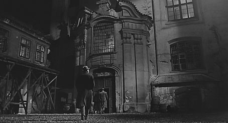
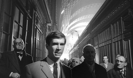
Orson Welles in one of his Peter Bogdanovich interviews describes how producer Alexander Salkind gave him a list of literary classics to which he owned the rights and asked him to pick one. Given a choice of Kafka titles Welles says he would have chosen The Castle but The Trial was the only one on the list so it’s this which became the first major adaptation of a Kafka novel. Welles always took some liberties with adaptations—even Shakespeare wasn’t sacred—and he does so here. I’m not really concerned whether this is completely faithful to the book, however, it’s a first-class work of cinema which shows Welles’ genius for improvisation in the use of the semi-derelict Gare d’Orsay in Paris as the main setting. (Welles had commissioned set designs but the money to pay for those disappeared at the last minute.) As well as scenes in Paris the film mixes other scenes shot in Rome and Zagreb with Anthony Perkins’ Josef K frequently jumping across Europe in a single cut. The resulting blend of 19th-century architecture, industrial ruin and Modernist offices which Welles called “Jules Verne modernism” continues to be a big inspiration for me when thinking about invented cities. Kafka has been fortunate in having many great actors drawn to his work; here with Perkins there’s Welles himself as the booming and hilarious Advocate, together with Jeanne Moreau, Romy Schneider and Akim Tamiroff.

Continue reading “Screening Kafka”

Ten titles and a cover

cdlcover.jpg

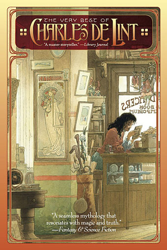
The Very Best of Charles de Lint. Art by Charles Vess.

Over the weekend I found the time to finally update the book design section of the site, adding new pages for most of the titles I’ve been working on recently. There’s still a couple of things missing but I’ll add those in due course. Many of these design jobs have been for the interiors only so what follows is a comparison of title spreads from books I’ve worked on that have been published this year. Lest it seem that I have an army of clones at my service it should be emphasised that I was working on several of these last year (and Engelbrecht was completed in 2008) but the nature of release schedules means they all carry 2010 publication dates.

sr.jpg

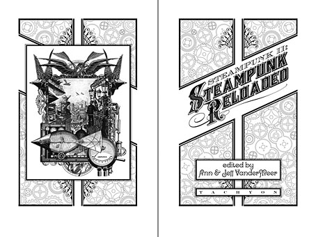
Steampunk II: Steampunk Reloaded, edited by Ann & Jeff VanderMeer.

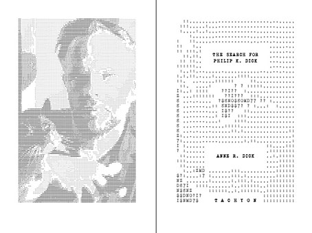
I invariably make a feature of title pages, usually creating them as a spread in order to heighten their impact. The title page is a kind of gateway to the rest of the book which gives you an opportunity to establish a mood for what follows. It’s also the area where you can be most lavish with your graphic treatment and, where necessary, add illustrative material without worrying too much about intruding on the content. With a number of these designs I was following typographic choices from pre-designed covers so the challenge was to find something that would match the cover and connect to the rest of the interior. The Charles de Lint book was a variation on this process in that the author had chosen a Charles Vess drawing for the cover art. I designed a cover to accommodate the drawing then carried the design inside. The colours were chosen to match Vess’s artwork while the general Art Nouveau style came from an Alphonse Mucha poster he’d placed on the wall. With a different cover picture the entire book would have had a very different design.

pkd.jpg

The Search for Philip K Dick by Anne R Dick.

Continue reading “Ten titles and a cover”

Weekend links 14

fraser.jpg

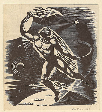
A drawing by Eric Fraser from the Radio Times, 1947. From this Flickr set.

• I helped put together the design for the Pursuit Grooves album recently. FACT magazine interviewed Vanese Smith about her work.

• One of the books whose interiors I designed last year for Tachyon was The Secret History of Science Fiction, a story collection edited by James Patrick Kelly and John Kessel. (And a book which I’ve yet to add to my web pages, I’m still behind with updates.) The LA Times has a piece about the anthology here, focusing on the Don DeLillo contribution, Human Moments in World War III.

• It’s been another week of Facebook hate; being a self-satisfied refusenik I can’t help but find this amusing. Too many good pieces to list but Gizmodo had more reasons why you should still quit Facebook, Jason Calacanis gathered lots of links to other stories on his blog while social media expert Danah Boyd got to the heart of the matter with a very cogent polemic.

• If you want an alternative to Facebook, Diaspora is “the privacy aware, personally controlled, do-it-all distributed open source social network”.

• David Toop has a new book out next month. “Sinister Resonance begins with the premise that sound is a haunting, a ghost, a presence whose location is ambiguous and whose existence is transitory. The intangibility of sound is uncanny – a phenomenal presence in the head, at its point of source and all around. The close listener is like a medium who draws out substance from that which is not entirely there.”

• Coilhouse looks at the late Decadent artist and designer Hans Henning Voigt (1887–1969), better known as Alastair.

mclark.jpg

come, been and gone.

• “After a sold out season at the Barbican in 2009 Michael Clark Company returns with the next instalment of his critically acclaimed production made primarily to the music of David Bowie. come, been and gone also embraces the work of Bowie’s key collaborators: Lou Reed , Iggy Pop , Brian Eno and touches on some of his influences; The Velvet Underground , Kraftwerk and Nina Simone……This production contains loud music and graphic images.” I should hope so.

• “Why should boys always be boys, and girls always be girls?” Brutal/Beautiful, photography by Austin Green.

• John Foxx, Iain Sinclair and others appear at Short Circuit 2010 next month.

Black, Brown, and Beige: Duke Ellington’s music and race in America.

Jane Siberry has made all her albums available as free downloads.

Ruth Bayer photographs people after they’ve inhaled poppers.

Swiss artist catalogues mutant insects around nuclear plants.

Pompeii’s X-rated art will titillate a new generation.

The Happy, Haunted Island of Poveglia, Venice.

The Art of American Book Covers, a blog.

Kanellos, the Greek protest dog.

• Song of the week: Twiggy Twiggy (1994) by Pizzicato Five.