Heaven and Hell calendar

heavenhell00.jpg

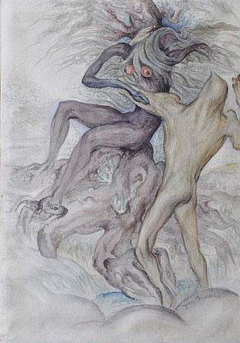
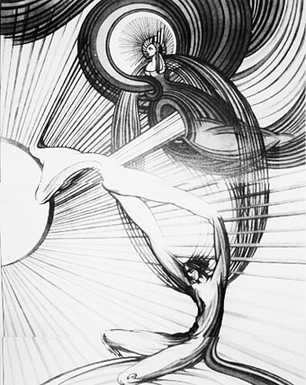
Painting from the poster art for The Highbury Working (2000) by Alan Moore & Tim Perkins.

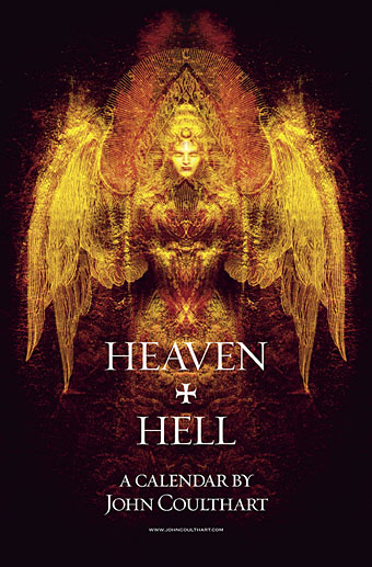
Unlike last year, this year’s CafePress calendar arrives on time, its creation being eased by the fact that it’s a reworking on an earlier version. The idea with the previous Heaven & Hell calendar had been to alternate various pieces of infernal Cradle of Filth artwork with contrasting imagery; as things turned out I had more offerings for Hell than for Heaven—no surprise there—so the reality wasn’t very satisfying.

This year I’ve managed to fill out the Heaven sequence with more recent works, all of which have been slightly adjusted to fit the square page ratio required by CafePress. So even though these are old pieces many of them are unique to this printing. Larger copies of the pages may be seen here while the CafePress purchase page is here. As always, my thanks to everyone who buys these things.

And as before, the calendars for previous years are now available all year round; see the full range here. Note that this means you need to select January as the starting month if you want the months to run for a single year only.

heavenhell01.jpg

JANUARY: Variation of the poster art for Angel Passage (2001) by Alan Moore & Tim Perkins.

Angel Passage was Alan and Tim’s album about the life and work of William Blake. I designed the CD, a poster, and also produced a video for the multi-media performance of the piece at the Purcell Room, London, in February 2001.
heavenhell02.jpg

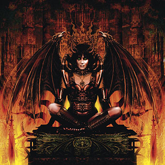
FEBRUARY: Cover for Bitter Suites To Succubi by Cradle of Filth (2001).

My first piece of Cradle of Filth art. I was a little surprised when working on this that they really did want the wings and horns; Dani loved that kind of imagery. I was even more surprised when this cover was subsequently showcased in an entire window in Tower Records’ main London shop in Piccadilly.

Continue reading “Heaven and Hell calendar”

The art of Fay Pomerance, 1912–2001

pomerance1.jpg

The Sixth Palace of Hell (1945).

Fay Pomerance’s painting of Lilith makes a startling appearance in a book I have about the history of magic symbols, and it’s that appearance which prompts this post since I’ve never seen her work given any attention elsewhere. This seems surprising when women artists, and artists whose concerns encompass mysticism or the occult, are receiving greater attention than ever before.

pomerance2.jpg

The Union of Isis and Osiris (1959).

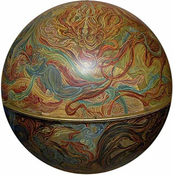
Pomerance was British, and had the misfortune to be working during a lengthy period when expressions of the imagination or unorthodox spirituality in visual art were regarded as suspect or even disreputable. Her work also stands apart from any of the prevailing movements which provide such convenient labels for those art critics and writers who dislike anything that won’t fit into one of their boxes. The Lilith picture shows an obvious debt to another British artist who stands apart from the crowd: William Blake. The BBC’s Your Paintings site has a few of Pomerance’s larger works from the collection at Durham University, including the Sphere of Redemption below which is painted on a fibreglass globe, but for the moment there isn’t a dedicated site representing her art.

pomerance3.jpg

The Temptation (date unknown).

pomerance4.jpg

The Sphere of Redemption (date unknown).

Lyrical Substance Deliberated

beatles.jpg

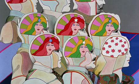
Lucy In The Sky With Diamonds from Yellow Submarine (1968).

The advent of spring invariably gets me listening to favourite psychedelic songs, and this year has been no exception. Earlier this week I was idly wondering how many songs there are that follow the Beatles’ lead in telegraphing their drug metaphors by using the initials L-S-D in their titles. Wikipedia’s page for Lucy In The Sky With Diamonds (1967) relates John Lennon’s oft-repeated claim that the initialism in the title was a coincidence, and the song itself is really a bit of Lewis Carroll-like whimsy. This might be credible if works of art only ever carried one meaning but they don’t, of course, and the song is both a piece of Lewis Carroll-like whimsy as well as being a pretty obvious paean to the drug experience: “Climb in the back with your head in the clouds / And you’re gone”. Jefferson Airplane’s White Rabbit (1967) was similarly ambivalent with mushrooms/pills replacing acid.

Among the many things birthed by the enormous success of the Sgt Pepper album, a small flurry of songs or instrumentals have imitated Lennon’s initialism for their titles. The ones that came immediately to mind are detailed below, and they make a curious group. If anyone knows of any others—there must be others…—then please leave a comment.

hendrix.jpg

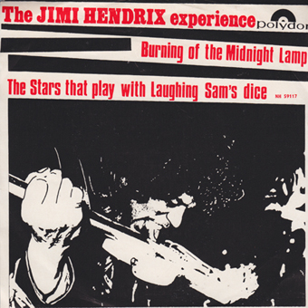
Burning Of The Midnight Lamp/The Stars That Play With Laughing Sam’s Dice (Aug, 1967).

The Jimi Hendrix Experience’s B-side not only alludes to LSD but also to STP. The song itself doesn’t go very far before collapsing into freakout mode.

trip.jpg

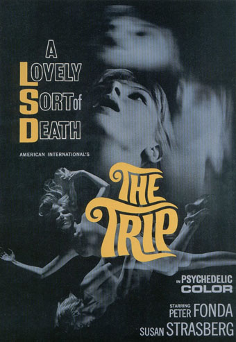
The Trip (1967).

Not a song but included here for that “Lovely Sort of Death” tag. Written by Jack Nicholson! With Dennis Hopper as the acid dealer! See the trailer here, then watch the whole film here.

power.jpg

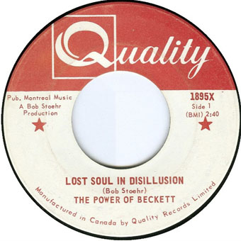
Lost Soul In Disillusion (November, 1967).

Hard to imagine anyone in London would have heard this in 1967. The Power of Beckett were a Montreal garage group who only released two singles. Lost Soul In Disillusion turned up years later on compilation albums.

Continue reading “Lyrical Substance Deliberated”

Google Art Project revisited

google1.jpg

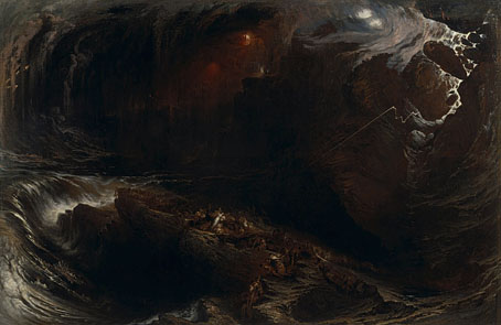
The Deluge (1834) by John Martin.

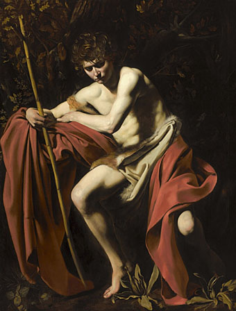
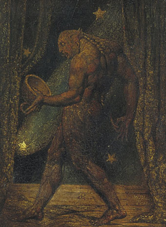
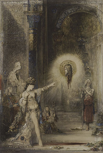
One of John Martin’s Biblical cataclysms succumbs to a Turner-like nebulosity at the Yale Center for British Art, something that can now be viewed in detail thanks to Google’s expansion of its Art Project. 151 additional galleries have been added, and the collections of those already present expanded, which means there are now 30,000 paintings and other art objects waiting to be examined. The examples here are those picked from a very cursory look at what’s on offer. Good to see the Musée d’Orsay is now one of the featured galleries where I ignored all the Van Goghs, Monets and the rest in order to select one of Gustave Moreau’s Salomés. Blake’s Ghost of a Flea is actually a lot more visible in its online state than in the original. Many of the works in the Blake collection at Tate Britain are so fragile the lights are kept low to avoid damaging their pigments. Most of Blake’s paintings are also very small, Ghost of a Flea included. Even peering at it up close doesn’t yield as much as the opportunity we now have to explore its frosted craquelure.

google2.jpg

Saint John the Baptist in the Wilderness (1604–1605) Michelangelo Merisi, called Caravaggio.

google3.jpg

The Ghost of a Flea (c. 1819) by William Blake.

google4.jpg

The Apparition (c. 1876) by Gustave Moreau.

Previously on { feuilleton }
The Ambassadors in detail

Compass Road by Iain Sinclair

sinclair.jpg

I was hoping to get my delayed 2011 calendar launched today but other work needed completing so here’s an interim post.

Think of your journey through mortality as a sequence of valid movies and the pain is ameliorated. Forget the tedious 60-minute division of the lecture hall or dead television (quartered by adverts): arrange just enough markers for the 90-minute slots of Golden Age cinema. And then it’s only a question of nominating the eight guides, culture-figures who will dominate your thoughts (and reveries) for as long as you stay upright. The road is endless, you aren’t. Iain Sinclair

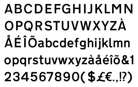
There may be a recession on but people still keep putting out the luxury goods; maybe the bankers are buying all this stuff with their unwarranted bonuses. Compass Road is a limited edition wristwatch from Mr Jones Watches, London, and sports a design commissioned from writer Iain Sinclair, a somewhat surprising choice given that these things are more usually farmed out to those individuals we have to call celebrities. Sinclair is too intelligent and interesting to be a mere celebrity and consequently designs a watch I’d probably buy if I had an excessive income. The watch middle and the hands are based on the British road signs designed by Margaret Calvert and Jock Kinneir while the typeface used for the compass points is Calvert and Kinneir’s Transport (below) which is also used across Britain’s road signs. For the destinations Sinclair has chosen eight writers with London associations: John Clare, Gerald Kersh, Bram Stoker, Joseph Conrad, William Blake, HG Wells, JG Ballard and Louis-Ferdinand Céline. The last seems an odd choice but he did work in London for a while.

transport.jpg

Sinclair’s design is a flexible enough to be applied to other literary cities which raises the question of which names you’d choose for Paris, say, or New York. And which signage systems? Subways or the local roads? Compass Road meanwhile can be yours for £145.