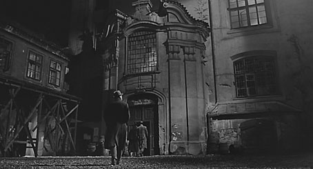
Screening Kafka

kafka1.jpg

Kafka (1991).

This week I completed the interior design for a new anthology from Tachyon, Kafkaesque, edited by John Kessel and James Patrick Kelly. It’s a collection of short stories either inspired by Franz Kafka, or with a Kafka-like atmosphere, and features a high calibre of contributions from writers including JG Ballard, Jorge Luis Borges, Carol Emshwiller, Jeffrey Ford, Jonathan Lethem and Philip Roth, and also the comic strip adaptation of The Hunger Artist by Robert Crumb. When I knew this was incoming I rewatched a few favourite Kafka-inspired film and TV works, and belatedly realised I have something of a predilection for these things. What follows is a list of some favourites from the Kafkaesque dramas I’ve seen to date. IMDB lists 72 titles crediting Kafka as the original writer so there’s still a lot more to see.


wellestrial.jpg

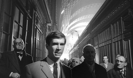
The Trial (1962), dir: Orson Welles.

Orson Welles in one of his Peter Bogdanovich interviews describes how producer Alexander Salkind gave him a list of literary classics to which he owned the rights and asked him to pick one. Given a choice of Kafka titles Welles says he would have chosen The Castle but The Trial was the only one on the list so it’s this which became the first major adaptation of a Kafka novel. Welles always took some liberties with adaptations—even Shakespeare wasn’t sacred—and he does so here. I’m not really concerned whether this is completely faithful to the book, however, it’s a first-class work of cinema which shows Welles’ genius for improvisation in the use of the semi-derelict Gare d’Orsay in Paris as the main setting. (Welles had commissioned set designs but the money to pay for those disappeared at the last minute.) As well as scenes in Paris the film mixes other scenes shot in Rome and Zagreb, with Anthony Perkins’ Josef K frequently jumping across Europe in a single cut. The resulting blend of 19th-century architecture, industrial ruin and Modernist offices which Welles called “Jules Verne modernism” continues to be a big inspiration when I’m thinking about invented cities. Kafka has been fortunate in having many great actors drawn to his work. Here with Perkins there’s Welles himself as the booming and hilarious Advocate, together with Jeanne Moreau, Romy Schneider and Akim Tamiroff.


brazil.jpg

Brazil (1985), dir: Terry Gilliam.

Having watched Brazil again recently I was struck by how much it resembles the popular view of Kafka’s worlds rather than the Orwellian nightmare which Terry Gilliam first intended. The story is powered by a bureaucratic error caused by a crushed insect, after all, and Gilliam follows Welles in mashing up the styles and motifs of an authoritarian century to create a hybrid world he described as being “on the Belfast/Los Angeles border”. Tom Stoppard had a hand in the screenplay, and there’s another great cast with Jonathan Pryce, Katherine Helmond and Ian Holm. Also a nod to an Orson Welles role with the character named Harvey Lime.


insuranceman.jpg

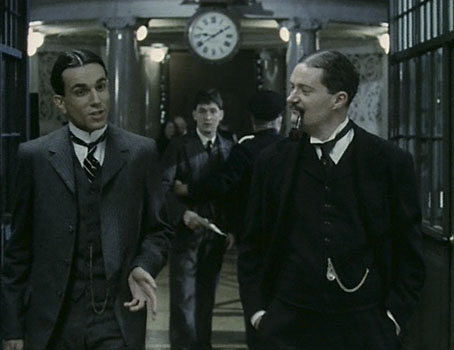
The Insurance Man: Daniel Day-Lewis, Robert Hines & Jim Broadbent.

The Insurance Man (1986), dir: Richard Eyre.

Jim Broadbent played a plastic surgeon in Brazil; here he’s a clerk in the offices of the Worker’s Accident Insurance Institute in Prague. Writer Alan Bennett was preoccupied with Kafka in the mid-1980s: his stage play, Kafka’s Dick (the title does indeed refer to the writer’s penis), was staged the same year as this TV film directed by Richard Eyre, a 70-minute drama which sees a young factory worker trying to find a cure for an industrial illness at the Insurance Institute where one “Doctor Kafka” is employed. Needless to say, his quest for health and some measure of justice becomes Kafkaesque. Kafka here is portrayed by Daniel Day-Lewis in a typically enthralling performance which is never mannered but makes him seem a stranger creature (and a more sympathetic clerk) than his fellow workers. Most of this was filmed in Liverpool in some wonderful old office buildings using a sombre blue/grey palette. As with all Bennett’s dramas the dialogue is a treat. The film is now available on DVD in the Alan Bennett at the BBC collection.


metamorphosis.jpg

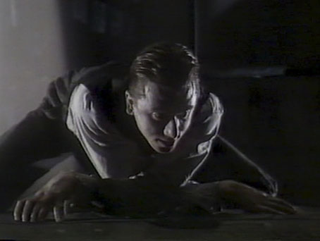
Tim Roth as Gregor Samsa.

Metamorphosis (1987), dir: Jim Goddard.

Another TV drama based on one of Steven Berkoff’s three stage adaptations of Kafka in which he also plays the part of Mr Samsa. Berkoff’s preference for physical theatre means there are no insect suits or special effects here, Gregor Samsa’s insectile nature is conveyed entirely through Tim Roth’s energetic performance, with shrieks, twisted limbs, and a climbing frame for when he needs to scuttle up the wall or hang from the ceiling. Not available on DVD but it’s scattered around YouTube if you can be bothered.


berkofftrial.jpg

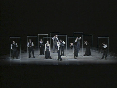
The Trial (1991), dir: Steven Berkoff.

Another Berkoff adaptation which is available on DVD from his own company. As with his Salome, this is a filmed stage performance and highly recommended for its fidelity to the book, although of the two I prefer the Oscar Wilde play. Berkoff’s great innovation is the bare stage where the only props are a couple of chairs and a number of tall metal frames, one for each performer, which the actors use to create doors, windows, picture frames and even a series of moving corridors. Berkoff himself plays Titorelli the painter as a hyperactive Dalí type.


kafka2.jpg

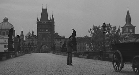
Kafka (1991), dir: Steven Soderbergh.

A cult film of mine which I’ve written about before so there’s no need to go into great detail. It’s a shame that Daniel Day-Lewis couldn’t have played Kafka in this one instead of Jeremy Irons who does a decent job but always seems slightly wrong for the part. Ian Holm in Brazil had a role named after Terry Gilliam’s MAD-magazine mentor Harvey Kurtzman; here Holm is named after one of the great silent film directors in the role of the enigmatic Doctor Murnau. Shot on location in Prague.


franzkafka.jpg

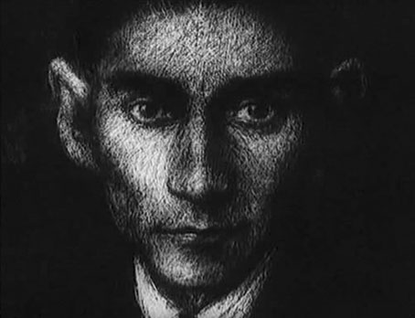
Franz Kafka (1992), dir: Piotr Dumala.

After all the fake Kafkas, something which is at least close to genuine article in a short and wordless animated film by Piotr Dumala. Can be watched in its entirety here.


zoetrope.jpg

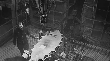
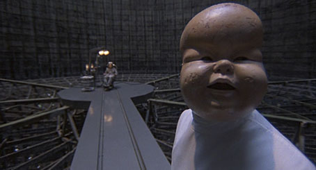
Zoetrope (1999), dir: Charlie Deaux.

Kafka’s In the Penal Colony is moved from its sun-blasted location to what looks like the interior of a power station in Charlie Deaux’s frenetic adaptation. The emphasis is very much on the industrial with the film nodding as much to David Lynch as Franz K. (And whatever happened to David Lynch’s proposed adaptation of The Metamorphosis?) The rumbling, clanging soundtrack by Lustmord provides the requisite Alan Splet-like atmospherics. Available on DVD from Soleilmoon.

Previously on { feuilleton }
Die Andere Seite by Alfred Kubin
Designs on Kafka
The Hourglass Sanatorium by Wojciech Has
Kafka’s porn unveiled
A postcard from Doctor Kafka
Alexandre Alexeieff and Claire Parker
Hugo Steiner-Prag’s Golem
Steven Soderbergh’s Kafka
Kafka and Kupka

Ten titles and a cover

cdlcover.jpg

The Very Best of Charles de Lint. Art by Charles Vess.

Over the weekend I found the time to finally update the book design section of the site, adding new pages for most of the titles I’ve been working on recently. There’s still a couple of things missing but I’ll add those in due course. Many of these design jobs have been for the interiors only so what follows is a comparison of title spreads from books I’ve worked on that have been published this year. Lest it seem that I have an army of clones at my service it should be emphasised that I was working on several of these last year (and Engelbrecht was completed in 2008) but the nature of release schedules means they all carry 2010 publication dates.

sr.jpg

Steampunk II: Steampunk Reloaded, edited by Ann & Jeff VanderMeer.

I invariably make a feature of title pages, usually creating them as a spread in order to heighten their impact. The title page is a kind of gateway to the rest of the book which gives you an opportunity to establish a mood for what follows. It’s also the area where you can be most lavish with your graphic treatment and, where necessary, add illustrative material without worrying too much about intruding on the content. With a number of these designs I was following typographic choices from pre-designed covers so the challenge was to find something that would match the cover and connect to the rest of the interior. The Charles de Lint book was a variation on this process in that the author had chosen a Charles Vess drawing for the cover art. I designed a cover to accommodate the drawing then carried the design inside. The colours were chosen to match Vess’s artwork while the general Art Nouveau style came from an Alphonse Mucha poster he’d placed on the wall. With a different cover picture the entire book would have had a very different design.

pkd.jpg

The Search for Philip K Dick by Anne R Dick.

Continue reading “Ten titles and a cover”

Steampunk Reloaded

sr00.jpg

Cover design by Ann Monn. Cover image by Dan Jones / Tinkerbots.

Here at last is the steampunk anthology I mentioned back in September and whose interiors I designed. This is another Tachyon publication, and also another anthology edited by Ann & Jeff VanderMeer. I went further with the design for this than I have done for other Tachyon books, partly because if there’s one thing steampunk lends itself to, it’s decoration but also because the book includes illustrations from Ramona Szczerba, Eric Orchard, and others, plus a comic strip by Sydney Padua; adding extra spot illustrations stopped the pictorial material from seeming too isolated.

sr01.jpg

Title spread. The illustration on the left is one I created last year.

This is a sequel to an earlier steampunk anthology by the same editors but the contents are just as strong as the first collection with excellent stories throughout. (For a review, see here.) By coincidence the book is published in the wake of a recent (and inevitable) backlash against steampunk as science fiction sub-genre and cultural phenomenon. This collection can serve as a repudiation to some of the lazier accusations that writers are ignoring the moral and physical squalor of the Victorian era and the legacies of imperialism; several stories in Steampunk Reloaded address those very issues. For my part I’ve read Friedrich Engels’ Condition of the Working Class in England, Henry Mayhew’s London Labour and the London Poor, and Kellow Chesney’s The Victorian Underworld so I don’t feel in urgent need of a lecture on the iniquities of the 19th century, thank you very much.

sr02.jpg

While we’re on the subject, the cover of The Steampunk Bible, edited by Jeff VanderMeer and SJ Chambers, has been revealed here. Abrams will be publishing this next year and having seen some of the interior pages it’s going to be a splendid book. More about that later. Further pages from Steampunk Reloaded follow.

Update: A couple more reviews here and here.

sr03.jpg

Contents spread.

sr04.jpg

sr05.jpg

sr09.jpg

A detail of one of the page footers.

sr06.jpg

Title page for A Secret History of Steampunk, a self-contained section within the body of the book.

sr07.jpg

sr08.jpg

Previously on { feuilleton }
Steampunk overloaded!
Skeleton clocks
Vickers Airship Catalogue
The Air Ship
Dirigibles
More Steampunk and the Crawling Chaos
The art of François Schuiten
Steampunk Redux
Steampunk framed
Steampunk Horror Shortcuts
The Airship Destroyer
Zeppelin vs. Pterodactyls

Steampunk overloaded!

infernal.jpg

Yes, it’s the “S” word again, and if there was any doubt that this has been the Year of Steampunk here at Coulthart Towers, look at these recent works. And this is by no means everything I’ve been doing in this area, there’ll be further announcements later on.

The covers for KW Jeter’s novels are a pair of reprintings from UK publisher Angry Robot whose books will shortly be available in the US and Canada. Jeter is now famous—infamous, perhaps—for having given the word “steampunk” to the world in the early 1980s. This was intended as a jest after he and a couple of other writers (including a favourite of mine, Tim Powers) had written a number of science fiction novels set in the 19th century; like many light-hearted neologisms, it gained a life of its own. Angry Robot are reissuing two of these early works as a result of the ongoing steampunk explosion.

morlock.jpg

Morlock Night (1979) is a pulpy affair which sees the Morlocks from HG Wells’ The Time Machine using the Time Traveller’s vehicle to return to Victorian London and wreak no end of havoc. Infernal Devices (1987) is a rather more substantial confection involving a great deal of clockwork mechanisms (for once the clock parts are justified!), automata, fish people, and a device capable of destroying the earth. I’ve been producing a lot of engraving collage à la Ernst and Sätty recently but the technique seemed especially appropriate here as a means of illustrating works which themselves are collages of Victorian motifs.

zeppelins.jpg

Meanwhile, over at Tachyon Publications, there’s this cover for another Victorian adventure, two in fact, from master beserker Joe R Lansdale. Flaming Zeppelins combines a pair of comic adventures, Zeppelins West (2001) and Flaming London (2006), which feature a host of notable figures including Mark Twain, Annie Oakley, Buffalo Bill Cody…and a talking seal. Publication date is November 1st.

steampunk.jpg

Then from Tachyon in mid-November there’ll be Steampunk II: Steampunk Reloaded, a 430-page anthology edited by Ann & Jeff VanderMeer which includes fiction and non-fiction from William Gibson, Caitlín R Kiernan, Jeffrey Ford, Cherie Priest, and many others. Also a comic strip, copious illustrations and a very full-on interior design from yours truly of which I’ll only show you the above page for the time being. Yes, that’s a mechanical ostrich but if you want to know what it’s doing there you’ll have to read the book. More about this later. And more later about The Steampunk Bible to which I’m also a contributor, a glossy, full-colour guide to the entire sub-culture which will be published next year by Abrams. By the time that appears I’ll probably be sick of the sight of clockwork parts, dirigibles, florid typefaces and Victorian decoration; I’ll be needing a good dose of Helvetica and Josef Müller-Brockmann minimalism to calm down.

Previously on { feuilleton }
Skeleton clocks
Vickers Airship Catalogue
The Air Ship
Dirigibles
More Steampunk and the Crawling Chaos
La route d’Armilia by Schuiten & Peeters
The art of François Schuiten
Steampunk Redux
Steampunk framed
Steampunk Horror Shortcuts
The Airship Destroyer
Zeppelin vs. Pterodactyls

Design as virus 12: Barney’s faces

lowe.jpg

Sleeve for I Love The Sound Of Breaking Glass (1978), a 7″ single by Nick Lowe. Design by Barney Bubbles.

Continuing an occasional series. Designer Vic Fieger had a guest post at Reasons To Be Cheerful earlier this week examining Barney Bubbles’ use of the human face in his graphic designs. This is one side of the Bubbles work I really enjoy, he had a remarkable facility for demonstrating a versatility with abstract shapes—or found objects, as in the piece above—while playing games with our pattern recognition. A recurrent playfulness was one of the many notable things about his approach to design.

colour.jpg

Story title from The Best of Michael Moorcock (2009).

Fieger’s focussing on the faces in Barney’s work struck a chord for me since I’d deliberately tried something similar last year, taking a cue from Barney’s example. The Colour piece above is one of the story titles from The Best of Michael Moorcock published by Tachyon. For each story I designed a different title in a style which complemented the subject; Colour is a science fiction piece in which card games figure, hence the symbols. Mike Moorcock was friends with Barney during the 1970s so there was an additional reason for the reference.

booklife.jpg

I don’t know whether anyone has noticed the face on the cover of Booklife but it is there, with the two flowers at the top forming the eyes and the book’s title standing for the mouth. Once again, this wasn’t strictly necessary for the success of the design but it gave a rationale for the arrangment of the flowers. There’s also the hope when something is this subtle that the attraction of the pattern impells a browser to pick up the book in a shop without quite knowing why.

Booklife and The Best of Michael Moorcock are both available from Tachyon. Paul Gorman’s Barney Bubbles book, Reasons To Be Cheerful: The Life & Work Of Barney Bubbles, will be relaunched later this year in a new edition.

Previously on { feuilleton }
Into the Media Web by Michael Moorcock
Design as virus 11: Burne Hogarth
Design as virus 10: Victor Moscoso
Design as virus 9: Mondrian fashions
The Best of Michael Moorcock
Design as virus 8: Keep Calm and Carry On
Designing Booklife
Design as virus 7: eyes and triangles
Design as virus 6: Cassandre
Design as virus 5: Gideon Glaser
Design as virus 4: Metamorphoses
Design as virus 3: the sincerest form of flattery
Design as virus 2: album covers
Design as virus 1: Victorian borders
Barney Bubbles: artist and designer