Two covers

patel1.jpg

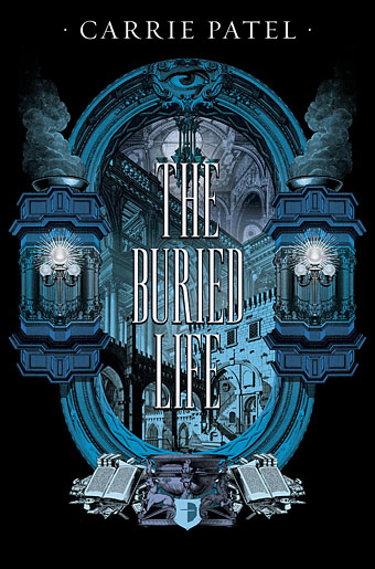
More new work of mine has been unveiled in the past few days so I can show these here. The Buried Life and Cities and Thrones are a pair of fantasy novels by new author Carrie Patel being published by Angry Robot. I was asked to provide something in an engraved style set against a black background, with imagery that reflected themes of vast, underground architecture and armed conflict.

patel2.jpg

Vast architecture of any description is something I’ve always enjoyed, the main challenge with each book came in trying to imply the architecture and events without the pictorial content becoming incoherent. Marc at Angry Robot asked for something Piranesian where the architecture was concerned. Looking over Piranesi’s non-Carceri designs didn’t turn up anything with a suitably dramatic perspective, however, so most of what you see in the first cover comes from Giuseppe Galli Bibiena’s Architetture e Prospettive (1740). The Bibienas were a family of architects and theatrical engineers who specialised in dizzying perspective views for their stage designs; Bibiena’s book was produced to preserve some of his more celebrated designs, the originals of which are now lost. I’ve had a book of these drawings for years but this is the first opportunity I’ve had to make use of them in any kind of collage.

patel3.jpg

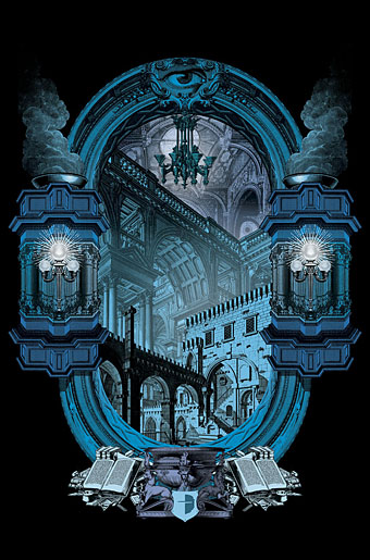
This style of Baroque architecture doesn’t suit steampunk imagery which tends towards 19th-century urban/industrial; the plates are also rather staid scenes without the graphic flare that Piranesi gave to everything he rendered, real or imagined. But I do like those plunging perspectives, and pieces from two of the plates turned out to share both the same perspective and the same lighting direction. It’s easy to collage things into a flat view but creating a realistic sense of depth from bits and pieces can be tricky.

patel4.jpg

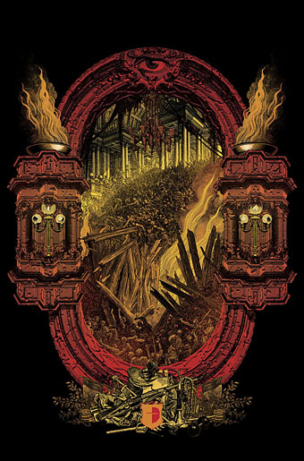
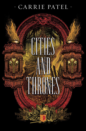
The frame for the second cover has more of a Piranesian quality being chipped and eroded. The typography for the titles went through several changes, the versions here show a late suggestion of mine with lettering that’s probably too thin to read well at a distance (or a small size on a web page). SF Signal has a post showing the Angry Robot versions which will probably be the final ones, together with a preview of the first book.

Previously on { feuilleton }
Aldous Huxley on Piranesi’s Prisons

Steampunk: The Art of Victorian Futurism

steampunk.jpg

Those who were wishing a few years ago that steampunk would crawl into a hole and quietly die must be gnashing their teeth at the way the sub-genre continues to flourish. (See Pinterest for examples from the increasingly wild world of steampunk fashion.) If anyone reading this is visiting Seoul in the next couple of months—or even living there—then they’ll find some of my book covers on display at Artcenter IDA. Steampunk: The Art of Victorian Futurism is a look at the wide range of steampunk aesthetics, from graphic works to three-dimensional constructions, clothing, and so on. I’d like to credit the promotional design above but I’m not sure who’s responsible. Good type design whoever it was.

jeter.jpg

Five of my covers are on display, including the three I’ve done for KW Jeter’s novels. Mr Jeter, as mentioned before, is the man who first coined the term “steampunk” in the 1980s. This isn’t the first time my artwork has appeared in South Korea—when I was painting cards for Magic: The Gathering in the 1990s there were Korean editions printed—but it is the first time anything of mine has been exhibited there. The exhibition runs to mid-May.

Previously on { feuilleton }
Steampunk Calendar
Words and pictures
Nathanial Krill at the Time Node
Fiendish Schemes
Ghosts in Gaslight, Monsters in Steam
Steampunk Revolution
The Bookman Histories
Aether Cola
Crafting steampunk illustrations
SteamPunk Magazine
Morlocks, airships and curious cabinets
The Steampunk Bible
Steampunk Reloaded
Steampunk overloaded!
More Steampunk and the Crawling Chaos
Steampunk Redux
Steampunk framed
Steampunk Horror Shortcuts

Steampunk Calendar

00steampunkcalendar.jpg

This one arrives two months late, the months of October and November being overly preoccupied with other work. I chose a steampunk theme for this year since this has been a productive area recently. The idea was one of those simple notions—rework some book covers into calendar pages—that in practice ended up taking much longer than anticipated. Larger copies of the pages may be seen here while the CafePress purchase page is here. My thanks to everyone who’s been buying things recently.

For those who dislike over-decorated 19th-century science fiction but may still want a Coulthart calendar there’s the Cthulhu Calendar (still a popular item), the Psychedelic Wonderland calendar, and the Through the Psychedelic Looking-Glass calendar. Note: Calendars at CafePress can now be purchased throughout the year so make sure that you select January as the starting month if you want the months to run for a single year only.

01steampunkcalendar.jpg

02steampunkcalendar.jpg

03steampunkcalendar.jpg

Continue reading “Steampunk Calendar”

Lovecraft’s Monsters

Lovecraft's Monsters

Graphic for the title page and ends of chapters.

I don’t usually post things so far away from publication, but editor Ellen Datlow put these pictures on her Facebook page a few hours ago so I may as well do the same here.

Back in February I bought a Wacom Intuos drawing tablet, something I’ve been using with regularity for the past few months. The Alas Vegas Tarot cards I designed in the summer were the first major attempt at getting used to working with it; Lovecraft’s Monsters, a forthcoming fiction anthology for Tachyon is the second, and I now feel very comfortable working with it. More than that, I’m increasingly pleased with the way it’s possible to combine the drawing techniques I’ve been using for years with the additional possibilities provided by working in Photoshop. As always, it’s the end result that counts but arriving at an end result can be easy or difficult. Some of these illustrations look no different than they would have done had I used ink on paper but they took half the time to create, a considerable benefit when a deadline is looming.

The stories Ellen Datlow has chosen for this collection all present different aspects of monstrosity seen through the lens of Lovecraft’s fiction and his cosmic menagerie. Some are full-on extensions of the Mythos, others are more allusive; all the pieces bar one have been published before but I’d not read any of them so for me this was fresh material. Having spent the past few years saying I was finished with Lovecraft’s fiction I was excited to be working on this book. The stories are good, and I welcomed the challenge of having to illustrate such a variety of material.

Larger copies of all the pictures can be seen here.

The star-headed thing at the top of this page is another amalgam of elements plundered from Haeckel’s Kunstformen der Natur and other sources. I’ve leaned rather heavily on Haeckel in the past, something I wanted to avoid here; this serves as a kind of visual punctuation separating the stories.

Lovecraft's Monsters

Cthulhu.

The drawing I’ve called Cthulhu is a piece for the introductory pages. Having already produced a lot of Cthulhoid art I didn’t want to repeat myself. The initial idea was of a tiny human figure faced with something enormous and nightmarish; that could be a vast eyeball or it could be a mouth or some other organ/aperture, the vagueness was intentional. Lovecraft continually impresses upon his readers how difficult things are to describe or apprehend but you seldom find this quality in art based upon his stories. Cthulhu especially has devolved into little more than an outsize man-in-a-rubber-suit à la the Creature from the Black Lagoon. In The Call of Cthulhu the figure on the mysterious statuette is described as having a humanoid shape but Lovecraft doesn’t describe the appalling reality in any detail at all. When Cthulhu is struck by a ship at the end of the story it breaks apart and is then seen recombining, the implication being that the creature is corporeally amorphous.

Lovecraft's Monsters

Only the End of the World Again by Neil Gaiman.

Neil Gaiman’s entry concerns a werewolf private detective in Innsmouth. Lovecraft’s decaying fishing village and its inhabitants turn up in several of the stories so care was taken to avoid repetition.

Lovecraft's Monsters

Bulldozer by Laird Barron.

A great story about another detective, a Pinkerton agent this time, hunting his quarry through the Old West. Collin de Plancy’s Dictionnaire Infernal is mentioned so I used some of Louis Breton’s illustrations from the third edition.

Continue reading “Lovecraft’s Monsters”

Weekend links 187

delia.jpg

Delia Derbyshire (2007) by Iker Spozio.

Whatever you think of Doctor Who, Delia Derbyshire’s recording of Ron Grainer’s theme tune is a landmark piece of electronic music. Those glassy electronic tones still sound unique today, not least for their having been created using rudimentary oscillators and much laborious tape editing. In Radiophonic Workshop: the shadowy pioneers of electronic sound, Joe Muggs looks at the history of the BBC’s electronic composers. If you’re a Radiophonic-head then the Alchemists of Sound TV documentary from 2003 is essential viewing.

There’s more (there’s always more): Delia Derbyshire – Sculptress of Sound: part one of a seven-part radio documentary about the great electronic music composer, and Blue Veils and Golden Sands, Martyn Wade’s radio play about Delia. Related: Delia-Derbyshire.org, Delia Derbyshire: An audiological chronology and A History of the Doctor Who theme. And don’t miss: Silence Is Requested In The Ultimate Abyss (1969) by Welfare State and White Noise, an incredible slice of electro-psychedelia from the John Peel Presents Top Gear album.

• “Why don’t books for grown-ups have illustrations any more?” asks Christopher Howse. Some of them do, this past week I’ve been finishing a new series of illustrations for a story anthology.

• From 2006: Ian Penman on cigarettes, espionage, and the masterful (and superior) television adaptation of Tinker, Tailor, Soldier, Spy.

It was Malcolm [McLaren] who suggested that the main characters be a boy who looks like a girl who looks like a boy and vice versa. What was strange was that, actually, in 1985 this was nobody’s vision of the fashion industry. Since then, fashion and fascism have crept closer: you’ve got John Galliano doing his promotional bits for the Third Reich, you’ve got Alexander McQueen killing himself, you’ve got Versace and that horrible, violent stalker coming for him. Since it was written, almost all of it has come true apart from the nuclear winter, but I think we’re working on that. The actual society that the story happens in is much more like the society we have now than culture was in 1985.

Alan Moore on Fashion Beast, Situationism, and why he hates superheroes.

• KW Jeter talks about his latest novel, Fiendish Schemes, and the “cultural juggernaut” that is steampunk.

• Grit and Social Dynamics in Smoke Ghost: Elwin Cotman on the weird fiction of Fritz Leiber.

The Secret Lives of the Vatican’s Gay Cardinals, Monks, and Other Clergy Members.

Don Cherry & Organic Music Theatre, live in the RAI TV studios, 1976.

• Otherworldly Art and Photography: Mlle Ghoul finds the best things.

• From 1998: Rahma Khazam on composer Bernard Parmegiani.

• Mix of the week: Marshland: The Mix by Hackneymarshman.

• “Let’s colonize the clouds of Venus,” says Ian Steadman.

J. Hoberman on David Cronenberg’s Visual Shock.

The Delian Mode (1968) by Delia Derbyshire | Tom Baker (1981) by The Human League | Doctor Who? (1984) by Doctor Pablo & The Dub Syndicate