Forget Me Not (no date) by Caitlin Hackett.
• Halloween brings out the articles about weird fiction: “No one would now write of [HP Lovecraft] as the critic Edmund Wilson did, in the New Yorker in 1945: ‘The only real horror in most of these fictions is the horror of bad taste and bad art.’ The true horror was in fact that of judging Lovecraft by the standards of a defunct literary culture,” says John Gray. At The Atlantic there’s Jeff VanderMeer on the uncanny power of weird fiction, while Matt Seidel at The Millions explores the mysteries and attractions of Robert Aickman’s “strange stories”.
• The Witching Hour is a video essay by Pam Grossman “examining the many different faces of witches in film”. Pam’s video opens with a scene from Suspiria; over at FACT, Goblin’s Claudio Simonetti talks about the creation of Suspiria‘s peerless soundtrack.
• David Rudkin and Alan Clarke’s uncanny television film, Penda’s Fen, is given a 40th anniversary screening later this month at the Horse Hospital, London. For those who can’t attend (and those who haven’t already read it) there’s my post from 2010.
Nabokov sees each day’s weather as a palette: “The weather this morning was soso: dullish, but warm, a boiled milk sky, with skin – but if you pushed it aside with a teaspoon, the sun was really nice, so I wore my white trousers”. He listens carefully to the sound of the rain, which his letters brilliantly orchestrate. He provides fantastic descriptions of puddles, some of which contain shifts in perspective reminiscent of the nearly cinematic transitions found in the novel he would write shortly afterwards, King, Queen, Knave:
“I looked out of the window and saw: a red-haired housepainter caught a mouse in his wheelbarrow and killed it with the stroke of a brush, then he tossed it in a puddle. The puddle reflected the dark-blue sky, quick black upsilons (reflections of swallows flying high) and the knees of a squatting child, who was attentively studying the little grey round corpse.”
Eric Naiman on Vladimir Nabokov’s Letters to Véra
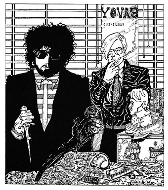
• Occult rock: Peter Bebergal talks to Expanding Minds about his new book, Season of the Witch: How the Occult Saved Rock and Roll. There’s an hour-long film of Black Sabbath saving rock and roll in Paris, 1970, here.
• Mixes of the week: Burning The Existence, “a three-hour sonic exploration of the outer fringes of Goth”, and a horror soundtrack mix by Death Waltz.
• “‘Capital loathes the old,’ [Gareth] Evans said, ‘for anchoring us in the reality of the lived.'” Iain Sinclair on London’s lost cinemas.
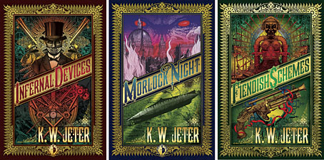
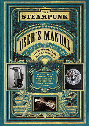
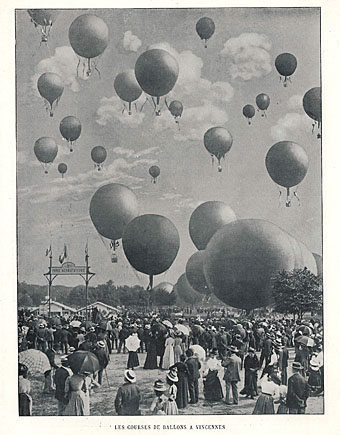
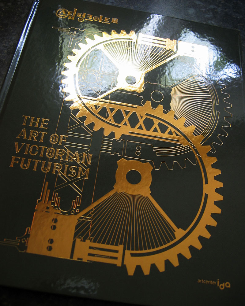
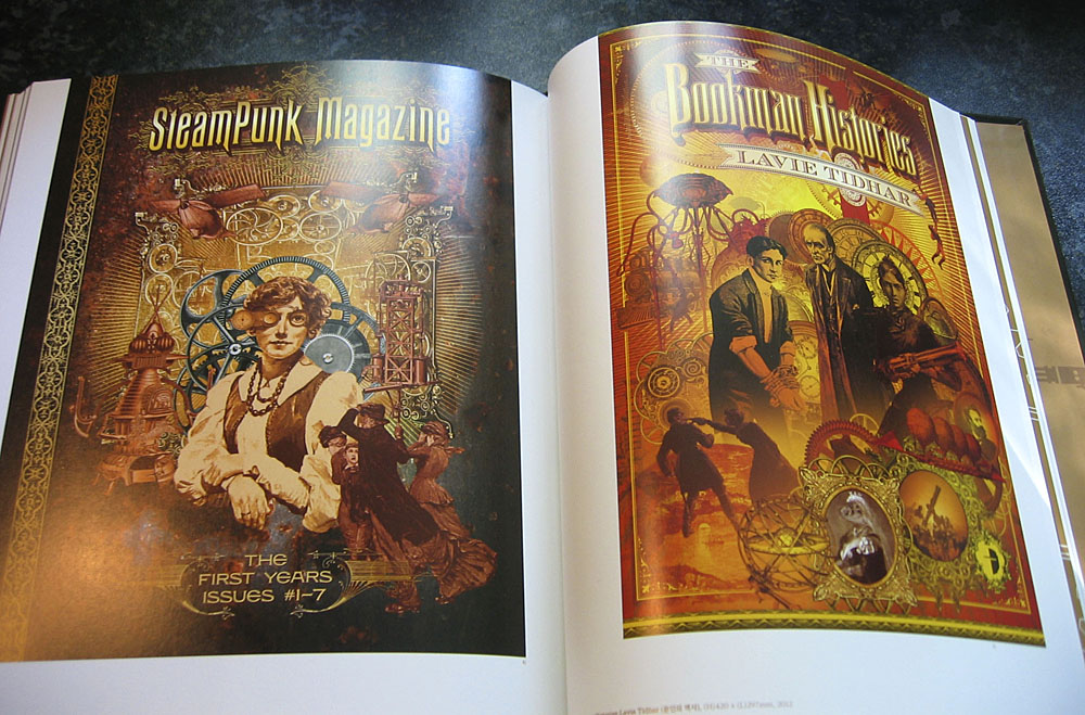
• Desirina Boskovich, co-editor of the Steampunk Users Manual, offers “7 Reasons Why Steampunk Is Totally ‘Now'”.
• Penguin has new collage covers by Julian House for The Cut-Up Trilogy by William Burroughs.
• Hear a homemade synthesizer turn weather into music.
• Grotesque doodles by William Makepeace Thackeray.
• full fathom five is Thom’s new blog.
• Weird Dream (1976) by Harmonia 76 | Weird Caravan (1980) by Klaus Schulze | Weird Gear (1991) by Ultramarine