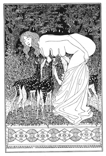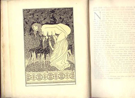
Pages from Der Amethyst (1906) showing Reh-Inkarnation by Thomas Theodor Heine.
Okay, don’t get too excited, I simply wanted to make a couple of points of order while this story is still causing a stir. I noted earlier the recent (London) Times piece about James Hawes’ new book, Excavating Kafka, described as a work which:
seeks to explode important myths surrounding the literary icon, a “quasi-saintly” image which hardly fits with the dark and shocking pictures contained in these banned journals.
Hawes claims to have been surprised, if not shocked, by the discovery—new to him but not to Kafka scholars, it seems—of Kafka’s collection of Franz Blei publications, The Amethyst and Opals. Blei published Kafka’s short stories as well as other literary works and fits the mould of many small publishers (Leonard Smithers and Maurice Girodias come to mind) who financed poorly-selling literature with erotic titles. Kafka may well have been “paid” for his writing with these books. However:
Even today, the pornography would be “on the top shelf”, Dr Hawes said, noting that his American publisher did not want him to publish it at first. “These are not naughty postcards from the beach. They are undoubtedly porn, pure and simple. Some of it is quite dark, with animals committing fellatio and girl-on-girl action… It’s quite unpleasant.”
Read the rest of the breathless saga here. The Times doesn’t show any of the pictures in that piece but the paper edition showed a drawing which looked like the usual erotica of the period, a slightly cruder version of the kind of thing done so well by artists like Franz von Bayros. So not photographs, then, but drawings. Sure enough, descriptions of Blei’s books list well-known names such as Aubrey Beardsley, Alfred Kubin, Thomas Theodor Heine, Karl Hofer, Félicien Rops, and von Bayros. Yesterday’s Guardian examined some of the reaction to Hawes’ assertions from other Kafka scholars which is generally hostile, their counter-assertion being that he’s making a mountain out of a molehill. That piece includes another description of the depraved contents:
They include images of a hedgehog-style creature performing fellatio, golem-like male creatures grasping women’s breasts with their claw-like hands and a picture of a baby emerging from a sliced-open leg.
Hmm…Beardsley, sliced-open leg? That could only be Aubrey’s illustration for Lucian’s True History. Sensitive readers may wish to avert their gaze.
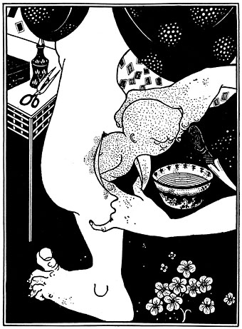
Birth from the Calf of the Leg. Illustration intended for Lucian’s True History (1894). Not used, but published in An Issue of Five Drawings Illustrative of Juvenal and Lucian by Leonard Smithers, London (1906).
Shocking stuff. Allow me to veer from the point for a moment with Beardsley scholar Brian Reade’s explanation of that drawing:
This illustration (was) rejected from the 1894 and 1902 editions of Lucian’s True History. At the time when it was drawn the artist was obsessed by foetuses and irregular births; creatures derived from the foetus form occur in the Bon-Mots series, in The Kiss of Judas, in Salome and elsewhere. That he chose to illustrate this subject suggests that there may have been a latent strain of homosexuality in Beardsley. Lucian describes in his True History the way in which children are born in the kingdom of Endymion on the Moon. “They are not begotten of women, but of mankind: for they have no other marriage but of males: the name of woman is wholly unknown among them: until they accomplish the age of five and twenty years, they are given in marriage to others: from that time forwards they take others in marriage to themselves: for as soon as the infant is conceived the leg begins to swell, and afterwards when the time of birth is come, they give it a lance and take it out dead: then they lay it abroad with open mouth towards the wind, and so it takes life: and I think thereof the Grecians call it the belly of the leg, because therein they bear their children instead of a belly”. Lucian also explains that “their boys admit copulation, not like unto ours, but in their hams, a little above the calf of the leg for there they are open”.
The other drawings mentioned by the Guardian don’t sound familiar but may well be by Alfred Kubin who produced a number of curious erotic pieces, one of which is in my Art of Ejaculation post. Meanwhile Die Welt Online reproduces some of the Félicien Rops pictures in a small gallery, all of which are rather innocuous depictions of prostitutes.
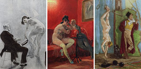
Rops could be a lot weirder and wilder than this. (See his Octopus drawing of 1900.) I haven’t seen Hawes’ book yet, but going on this evidence it seems the Kafka scholars may have a point about his inflated claims. Much of this work was shocking at the time, of course, and open publication of some of it would have been an invitation to an obscenity prosecution. But I’ll let the Kafka scholars haggle over Franz’s reputation, quasi-saintly or not; the main point for me was that the works in question are very familiar to anyone who knows the art of the period. So in place of rancour, here’s a nice homoerotic painting by another of the artists published by Blei, Karl Hofer, in style and colour reminiscent of Picasso’s Rose Period pictures.
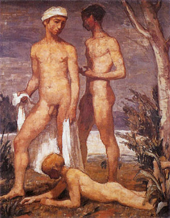
Drei Badende Jünglinge by Karl Hofer (1907).
Update: this volume finally turned up in the Savoy Books office so I was able to look through it. The Beardsley picture above is indeed among the very few examples of “Kafka’s porn”, used without any credit and Beardsley receives no mention in the index. There’s also a Félicien Rops drawing with a caption which says it “may be Victorian”, along with a couple of other pieces, all equally uncredited. Yes, that’s the level of the scholarship at work here; the author couldn’t even be bothered to research the art in question. Summary: worthless.
Previously on { feuilleton }
• A postcard from Doctor Kafka
• Alexandre Alexeieff and Claire Parker
• Hugo Steiner-Prag’s Golem
• Steven Soderbergh’s Kafka
• Kafka and Kupka
• The art of ejaculation
• The art of Félicien Rops, 1833–1898
 Thomas Disch castigating a science fiction readership which often regarded his work with a disdain born of narrow expectations. Disch (left), who took his own life a few days ago, was one of the
  NEW YORK, city of contrasts! Here we are on Fourteenth Street, walking past The New School Graduate Faculty, a clean modern building. Inside it today there is a fine museum exhibit of surreal landscape photography, but the drapes are permanently closed across the windows because, out here on the stained sidewalk, just the other side of the plate-glass, it’s Filth City, peopled by the usual cast of winos, monte dealers. shopping-bag ladies festooned in rags and mumbling obscenities, addicts nodding out and falling off fire hydrants. Fourteenth Street, clientele from Puerto Rico, merchandise from Taiwan. And what merchandise! In stores as garish and impermanent as sideshows at a cheap carnival, here are plastic dinner-plates and vases, plastic toys, plastic flowers and fruit, plastic statues of Jesus, plastic furniture, plastic pants and jackets-all in Day-Glo colors, naturally. And outside the stores are dark dudes in pimp-hats and shades, peddling leather belts, pink and orange wigs, and afro-combs… itinerant vendors of kebabs cooked over flaming charcoal in aluminium handcarts… crazy old men selling giant balloons.., hustlers of every description. And further on, through the perpetual fanfare of disco music and car horns, past the Banco Populare, here is Union Square, under the shadow of the Klein Sign. Klein’s, a semi-respectable old department store, was driven out of business by the local traders and has lain empty for years. But its falling apart facade still looms over the square, confirming the bankrupt status of the area. While in the square itself—over here, brother, here, my man, I got ’em, loose joints, angel dust, hash, coke. THC, smack, acid, speed, Valium, ludes. Seconal. Elavil!