Soviet posters

lenin.jpg

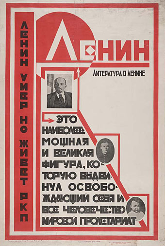
“Lenin is dead but the Russian Communist Party lives on” (no date).

More typography and yet more Soviet poster art which seems perennially popular with graphic designers. Bold Constructivist designs like this example are part of the reason why: over 80 years old yet still striking. Type foundry P22 have a set of Constructivist fonts similar to the typeface used here. Poster tip via Coudal.
siegheil.jpg

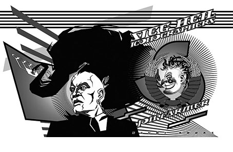
Sieg Heil Iconographers, title spread (2006).

I plundered the Soviet style in 2006 for the design of Jon Farmer’s Sieg Heil Iconographers for Savoy Books. The typeface this time was Jonathan Barnbrook’s contemporary design, Newspeak. Does the assertive bad taste of the book’s title undermine the Communist propaganda or do the Agitprop graphics ironically counterpoint the discussion of fascist history within? That’s left for the reader to decide.

Previously on { feuilleton }
Lenin Rising
Dead Monuments
Soviet ceramics of the 1920s
Enormous structures II: Tatlin’s Tower
New things for December

lord_horror.jpg

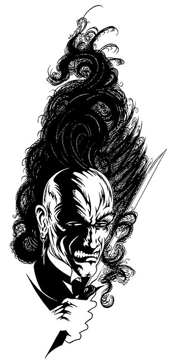
Lord Horror (1997).

Time for an end of year news round up.

• As mentioned earlier, issue 11 of US horror magazine Penny Blood features a look at Savoy Books and David Britton’s Lord Horror mythos. The magazine is now on sale and includes comments from Savoy’s Michael Butterworth and myself.

• I was interviewed last month by Creative Review, the UK’s leading design mag, as their January 2009 issue includes a feature on Barney Bubbles. This is also now on sale although I’ve yet to see a copy so I don’t know how much of what I was saying made the cut. I did finish by calling Barney B a “true pop artist” and I see they’ve used those words as their sub-heading so that may be one contribution.

• Back in the USA, book chain Barnes & Noble have licensed my 2004 Cthulhu Rising picture for an HP Lovecraft reprint. Not sure when that’s appearing yet. The same picture (which is also my most popular print) was licensed earlier by a Romanian publisher for (surprise) a Lovecraft collection. I’m told that volume will be published in May 2009.

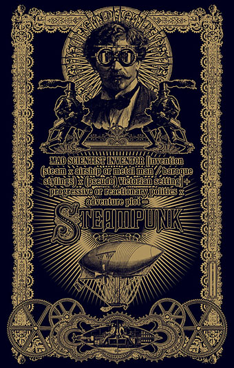
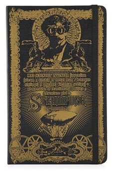
• Finally, the recent Steampunk design which Modofly are now selling on their laser-etched Moleskin books will be appearing shortly in a surprise location. More about that later. I’ll probably be doing some prints and CafePress stuff with this picture eventually but for now Modofly has the monopoly.

Posting here may be rather sparse over the next couple of weeks since I’m very busy work-wise just now. So don’t be surprised if there’s a long run of picture-only posts. December and early January are often slack and moneyless so it’s good to be busy.

Jim Cawthorn, 1929–2008

cawthorn1.jpg

“Jim Cawthorn and I have been inseparable for over twenty-five years, sometimes to the point where I can’t remember which came first—the drawing or the story. It is his drawings of my characters which remain for me the most accurate, both in detail and in atmosphere. His interpretations in strip form will always be, for me, the best.” Michael Moorcock.

Jim Cawthorn—illustrator, comic artist and fantasy historian—died this week. Cawthorn was the first illustrator employed by Savoy Books and one of the key factors in drawing me to their doors in the early 1980s. His illustrations made their books special and his comics adaptation of Moorcock’s The Jewel in the Skull was a big influence on my early black and white work.

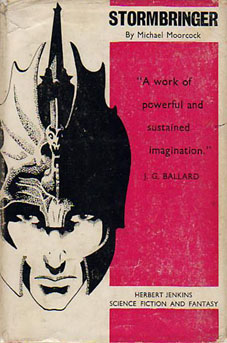
Mike Moorcock, Dave Britton and I seem to be in a minority in regarding Cawthorn as one of the finest fantasy illustrators of his generation. His carefully stipled drawings of the late Fifties and early Sixties are all miniature masterpieces and I don’t care how many artists attempt lavish paintings of Moorcock’s Elric character, for me the definitive representation remains the drawing used on the cover of the first edition of Stormbringer in 1965. Cawthorn was Moorcock’s illustrator of choice for many years and was involved with the Moorcock-edited run of New Worlds right from the start with his cover illustrating Ballard’s Equinox story. He also provided reviews for New Worlds, and his critical faculties were demonstrated to the full in 1987 with Fantasy: The 100 Best Books, an overview of the genre credited to Cawthorn and Moorcock for which Cawthorn himself wrote most of the entries.

I wrote in more detail about Cawthorn’s work for the Savoy site several years ago. For an overview of his career and influences, there’s Dave Britton’s interview from 1979.

Update: some extra pictures added.

cawthorn2.jpg

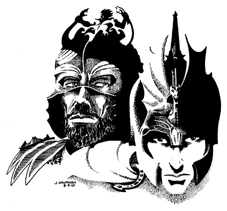
Jagreen Lern and Elric (1963).

Continue reading “Jim Cawthorn, 1929–2008”

Steampunk Horror Shortcuts

steampunk.jpg

steampunk2.jpgTime again for some work updates and other news. I mentioned in August that this Steampunk design—created to illustrate a formula definition of the genre by Jeff VanderMeer—was originally going to be a T-shirt. That idea fell by the wayside when an opportunity arose to submit it to Modofly who were asking for Steampunk-related work for a new line of their laser-etched Molekin books.

I’m pleased to announce that the books are now done and on sale at the Modofly store. These are available in two sizes, large (5.25ins x 8.25ins; 13.3cm x 20.9cm) and small (3.5ins x 5.5ins; 8.9cm x 13.9cm), $36 USD and $22 USD respectively.

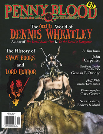
penny_blood.jpg

Next up is issue 11 of Penny Blood, an American horror magazine due out shortly which includes a feature on David Britton’s Lord Horror character and runs through the often tormented history of Savoy Books. Savoy’s Mike Butterworth and I were both interviewed and the piece should also include some comments from Keith Seward whose Savoy title, Horror Panegyric, examines the Lord Horror mythos. They don’t say yet when the magazine is out but it’s available for pre-order now.

While we’re on the subject of his lordship, I recently updated my pages for the Reverbstorm comics with a lot more samples taken from the re-scanned and re-lettered artwork. Work is still progressing on assembling the definitive single-volume edition of Reverbstorm as time permits. I’ve finished work on all seven published issues and am now engaged with the eighth and final section. More about that, and Reverbstorm itself, at a later date.

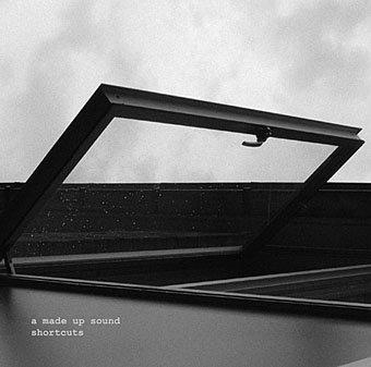
shortcuts.jpg

Finally, there’s another new CD design out, my fourth this year and there are more on the way; I’m starting to feel prolific. As can be seen from the cover, this was a very minimal job. A Made Up Sound is a pseudonym of Dave Huismans, aka 2562, whose excellent Aerial album I also designed. Shorctuts is a collection of electronic sketches and Dave took the moodily anonymous photographs himself.

Ronald Searle book covers

searle.jpg

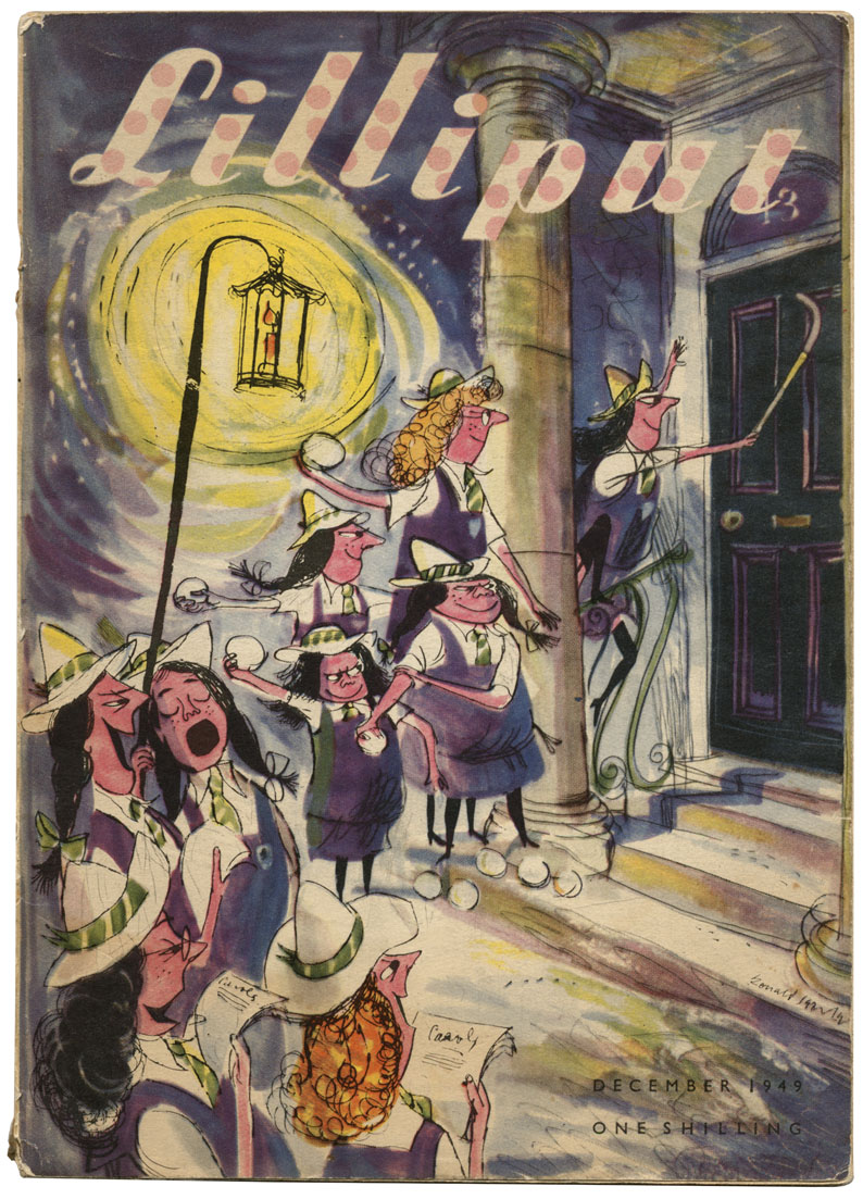
Lilliput issue no. 150, December 1949.

A nice selection of Ronald Searle book covers and illustrations turns up at Caustic Cover Critic. The Lilliput cover above isn’t among them, I just happened to have it lying around as a result of putting together a new edition of Maurice Richardson’s The Exploits of Engelbrecht earlier this year. That volume is still in a holding pattern at Savoy Books but plans are afoot to see it published in the next few months. Searle produced a number of illustrations for the Engelbrecht stories, of course, although not for this particular issue.

Lilliput #150 featured Richardson’s story Engelbrecht and the Mechanical Brain as well as a St Trinian’s Christmas story by Searle and Arthur Marshall, hence the cover. It’s good to see some of the original covers for the Molesworth books on the CCC page. Geoffrey Willans’ Nigel Molesworth was the delinquent male equivalent of the St Trinian’s schoolgirls and I read all the books when they were reprinted in the early Seventies.

Via Coudal.

Elsewhere on { feuilleton }
The book covers archive
The illustrators archive

Previously on { feuilleton }
Engelbrecht again
Mervyn Peake in Lilliput