Drowned worlds

rockman1.jpg

Hollywood at Night (2006).

Alexis Rockman‘s paintings of swamped or ruined American landmarks present views which are a novelty in contemporary art galleries whilst being very familiar to science fiction readers. Many of these could well be illustrations for JG Ballard’s 1981 novel, Hello America, which imagined a depopulated United States reclaimed by flora and fauna. Others would suit The Drowned World, of course, and they bear favourable comparison with Dick French’s illustrated edition (below) which was also published in 1981.

rockman2.jpg

Gateway Arch (2005).

Rockman’s hothouse atmospheres remind me of earlier paintings of Brazilian wildlife by another American artist, Martin Johnson Heade (1819–1904), many of whose tropical landscapes only require a distant ruin or two to match Rockman’s work. (Tip via Design Observer.)

french.jpg

The Drowned World by Dick French (1981).

While we’re on the subject, Ballardian has posted the first of three features about my colleagues at Savoy Books, beginning with a Michael Butterworth interview which discusses some of Ballard’s connections with Savoy. One of the subsequent posts should see yours truly discussing the visual dimension of the Savoy world. More about that later.

Previously on { feuilleton }
The coming of the dust
Ballard and the painters

The Best of Michael Moorcock

mm1.jpg

The first of the books I’ve been designing for Tachyon Publications appears this month. Two more are due to follow and I’m working on another at the moment; more about those titles later.

The Best of Michael Moorcock was a pleasure to be involved with not only because I’ve been reading Moorcock’s fiction for a very long time but I’ve also been fortunate during that time to get to know the writer and Linda Moorcock, his wife. Mike likes the work I’ve done in the past for Savoy Books and we did have an anthology of his favourite pieces by other writers planned for Constable & Robinson back in 2005. That book didn’t work out so this makes up for its cancellation. This is an excellent anthology, put together initially as a private enterprise by editor John Davey who managed the difficult task of compiling a collection which ranges over forty years of writing. Ann and Jeff VanderMeer came aboard as co-editors for the Tachyon edition.

I’ve been working mainly on the interior design of the Tachyon volumes (although I’ve also done the cover for Jeff VanderMeer’s forthcoming Booklife) and for this title I took a cue from Ann Morn’s cover design which features a pair of gates emblazoned with large letter Ms. The title spread above takes the letter M from the typeface used for the author’s name and multiplies that to create an equivalent set of gates for the reader to pass through. I try to play down the pyrotechnics for fiction—the words are the important thing, not the graphic design—but since this was a story collection I thought I’d try illustrating each piece using the title typography alone. Most of these are done by using a suitable typeface but for a few pieces I managed to create an arrangement that reflected the story. Behold the Man (below) is the Nebula Award-winning story of a journey back in time to find the historical Jesus. The cross shape not only relates to the Biblical theme but also implies the crossed time streams and Moorcock’s layered, cross-cut narrative.

mm2.jpg

The Best of Michael Moorcock is available now from the usual sources and received a glowing review in the Guardian. Later this month, and other work permitting, I’m hoping to make a start on what will effectively be a companion volume, Savoy’s long-delayed Into the Media Web, another collection by John Davey which this time collects the best of Moorcock’s copious essays, reviews and other non-fiction.

Previously on { feuilleton }
Designing Booklife
The Sonic Assassins
Revenant volumes: Bob Haberfield, New Worlds and others
An announcement redux

Marbled papers

endpapers.jpg

left: Serpentine pattern; right: Bouquet pattern, both 19th c.

Regular readers here will have seen a number of posts recently concerning psychedelic culture, a perennial fascination/obsession of mine. One of the notable qualities of movements such as psychedelia or Surrealism is the way they highlight what seem to be previous manifestations of themselves which, until their emergence, lacked a specific label. Borges examined the literary version of this phenomenon in his 1951 essay, Kafka and His Precursors. In art and design, the vivid and chaotic appearance of psychedelic visuals cause us to class certain products of earlier centuries as psychedelic even though they were never intended as such. The Victorian era is especially rich in this regard with its proliferation of Paisley textile designs—which saw a resurgence in the 1960s—the fractal cats of artist Louis Wain, and incredible marbled papers such as these, the samples above being from a University of Washington collection. Of particular interest is the details of their creation; the look is familiar enough but one rarely sees any mention of how paper manufacturers went about designing or even making new works. I selected a red and black marbled paper for the endpapers of The Adventures of Little Lou which we produced at Savoy Books in 2007. The sheets used for that book were handmade, not printed copies, and had to be ordered from a specialist supplier in Scotland.

Via Design Observer.

Previously on { feuilleton }
Paisley patterns
The Adventures of Little Lou

JG Ballard, 1930–2009

crystal_world.jpg

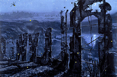
Panther Books paperback edition, 1968; cover painting: The Eye of Silence by Max Ernst.

If I can’t remember when I first encountered JG Ballard’s work, it’s not because I was reading him at a very early age, more that a childhood enthusiasm for science fiction made his books as omnipresent in my early life as any other writer on the sf, fantasy and horror shelves. I know that when I started to read the New Wave sf writers his work immediately stood out, not only for its originality but also for the numerous references to Surrealist painting which litter his early fiction, references which meant a great deal to this Surrealism-obsessed youth. Ballard was a lifelong and unrepentant enthusiast for the Surrealists, with repaintings by Brigid Marlin of two lost Paul Delvaux pictures prominent in one of his rooms (often featured in photo portraits). I always admired the way he never felt the need to apologise for Salvador Dalí’s excesses, unlike the majority of art critics who dismiss Dalí after he went to America. The paintings of Dalí, Delvaux, Tanguy and Max Ernst became stage sets which Ballard could populate with his affectless characters.

Once I’d encountered the New Worlds writers—Ballard, Michael Moorcock, M John Harrison, Brian Aldiss and company—and their American counterparts, especially Harlan Ellison, Samuel Delany and Norman Spinrad, there was no returning to the meagre thrills of hard sf with its techno-nerdery and bad writing. Ballard and Moorcock were the gateway drug to William Burroughs, Jorge Luis Borges and countless others, and I thought enough of his work in 1984 to attempt a series of unsuccessful illustrations based on The Atrocity Exhibition. It’s been an axiom during the twenty years I’ve worked at Savoy Books that Ballard, Moorcock and Harrison were (to borrow a phrase from Julian Cope) the Crucial Three of British letters, not Rushdie, Amis and McEwan. One of the books I designed for Savoy, The Exploits of Engelbrecht by Maurice Richardson, was a Ballard and Moorcock favourite, and included appreciations of Richardson by both writers. I wish Ballard could have seen the new (and still delayed) edition of Engelbrecht but he got a copy of the earlier book. Sometimes once in a lifetime is more than enough.

Ballardian.com
Pages of obits and MM comment at Moorock’s Miscellany
Ballard interview by V Vale at Arthur with an special intro by Moorcock
Jeff VanderMeer at Omnivoracious
Guardian | Times | Independent | Telegraph

Previously on { feuilleton }
Ballard in Barcelona
1st Ballardian Festival of Home Movies
Revenant volumes: Bob Haberfield, New Worlds and others
JG Ballard book covers

Soviet posters

lenin.jpg

“Lenin is dead but the Russian Communist Party lives on” (no date).

More typography and yet more Soviet poster art which seems perennially popular with graphic designers. Bold Constructivist designs like this example are part of the reason why: over 80 years old yet still striking. Type foundry P22 have a set of Constructivist fonts similar to the typeface used here. Poster tip via Coudal.

siegheil.jpg

Sieg Heil Iconographers, title spread (2006).

I plundered the Soviet style in 2006 for the design of Jon Farmer’s Sieg Heil Iconographers for Savoy Books. The typeface this time was Jonathan Barnbrook’s contemporary design, Newspeak. Does the assertive bad taste of the book’s title undermine the Communist propaganda or do the Agitprop graphics ironically counterpoint the discussion of fascist history within? That’s left for the reader to decide.

Previously on { feuilleton }
Lenin Rising
Dead Monuments
Soviet ceramics of the 1920s
Enormous structures II: Tatlin’s Tower