Against Nature in New York

huysmans.jpg

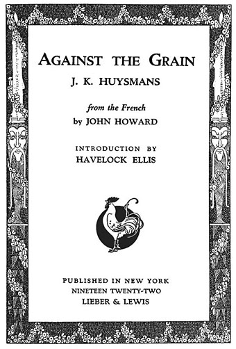
I’ve always preferred Against Nature as an English translation of Huysmans’ À rebours, it’s a snappier and more provocative title than Against the Grain which these days might be taken as a prescription for a paleo diet.

À rebours this month is also the title of an art exhibition opening Venus Over Manhattan, a new exhibition space in New York City created by art collector and writer Adam Lindemann:

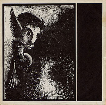
À rebours at Venus over Manhattan explores the notion of “against the grain” through a selection of more than 50 works including African fetishes. The artists represented range from Odilon Redon – the favorite of the book’s protagonist – to Henri Fuseli, Gustave Moreau, Felicien Rops, Franz von Stuck, Lucas Samaras, William Copley, Jeff Koons, Glenn Brown, Salvador Dalí, Walter Dahn, David Hammons and Bernard Buffet, as well as Jeni Spota, Andra Ursuta and Gavin Kenyon.

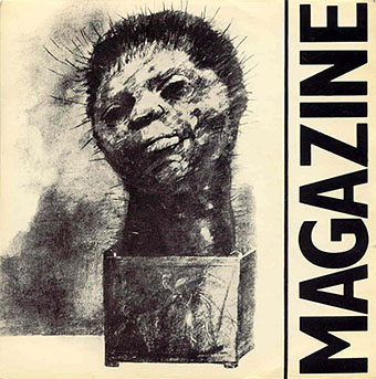
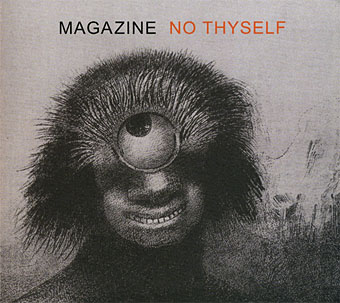
A document detailing the exhibits may be downloaded in pdf form here. Few of the works have any direct connection with Huysmans’ novel but there are some book covers there I hadn’t seen before. The exhibition runs to 30th June, 2012. (Thanks to @supervert for the tip.)

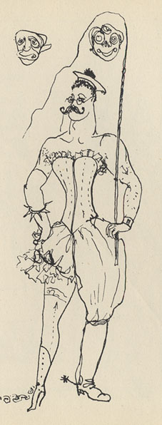
Looking around for some more Huysmans-related imagery turned up the uncredited title page above (the entire book is here), and the following quote from Theophile Gautier which Havelock Ellis uses in his introduction. Gautier was discussing Baudelaire but, as Ellis says, it’s an excellent statement of the principles of Decadence as an artistic concept:

The poet of the Fleurs du Mal loved what is improperly called the style of decadence, and which is nothing else but art arrived at that point of extreme maturity yielded by the slanting suns of aged civilisations: an ingenious complicated style, full of shades and of research, constantly pushing back the boundaries of speech, borrowing from all the technical vocabularies, taking colour from all palettes and notes from all keyboards, struggling to render what is most inexpressible in thought, what is vague and most elusive in the outlines of form, listening to translate the subtle confidence of neurosis, the dying confessions of passion grown depraved, and the strange hallucinations of the obsession which is turning to madness. The style of decadence is the ultimate utterance of the Word, summoned to final expression and driven to its last hiding-place. One may recall in this connection the language of the later Roman Empire, already marbled with the greenness of decomposition, and, so to speak, gamy, and the complicated refinements of the Byzantine School, the last forms of Greek art falling into deliquescence. Such indeed is the necessary and inevitable idiom of peoples and civilisations in which factitious life has replaced natural life, and developed unknown wants in men. It is, besides, no easy thing, this style disdained of pedants, for it expresses new ideas in new forms, and in words which have not yet been heard. Unlike the classic style it admits shadow… One may well imagine that the fourteen hundred words of the Racinian vocabulary scarcely suffice the author who undertakes the laborious task of rendering ideas and things in their infinite complexity and multiple coloration.

Previously on { feuilleton }
À Rebours illustrated
Arthur Zaidenberg’s À Rebours

John Martin’s musical afterlife

martin1.jpg

Angel Witch (1980) by Angel Witch. Art: The Fallen Angels Entering Pandemonium (1841).

It’s been a busy week so the posts just now are tending towards haste and laziness. The paintings of John Martin (1789–1854) make such good album covers you’d expect that there were more than this handful. Perhaps there are (Discogs.com contains numerous omissions), in which case leave a comment if you know of any. It’s no surprise that three of these are metal albums when the artist depicted so many apocalypses and scenes from Paradise Lost. Given the recent reappraisal of Martin’s work these won’t be the last albums we see borrowing his art.

heresy.jpg

Heresy (1990) by Lustmord. Art: The Great Day of His Wrath (1851).

This is the reissue of Lustmord’s excellent album of doomy volcanic rumbles. Both CDs use the same painting but the new edition has a better type layout.

martin3.jpg

Cradle (1992) by Suns of Arqa. Art: Manfred and the Witch Of The Alps (1837).

A good painting, a decent album (I have this one on CD) by a musical collective from Manchester originally, unfortunately spoiled by dreadful design. The group eventually saw sense and reissued this one with a better layout. The painting is the only example of Martin’s work in Manchester and features a ghostly figure where the artist had painted over an earlier Manfred.

martin4.jpg

The Closed Eyes of Paradise (demo, 1999) by Draconian. Art: Pandemonium (1838).

bombs.jpg

Bombs (2006) by Faithless. Art: The Great Day of His Wrath (detail, 1851).

martin2.jpg

Vast Oceans Lachrymose (2010) by While Heaven Wept. Art: Christ Stilleth The Tempest / Storm On The Sea Of Galilee (1867).

This American metal band appeared in the earlier post about Odilon Redon with the cover of their debut album.

Elsewhere on { feuilleton }
The album covers archive

Previously on { feuilleton }
Odilon Redon’s musical afterlife
Danby’s Deluge
John Martin: Heaven & Hell
Darkness visible
Aubrey Beardsley’s musical afterlife
Death from above
The apocalyptic art of Francis Danby

Odilon Redon’s musical afterlife

redon5.jpg

Pilgrim Of The Sublunary World (2002) by Heid.

It would have been surprising if Magazine were the only group to have used Odilon Redon’s art for album covers. What is surprising is that these releases are all relatively recent and aren’t the cluster of Goth doodlings I would have expected: descriptions at Discogs list Heid as an industrial outfit, Revelation and While Heaven Wept are doom metal while Spider Trio play jazz. Odilon Redon is unusual in being able to provide artwork strange enough for Magazine or, in the case of his many pastel drawings, pretty enough for classical recordings. I omitted a couple of other CD covers which inset his pictures in dreadful layouts. The Heid album uses more Redon art on the insert pages.

redon4.jpg

Live @ Rendezvous/Jewelbox Theater 8.12.06 (2007) by Spider Trio.

redon1.jpg

Never Comes Silence (2007) by Revelation.

redon3.jpg

L’Amour De Loin (2009) by Kaija Saariaho.

redon2.jpg

Sorrow Of The Angels (2010) by While Heaven Wept.

Elsewhere on { feuilleton }
The album covers archive

Previously on { feuilleton }
Odilon Redon and Magazine
Odilon Redon lithographs
The eyes of Odilon Redon
Aubrey Beardsley’s musical afterlife

Odilon Redon and Magazine

magazine1.jpg

Shot By Both Sides (1978). Design by Malcolm Garrett. Art: La Chimere regarda avec effroi toutes choses (1886) by Odilon Redon.

The first two albums by British post-punk band Magazine have been soundtracking the inner landscape here for the past couple of weeks. Looking at some of their cover art on Discogs reminded me that two of their early singles came dressed with drawings by Symbolist artist Odilon Redon (1840–1916) so these covers may well have been the first place I saw any of Redon’s work at all. This was an unusual choice at the time which makes it typical of a group that stood slightly apart from much of the music around them, often being regarded as too proficient and too clever. (Pop music and politics are the only places where incompetence and stupidity are virtues.)

magazine2.jpg

Give Me Everything (1978). Design by Malcolm Garrett? Art:The Cactus Man (1881) by Odilon Redon.

Magazine’s golden era runs from 1978 to 1980 and for me their music and that of fellow Mancunians Joy Division remains inextricably connected to memories of Manchester in the late 1970s, a place I visited sporadically before moving here in 1982. The city then was a lot more grimy and run-down, filled with the disused mills and warehouses of the collapsed cotton industry, blighted by the failed architecture of the 1960s and polluted by endless convoys of orange buses. This photo from 1978 fixes the mephitic ambience, as does some of M. John Harrison‘s fiction from the period, notably his short story Egnaro. Unlike Joy Divison, Magazine haven’t been burdened with an increasingly inflated reputation which makes revisiting their works all the more enjoyable. They pull you back to those gloomy times then take you off elsewhere, into the cajoling and neurotic imagination of that Nosferatu-in-a-leather-jacket, Howard Devoto.

magazine3.jpg

No Thyself (2009). Designer unknown. Art: Le polype difforme flottait sur les rivages, sorte de cyclope souriant et hideux, Les Origines (1883) by Odilon Redon.

The band reformed in 2009 although I’m not convinced the current incarnation is for me, I’m generally sceptical of such moves and the absence of ace guitarist John McGeogh (who died in 2004) and bassist Barry Adamson means it won’t be the same. No Thyself did refer back to their origins, however, literally so in the title of the Odilon Redon picture on the cover, while the Chimera from the first single turned up on a recent tour poster. Howard Devoto talked late last year to The Quietus about the recent album.

Elsewhere on { feuilleton }
The album covers archive

Previously on { feuilleton }
Odilon Redon lithographs
The eyes of Odilon Redon

Philippe Jullian, connoisseur of the exotic

jullian01

Monsieur Jullian as seen on the back cover of Dreamers of Decadence (1971).

Here at last is the long-promised (and long!) piece about the life and work of Philippe Jullian (1919–1977), a French writer and illustrator who’s become something of a cult figure of mine in recent years. Why the fascination? First and foremost because at the end of the 1960s he wrote Esthètes et Magiciens, or Dreamers of Decadence as it’s known to English readers, a book which effectively launched the Symbolist art revival and which remains the best introduction to Symbolist art and the aesthetic hothouse that was the 1890s. If I had to choose five favourite books Dreamers of Decadence would always be on the list. This point of obsession, and Philip Core’s account of the writer, made me curious about the rest of Jullian’s career.

jullian13

An illustration from Wilson & Jullian’s For Whom the Cloche Tolls (1953). “Tata has called these his Krafft-Ebbing (sic) pictures of his friend Kuno, whatever that means.”

Philip Core was friends with Philippe Jullian, and Core’s essential Camp: The Lie that Tells the Truth (1984) has Jullian as one of its dedicatees. It’s to Core’s appraisal that we have to turn for details of the man’s life. There is an autobiography, La Brocante (1975), but, like a number of other Jullian works, this doesn’t seem to have been translated and my French is dismally pauvre. Core’s piece begins:

Philippe Jullian, born to the intellectual family of Bordeaux Protestants which produced the well-known French historian, Camille Jullian, was a last and lasting example of pre-war camp. His career began as an artist in Paris with a reputation for drag-acts parodying English spinsters. Snobbery, a talent for sensitive daydreaming, and a consuming passion for antiques, obscure art and social history, made a very different figure out of the thin and dreamy young man. Jullian suffered terribly during the Second World War; he managed to survive by visiting some disapproving cousins dressed as a maiden aunt, whom they were happy to feed. However, he made a mark in the world of Violet Trefusis, Natalie Barney and Vita Sackville-West by illustrating their books with his wiry and delicate doodles; this led to a social connection in England, where he produced many book jackets and covers for Vogue throughout the 1950s.

Having only seen Jullian in his besuited and bespectacled guise it’s difficult to imagine him dragged up, but the cross-dressing interest is apparent in his humorous collaboration with Angus Wilson and in a later novel, Flight into Egypt. As for the wiry and delicate doodles, they’re very much of their time, in style often resembling a less-assured Ronald Searle. One early commission in 1945 was for the first of what would become a celebrated series of artist labels for Château Mouton Rothschild. Later cover illustrations included a run for Penguin Books some of which can be found at Flickr.

Philip Core continues the story:

Elegant in the austerely tweedy way the French imagine to be English, Jullian exploited his very considerable talents as a writer, producing a series of camp novels throughout the 1950s (Scraps, Milord) which deal frankly but amusingly with the vicissitudes of handsome young men and face-lifted ladies, grey-haired antique dealers and criminals. One of the first to reconsider Symbolist painting, Jullian reached an enormous public in the 1960s with his gorgeous book, Dreamers of Decadence – where an encyclopaedic knowledge of the genre and its accompanying literature helped to create the boom in fin de siècle revivalism among dealers and museums.

An acerbic wit accompanied this vast worldly success; always docile to duchesses, Jullian could easily remark to a hostess who offered him a chocolate and cream pudding called Nègre en chemise, “I prefer them without.” Less kindly, to a gay friend who objected to Jullian’s poodles accompanying them into a country food shop by saying “Think where their noses have been”, he could also retort “Yes, that’s what I think whenever I see you kiss your mother.”

Continue reading “Philippe Jullian, connoisseur of the exotic”