Weekend links 618

anderson.jpg

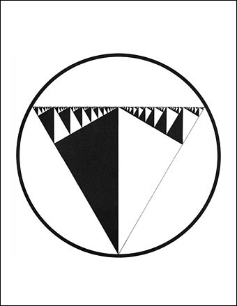
O Superman (1981), a seven-inch single on One Ten Records. Design by Laurie Anderson and Perry Hoberman.

• “…I was painting a picture of a garden at night. It had a lot of black and this green kind of coming out of the black, and I sat back, probably to take a smoke, looking at this painting, and I suddenly heard a wind coming from the painting, and the green started to move. And I thought, ‘Oh, a moving painting.’ And that experience led to cinema.” David Lynch talking to Josh Hitchens about living in Philadelphia.

• “This is the time and this is the record of the time.” Big Science, the album that propelled Laurie Anderson from performance artist to pop star, is 40 years old this month. Mat Colegate recalls his confused impression that the album was the work of a West Country folk singer, while Studs Terkel talked to Laurie Anderson about the album shortly after its release.

• At Public Domain Review: Kensy Cooperrider explores a millennium of “hand mnemonics”, “the variety of techniques practised by Buddhist monks, Latin linguists, and Renaissance musicians for remembering what might otherwise elude the mind.”

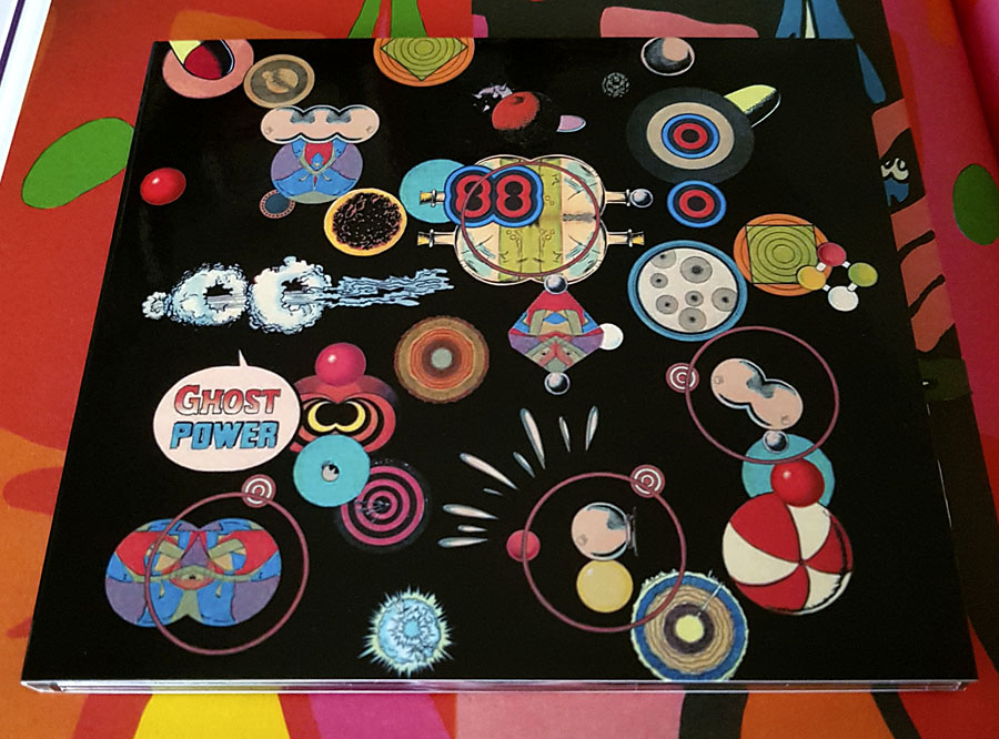
Ghosts in the Machine is an exhibition being hosted by Bower Ashton Library, Bristol, for World Book Night, 2022. 93 participants contributed ghost-related images for an accompanying artist’s book [PDF].

• “Sixty years after Seattle’s Century 21 Exposition, world’s fairs have largely fallen out of fashion in the US.” Grant Wong charts the rise and fall of world’s fairs.

• A trailer for Ennio: The Maestro, a feature-length documentary about Ennio Morricone by Giuseppe Tornatore.

• “The film Putin doesn’t want the world to see: Firebird, a gay love story about fighter pilots.”

• At Dennis Cooper’s: Andrei Tarkovsky Day.

• New music: Intersections by Specimens.

Schöne Hände (1977) by Cluster & Eno | Hands 2 Take (1981) by The Flying Lizards | Red Hand (1996) by Paul Schütze

Pavonine pattern play

pattern1.jpg

One of the projects I’ve been working on recently contains a large quantity of Art Nouveau design. I can’t discuss this any further for the usual embargo reasons, but I can show off this pattern which has been generated as a by-product of the main work. This is one of those fin-de-siècle designs that looks like it might have originated in the 1960s, a decade which saw a revival of interest in Art Nouveau graphics. Those sinuous lines would work well on a psychedelic poster, and there’s even a touch of Op art in the melting ovals that separate the peacock feathers.

pattern7.jpg

But this isn’t a design from 1970, it actually dates from 1900, the source being a small wallpaper sample that I spotted some years ago in issue 7 of Deutsche Kunst und Dekoration. “Frau Dunsky, Berlin” is named as the designer although there’s no further information about her design in the text. After seeing this I thought I’d have a go at copying the pattern in order to create a digital version but I soon gave up when it became apparent that too much work was required to convert the indistinct image into a sharp outline. I didn’t have a graphics tablet at the time, and my printer had broken down, so the only way to draw an outline was the hard way, using a mouse pointer.

pattern2.jpg

Vectorised and coloured.

A few days ago I pulled out the copy I’d been working on and, since I now have a graphics tablet, decided to try again. Even though creating the outline was easier this time I still wasn’t sure whether a repeatable pattern would be possible. The magazine sample is slightly warped, and the repeated elements don’t match exactly when overlaid, but I was able to compensate for the flaws with some stretching and redrawing in Photoshop. It’s very satisfying getting something like this to work, even more so when it’s a 120-year-old design that you’ve managed to resurrect. I also feel a little familial continuity with this kind of pattern making. My mother worked as a textile designer for a few years in the 1950s, although she never worked on anything like this, the designs produced by her studio were generally chintz-like floral patterns.

pattern3.jpg

Prior to redrawing the peacock design I’d resurrected another wallpaper design from the same period. This is one of several examples by a French designer, André Morisset, that appeared in issue 15 of L’Art Decoratif. Monsieur Morisset’s design was easier to work into a digital version, being a better reproduction, while the design itself is a square that tiles vertically and horizontally so it’s easier to build into a pattern.

pattern4.jpg

Drawing the outline.

pattern5.jpg

A tessellated tiff.

pattern6.jpg

A coloured vector version.

I’ll be doing a few more things like this when I get the chance. I’m not sure yet whether they’ll find a place in the things I’m working on, but once you have a satisfactory vector outline you can file the art away until you need it later.

Previously on { feuilleton }
Louis Rhead’s peacocks
Peacocks
Rene Beauclair
Whistler’s Peacock Room
Beardsley’s Salomé

Splendid Suns

suns.jpg

I answered a few interview questions recently for Shunga Gallery, a site concerned with the erotic side of Japanese prints, and with contemporary practitioners who work in a similar areas. (All NSFW, needless to say.) I’m not really an erotic artist but Marijn has selected a few examples of my artwork that contain prominent erections, going back to the badly-proportioned drawing of the Great God Pan that I did in 1986 for my late friend, Ed, when he was part of a Dutch music & performance group, Abrahadabra. The drawing appeared in the zine of the same name, and later provoked mild disapproval from the organisers of a video festival in Den Haag where Ed and friends were using it as a flyer to promote their activities. Also at Shunga Gallery are a few pages from the rebarbative Reverbstorm, a book that’s the darkest and nastiest thing I’ll ever do. Some of that artwork provoked a rather more serious form of disapproval, as I explain in the interview.

Continue reading “Splendid Suns”

Through The Gates Of Yesterday

broadcast1.jpg

Here at last, the two Broadcast reissues and the album of officially released radio sessions. I already had much of the music so these purchases are mostly for reasons of cult completism and the Julian House cover designs. Mr House had already designed the rest of the Broadcast discography, as well as collaborating with them in his Focus Group guise, so this continuity was essential.

broadcast2.jpg

Also essential, music-wise, is the Mother Is The Milky Way EP even though it’s only 20 minutes long. This was originally limited to 750 copies sold during the 2009 tour so it’s always been hard to find. Musically, it’s of a piece with the Witch Cults Of The Radio Age album, and just as beguiling, a dreamy mélange of song fragments and sound samples—Kurt Schwitters’ Ursonate colliding with Jonathan Miller’s Alice in Wonderland—that’s more genuinely “psychedelic” than many attempts to conjure these qualities by mimicing old musical styles. The overlaid images on the cover may be alluding to the layered sounds…and are those magic mushrooms in one of the squares? Answers on a lysergic sugarcube.

broadcast3.jpg

The two Microtronics EPs were intended to be functional works rather than entertainments, “Music for links and bridges”, although I don’t know if they’ve ever been used as such outside Broadcast mixes. These were also sold on separate tours as mini CDs but they now come packaged together, including a first-time release on vinyl which will keep the fetishists happy despite the format seeming like overkill for a collection of 21 very short squawks and drum loops.

broadcast4.jpg

Maida Vale Sessions will also be essential for some listeners, comprising the group’s three sessions for John Peel’s show (1996, 2000, 2003) plus one from 1997 for Steve Lamacq’s Evening Session, 54 minutes in total. Being a collector of Broadcast bootlegs I already had most of these but they sound so much better coming from the original recordings. The final session, which I hadn’t heard before, is a fantastic set, and includes one of their few covers, a version of Sixty Forty by Nico. John Peel was an enthusiast, unsurprisingly, who may be heard on a bootleg of a Birmingham concert introducing the group as “one of the nation’s great bands”.

And if any of the above has stimulated your interest, Warp Records wisely commissioned The Gaslamp Killer to create an hour-long mix from the new records which may be heard here.

Previously on { feuilleton }
Esoterica 49
Peter Strickland’s Stone Tape
Valerie and Her Week of Wonders
The Ghost Box Study Series

Covering Ishiguro

ishiguro1.jpg

I like seeing an author’s works designed as a set, and so do the bigger publishers for whom redesigns are a useful way to freshen their back catalogue. This month the Faber edition of Klara and the Sun by Kazuo Ishiguro provides the template for a redesign of the author’s previous works, with new editions of the seven other novels plus a story collection, Nocturnes. I’ve not read any of these books so I’ll leave it to Ishiguro’s readers to gauge the suitability of the minimal illustrations, although the one for Nocturnes is the kind of visual pun that designers today often search for. The image is explained by the book’s subtitle, “Five Stories of Music and Nightfall”. I’d have been tempted to go the George Hardie route with the illustrations, flattening the colours, adding outlines, and placing that cassette and shadow at forty-five-degree angles. But Hardie’s bold isometrics might seem a little too cartoony for Ishiguro. Faber designer Pete Adlington recounts the thinking behind his covers here.

ishiguro2.jpg

ishiguro3.jpg

ishiguro4.jpg

ishiguro5.jpg

Continue reading “Covering Ishiguro”