Void City

hawkwind.jpg

Friends & Relations Vol. 3 (1985) by Hawkwind.

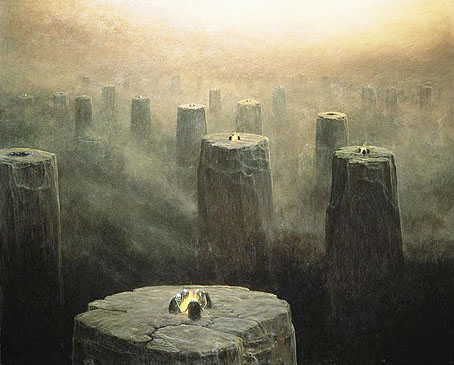
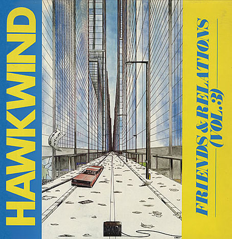
Unless you assiduously collect everything you’ve ever worked on—which I don’t—you occasionally have to rely on the web to remind you of something you created years ago. This Hawkwind album is a good example, being one of the last releases by the band to use a piece of my artwork. (And I’ll quickly note that the accompanying type design was nothing to do with me; my design suggestions were always ignored, hence a growing frustration at that time with album cover work.) The album itself was the third in a series of odds and ends compilations gathering stray tracks by, yes, friends and relations of Mr Brock and co. Subsequent CD reissues used different packaging so the original vinyl is the only place you’ll see this illustration.

The reason I don’t have a copy is that the record label never sent me anything so unless Dave Brock put something in the post I had to buy them myself. (This happens more often than you’d expect.) I evidently didn’t think this one was worth it even though I much prefer the artwork to many of the earlier things of mine that were used. The drawing was a couple of years old, being inspired by the track Void City on the Choose Your Masques album from 1982. Void City is an atypical piece of electronica which I liked for its resemblance to some of the higher level synth pop and industrial music that was around in the early 1980s. 1982 to ’84 was the height of my JG Ballard obsession so Ballard is also a slight influence here. I had in mind his 1981 novel Hello America, which takes place in a post-apocalypse United States. And there’s also a trace influence from one of my early pieces of writing, a mercifully unpublished splurge of intense prose influenced by the New Worlds school of speculative fiction in which someone wanders around a vast and almost completely depopulated city. Looking at this drawing now it seems emblematic of my loss of interest in doing any kind of science fiction art; it also no longer seems futuristic. I produced my last album cover for Hawkind, The Chronicle of the Black Sword, in 1985; in January 1986 I started adapting HP Lovecraft’s The Haunter of the Dark. This took me out of the public eye for a few years but it was a more rewarding place to be for many other reasons.

Elsewhere on { feuilleton }
The album covers archive

Previously on { feuilleton }
Hawk things
The Sonic Assassins
New things for July

Weekend links 47

beksinski1.jpg

DG-2499 (1975) by the fantastic (in every sense of the word) Zdzisław Beksiński (1929–2005). See the Dmochowski Gallery for a comprehensive collection of the artist’s work. Thanks to BibliOdyssey for the tip.

• More ICA events: From Animism to Zos: Strange Attractor Salon will be “a series of weekly events, consisting of a talk and a film, exploring some lesser-known intersections of culture, history, mind and nature” running from 10 March–12 May, 2011.

• And on May 10, the London Word Festival presents a Dodgem Logic evening with entertainment provided by contributors to that magazine:

Alan Moore’s reinvigoration of the underground fanzine, Dodgem Logic, comes alive in the non-conformist surroundings of Hackney’s Round Chapel. A night of art, comedy, comment and put-something-back localism. (…) With Robin Ince heading up a colossal stand-up bill, artists Steve Aylett, Savage Pencil, Melinda Gebbie and Kevin O’Neill panel-up to talk about their comic work, while music comes from hyperactive racketeers The Retro Spankees. With an exhibition of artwork from the magazine, and conducted by editor-in-chief Alan Moore.

• Taschen publishes a collection of Dennis Hopper’s photographs this week. The Independent has a small selection here. Also new from Tachen, Alex Steinweiss, The Inventor of the Modern Album Cover.

Bass Notes: The Film Posters of Saul Bass at the Kemistry Gallery, London.

beksinski2.jpg

DG-2507 by Zdzisław Beksiński.

While riding through the bustling streets of London from 1603 to 1621, one was liable to hear the shout “Long live Queen James!” King James I of England and VI of Scotland was so open about his homosexual love affairs that an epigram had been circulated which roused much mirth and nodding of the heads: Rex fuit Elizabeth: nunc est regina Jacobus—”Elizabeth was King: now James is Queen.”

There’s more about the private life of the man who gave his name to the King James Bible here.

Addams and Evil, a Tumblr devoted to the great Charles Addams.

Hannes Bok again at Golden Age Comic Book Stories.

Caravaggio’s crimes exposed in Rome’s police files.

Deserted City, photographs by Kim Høltermand.

• The blue sand dunes of the planet Mars.

• A map of the ghost signs of Chicago.

The movie title stills collection.

The pitfalls of e-book buying.

Life On Mars? (1971) by David Bowie | Uncle Sam’s On Mars (1979) by Hawkwind | Eyes On Mars (1980) by Chrome | Cache Coeur Naif (1997) by Mouse on Mars.

Deutsche Kunst und Dekoration #8

dkd08-00.jpg

Continuing the delve into back numbers of Deutsche Kunst und Dekoration, the German periodical of art and decoration. Volume 8 covers the period from April–September 1901 and continues to use the ornamental capitals by Karl Lürtzing featured in the previous volume. In this edition the emphasis is predominately upon the Darmstadt Artists’ Colony, a remarkable venture in which many of the artists involved designed and decorated their own houses, the intention being to create living examples of the Jugendstil, or German Art Nouveau, style. This is explored in greater detail in the next volume but for now I’ve chosen a selection of work by Darmstadt artist Paul Bürck. As usual, anyone wishing to see these samples in greater detail, or the rest of the edition, is advised to download the entire volume at the Internet Archive. There’ll be more DK&D next week.

dkd08-01.jpg

These peacock border designs are uncredited but they show how flexible the ubiquitous fin de siècle bird could be. The last page gives us something unique: an ape in peacock finery.

dkd08-02.jpg

dkd08-03.jpg

Continue reading “Deutsche Kunst und Dekoration #8”

Victorian typography

type1.jpg

“Victorian” isn’t really the correct term for the products of 19th century America but then “19th century” covers rather a lot of ground. Mr BibliOdyssey’s most recent post is a stunning collection of title pages from fire insurance maps of the late 19th and early 20th century. Rather than repost any you ought to go and see them for yourself, they’re excellent examples of the best and worst of “Victorian” graphic design, insanely and pointlessly ornate yet often very inventive in their elaborations and stylised letterforms. Being a typophile I’d often feel frustrated when looking at 19th century documents and seeing type designs in use for which there were no contemporary equivalents. There was such a profound reaction against ornamented design in the 20th century that it’s only relatively recently that typography of this period has been reappraised and, in some cases, resurrected. The book from which these examples are taken dates from 1897, and it fascinates for putting names to some of those neglected designs. This is a big catalogue of 740 pages so I’ve been sparing in my selection. Anyone wishing to see more can download the whole thing here.

type2.jpg

Despite my affection for curvilinear Art Nouveau, when it comes to typography I’m often drawn to the spikier styles. Atlanta was digitised by P22 in a style they call Victorian Gothic. Their accompanying ornament set replicated that curious shape from Victoria below.

type3.jpg

type4.jpg

This typeface, or ones which resemble it, is a common one in 19th century newspaper and advertising design but I’d never seen it given a name until now. The catalogue pages have a number of variations which is no doubt an indicator of its popularity. A bold weight of the design was digitised by Scriptorium as a font they call Mephisto.

type5.jpg

Rubens is my favourite of all the designs in this catalogue, probably because I always liked the way it looked when it enjoyed a surprising flush of popularity in the 1960s and 1970s. The narrow style made it very useful for book covers (as with the examples here) while those spiky serifs made it popular with art directors looking for a typeface that said “horror”. Wooden Type Fonts recently digitised a version of Rubens but their version lacks the elegance of the original. Anyone else want to have a go?

type6.jpg

Lastly the catalogue has many pages of clip art figures and decorations including the pointing hands which people always associate with 19th century design. I’d wondered a few times whether these jagged decorations were meant to be electrical or not. Electricity was a new thing in 1897 so these would have seemed distinctly modern.

Previously on { feuilleton }
Steampunk overloaded!
Penguin Labyrinths and the Thief’s Journal
Masonic fonts and the designer’s dark materials

Weekend links: fifth anniversary edition

demuth.jpg

The Figure 5 in Gold (1928) by Charles Demuth.

It’s a little surprising to find I’ve been doing this for five whole years yet here we are. Having seen a number of blogs call it quits at the five-year point I should note that I don’t feel quite that exhausted although maintaining a discipline of daily posting can be a chore at times, especially when you’re pressured by work. On the whole the advantages continue to outweigh the disadvantages. Some of the discoveries here have fed back into things I’ve been working on or opened avenues for future exploration. Researching something for an audience (however slight that audience or the resulting post) encourages you to look more deeply into a given subject; sometimes you learn more as a result and occasionally make surprising discoveries. Obsessions are teased out which might otherwise have lain dormant. Yes, it’s an extra bout of work but I’ve spent much of my life saying to people “if you like that, you may like this”, and that’s all many of these posts are doing.

This year promises to be an interesting one so watch this space. And, as always, thanks for reading!

John x

On to the links…

Cathedral Scan translates the architectural plans of Gothic cathedrals into open-ended musical scores via custom software. There’s more at Blake Carrington‘s website.

Forty-three William Burroughs recordings (tape experiments and readings) at the Ubuweb archives.

• The opening scene of Deadlock (1970), an obscure German film with a theme by the mighty Can.

Strange Lands: A Field-Guide to the Celtic Otherworld, a new book by Andrew L Paciorek.

• The enduring nature of Frankenstein, currently on stage at the National Theatre, London.

shimojo.jpg

Owl One (2004) by Yuri Shimojo.

¡Activista! by Sonny Smith: Drag Queens, Borders, Rivers, Death and Transformation.

• Estonian sculptor Mati Karmin makes furniture out of Russian anti-submarine mines.

Alan Moore’s contribution to the Save Our Libraries campaign.

• Innsmouth Free Press is raising funds for their running costs.

A history of queer street art (Facebook link, unfortunately).

Illuminated book design for Heston’s Fantastical Feasts.

Physica Sacra, an engraving set at Flickr.

Egypt (1985) by Tuxedomoon | Egyptian Basses (1998) by Coil | Soleil D’Egypte (2001) by Natacha Atlas.