Chute Libre science fiction

chutelibre01.jpg

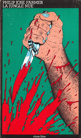
La Jungle Nue (A Feast Unknown, 1974). Illustration de Alain Le Saux.

Chute libre means “free fall” in French, and here refers to an imprint of French publisher Champ Libre that from 1974 to 1978 reprinted a series of science fiction titles under that name. The imprint is notable for a number of reasons, not least the striking covers which impress with their uniform design and bold imagery. The combination of black cover with vivid artwork is very similar to the covers Penguin were producing for their SF titles a few years earlier but since there’s little written anywhere about the French books I can’t say whether this was an influence or merely coincidence. I’ve not been able to find a complete list of all the illustrators either. At least two of the covers are the work of Moebius, rare examples of him being commissioned outside the comics medium.

The other notable aspect of the imprint is the books themselves which are an odd mix of the outrageous and sexually provocative end of SF spectrum, together with more usual fare. Some of the covers play to the provocation more than is necessary: Michael Moorcock has always been pleased by the attention his work receives in France but I’ll bet he hates that cover. Several of these titles appeared as SF in the 1970s because of other work by their authors despite there being nothing overtly science fictional about The Atrocity Exhibition or Breakfast in the Ruins. Farmer’s A Feast Unknown and The Image of the Beast/Blown are violent and sexually excessive, and feature little genre material, but managed to slide onto the SF shelves for the same reason. Every so often I wonder whether any of these books (or books like them) would be offered to, or accepted by, genre publishers today.

As usual, if anyone can supply information about the missing illustrators then please leave a comment.

chutelibre02.jpg

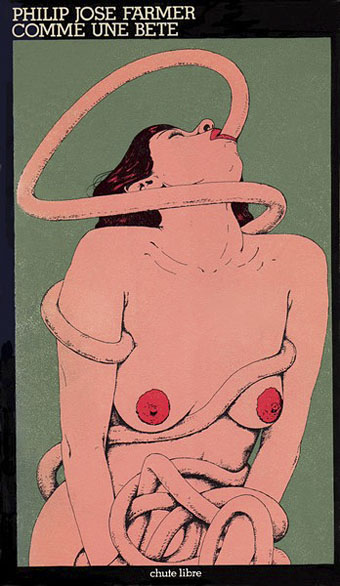
Comme une Bête (Image of the Beast, 1974). Illustration by Moebius.

chutelibre03.jpg

Les Culbuteurs de l’Enfer (Damnation Alley, 1974). Illustration by Jean-Claude Castelli.

chutelibre04.jpg

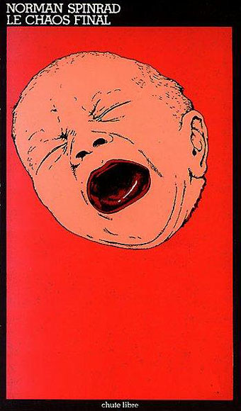
Le Chaos Final (The Men in the Jungle, 1974).

Continue reading “Chute Libre science fiction”

H.P. Lovecraft: The Complete Fiction

lovecraft1.jpg

Illustration by Sven Geier, design by Jo Obarowski and Rebecca Lysen.

HP Lovecraft would have been as surprised as anyone if he could have witnessed the tremendous posthumous triumph he and his work have achieved.

Thus leading Lovecraft biographer and scholar ST Joshi in the introduction to this suitably monstrous book. H.P. Lovecraft: The Complete Fiction was published in a new edition last year after first appearing in 2008 as part of Barnes & Noble’s Leatherbound Classics Series. My drawing of Dagon from 1999 adorns the silvered endpapers, and the reason for this belated mention is because I was only sent copies this week after moaning about not having seen a copy in a Tor.com post about the series. In truth the oversight was partly my own fault: one hazard of this line of work is that artwork is requested months (or even years) in advance of publication, so if the work in question is a reprint it’s easy to forget all about it as you get involved with other things.

lovecraft2.jpg

So anyway, this is a handsome volume of over a thousand pages, not quite leather, it’s more of a leatherette with the design blocked into it. Sven Geier’s cosmic illustration has been given an iridescent finish, and the copies I was sent have metallic silver on the edges as well as a purple ribbon which makes a better match with the colour scheme. The contents comprise all of Lovecraft’s solo fiction (no collaborations, in other words) from the juvenilia through to the non-fiction of his Supernatural Horror in Literature essay. In addition to the introduction there’s a short note from ST Joshi for each story. Needless to say, I’m very pleased to be associated with Lovecraft’s work in this way.

Anyone considered buying a copy should note that the book is currently cheaper at B&N than at Amazon. Also, complaints about typos would appear to apply to the earlier edition although I’ve not had a chance to read any of the stories.

My Dagon picture below appears here larger than it has done before. The drawing was done with a Biro pen, something I’ve always liked using, then tweaked slightly in Photoshop to blur the lines a little and bring out the highlights. I’m not sure now the tweaking was necessary so I may dig out the original at some point to see how it compares.

dagon.jpg

Dagon (1999) by John Coulthart.

Elsewhere on { feuilleton }
The Lovecraft archive

Books Borges never wrote

borges2.jpg

Design by Hector Haralambous.

The composition of vast books is a laborious and impoverishing extravagance. To go on for five hundred pages developing an idea whose perfect oral exposition is possible in a few minutes! A better course of procedure is to pretend that these books already exist, and then to offer a resume, a commentary… More reasonable, more inept, more indolent, I have preferred to write notes upon imaginary books.

Jorge Luis Borges

Borges was true to his intention in scattering invented volumes throughout his work, a number of the ficciones either have invented books as their subjects or use them to propel the narrative. Tlön, Uqbar, Orbis Tertius is perhaps the most elaborate example, the story in which Borges invents an encyclopedia which is itself being invented to prove a philosophical point. My favourite Borges site at The Modern Word has a page detailing some of the imaginary volumes. Invented books naturally suggest invented book covers. Several years ago another Borges site took up the challenge for the latter which is where the examples above and below originate. The site is now defunct but its pages can be seen mostly intact thanks to the Internet Archive. The book covers are here and here. The designs for the most part could have been better, although they don’t look any worse than some of the poorly-designed covers for genuine books now flooding the web thanks to print-on-demand and electronic publishing.

borges3.jpg

Design by George Kranitis.

ttl7.jpg

The Spanish language edition of the Thackery T Lambshead Pocket Guide to Invented and Discredited Diseases (1977).

All of which reminded me of my own fake Borges covers from 2003, supposedly Borges’ own compilations of The Thackery T Lambshead Pocket Guide to Invented and Discredited Diseases, the fake disease guide edited by Jeff VanderMeer and Mark Roberts. These were created in colour but printed in black-and-white. Since they’ve appeared here before I’ve included links this time to larger copies. In a detail that Borges might have appreciated the idea for the disease guide came about after Modern Word editor Allen B. Ruch, who often manifests as The Great Quail, remarked to Jeff VanderMeer that “I think I have contracted Mad Quail Disease”. You have to be cautious with casual quips to writers, you never know where they might lead.

ttl8.jpg

An English paperback reprint of the Borges edition (1979).

Update: While we’re on the subject… Remember the Fake Books from The Royal Tenenbaums? Here They Are!

Elsewhere on { feuilleton }
The book covers archive

Previously on { feuilleton }
Borges and I
Recovering Viriconium
Forbidden volumes
Pasticheur’s Addiction

Weekend links 120

sanssoleil.jpg

• More Nabokov: The University Poem by Vladimir Nabokov, translated by Dmitri Nabokov and read by Ralph Fiennes. And Breitensträter – Paolino, a short story from Nabokov’s Russian period that’s only just been translated into English.

• More LSD: “For decades, the U.S. government banned medical studies of the effects of LSD. But for one longtime, elite researcher, the promise of mind-blowing revelations was just too tempting,” says Tim Doody.

• More Marker: The Guarded Intimacy of Sans soleil by Jonathan Rosenbaum, The Revolutionary Cinema of Chris Marker by Patrick Higgins, and Chris Marker’s Faces by Brian Dillon.

• “A private realm, not easily penetrated, from which emerged music that would give rise to so much of the music we know today.” Guy Horton on Kraftwerk’s Kling Klang studio.

• A narrative from the swamps of Borneo: BLDGBLOG on the mephitic enigma of London’s sewers.

• At Coilhouse: The Incredibly True Adventures of Gerda Wegener and Lili Elbe.

• “What some people call idleness is often the best investment,” says Ed Smith.

• Book cover design: Rick Poynor on Pierre Faucheux and Le Livre de Poche.

• Metaphysical psychedelia: Erik Davis on Rick Griffin: Superstar.

Diamanda Galás discusses her 13 favourite albums.

• Rudy Rucker’s Memories of Kurt Gödel.

• The Men of the Folies Bergère

Olympics or gay porn?

Smoketography

The songs of bowhead whales | Another Moon Song (2009) by Espers | One Thousand Birds (2012) by Six Organs of Admittance.

Charles Ricketts’ Salomé

ricketts1.jpg

Here is my scheme. I proposed a black floor – upon which Salomé’s white feet would show; this statement was meant to capture Wilde. The sky was to be a rich turquoise blue, and across by the perpendicular fall of strips of gilt matting, which should not touch the ground, and so form a sort of aerial tent above the terrace. Did Wilde actually suggest the division of the actors into separate masses of colour, today the idea seems mine! His was the scheme, however, that the Jews should be in yellow, the Romans were to be in purple, the soldiers in bronze green, and John in white. Over the dresses of Salomé, the discussions were endless: should she be black “like the night”? Silver, “like the moon”? Or – here the suggestion is Wilde’s – “green like a curious poisonous lizard”? I desired that the moonlight should fall upon the ground, the source not being seen; Wilde himself hugged the idea of some “strange dim pattern in the sky”.

Thus artist, designer, publisher and writer Charles Ricketts (1866–1931), describing in later years his proposal for what would have been the first staging of Oscar Wilde’s Salomé in London. The scheme never materialised since the play was banned but Ricketts did create costume and stage designs for subsequent productions elsewhere, including performances in Japan in 1920. The V&A has Ricketts’ sketch of the stage for a private production in 1906 by the Literary Theatre Society, London. (The ban on Biblical themes in theatre kept the play from public performance in London until 1931.) In the Tate archives there’s what may be one of Ricketts’ costume designs from the Japanese production. Ricketts’ painting of Salomé dates from 1925, and for such a lurid and passionate subject seems rather passionless and inert. This isn’t so surprising, he was always a better designer and graphic artist than a painter; his lifelong partner, Charles Shannon, was the one who excelled with oils.

And speaking of Ricketts and Shannon, searching around turned up this recent blog devoted to the pair which contains much detail about their celebrated book designs.

ricketts2.jpg

Elsewhere on { feuilleton }
The Salomé archive

Previously on { feuilleton }
Charles Ricketts’ Hero and Leander