Weekend links 328

jamison.jpg

Feathers and Weights (2016) by Susan Jamison.

• The latest release from A Year In The Country is No More Unto The Dance, “a reflection of nightlife memories and the search for the perfect transportative electronic beat”.

• Depero Futurista (1927), the bolted book showcasing the artistic work of Fortunato Depero, returns in a facsimile edition.

• This week in the occult: Sam Kean on 21st-century alchemists, and a second volume of The Occult Activity Book.

How could so many jazz critics have overlooked Davis’s powerful trumpet playing on Bitches Brew, and its continuities with his previous work? The reason for their bewilderment was, in large part, the brew, the music’s muddy electric bottom, which bore no resemblance to the jazz they knew. Davis had never been a pure bopper, but his music had always made allusion, however oblique, to the grammar of Parker and Gillespie. On Bitches Brew, Davis decisively broke with his roots in bop. As [George] Grella argues, building on the pivotal work of Greg Tate and Paul Tingen, the more revealing points of comparison were no longer to be found in jazz but in the psychedelic guitar of Jimi Hendrix, the warbled vocals of Sly Stone, and the bass lines of James Brown.

Adam Shatz on Miles Davis

• Daniel Wenger on Bob Mizer, “the obsessive photographer behind America’s first gay magazine”.

• The Hauntings at Tankerton Park, a book of words and very detailed drawings by Reggie Oliver.

• A 40-minute performance by Pentangle for Norwegian television in 1968.

• Maisie Skidmore on ten things you may not know about René Magritte.

• Shirley Collins is the secret queen of England, says Nick Abrahams.

• Eighth Climate: ethnographic recordings from the imaginal world.

• Pasquale Iannone on five ways to recognise a Pasolini film.

• The greatest record sleeves, as chosen by the designers.

• Cosmic Horror, new comics work by Ibrahim R. Ineke.

• Mix of the week: FACT mix 569 by S U R V I V E.

• At Dennis Cooper’s: 47 unmade films.

• Cosmic Dancer (1971) by T. Rex | Cosmic Slop (1973) by Funkadelic | Cosmic Tango (1973) by Ash Ra Tempel

Portraits of futures past

ttc1.jpg

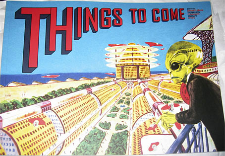
Since blogging here has become sporadic I find myself continually playing catch-up. Recent arrivals in the book department have included two art-related items that feature work of mine. The first is the catalogue for the Things To Come exhibition which ended last month at the Petach Tikva Museum of Art, Israel. When I posted photos of the exhibition back in May I was wondering about the identity of the curious iridescent structure occupying the gallery floor. This turns out to be a piece from 2015 by Netaly Aylon entitled Armour (Disappearing Methods). The same artist is also responsible for the cover of the catalogue, an homage to SF illustrator Frank R. Paul. I’ve always admired the wild inventiveness of Paul’s work so approve of the choice. There’s more Paul (and many other artists, past and present) inside the catalogue.

ttc2.jpg

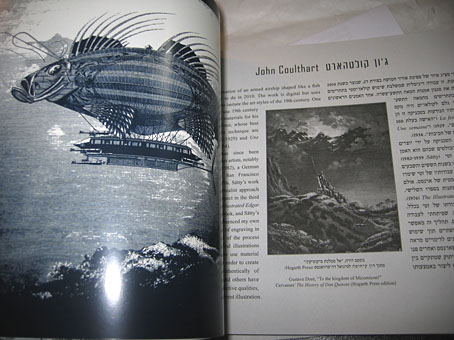
The booklet design by Yon Shavit cleverly solves the need to present bi-lingual information by having the English text run from the front while the Hebrew equivalent runs from the back. The artist pages feature both languages.

dg0.jpg

Book design by Emmanuel Dubois.

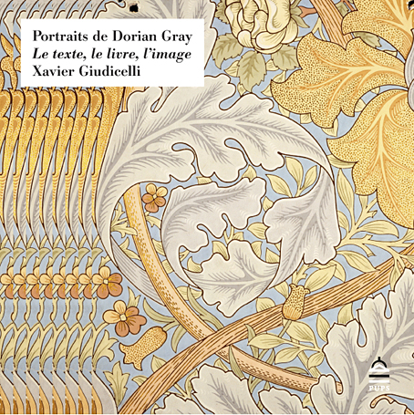
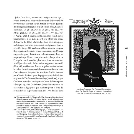
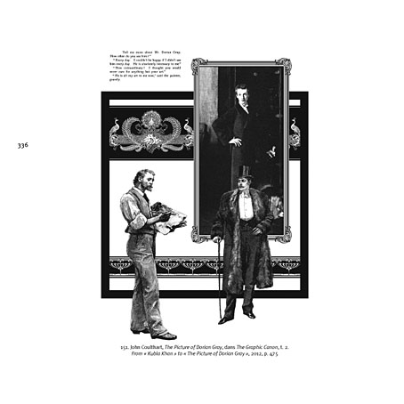
The other arrival was Portraits de Dorian Gray: Le texte, le livre, l’image by Xavier Giudicelli, a lavish, 404-page study from the Presses de l’université Paris-Sorbonne examining representations of Dorian Gray across various media. Xavier had already written about my illustrations based of Oscar Wilde’s novel for a French academic journal, Imaginaires. The book reprises that piece in the wider context of the many other adaptations of the novel. The text is French so much of the discussion is beyond me but the pictorial content is profuse, and includes many illustrations I’ve never seen before. Xavier says he’s already had an enquiry about a possible English edition so I’m hoping this goes ahead.

dg1.jpg

dg2.jpg

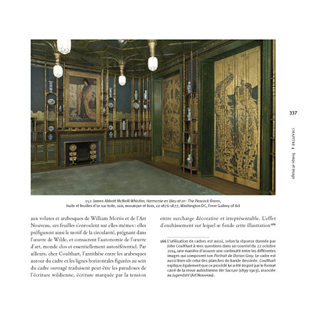
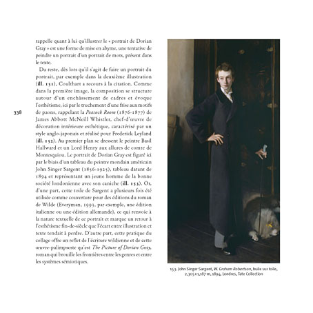
In addition to reproducing two of my pages from the Graphic Canon adaptation, Xavier illustrates my comments with photos of Whistler’s Peacock Room and Sargent’s portrait of W. Graham Robertson, a painting I used as the model for Basil Hallward’s portrait.

dg3.jpg

dg4.jpg

Previously on { feuilleton }
• More Things to Come
• Things to Come
• Foreign appearances
• Picturing Dorian Gray

Mapping the Boroughs

boroughs.jpg

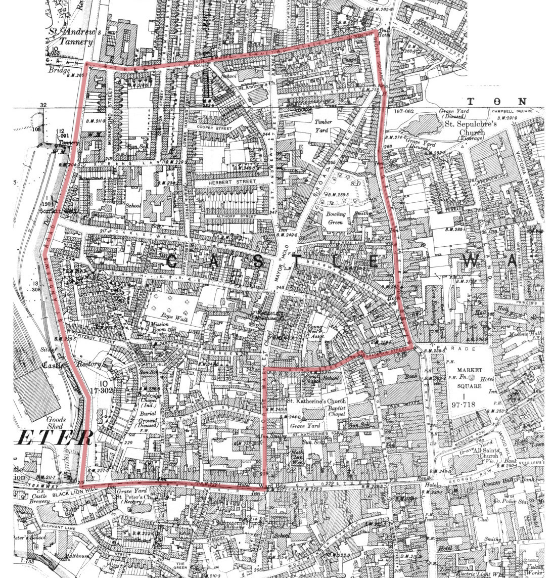
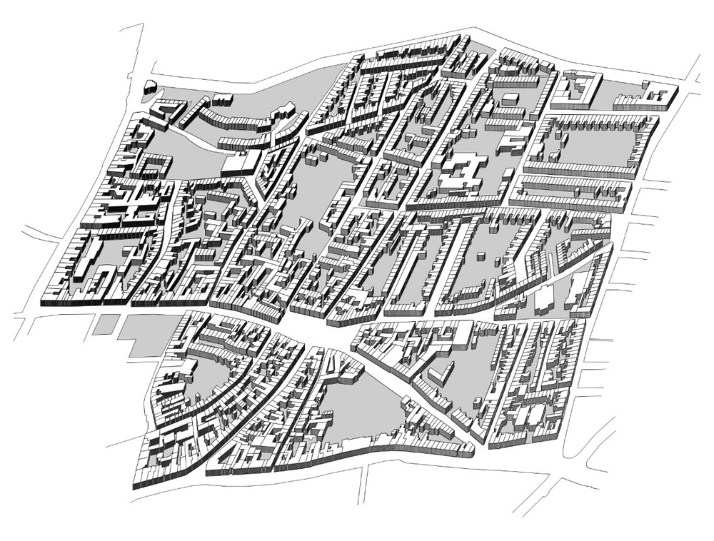
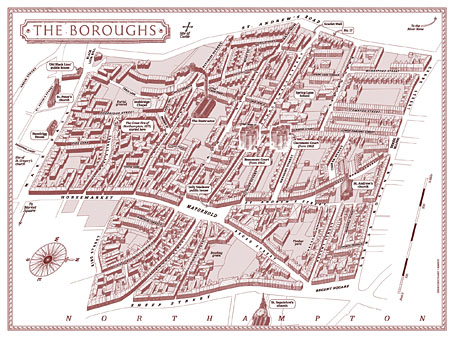
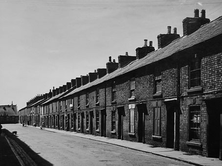
Alan Moore’s magnum opus, Jerusalem, is published today so I can talk at last about my small involvement with this huge novel. The request came through just before Christmas last year: Alan and his publishers, Knockabout Comics, wished to know whether I could create a map for the endpapers of the book. Not a flat street plan, but a bird’s eye view (in isometric or axonometric projection) of the now-demolished area of Northampton known as the Boroughs. The area still exists today under this name but Jerusalem concentrates on the region as it was when Alan was living there as a child: a dense labyrinth of houses, shops and a few small factories dating back to the 19th century, with many older buildings among them. This was the oldest area of the town, having originally grown up around Northampton Castle, a structure that was demolished gradually over the past few hundred years. Some of the street names in the Boroughs recall this history: Castle Street, Fort Street, Moat Street, Castle Terrace, etc.
compton.jpg

Compton Street a few years before demolition.

I immediately agreed to the request, of course, while swallowing heavily at what I was sure would be a demanding task. Looking at the crude street plan that Tony from Knockabout sent through, and examining the available maps on local history websites, it was evident that this was going to be a difficult technical challenge. Difficult, but not impossible if I could get hold of accurate maps of the area, which is what I did shortly after the Christmas break.
boroughs1899.jpg

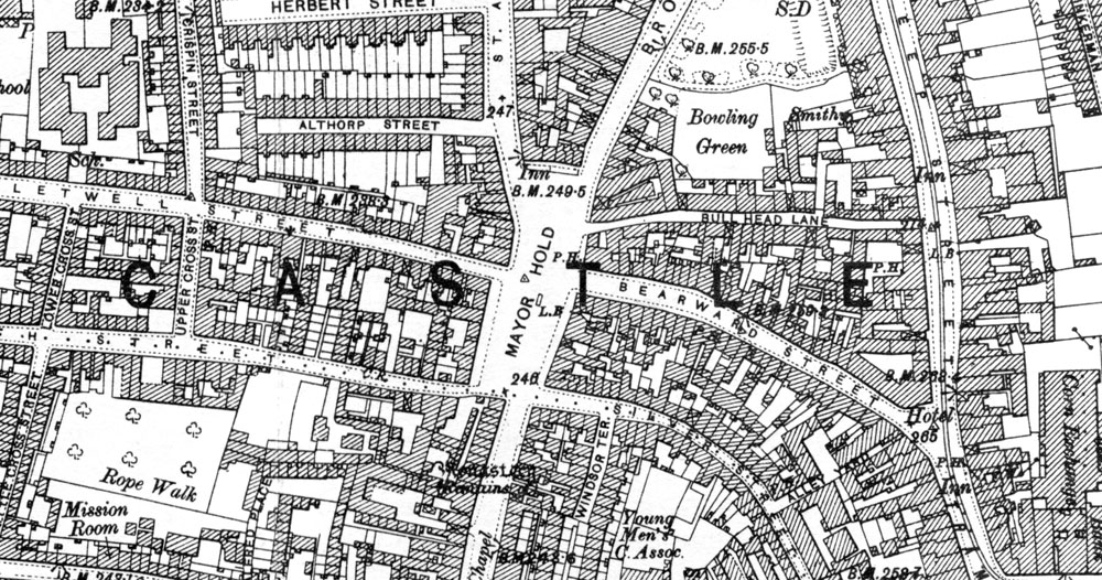
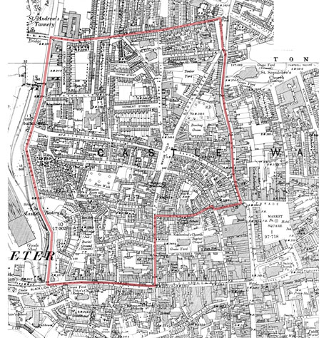
The Boroughs mapped by Ordnance Survey, 1899.

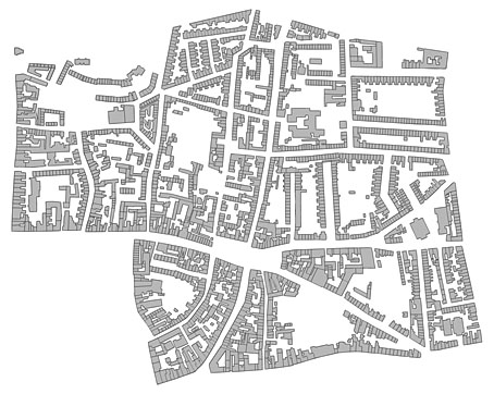
There’s a wonderful publishing company, Alan Godfrey Maps, that specialises in reprinting old Ordnance Survey charts of Britain for use by genealogists and local historians. I’ve had some of their maps of Manchester city centre for years, so I knew they’d be ideal if they covered the relevant area of the town. Fortunately for my purposes, they publish two 1899 25-inch-to-the-mile maps of Northampton town centre which cover the whole of the Boroughs. When the maps arrived I scanned them at high-resolution then stitched them together; the top of the Boroughs extends onto the lower part of the map of northern Northampton. After scanning, it was a case of tracing all the streets and the outline of every single building in the area in order to create a plan that was much more accurate than any of the vague plans available online.
boroughs1899-2.jpg

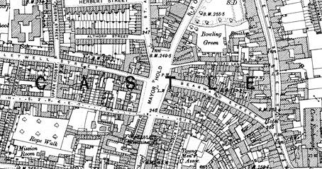
When I began work I had the idea of widening all of the streets in order to have legible street names running along the roads, a common practice among mapmakers who draw city plans. (The map of New York City that Alan and Dave Gibbons used when creating Watchmen is a good example.) However, widening the roads (or diminishing the scale of the buildings) would have risked important landmarks appearing too small, and there were other potential problems looming, so I decided to play safe and keep to the map scale.
plan.jpg

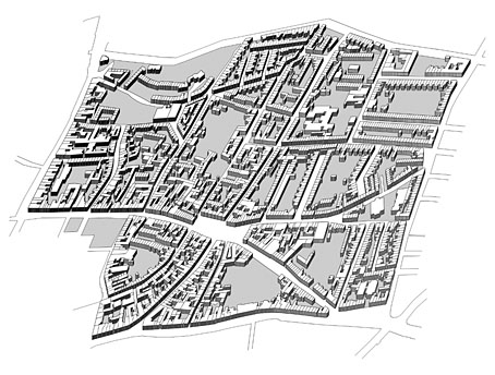
The biggest headache after solving the accuracy of the roads and buildings was what to do about the roofs. It wasn’t too difficult to elevate the ground plan once I had it tilted at a suitable angle: the elevation was achieved by making about 12 copies of the ground plan which are stacked one on top of the other. The first layer was run through the bas relief filter in Photoshop in order to give it some depth and shadow. This had the result of shadowing the building walls so they resembled solid three-dimensional blocks when enough layers were stacked together.
plan2.jpg

So all the streets and buildings are accurate up to a point. One inaccuracy is that all the buildings except for the churches are the same height, something that was unavoidable without invention. And there’s no representation of the slight hills which raise the streets in places. As for the roofs, these are mostly speculation. I’d thought at first that I might be able to save time by copying and pasting a generic roof shape but the streets are too meandering, and the building plans are too varied. The only solution was to put a copy of the roofless map into Illustrator then draw every single part of every single roof by hand: over 4500 vector pieces in all. By examining Google’s satellite pictures of the undemolished fringes of the old Boroughs I was able to guess how the some of the roofs might have worked together. At the beginning of the novel there’s repeated mention of the word “angles” (and its confusion with “angels”) so it now seems fitting that I spent the best part of a week drawing so many angles on the map. It would have been nice to also put chimneys on each house, and doors and windows (and add fences and pavements…), but if I’d started doing that I’d probably be finishing the work about now. Louis Bretez spent two years drawing the Turgot Map of Paris; I had deadlines pressing so had to get mine finished in five weeks.
boroughsdetail.jpg

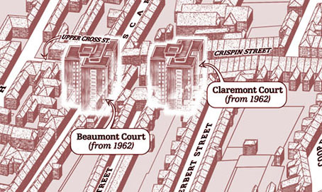
The map is based on the area as it was in 1899 but some of the landmarks are anachronisms. Alan’s story covers the past and present of the area so The Destructor, for example, wasn’t built until the 1920s. This is the building with the smoking chimney, one of several “municipal destructors” (incinerators) built around Britain at the time. The high-rise blocks of Beaumont Court and Claremont Court are even more out-of-time, having been built in 1962. It’s not so obvious from the printed map but these have a slightly ghostly presence since they don’t fit into the streets of the older Boroughs at all. Beaumont Court was built across Scarletwell Street so if you visit the area today you’ll find a block of flats at the end of a street that used to run from the houses where Alan grew up (on St Andrew’s Road) down to the Mayorhold.

A tough assignment, then, but it worked out in the end. It’s been an immense honour being asked to contribute to such a major novel.

Previously on { feuilleton }
• Maps of Midtown Manhattan
• The Turgot Map of Paris
• Art is magic. Magic is art.
• Alan Moore: Storyteller
• Alan Moore: Tisser l’invisible
• Dodgem Logic #4

Holzmüller and the Quays

ib1.jpg

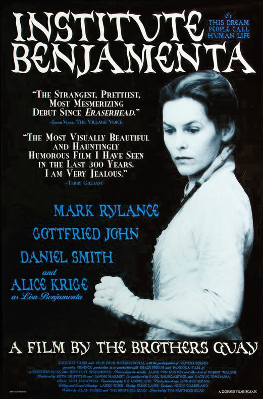
US one sheet (1996).

Heinrich Holzmüller (also spelt Holtzmüller) was a German printmaker and calligrapher active during the 16th century. He may have been dead for centuries but this inconvenience didn’t prevent him from appearing as an interviewer in the catalogue for the MoMA exhibition of artworks by the Brothers Quay that ran throughout the end of 2012.

ib4.jpg

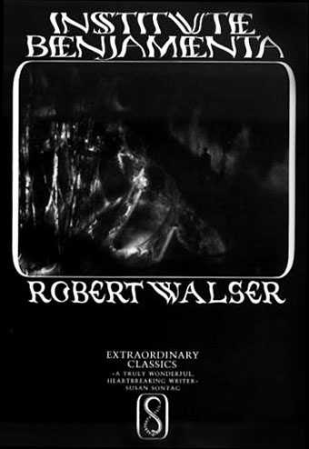
Film tie-in edition of Jakob von Gunten (1995).

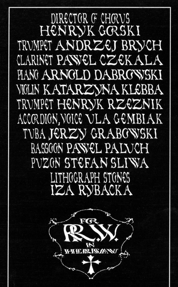
One of the more informative pieces of information to come from that interview concerned the Quays’ resurrection of typefaces designed by Holzmüller in his Liber Perutilis, a book about lettering and calligraphy published in 1553. The Quay versions were most visible around the time of the production of their first feature, Institute Benjamenta (1995): you can see them on the posters, on the cover of the Serpent’s Tail tie-in edition of Jakob von Gunten and also inside the rare soundtrack CD which the Quays designed for Lech Jankowski.

ib2.jpg

Institute Benjamenta soundtrack booklet (1998).

ib3.jpg

Institute Benjamenta soundtrack booklet (1998).

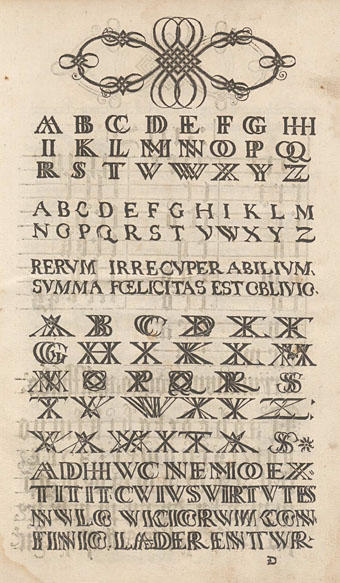
I’ve had the MoMA catalogue since it was published, and more than once had searched half-heartedly for Holzmüller’s book without success. A more recent search turned up the goods, however (sometimes it helps to keep following leads from one page to another): a copy of Liber Perutilis may be found online at the Universitätsbibliothek Basel.

holzmuller.jpg

Liber Perutilis is only a short book compared to some in the field but it’s much more varied and original than others I’ve seen. Among the alphabets which the Quays digitised there are sets showing the letters doubled and tripled in the manner of monograms. The Quays have often signed themselves using a double Q so this may explain the attraction. The undoubled alphabet is especially striking for Holzmüller’s distortions of the letterforms which make them seem like characters viewed under rippled glass. At a time when most books about lettering and calligraphy were showing alphabets produced by careful and elegant hands this is a feature which to our eyes seems surprisingly advanced. The Quays have copied the alphabets fairly closely, making minor changes such as rounding off an E and adding the J and U which are always missing in Latin alphabets of the period. Elsewhere in the book there are many examples of calligraphic flourishes and some unusual pieces of decorative knotwork. As for Holzmüller’s posthumous interview, copies of the MoMA catalogue are still available, while the interview itself will be reprinted in the booklet for the BFI’s forthcoming Blu-ray collection, Inner Sanctums—Quay Brothers: The Collected Animated Films 1979–2013.

Elsewhere on { feuilleton }
• The Quay Brothers archive

Roger Dean postage stamps

dean11.jpg

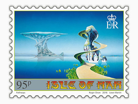
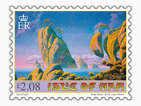
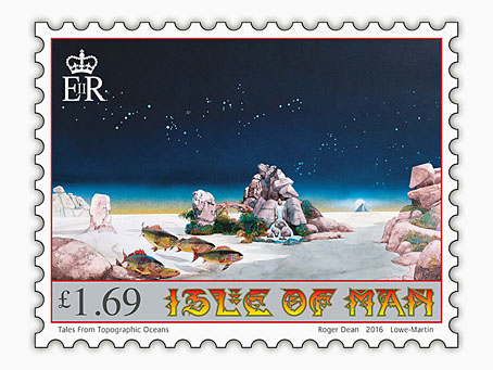
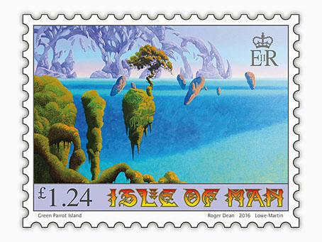
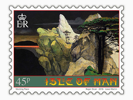
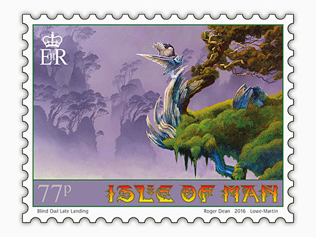
Roger Dean book covers last week; this week it’s postage stamps. These are exclusive to the Isle of Man Post Office, unfortunately, so there’s little chance of buying them over the counter in mainland Britain. First day covers, presentation packs and individual sheets may be ordered from the post office website, however. For those who can visit the Isle of Man there’s also an exhibition of Dean’s art running at the Manx Museum in Douglas until November.

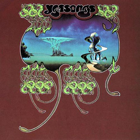
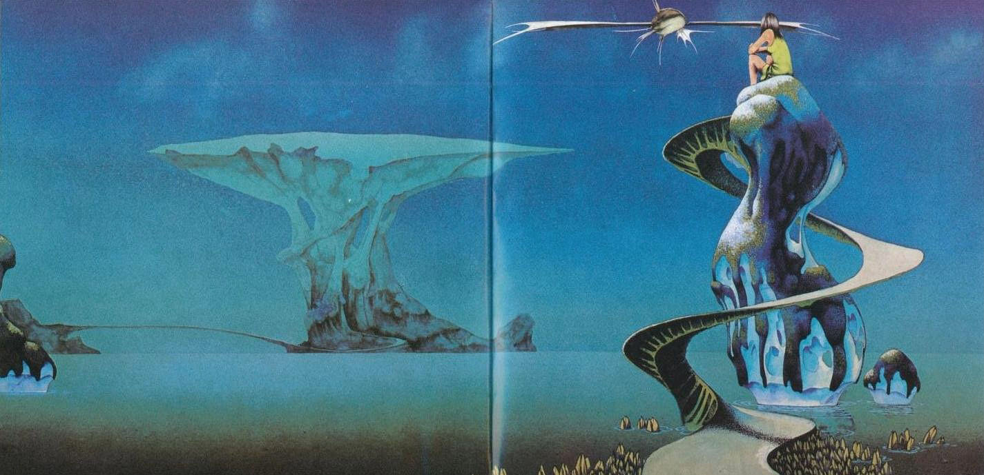
Several of the paintings on the stamps are from the covers for albums by Yes and Asia, including the one above which was used twice on the live Yessongs album in 1973. (The large version inside the gatefold had a figure of a girl and a fish spacecraft added.) The version appearing on the stamp is Dean’s recent reworking of the piece. This removed the airbrushed clouds—added to disguise the footprints of his cats which had walked over the painting when it was drying—and also smoothed the gradients and added a reflection. I’ve been familiar with the album version of this picture for decades so I prefer the rougher original as it is on the cover (and in Dean’s Views book) without the girl and spacecraft.

yessongs.jpg

yessongs2.jpg

One other thing of note is Dean’s lettering design for the stamps. When I wrote about Dean’s art a few years ago I drew attention to the way his design work has been either marginalised or ignored altogether by people who dismiss him as a mere fantasy artist. All of Dean’s album covers have included unique letterforms that are immediately recognisable as his own (so too the logos and lettering he was designing for computer games in the 1980s) but I’ve yet to see this side of his work given any serious attention. (Postage stamp tip via It’s Nice That.)

dean8.jpg

dean9.jpg

dean10.jpg

dean7.jpg

dean12.jpg

Previously on { feuilleton }
• Roger Dean book covers
• Design as virus 17: Boris and Roger Dean
• Roger Dean: artist and designer