Weekend links 427

davis.jpg

Inside an O’Neill Cylinder, an orbital megastructure. Painting by Don Davis, 1975.

• RIP Lindsay Kemp: dancer, actor, choreographer and (if we have to drop names) mentor to David Bowie and Kate Bush. Kemp’s work has been featured here on a number of occasions, particularly his landmark productions of an all-male Salomé, and Flowers, A Pantomime for Jean Genet. There was also considerable overlap with Kemp’s troupe and the films of Derek Jarman via appearances by Kemp himself, David Haughton and the irrepressible Jack Birkett. The Genet production was filmed in 1982, and is now available on DVD. (There’s also a rougher copy with unmatched audio and video.) From 1970: Pierrot in Turquoise, or The Looking Glass Murders, a Commedia dell’arte performance for Scottish TV featuring David Bowie. And reversing roles, Mick Rock’s video for Bowie’s John, I’m Only Dancing featuring Kemp and company.

• At Expanding Mind: Erik Davis in conversation with activist and writer David Nickles about “the DMT Nexus, psychedelic militancy, extraction tek, the Statement on Open Science for Psychedelic Medicines, MAPS, and the trouble with for-profit psilocybin companies”.

• From the end of August to January 2019: Spellbound at the Ashmolean; “Spellbinding stories, fascinating objects…from crystal balls and magic mirrors to witch bottles and curse poppets”.

On Earth, as on the International Space Station, the collective misperception of a flat plane helps build community and culture. We are all equal in our geometric relationship to one another. The reality, of course, is that we do not stand parallel. Each of our bodies corresponds with a distinct radial vector on the surface of a sphere, pointing away from a common center that we can never perceive or occupy. Our vectors diverge by imperceptible angles.

In “inside-out” worlds like the Bernal Sphere and the concave Earth, the situation is reversed. Our feet all point outward, into an inaccessible, but technologically habitable void, while our heads point inward, some of us apparently “upside-down.” Standing, we rise toward a visible center, which can be reached simply by climbing a hill, strapping on wings, and jumping into the air, as low-tech as Icarus.

The Shape of Space by Fred Scharmen

Michael Moorcock again, interviewed this time by Bernard Braden in 1968. I think this one was for a Braden TV series which was never broadcast.

• “Stupid things are best”: Neil Fox on Conny Plank: The Potential of Noise, a documentary about the great music producer.

• Mixes of the week: XLR8R Podcast 556 by Helios, and An Ode to Eris with An Other Ode to Eris by The Ephemeral Man.

• A monstrous primer on the works of HP Lovecraft by Emma Stefansky. With illustrations by Michael Bukowski.

Silent Agents by Julius-Christian Schreiner: photographs of hostile architecture from around the world.

• Back to the Futuro: Mark Hodgkinson on the spaceship house that landed in Yorkshire.

• The Great Chinese Art Heist by Alex W. Palmer.

Rhizome: a new recording by Drew McDowall.

The Starman Tarot

Mad Pierrot (1978) by Yellow Magic Orchestra | Spellbound (1981) by Siouxsie And The Banshees | Sphere (2011) by Emptyset
Weekend links 426

slinger.jpg

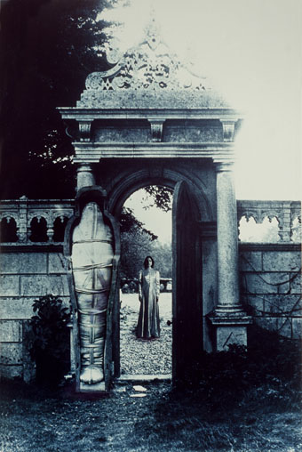
Self Preservation (1970–77), a collage by Penny Slinger from the series An Exorcism.

• RIP John Calder, one of the most important British publishers of the last century whose death was acknowledged in the Washington Post (and in the Telegraph, a paper that would have given him no support during his censorship battles) but at the time of writing hasn’t been mentioned at all in the increasingly useless Guardian. The omission in the latter seems even more surprising when Calder himself wrote obituaries for the paper, and they ran an archive piece two weeks ago for the 50th anniversary of Calder & Boyars’ successful court defence of Last Exit to Brooklyn. “Publishing is an industry run by capitalists now.

• Another 50th anniversary: David Bushman asked Alan Moore for his memories of Patrick McGoohan’s superb TV series The Prisoner.

Michael Moorcock in conversation with Hari Kunzru at Shakespeare and Company, Paris.

Stephen O’Malley presents Acid Quarry Paris – In Session with Richard Pinhas (Heldon).

• When a rock is a stone: Louise Steinman on finding Robert Smithson’s Spiral Jetty.

• Victorians, Vaults, and Violet Water: a profusion of links at Greydogtales.

• Mix of the week: FACT mix 666 by Róisín Murphy.

• The amazing adventures of Melinda Gebbie.

Starbirthed

Exorcism (1971) by Lucifer | The Final Calling (Physical Exorcism) (1984) by CTI | Exorcism Of The Hippies (2010) by Mater Suspiria Vision

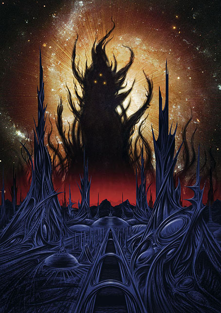
A view over Yuggoth

yuggoth2.jpg

I mentioned in the post about the Sherlock Holmes illustrations that the next book from Editorial Alma featuring my work would be another Lovecraft collection. One of the illustrations in the new volume was of the planet Yuggoth, a world known to human beings as Pluto. In Lovecraft’s mythos Yuggoth has long been an outpost of advanced alien civilisations, particularly the fungoid crustaceans of The Whisperer in Darkness and the splendidly-titled sonnet sequence Fungi from Yuggoth. I’d broached this subject a couple of times in the past, first with a panel in my Haunter of the Dark comic strip (the Shining Trapezohedron is described as being brought to Earth from Yuggoth) then with a photocopy collage of Haeckel organisms for the first Starry Wisdom collection.

Yuggoth is one of several alien outposts in Lovecraft’s fiction, allied in its remoteness from humans with the underwater city of R’lyeh and the Antarctic city in At the Mountains of Madness. All these locations suggest exotic architecture so they’ve long been some of my favourite features in Lovecraft’s work, hence this new piece which I couldn’t resist doing after completing work on the Alma book. Since I acquired a Wacom tablet four years ago I’ve become so used to using it for line drawing that working with it now feels as natural as working with pens and inks. But digital painting was something I still didn’t feel happy with. This is mainly because the brush options in Photoshop are limitless, and one thing I’ve never liked with art materials is too much choice. When I was working with physical media I used to use a minimum of pens and brushes so what I really wanted from Photoshop was a single brush that would do what I wanted without having to swap tools all the time when working. This view of Yuggoth is the result of having finally settled (by chance, as it happened) on a brush that does everything I want without getting in the way. The drawing was completely improvised so as a composition it has some flaws; it could also have been developed a lot more to bring out highlights and details. But as an experimental piece it worked out well and also didn’t take too very long to do. When I have the time I’ll be doing more with this new brush.

Elsewhere on { feuilleton }
The Lovecraft archive

Weekend links 425

tsuruta.jpg

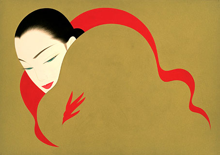
Art by Ichiro Tsuruta.

• “Writing is so much about subverting dogmatisms of all kinds, above all the ones that insist you cannot go there! You must not say that! Writers need to go anywhere, to take anything on. And the only rule is to do it well.” Rikki Ducornet in a feature at Dennis Cooper’s which has been linked here before but was previously on DC’s old (now deleted) blog.

• “This book-cover trend is turning bookstores into flower shops,” says Kenzie Bryant. “How publishing’s floral-print trend came to rule the world’s bookshelves.” (Where “the world” means the USA, as usual…)

• The third edition of Wyrd Daze—”The multimedia zine of speculative fiction + extra-ordinary music, art & writing”—is out now.

For this listener, Nardis has become a full-on musical obsession. I have more than ninety official and bootleg recordings of the tune stored in the cloud, ranked in a fluid and continually updated order of preference, so they follow me wherever I go. In my travels as a writer, I use Nardis as a litmus test of musical competence: if I see a jazz band in a bar or a busker taking requests, I inevitably suggest it. (If they’ve never heard of it, I understand that they must be new at this game.) By now I’ve heard so many different interpretations, in such a far-flung variety of settings, that a Platonic ideal of the melody resides in my mind untethered to any actual performance. It’s as if Nardis were always going on somewhere, with players dropping in and out of a musical conversation beyond space and time.

Steve Silberman on the obsession that he and pianist Bill Evans share with Nardis, a Miles Davis composition that Davis himself never recorded

• Mixes of the week: Secret Thirteen Mix 263 by Jung An Tagen, and XLR8R Podcast 554 by Tutu.

• “René Magritte still has the power to surprise,” says Sophie Haigney.

Ishmael Reed at the Brockport Writers Forum, 1st May, 1974.

• The On-U Sound label is now at Bandcamp.

Brian Eno talks music, global politics, etc.

Faded Flowers (1985) by Shriekback | Other Flowers (2003) by Harold Budd | White Flowers (2014) by Lutine

The Joe Phenix Detective Series

joephenix.jpg

After six months of black-and-white drawing it’s been good to return to colour book covers of which this is the first of a new crop of designs. Albert W. Aiken (c.1846–1894) was a prolific American author of pulp fiction, whether writing under his own name or pseudonymously (and sometimes as a woman) for Dime Library, Banner Weekly, Saturday Journal and many other publications. Joe Phenix (also named Phoenix in later stories) was one of his more popular creations, a late-Victorian detective whose investigations ran to over 20 adventures. These tales are in the process of being made available by Mark Williams in ebook form so my task was to provide a single cover design that could function for all the titles.

In keeping with the new format, the style deployed here is mostly a pastiche of the dime novel idiom with a few contemporary touches. Many of the dime publications favoured a large box in the top third of the cover which would contain a typically florid title arrangement. The accompanying illustrations were often comparatively crude but the titles followed the style of the period with engraved drop shadows, gradients and lots of fine decoration. It’s fun to imitate this style although it can also be more time-consuming than contemporary design since everything has to be worked out one piece at a time. Several of the decorative elements on this cover are what printers used to refer to as “combination ornaments”, very small details which can be pieced together in a number of ways to form banners, borders and other motifs. Combination ornaments were a solution to the problem of working elaborate decoration into spaces of variable size and shape; instead of a pre-shaped design you’d shape the decoration to fit the space. They were also lucrative since printers charged for the use of each small element. In a digital composition such as this the joins between the pieces are invisible but in a period design you can often spot the combination pieces (especially in border designs) when the individual elements fail to line up properly. The figure with the gun, incidentally, is Mr Phenix himself, taken from the cover of Beadle’s Dime Library.

The first few Joe Phenix titles are available now at Amazon and other ebook outlets with further titles to follow.

Previously on { feuilleton }
The man who wasn’t Tesla
The George Dower Trilogy by KW Jeter
Steampunk in the Tank
More vapour trails
Steampunk catalogued
Steampunk: The Art of Victorian Futurism
Steampunk Calendar
Words and pictures
Nathanial Krill at the Time Node
Fiendish Schemes
Ghosts in Gaslight, Monsters in Steam
Steampunk Revolution
The Bookman Histories
Aether Cola
Crafting steampunk illustrations
SteamPunk Magazine
Morlocks, airships and curious cabinets
The Steampunk Bible
Steampunk Reloaded
Steampunk overloaded!
More Steampunk and the Crawling Chaos
Steampunk Redux
Steampunk framed
Steampunk Horror Shortcuts