The Devourer Below

devourer.jpg
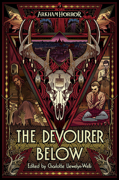
Another week, another cover design. This is the third cover of mine for the Arkham Horror line from Aconyte Books, a fiction series which complements the Lovecraftian Arkham Horror game:

Something monstrous has come to Arkham, Massachusetts. There have always been shadows here, but now a new hunger has risen from the depths and threatens those who dwell here. But there are heroes too—people who stand up and fight to stem the tide, even when it costs them everything. Explore eight shocking new tales of occult horror, captivating mystery, and existential fear—from a zealous new heroine to conniving cultists, bootleg whiskey to night terrors, and fiends that crawl from open graves. A nightmare has fallen across Arkham, and it will devour all.

As with the earlier titles I’ve worked on, The Last Ritual and Litany of Dreams, the general style is Art Deco in keeping with the period in which the game and the stories are set. The new cover worked out especially well thanks to the brief which suggested extending the triangle that appears on the previous covers so that it became a frame for a deer skull bedecked like a ritual artefact. This created a little more space for the requisite character panels, the figures here being an underworld investigator and a lycanthropic asylum inmate, both of whom feature in the game. The brief also requested that Arkham be represented somewhere, so I spent a lot of time drawing a view over the gambrel rooftops of the haunted town, only to shrink the panel down to a size which loses much of the detail. It may be a miniature view but it’s like one of those special effects shots you see in a film, something you know must have taken a lot of work to achieve but which is only visible for a few seconds; a minor presence that adds to the texture of the whole. And the view of nocturnal architecture provides a further link with the previous covers.

The Devourer Below will be available in ebook and US paperback in July, with a UK paperback following in September.

Elsewhere on { feuilleton }
The Lovecraft archive

Previously on { feuilleton }
Litany of Dreams
The Last Ritual

Weekend links 564

kolbe.jpg

Fantastical Tree (c. 1830) by Carl Wilhelm Kolbe.

• “It’s just a square and a semi-circle at the end of the day.” Pete Adlington navigates the rapids of high-profile cover design for the UK edition of Kazuo Ishiguro’s Klara and The Sun. I’m not always keen on the minimal approach but the Faber edition is a better design than the equally minimal US cover whose circle in a hand makes it look like a reprint of Logan’s Run. Faber also produced a limited edition with the sun circle wrapped onto sprayed page edges.

• “‘With a mysterious smile on her lips,’ writes the Chilean film director Alejandro Jodorowsky, ‘the painter whispered to me, “What you just dictated to me is the secret. As each Arcana is a mirror and not a truth in itself, become what you see in it. That tarot is a chameleon.”‘” The painter referred to is the now-ubiquitous Leonora Carrington whose own Tarot deck is investigated by Rhian Sasseen.

• “‘Horror is an emotion,’ Douglas E. Winter tells us. I would respectfully like to amend that assertion. Horror is a range of emotions. And each of these moods, if they are to be successful, must be cultivated differently.” Brian J. Showers offers his thoughts on horror fiction.

• “You move from awareness of—and preoccupation with—how sounds affect our bodies, into how that might create a web of connection with the external world—with the natural world.” Annea Lockwood talking to Jennifer Lucy Allan about her career as a composer and sound artist.

• Gay cruising and its geography in cinema and documentary, a list of films by Mike Kennedy. Related: Shiv Kotecha on O Fantasma (2000), a film by João Pedro Rodrigues.

• Coming from Strange Attractor in June: Coil: Camera Light Oblivion, a photographic record by Ruth Beyer of the first live performances by Coil from 2000–2002.

• At Wormwoodiana: Mark Valentine on The Star Called Wormwood (1941), a strange novel by Morchard Bishop.

• At Unquiet Things: Ephemeral and Irresistible: The Spectacular Still-life Botanical Drama of Gatya Kelly.

• “Fevers of Curiosity”: Charles Baudelaire and the convalescent flâneur by Matthew Beaumont.

• 1066 and all that: Explore the Bayeux Tapestry online.

• Mix of the week: Secret Thirteen Mix 311 by Arigto.

• New music: Terrain by Portico Quartet.

Fever (1956) by Little Willie John | Fever (1972) by Junior Byles | Fever (1980) The Cramps

32 Short Lucubrations Concerning Alan Moore

am.jpg

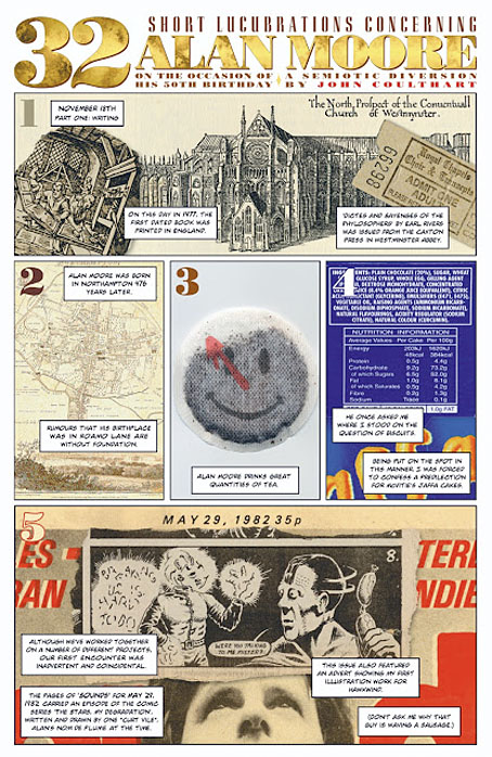
One of my few comic strips that isn’t either a Lovecraft adaptation or part of the Lord Horror mythos is a five-page piece I produced in 2003 for Alan Moore: Portrait of an Extraordinary Gentleman. This was a book compiled by Smoky Man to honour Alan’s 50th birthday, for which my strip was one of many other comics, one-off portraits and contributions by different artists and writers. The book is out of print so Smoky has been posting extracts (with permission) on his blog. My strip may now be seen in full here.

I got the idea for this one from Thirty Two Short Films About Glenn Gould (1994), a feature-length portrait of the celebrated pianist which evaded the clichés of the biopic by addressing its subject through self-contained sequences in a variety of modes: dramatic reconstruction, interviews with Gould’s friends, documentary material, a spectrographic display from the playback of one of his Bach recordings, even a short piece of animation. My strip is less ambitious but it combines factual trivia about Alan Moore with personal reminiscences plus significant historical details connected with his birth date, 18th November, 1953. It was fun to put together, and a reminder that comic strips can be used for more than just telling stories.

Previously on { feuilleton }
Voice of the Fire by Alan Moore
The Blake Video
The Cardinal and the Corpse
Mapping the Boroughs
Art is magic. Magic is art.
Alan Moore: Storyteller
Alan Moore: Tisser l’invisible
Dodgem Logic #4

Weekend links 563

tonto.jpg

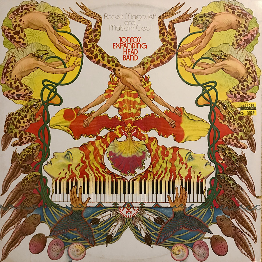
Cover art by Jeffrey Schrier for the 1975 reissue of Zero Time by Tonto’s Expanding Head Band.

• RIP Malcolm Cecil, electronic musician, and producer of Stevie Wonder, among many others. The term pioneer is over-used when discussing electronic artists, but it’s an accurate one when applied to Cecil and his partner in Tonto’s Expanding Head Band, Robert Margouleff. The first Tonto album, Zero Time (1971), was a collection of fully-realised all-electronic compositions recorded in the days when “electronic music” in the rock sphere usually meant rock-band-plus-synth-burbles. As I said in a post about Tonto’s debut album a few years ago, “Jetsex sounds like an outtake from Kraftwerk’s Autobahn (albeit three years early) while Timewhys wouldn’t have been out of place on The Human League’s Travelogue album almost a decade later”. Cecil may be seen in this short film showing off the bespoke synth gear that comprised The Original New Timbral Orchestra (aka TONTO), while he talks at length about his career in issue 4 of Synapse magazine here. Cecil and Margouleff parted company in the mid-70s shortly after releasing a second album, It’s About Time (1974), a collection of jazzy instrumentals that’s overdue a proper reissue.

• “Every film production company they showed it to said it was ‘too weird’ to ever be made. ” Next month Strange Attractor publishes The Otherwise, a script by Mark E. Smith and Graham Duff for an unmade horror film.

• More horror: Predator’s Ball by Uni; music video as horror scenario in which you can play spot-the-reference: Alice in Wonderland, Rocky Horror, Leigh Bowery (?), Pasolini’s Salò (?)…

• At Bibliothèque Gay: Narkiss by Jean Lorrain, another homoerotic classic newly translated into Spanish, and with new illustrations.

• The week in Gary Panter: Nicole Rudick on Gary Panter’s Punk Everyman, and the man himself writing about his life and art.

• At Wormwoodiana: Mark Valentine investigates the connections between Charles Williams and Sax Rohmer.

• At Dangerous Minds: New Age Steppers, “the only ever post-punk supergroup”.

• Mix of the week: XLR8R Podcast 689, a feast of funk compiled by Steve Arrington.

• At Public Domain Review: Agostino Ramelli’s Theatre of Machines (1588).

• At Dennis Cooper’s: Pier Paolo Pasolini Day.

Valentina Magaletti’s favourite music.

Louvre site des collections

Narcissus Queen (1958) by Martin Denny | Narciso (1974) by Pierrot Lunaire | Narkissos (2006) by Sadistic Mikaela Band

More Swans and Robots

robotartists01.jpg

Real Italian fantascienza is an authentic expression of Italian culture, which is brainy, nerdy, gutsy and pulp, it’s far-out but down-home, and raw but civilized. I would not proclaim that it’s the best fantasy writing ever created in the world, but it encourages and motivates me.

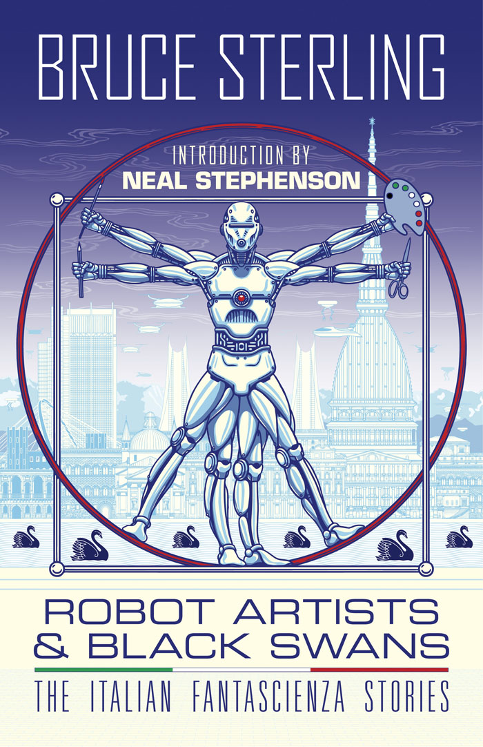
Bruce Sterling talking to Paul Semel about his collection of fantascienza stories, Robot Artists and Black Swans. My cover design was posted here last September; the book itself is published this week by Tachyon so I can at finally reveal the interior illustrations. Sterling’s collection presents seven stories written by his Italian alter-ego, Bruno Argento, with several of them appearing in English for the first time. The Italian theme informs the design as well as the content, although the associations aren’t always as obvious as they are in my illustrations for Sterling’s earlier fantascienza book for Tachyon, Pirate Utopia, the art and design for which adapted graphics by the Italian Futurists.

robotartists08.jpg

As I mentioned in the earlier post, while searching for more recent Italian graphics I came across the work of Franco Grignani (1908–1999), a designer whose most famous work was the Woolmark logo, one of those international symbols that most people will have seen even if few know who was responsible for its creation. The Woolmark’s black-and-white stripes are typical of Grignani’s designs, many of which work variations on the eye-jangling Op Art style pioneered by Bridget Riley. Grignani’s work seemed at first as though it might offer a suitable model for the cover design but it quickly became apparent that his style wasn’t suitable for this title so I went in another direction. Grignani’s influence is present inside the book, however, in the more abstracted illustrations, and in the parallel lines that provide a connecting thread between the stories and their illustrations. The Eurostile fonts used throughout the book also have an Italian flavour. They’re a little clichéd for science fiction but I liked the way they combined SF associations with more Italian design, being the work of Alessandro Butti and Aldo Novarese.

robotartists15.jpg

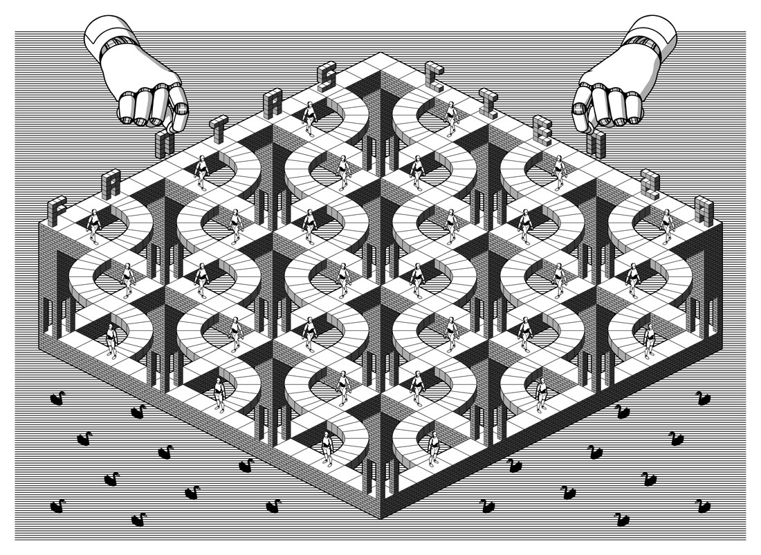
The other design influence, and a more identifiable source, is MC Escher, a choice prompted by the black swans in the title. Escher’s tessellated patterns feature a variety of animals, swans included, so I adapted two of the artist’s swan patterns to prevent the illustration from being robot-heavy. Escher also has an Italian side, as it happens; he enjoyed holidaying in Italy, and the vernacular architecture of the country’s small coastal towns may be found in many of his lithographs. The Escher swans led in turn to a self-indulgent illustration that fills two pages at the front of the book, something that came about after I was playing with Penrose triangles in Illustrator. I’d made a group of these impossible shapes into a construction which a little tweaking turned into a piece of equally impossible architecture, rather like those in the Escher-influenced mobile game, Monument Valley. All that was required to flesh things out was to cover the walls in a brick pattern then add a few swans and robots.

Continue reading “More Swans and Robots”