HP Lovecraft: Tales of Horror

hpl.jpg

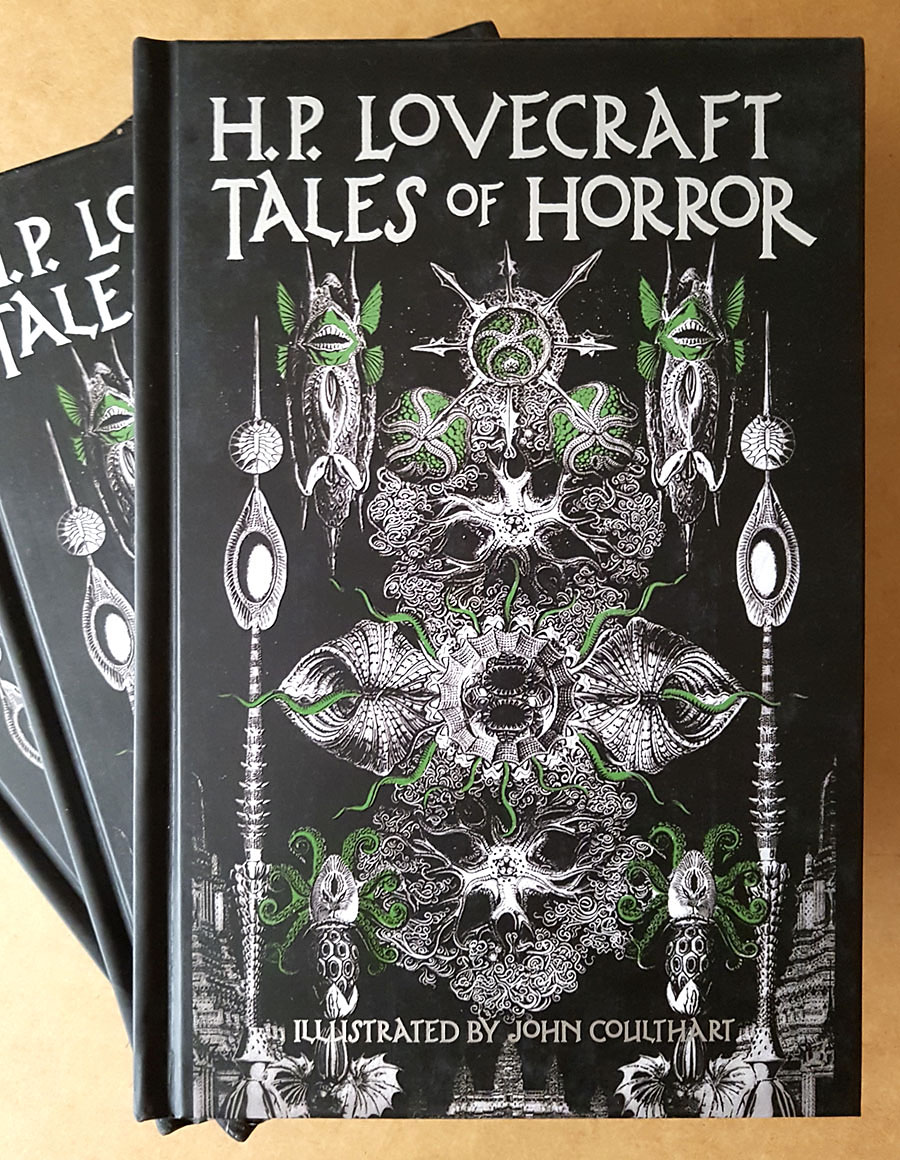
Cover design by Jo Obaroswki.

More Lovecraftiana (for a change). Today’s mail included the surprise delivery of these books, a very late arrival since the book was published over a year ago. Well better late than never, I was very pleased to be involved with this one which has been published by Fall River Press, an imprint of Barnes & Noble. The plan was to reprint a small number of Lovecraft stories on colour pages accompanied by my artwork. So the book is also a reprint of many of my earlier Lovecraftian drawings, from the comic strips to more recent illustrations, with the pictures carefully cropped and, in some places, reworked a little to match the stories.

The contents:
• Introduction by Stefan Dziemianowicz
The Call of Cthulhu
The Colour Out of Space
The Haunter of the Dark
The Whisperer in Darkness
The Dunwich Horror
The Thing on the Doorstep

hpl2.jpg

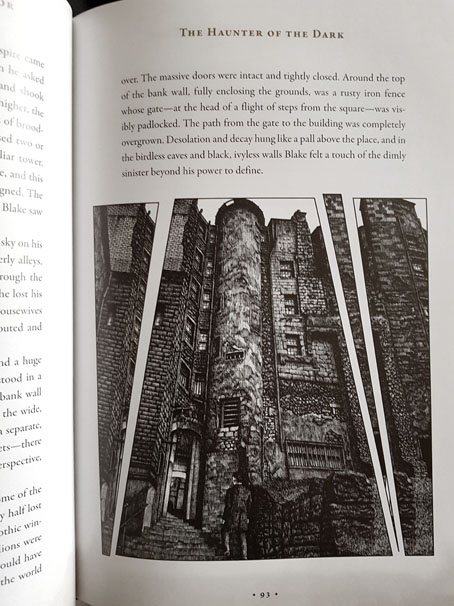
The end result is very impressive. The book is solidly bound in hard covers with the cover art featuring metallic silver ink and gloss highlights. The interior design is by Gavin Motnyk who chopped up and tinted my drawings (with my approval) in a very effective manner. Many of the panels at the end of my adaptation of The Call of Cthulhu were presented with this kind of fragmentation so I was happy to see this extended to other drawings. In addition to presenting the artwork in a new way it also helped compensate for some of the shortcomings in drawings that date back to 1986. Not everything is this old, however. I sent Gavin a copy of my redrawn R’lyeh panorama which has been printed across the endpapers.

For now this is the most substantial collection of my Lovecraft artwork in print. And since it’s being distributed by Barnes & Noble it’s also relatively easy to find (although that title, Tales of Horror, is very similar to other collections). Fall River Press will be publishing another classic horror volume featuring my illustrations towards the end of the year. More about this later.

Elsewhere on { feuilleton }
The Lovecraft archive


Necronomicon all’italiana

necro01.jpg

The 1978 edition of the Necronomicon edited by George Hay remains my favourite among the many fake Necronomica. It was the first one I bought, following a memorable “WTF?!” encounter with the Corgi paperback in WH Smiths, and as a book it’s always been better value than the much more popular “Simon” Necronomicon (1977) despite having a smaller page-count. Hay’s book is as much a general guide to Lovecraft’s fiction as an invented grimoire. In addition to the detailed occult fabulation crafted by Robert Turner and David Langford there’s a lengthy introductory essay by Colin Wilson, while the appendices comprise essays by L. Sprague de Camp (“Young Man Lovecraft”), Christopher Frayling (“Dreams of Dead Names: The Scholarship of Sleep”) and Angela Carter (“Lovecraft and Landscape”). The “Simon” book had little in the way of illustration beyond the few invented sigils which you now see reproduced endlessly in role-playing circles. The Hay book, on the other hand, featured a handful of illustrations by Gavin Stamp (all but one of them them credited to the fictitious “GM Sinclair”) which have been marooned with the essays in obscurity for far too long.

necro02.jpg

I posted some of Stamp’s illustrations several years ago but they’re worth visiting again now that an Italian translation of the Hay book has turned up at the Internet Archive. This edition, published in 1979 by Fanucci Editore, includes an additional appendix containing two more text pieces plus a portfolio section with further illustrations by Italian artists. The Italians seem to like Lovecraft’s fiction almost as much as the French do. The first substantial collection of Lovecraftian comic strips and illustrations was an Italian book, The Cosmical Horror of HP Lovecraft, published by Glittering Images in 1991. A more recent collection, Lovecraft Black and White from Dagon Press, featured a quantity of illustrations rather like those at the end of the Italian Necronomicon. The Dagon Press collection also reprinted one of my pieces but I don’t seem to have noted this until now.

necro03.jpg

The cover art for the Italian Necronomicon is worth mentioning since this isn’t a recent piece of art at all. The image is one of eleven woodcuts by Lorenz Stöer (c.1537–c.1621) which were published in book form as Geometria et Perspectiva in 1567. Happily, the 2009 BibliOdyssey post about Herr Stöer and his remarkable works is still available, so you can see the whole series and read about their history without my having to go searching for the details. Stöer’s creations are a good match for Lovecraft’s concept of deranged or non-human architecture. They remind me of Fred Chappell’s Remnants, one of the stories in Lovecraft’s Monsters, in which the Great Old Ones return to the Earth and begin to refashion the planet to their own designs.

necro04.jpg

necro05.jpg

Continue reading “Necronomicon all’italiana”

Weekend links 685

katoh.jpg

Art by Naoyuki Katoh, 1982.

• RIP Paul Reubens. Here’s Steven Heller on Pee-wee Herman and his clinically hyperactive playhouse (not forgetting Gary Panter’s involvement); Bruce Handy on Paul Reubens’ preposterous grace; and David Hudson on Paul Reubens before and after Pee-wee.

Three Thousand (2017), a short film by Asinnajaq in which “a riveting collage portrays a century of Inuit history, and envisions a vibrant future”.

• New music: Velocity Of Water by Suki Sou; The Blue Beyond by Jana Winderen; and Jäi mieleen by Aki Yli-Salomäki.

DJ Food posted a handful of psychedelic LP sleeves for non-psychedelic artists. There’s a lot more to be found.

• “We had no rules. Song structure didn’t exist. It was nihilistic.” It’s Bush Tetras again.

• “Infrared light reveals hidden portrait beneath 1943 René Magritte painting.”

• At Dennis Cooper’s: Gakuryu Ishii Day.

Tequila (1958) by The Champs | Tequila (1958) by Perez Prado | Tequila (1972) by Hot Butter

Biblio-hauntology

hauntology.jpg

An invented book cover from the latest post at blissblog. Since I like fakes of this nature, especially when they’re carefully done, I had to go in search of the creator. Rachel Laine is the person responsible, and there’s more along these lines at her Flickr pages, together with many similar items from the universe next door. (I know someone who’ll appreciate all those faded magazine covers combining soft-porn photos with headlines for stories about analogue synths.) Another of the book covers is a guide to “Witches and Witch Craft”, a title whose real-life counterparts included books such as the Hamlyn guide to witchcraft and black magic from 1971. As I’m often saying, the 1970s was the witchiest decade of the 20th century.

uncanny.jpg

All of which reminded me of a couple of recent inventions of my own. One of the advantages of writing here is that I can retrieve from obscurity some of the things I’d previously cast into the Malebolge formerly known as Twitter. This impromptu creation is something I threw together after Callum J posted the cover of an old I-Spy book dedicated to “The Unusual”. (If you don’t know what the I-Spy books were—and still are—Wikipedia has the history.) The screen-grab from Whistle and I’ll Come to You is a lazy choice but I wanted to surprise Callum by reworking his cover as quickly as possible.

quatermass-stamps.jpg

A little more considered is this proposal for a set of British postage stamps dedicated to Nigel Kneale and his works. This one came about after a comment from Kim Newman that such a thing was overdue from the Royal Mail. Since I agreed I thought I could at least fake them into existence. They’re still a little incomplete—actual stamps would have a mention of Kneale on each one—but they look plausible. The artwork was swiped from a series of Quatermass book covers created by the prolific Karel Thole for Mondadori in the late 1970s. The images for the first Quatermass and Quatermass and the Pit work very well, I think, the fourth one less so. If I was doing these myself I’d try some combination of a radio telescope and a stone circle. Windows into another world; in the universe next door Quatermass is bigger than Star Wars. But we live here, not there.

Previously on { feuilleton }
Disciples of the Scorpion
Ghost Box and The Infinity Box
Llewellyn occult magazine and book catalogue, 1971
Typefaces of the occult revival
The Book of the Lost
Books Borges never wrote
Forbidden volumes

Worlds Beyond Time

worlds1.jpg

Or yesterday’s tomorrow today. Adam Rowe’s book arrived in the post this weekend, a little bumped at the corners (art books often suffer at the hands of the postal services) but very welcome all the same.

In the 1970s, mass-produced, cheaply printed science-fiction novels were thriving. The paper was rough, the titles outrageous, and the cover art astounding. Over the course of the decade, a stable of talented painters, comic-book artists, and designers produced thousands of the most eye-catching book covers to ever grace bookstore shelves (or spinner racks). Curiously, the pieces commissioned for these covers often had very little to do with the contents of the books they were selling, but by leaning heavily on psychedelic imagery, far-out landscapes, and trippy surrealism, the art was able to satisfy the same space race–fuelled appetite for the big ideas and brave new worlds that sci-fi writers were boldly pushing forward.

worlds2.jpg

In Worlds Beyond Time: Sci-Fi Art of the 1970s, Adam Rowe—who has been curating, championing, and resurrecting the best and most obscure art that 1970s sci-fi has to offer on his blog 70s Sci-Fi Art—introduces readers to the biggest names in the genre, including Chris Foss, Peter Elson, Tim White, Jack Gaughan, and Virgil Finlay, as well as their influences.

worlds3.jpg

One of my own formative influences was Visions of the Future (1976), a large-format book edited by Janet Sacks that recycled material from NEL’s Science Fiction Monthly magazine to present a guide to British SF art in the 1970s. In many ways the book was a rather poor collection—the reproductions aren’t good, not all the artists are first-rate, and a few have nothing to do with SF or “the future” at all—but it was important to me for the many artist interviews which confirmed that you could make some kind of living producing this type of art. Adam Rowe’s book is like a superior sequel to Visions of the Future, with miniature biographies for many of the artists, plus a look at the recurrent themes he’s explored on his 70s Sci-fi Art Tumblr. There’s a lot in here I hadn’t seen before. I’m grateful he’s found space for Paul Kirchner’s Dope Rider, a typically Surrealist Kirchner comic strip, and one I never got to see when it was running in the pages of High Times. Kirchner’s The Bus was a favourite, however, being a regular in the pages of Heavy Metal magazine. Kirchner has never been very science fictional either but Worlds Beyond Time is a more flexible title than Visions of the Future, one that can embrace imaginative possibilities that aren’t limited to spaceships, planets and futuristic cities.

Elsewhere on { feuilleton }
The book covers archive
The illustrators archive

Previously on { feuilleton }
Corgi SF Collector’s Library
Foss, Jodorowsky and low-flying spacecraft
Crank book covers
Do You Have The Force?
The artists of Future Life
Science Fiction Monthly
The fantastic and apocalyptic art of Bruce Pennington
Roger Dean: artist and designer