New Worlds 224

NW-224-1.jpg
Illustration by Mark Reeve.

New issues of New Worlds magazine have been rare things in recent years so the announcement last week of issue number 224 was a special moment:

New Worlds Vol. 66 No. 224, ed. Michael Moorcock (to commemorate the sixtieth anniversary of his taking over editorship of the title), 09/’24, 978-0-9575764-6-9, a new full-colour A4 stapled outsized paperback/magazine, 72pp., illustrated by John Coulthart, Mal Dean, Herbert Sydney Foxwell, Allan Kausch, Mark Reeve, Julius Stafford-Baker; fiction/non-fiction anthology, contributors: John Clute, Coulthart, John Davey, Thomas M. Disch, Kausch, Roz Kaveney, Moorcock (a brand-new Cornelius story), Iain Sinclair, John Sladek, Pamela Zoline; first edition: £20.00 (for pre-ordered signed copies [while stocks last]).

N.B. This title is published on 30th September, 2024. Pre-ordered copies will be signed by Michael Moorcock and the magazine’s publisher.

See: https://jaydedesign.com/products_new.php

Copies in the U.S.A. will soon be available via www.ziesings.com @ $25 (for pre-ordered signed copies [while stocks last]).

If you’re in the mood for a spoilerish review you can see the entire issue leafed through and described here. In addition there’s also the New Worlds Annex which I’m hosting on these pages, a small repository of supplementary material.

There’s no need for me to recount the history of New Worlds, you can read about it in detail here. If you do know the history then you’ll know that the magazine under Michael Moorcock’s editorship acquired a considerable reputation in the late 1960s, upsetting politicians, the proprietors of WH Smiths, and the more conservative readers and writers of science fiction while publishing many important stories. In the 1970s New Worlds became a paperback series for a few years, managing ten numbers before resuming magazine format and increasingly sporadic publication.

NW-224-3.jpg

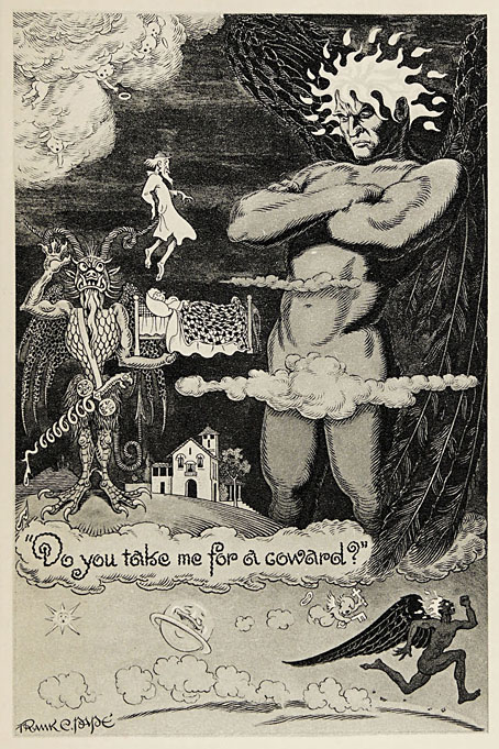
Mike Moorcock’s Jerry Cornelius story is a Holiday on the Buses scenario set in the usual Cornelius landscape of geo-political chaos. Mark Reeve and Allan Kausch also illustrated this one. I think my piece may be the first time I’ve ever had reason to draw a bus despite being a regular user of public transport. In order to create a contrast with the other illustrations I opted for something in the isometric manner of George Hardie. Not as severely styled as Hardie’s drawings often are but it’s heading in that direction.

The last Moorcock-edited number prior to the present one was in 1996, an issue which included a drawing of mine from the Reverbstorm comic series. The new issue sees Moorcock returning to the editor’s chair for what he insists will be the final time so I feel fortunate to be able to contribute more substantially to this issue than I did in 1996. As well as designing the magazine I’ve illustrated four of the stories, and also wrote a page about the hundredth anniversary of Surrealism which provides a loose theme for the issue as a whole. In a reversal of the usual state of affairs the writing was commissioned first, the design having been offered to other parties earlier this year. This didn’t work out, however, so Mike asked if I could take over, something I was more than happy to do. Rather than follow any pre-existing layouts I started with a blank slate, something I prefer in these situations. The erratic nature of the magazine schedule has meant that many of the recent issues have been standalone items even though each one bears an issue and volume number. The issues that followed the paperback series in the 1970s differed widely from one another, a trend that continued up to 1996; consequently I didn’t have to worry about retaining any attributes of the previous issues.

Continue reading “New Worlds 224”

Rockwell Kent’s Wilderness

kent03.jpg

Wilderness: A Journal of Quiet Adventure in Alaska (1920) was Rockwell Kent’s first book, an illustrated memoir written by Kent and his wife, Frances Lee, which recounts several months the couple spent with their son on Fox Island in Resurrection Bay, Alaska. Most artists would illustrate something like this with drawings intended to evoke the remote location and its wildlife, and Kent does provide a number of documentary vignettes. Many of the full-page drawings are very different, however, being Blake-like renderings of nude figures representing a variety of moods and conditions. There’s a lot of this mysticism in Kent’s work, it’s what makes his art stand apart from the jobbing illustrators who were his contemporaries. You could also argue that Kent’s mystical nature and his love of voyaging to remote places, whether on land or sea, is why his Moby Dick from 1930 is the definitive illustrated edition. Don’t take my word for it, see for yourself.

kent01.jpg

kent02.jpg

kent04.jpg

kent05.jpg

Continue reading “Rockwell Kent’s Wilderness”

French fables by Japanese hands

fontaine01.jpg

The fin-de-siècle interest in Japanese art is given a twist by four small books in which a group of Japanese artists illustrate well-known fables for a French readership. The books were commissioned circa 1890 by Pierre Barboutau, an art collector who specialised in Japanese arts and crafts. Barboutau’s volumes would have been intended to broaden the interest in Japanese art which had been fuelled a few years before by Le Japon Artistique, a magazine edited by a German art dealer with a business in Paris, Siegfried Bing. Le Japon Artistique was criticised for its inaccuracies by Japanese readers but it did feature colour reproductions of prints which otherwise might only be seen as monochrome reproductions. (Bing’s Paris shop, L’Art Nouveau, is also historically significant for giving a name to the predominant mode of fin-de-siècle design.)

Barboutau’s books take the French interest in Japonisme a stage further, allowing readers to experience familiar stories through Japanese eyes. Each book was printed in a limited run on Japanese paper. Of the four, I’m only familiar with the fables of La Fontaine where the emphasis on animal characters in rural settings means there are few explicitly Japanese details. Some of the landscapes are more Japanese than French, however, especially the drawing that includes a Fuji-like mountain in the background. There’s also a drawing of a group of foxes where the background details of a shrine and torii gate seem intended more for Japanese readers. Foxes in Japan are associated with the Shinto deity, Inari, to a degree that fox statues are a common site in Shinto shrines. None of this is mentioned in the book but if you’re aware of the significance it adds an additional layer to the cultural intersections.

All these books may be seen at Gallica, a valuable site whose interface is still woefully bad, especially on mobile devices. My advice, as always, is to download the PDFs.


Choix de fables de La Fontaine, Tome 1 (1894)

fontaine02.jpg

fontaine03.jpg

fontaine04.jpg

fontaine05.jpg

Continue reading “French fables by Japanese hands”

Weekend links 738

rossetti.jpg

How They Met Themselves (1860) by Dante Gabriel Rossetti.

• At Igloo magazine: Justin Patrick Moore interviews inventor and electronic music composer Don Slepian about his life and work.

• At The Washington Post (archived link): Michael Dirda in praise of weird fiction, horror tales and stories that unsettle us.

• At The Daily Heller: Tina Touli’s explosively twirling typography. Steven Heller’s font of the month is Doublethink.

• At Colossal: Dreams and memories form and dissipate in Tomohiro Inaba’s delicate iron sculptures.

• At Unquiet Things: Jerome Podwil’s captivating cover art.

• New music: Strangeness Oscillation by 137.

• At Dennis Cooper’s: Craig Baldwin’s Day.

Brìghde Chaimbeul’s favourite albums.

Penguin Series Design

Double Image (1971) by Joe Zawinul | Double Flash (1999) by Leftfield | Double Rocker (2001) by Stereolab

Frank C. Papé’s The Well of Saint Clare

pape01.jpg

I was asked recently if I’d ever written anything about British illustrator Frank C. Papé (1878–1972). The answer was no for two reasons, the first being that where book illustration is concerned I like to be able to point to whole books, and until recently there hasn’t been much of Papé’s work available in complete editions. The second reason is that Papé’s illustration is often broadly comic, to a degree that had he been born a generation or two later he might have been drawing humorous comic strips or editorial cartoons. Papé was very adept on a technical level but his drawings aren’t always to my taste so I’ve never spent much time looking for his books.

pape02.jpg

The first of those caveats has been ameliorated by recent uploads at the Internet Archive which include this volume, one of several Anatole France editions with Papé illustrations. The Well of Saint Clare (1928) is a collection of religious stories set in the medieval era. The book appeared a few years after Papé had illustrated James Branch Cabell’s Jurgen: A Comedy of Justice, a quasi-medieval fantasy which was the subject of a celebrated obscenity case in the USA. Anatole France’s satires were almost as contentious for a time—the Vatican put his books on their prohibited list—which leaves me wondering whether Papé had a natural inclination for risqué material or whether his publishers pushed him in this direction. Probably a little of both.

pape03.jpg

pape04.jpg

pape05.jpg

Continue reading “Frank C. Papé’s The Well of Saint Clare”