Reverbstorm at Supervert

reverbstorm.jpg

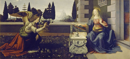
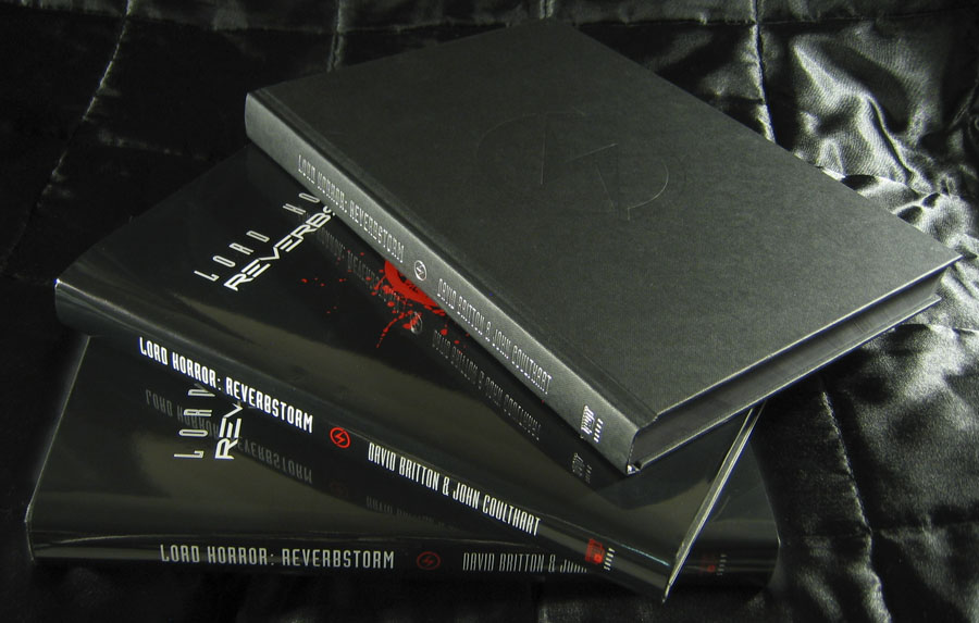
Keith Seward’s Horror Panegyric was a concise examination of David Britton’s multimedia Lord Horror project which Savoy Books published in 2007. I designed the book, the cover of which was my Arcimboldo pastiche of Lord Horror’s profile which appeared on the cover of issue 3 of Reverbstorm. The Supervert site which hosts an online copy of Horror Panegyric has this month posted my answers to some questions about Reverbstorm, the series having grown out of the first Lord Horror novel and the earlier comics:

The graphics in Reverbstorm sometimes seem more narrative than the words. How did you and David work out a scenario?

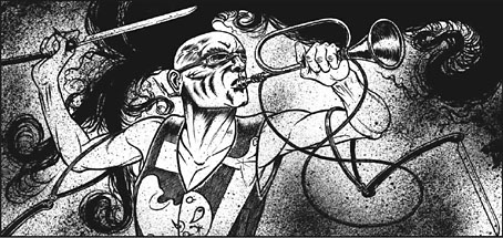
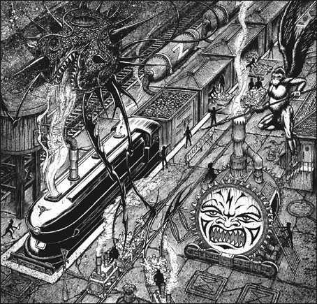
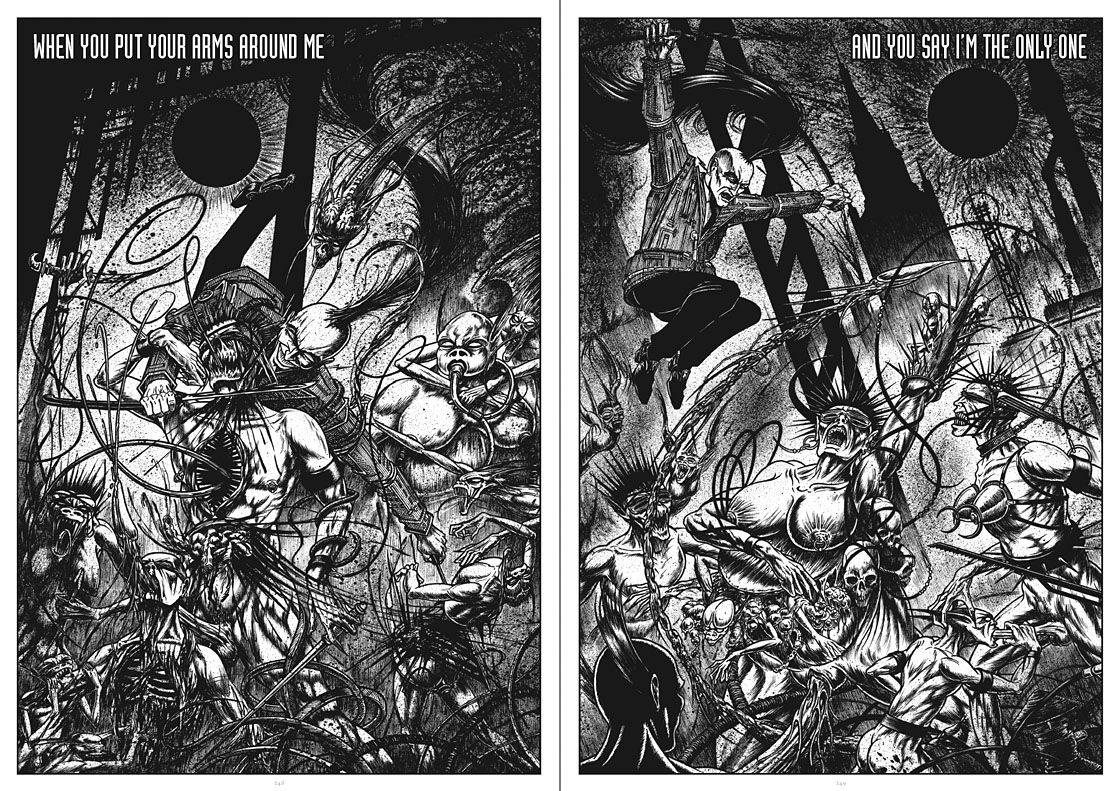
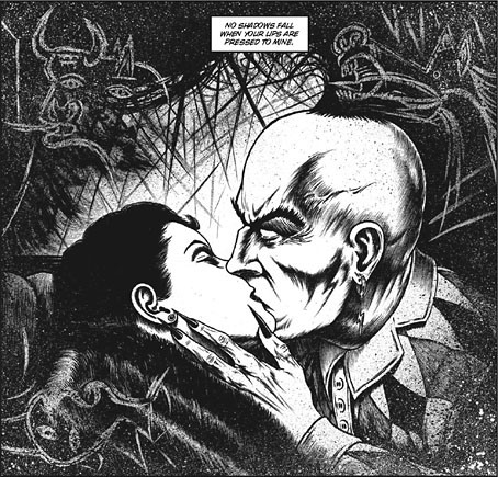
I don’t have objections per se to the usual story structures but in this series we both wanted to create something that wasn’t following familiar adventure narrative lines. The precedents for me were the European comic artists from Métal Hurlant who often favoured art over story; also Burne Hogarth whose work was a great influence on the style I used to draw Lord Horror. Hogarth’s Tarzan strips are adventure narratives but in his later books it’s the art that’s paramount. James Joyce is one of the characters in Reverbstorm, and you can also find a precedent in Ulysses where the story is overwhelmed by the surface detail.

Reverbstorm began with Paul Temple’s lyrics for the Reverbstorm song and a brief Lord Horror film treatment that Dave and Mike had put together for a production company. I don’t recall much about the treatment — I only looked at it once in the office — but it concerned Horror and Jessie Matthews in New York City, opening with a sequence where his Lordship kills some policemen in an alleyway. That vague outline can be seen in the first few pages of Reverbstorm with NYC changed to Torenbürgen. Other elements taken from the film treatment included the name Blue Blaze Laudanum — the actual robotic character came later — and the Souls which likewise became more substantially developed as the comic progressed.

Once we’d introduced all the characters things developed along thematic lines rather than strictly narrative ones. So the second part introduces the Ether Jumpers, the third part has the Apes, the fourth part the Ononoes, the fifth part Picasso and T.S. Eliot, and so on. Musical structure is an obvious parallel, and I consider some of the recurring background material to be visual leifmotifs which can indicate or imply one of the three main characters even if they aren’t present on the page. This musical analogy is an important one for appreciating the series as a whole. The entwined themes and references work in a manner that’s a lot closer to musical works than to the mechanics of an adventure narrative. (more)

Previously on { feuilleton }
Reverbstorm in print
Reverbstorm update
James Joyce in Reverbstorm
A Reverbstorm jukebox
Reverbstorm: Bauhaus Horror
Reverbstorm: an introduction and preview

Fabulous harbours

leonardo1.jpg

The Annunciation (c. 1472).

One pleasure of seeing paintings in an art gallery is the ability to scrutinise details. I like to be able to see that, yes, Picasso did indeed use a single stroke of the brush beginning here and ending here. Backgrounds are a recurrent source of interest if you’ve ever tried any kind of pictorial painting yourself. I always have a greater sense of the artist’s presence in the background details since that’s the area of a picture which few viewers will pay any attention to. In the foreground the artist is always aware of the viewer’s gaze; in the background the artist has a sense of being left alone. It’s there that the mind is most liable to wander when you’re at work.

leonardo2.jpg

The trouble with very famous paintings is that they’re almost always preserved from this kind of close scrutiny either because they’re too popular—so you have a few seconds to stand there before having to make room for others—or they’re being monitored by gallery staff who don’t want you getting too close, or—as in the case of Leonardo da Vinci’s few paintings—they’re imprisoned behind sheets of glass. Few art books outside the weighty monographs ever show you actual brushstrokes or give you a close view of the background details, so once again it’s thanks to the Google Art Project that we can examine two of Leonardo’s paintings in a manner that wouldn’t be allowed unless you were an art historian.

leonardo3.jpg

The Annunciation originated in Andrea del Verrocchio’s studio where Leonardo was apprenticed. Leonardo is believed to have painted the angel—which certainly looks like his work—and the background which includes a fantastic harbour and, in the vaporous distance, some colossal mountain peaks. I’ve always liked this painting for the composition and sense of stillness, those trees standing outside the garden like vertical plumes of smoke. We’re told that a later hand extended the angel’s wings which I can easily believe since their termination clashes with the disposition of the trees; you’d never do that deliberately when everything else in the picture is so carefully arranged.

leonardo4.jpg

Continue reading “Fabulous harbours”

Weekend links 142

bowie.jpg

Gratifying this week to see album cover art under discussion even if the heat-to-light ratio was as unbalanced as it usually is when pop culture is the subject. Jonathan Barnbrook, who also designed the Heathen (2002) and Reality (2003) packaging for David Bowie, wrote about the thinking behind the new cover on his blog. (And for the time being let’s note that this is still only a cover design, we don’t know what else is on its way.)

For my part I’ll point out that the artist-as-cover-image is the great cliché of album design, and the bigger the name the more the rule applies; Neville Brody complains about this in the first book of his work, as does Storm Thorgerson in the Hipgnosis books. In Bowie’s case the rule has been applied almost universally since his debut album in 1967, the only variations being illustrational ones or slight dodges like having his feet appear on the front of Lodger and his back facing the viewer on Earthling. Consequently the new design is a radical gesture from an artist who could have got away with a photo of himself du jour. By way of contrast, consider that Rod Stewart is a year older than David Bowie and presented the world with this artefact in October 2012.

Related: Hard Format responds to the cover, Chris Roberts on “Picasso resurrected in a Rolf Harris era“, and Alexis Petridis on The inside story of how David Bowie made The Next Day.

The Quicksilver typeface, designed by Dean Morris when he was only 16, bought by Letraset and now an indelible feature of pop design from the 1970s. Morris describes his experience here (“they shunned rapidographs!”) and collects examples of the print history here.

When the days are short, we are closest to the medieval world. To the avoidance of mirrors where death improves our portraits every morning with a few more lines and shadows. What would once have been a sermon, a conjuring of hellfire, a phantom slide show, is now an entertainment. But before we can begin again, we have to kick free of the embrace of our inconvenient predecessors, that compost legion of the anonymous dead. They come uninvited, requiring us to sign up for what the late Derek Raymond called the general contract: a brief turn in the light, then extinction. Eternal darkness. How to live with such knowledge? William Burroughs admired the unswerving bleakness of Beckett’s gaze, the way he reduced compensatory illusions to zero. Nowhere left to crawl. And nothing to crawl on. Last breath is last breath. Stare into the abyss and the abyss will stare right back.

Iain Sinclair reviews The Undiscovered Country: Journeys Among the Dead by Carl Watkins

Broadcast’s James Cargill on Morricone, Minidiscs and Scoring Berberian Sound Studio. Related: Melmoth the Wanderer posts a new mix, The Curious Episode of the Wizard’s Skull, and more spooky sounds are on their way from The Haxan Cloak.

• A Firm Turn Toward the Objective: Joanne Meister on meeting the great Swiss designer Josef Müller-Brockmann.

duchess.jpg

Twitter user @thisnorthernboy reworked Paul Emsley’s portrait of Kate Middleton. @barnbrook approved.

• The Beatles of Comedy: David Free on the Monty Python team.

• The history of the London Underground poster.

Impossible Architecture by Filip Dujardin.

• At Pinterest: Art Dolls & Sculpture

• Grace Jones’ Nightclubbing album has been on repeat play this week: Warm Leatherette/Walking In The Rain | I’ve Seen That Face Before (Libertango) | Demolition Man

Reverbstorm on sale

reverbstorm1.jpg

At long last, the news that many people have been waiting for: the Reverbstorm book is now on sale at Savoy. From the hyperbolic press release:

“Surfin’ bird Bbbbbbbbbbrbrbrbrbrb…awawawawawawawaaaaaah! A-pa-pa-pa-pa-pa-pa-pa-pa-pa-pa-pa-pa-pa-pa-pa-pa-pa-pa-pa-pa-pa-pa-pa-pa-pa-pa-pa-pa-pa-pa-ooma-mow-mow Papa-oom-mow-mow!” The Trashmen, Surfin’ Bird

Welcome to the nightmare metropolis of Torenbürgen, where New York’s Art Deco architecture has fused with the termination machinery of Auschwitz. In this urban inferno Jessie Matthews is singing Sondheim, James Joyce is at work on a new novel and Lord Horror, ex-Nazi propaganda broadcaster and Torenbürgen’s model citizen, is stalking the streets in search of fresh victims for his razors. Murderous apes infest the alleyways, Ononoes feast on the living and the dead, while above the rooftops the Soul of the Virgin Mary drifts like a swollen Lovecraftian dirigible, picking at bodies destined for the charnel furnaces.

Lord Horror: Reverbstorm is a unique graphic collaboration between writer David Britton, the author of four Lord Horror novels, and artist John Coulthart, whose book of Lovecraft-derived comic strips and illustrations, The Haunter of the Dark, featured a collaboration with Alan Moore. Reverbstorm was originally published in serial form and is now being presented in a single volume for the very first time. Britton’s debut novel, Lord Horror (1990), was the last work of fiction to be banned in the UK; an earlier Lord Horror comic series, Hard Core Horror, was also banned by a British court in 1995. Coulthart’s death-camp artwork from the final issue in that series appears in Reverbstorm as a prelude to the main narrative.

There’s never been a comic like this surreal collision between Modernist art and pulp aesthetics, a world where Finnegans Wake is drenched in Alligator Wine and Picasso’s Guernica is invaded by Tarzan’s simian hordes. Ambitious, transgressive and meticulously rendered, Reverbstorm is one answer to the eternal question posed by those cultural philosophers, The Cramps: “How far can too far go?”

“Bababadalgharaghtakamminarronnkonnbronntonnerronn-
tuonnthunntrovarrhounawnskawntoohoohoordenenthurnuk!”
James Joyce, Finnegans Wake

reverbstorm2.jpg

rev2.jpg

Previously on { feuilleton }
Reverbstorm in print
Reverbstorm update
James Joyce in Reverbstorm
A Reverbstorm jukebox
Reverbstorm: Bauhaus Horror
Reverbstorm: an introduction and preview

Witkinesque

supervert.jpg

Arriving in the post this week, a Christmas gift from Supervert, a chapbook featuring a new piece of writing that purports to be the unauthorised biography of American artist/photographer Joel-Peter Witkin. The premise is that the facts of the real Witkin’s life are far too mundane to account for his extraordinary photo tableaux so Supervert supplies details such as “Mary Witkin [his mother] worked as a bookkeeper in a DDT plant, slowly saving to enrich the unfathomable reservoirs of the absurd.” A metaphysical portrait of the artist, then, with echoes of David Lynch or Bruno Schulz. Inside the chapbook was a promo postcard bearing pictures of the delightful Ms. Stoya whose reading of Necrophilia Variations has now gained over four million YouTube views.

The Witkin book isn’t for sale but copies are available to those who enter the Supervert contest which is running throughout December. All you need do is enter an email address here then keep your fingers crossed.

witkin.jpg

Sanitarium, New Mexico (1983) by Joel-Peter Witkin.

Witkin’s tableaux made an immediate impression circa 1993 when I bought a copy of PhotoVision, a Spanish photography journal which had devoted an entire issue to his work. This arrived at a point when I was halfway through drawing the Reverbstorm comic series, and Witkin’s parade of unorthodox humanity, crucified apes and sundry body parts seemed an ideal complement for the parade of similar grotesqueries (and sundry body parts) we were putting into the comic pages. I also liked the way Witkin worked his own variation on familiar scenes from art history, something we were doing throughout Reverbstorm (Witkin’s Vase: Study For the Base of the Crucifix just happens to combine a partly dissected human skull with Picasso’s Guernica, a recurrent motif throughout the series).

reverbstorm1.jpg

Above and below, some of the more Witkinesque details from part seven of Reverbstorm. The main figure above was a direct reference to Witkin’s Sanitarium, New Mexico. Many figures in other drawings are given Witkin-like blindfolds.

Continue reading “Witkinesque”