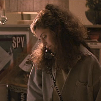
The art of Gregorio Prieto, 1897–1992

prieto01.jpg

Predicadors del be i del mal (c. 1928–1930).

My thanks to Will at 50 Watts for sending these experimental photos by Spanish artists Eduardo Chicharro (1873–1949) and Gregorio Prieto, neither of whose work I’d looked at before. Prieto is of most interest here (that’s him in photo five with the metalwork wrapped around his head) for the homoerotic quality of his other work, a quality which no doubt explains why some of these pictures set the gaydar bells ringing. I thought that Javier at Bajo el Signo de Libra might have featured Prieto already but it seems not.

prieto02.jpg

Iluita (c. 1928–1930).

The photos are from Les avantguardes fotografiques a espanya, 1925–1945. The superimposed images are reminiscent of those that Emil Cadoo was producing in the 1950s albeit with more of a deliberate Surrealist flavour; the ruins and Classical references are also a feature of Prieto’s paintings, some of which can be seen here. (Also a coloured print of the first photo above.) The homoerotics is most evident in his line drawings, some of which can be seen here. His reclining youths and embracing sailors look rather Cocteau-like but they probably owe more to the etchings of Picasso’s Vollard Suite which were being produced around the same period. There’s more Picasso-esque Prieto at Flickr including a drawing dedicated to Lorca.

prieto03.jpg

Metamorfosi (c. 1928–1930).

Continue reading “The art of Gregorio Prieto, 1897–1992”

The Secret Life of Edward James

james1.jpg

From the earliest days of YouTube there were two films about Surrealist art that I’d been hoping would one day be posted somewhere so I could watch them again. One was José Montes-Baquer’s collaboration with Salvador Dalí, Impressions de la Haute Mongolie – Hommage á Raymond Roussel (1976), which eventually turned up at Ubuweb; the other was Patrick Boyle’s The Secret Life of Edward James, a 50-minute documentary about the wealthy poet and Surrealist art patron that was screened once, and once only, on the UK’s ITV network in 1978. Boyle’s film, which was narrated by James’ friend and fellow Surrealism enthusiast, George Melly, was my first introduction to a fascinating figure who was one of the last—if not the last—of the many eccentric aristocrats that these islands have produced. I knew James’ name from Surrealist art books where the Edward James Foundation was credited as the owner of paintings by Magritte and Dalí, but had no idea that James was the model for three of Magritte’s paintings, including La reproduction interdite (1937); or that he’d abandoned his huge ancestral home to create a Surrealist house at nearby Monkton, and had also commenced the construction of a concrete fantasia, Las Pozas, in the heart of the Mexican jungle at Xilitla. Boyle’s film explores all of this in the calm and uncondescending manner that used to be a staple of UK TV documentaries. I’ve been telling people about this film for years, hoping that somebody might have taped it (unlikely in 1978) but no-one ever seemed to have seen it.

james2.jpg

In 1986, two years after James’ death, Monkton was up for sale so Central TV sent George Melly and director Patrick Boyle to revisit the place. Monkton, A Surrealist Dream, was the result, a 26-minute documentary which relied heavily on the earlier film to fill out the details of James’ life. The original resurfaced for me again, albeit briefly, in Brighton in 1998. A Surreal Life: Edward James (1907–1984) was an exhibition at the Brighton Museum & Art Gallery that featured many works from the James art collection, including major pieces by Leonora Carrington (who appears in Boyle’s film), Dalí, Leonor Fini, Magritte, Picasso, Dorothea Tanning, Pavel Tchelitchew and others. A tape of the 1978 documentary was showing on a TV in one part of the exhibition but the people I was with were reluctant to stand around for an hour so all I got to see was a minute or so of Edward in his jungle paradise. Happily we’re all now able to watch this gem of a film since it was uploaded to YouTube earlier this month (my thanks to James at Strange Flowers for finding it!).

james3.jpg

For anyone whose interest is piqued by all of this, two books are worth searching for: Swans Reflecting Elephants, My Early Years (1982) is an autobiography which George Melly compiled from conversations with its subject (and which apparently finished their friendship). James’ propensity for invention means it can’t always be trusted but then that’s the case with many memoirs. A Surreal Life: Edward James (1998) is the 160-page exhibition catalogue which explores James’ life and aesthetic obsessions in a series of copiously-illustrated essays. Both books can be found relatively cheaply via used book dealers.

Previously on { feuilleton }
Las Pozas panoramas
René Magritte by David Wheatley
Soft Self-Portrait of Salvador Dalí
Mongolian impressions
Hello Dali!
Return to Las Pozas
Dirty Dalí
Impressions de la Haute Mongolie revisited
Las Pozas and Edward James

Palais Idéal panoramas

cheval1.jpg

The oft-recounted story behind the extraordinary Palais Idéal in Hauterives, France, is that rural postman Ferdinand Cheval (1836–1924) found an unusually-shaped stone on his route which compelled him to spend the next thirty-three years building an elaborate architectural fantasy from cement and more stones collected on his rounds. The structure is aptly named if you consider it the ideal to which Edward James may have been aspiring with Las Pozas. James could hardly be unaware of Cheval’s work since it was praised as a Surrealist precursor by André Breton, admired by Picasso and inspired a collage by Max Ernst.

cheval2.jpg

These panoramas came via a link at the official Facteur Cheval site. As usual, Flickr is the place to go for detailed views.

cheval3.jpg

Elsewhere on { feuilleton }
The panoramas archive

Previously on { feuilleton }
Las Pozas and Edward James

Graphic design in Heat

heat4.jpg

Amy Brenneman.

In which Neville Brody’s early record sleeves lurk in the midst of a Michael Mann crime drama…

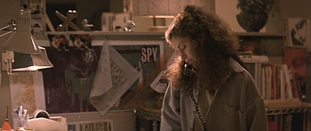
I picked up some cheap DVDs last week, among them a copy of Mann’s Heat (1995) which I hadn’t seen for over ten years. I like Mann best when he’s doing his high-tech thriller thing (although I also have a soft spot for The Keep), and enjoy this one despite its being too long for the thin story and characterisation. Something I’d completely forgotten when re-watching it was the scene where Eady (played by Amy Brenneman), a part-time graphic designer, is on the phone to her bank-robbing boyfriend, played by Robert De Niro. This is one of those cinematic moments where some stray cultural reference that no one is meant to notice leaps to your attention and for a few seconds upsets all interest in plot and dialogue. Offhand I can think of the moment in Alan Pakula’s Presumed Innocent where a copy of a Ramsey Campbell novel is seen on a bookshelf during a conversation. Much worse, since it’s an error as well as a distraction, is Picasso’s Les Demoiselles d’Avignon being shown onboard the Titanic in James Cameron’s fatuous disaster movie when the real painting has been hanging safe and sound for years in the Museum of Modern Art in New York.

heat1.jpg

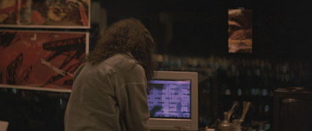
In Heat we have a scene in Eady’s apartment where the walls are covered with what I assume are meant to be examples of her design work. 99.9% of the audience will pay no attention to this but anyone with a copy of The Graphic Design of Neville Brody would recognise a number of familiar designs. Something I hadn’t spotted before was the word “FUSE” on the computer screen, Fuse being the name of the experimental typography magazine created in the 1990s by Brody and Jon Wozencroft. On the window to the left of the computer there’s pinned a copy of Brody’s design for Wipe Out, a single by Z’ev on the Fetish label. Brody designed nearly everything for Fetish during the label’s brief existence in the early 1980s, and the most visible Brody examples in this scene are all Fetish designs. This seems an odd choice for a film made in the mid-90s although in an earlier conversation Eady mentions having designed some music CDs. Brody’s later design work was very influential and overshadowed his work for Fetish which I’ve always liked a great deal.
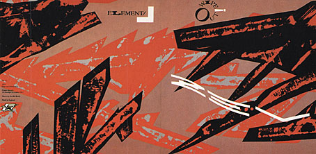
wipe_out.jpg

Wipe Out by Z’ev.

heat2.jpg

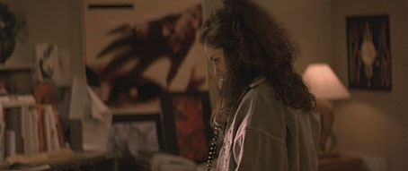
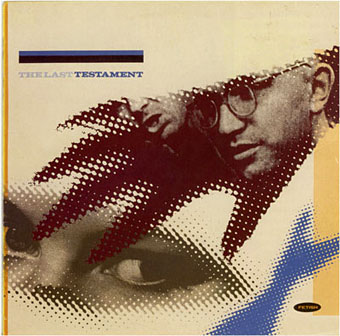
In another part of Eady’s apartment there’s a large reproduction of the sleeve for a Fetish compilation, The Last Testament.

testament.jpg

heat3.jpg

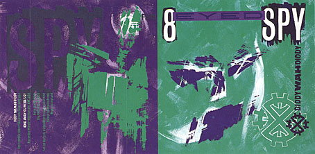
While further along the same wall there’s the sleeve for Diddy Wah Diddy by 8 Eyed Spy, yet another Fetish single. On the far right of the shot above there’s a face from one of Brody’s theatre posters which confirms that Mann’s set decorators must have plundered a copy of Brody’s book.

diddy.jpg

This isn’t a complaint, of course, I’d commend Mann and co. for their excellent taste, and for having used work by a real graphic designer rather than trying to fake something. It’s even possible to find a tenuous connection between the record sleeves and Mann’s eclectic soundtrack. Many of the Fetish artists—Throbbing Gristle, 23 Skidoo, Clock DVA, Stephen Mallinder—were in the first wave of Industrial music, and Mann briefly uses a great piece by Einstürzende Neubauten from their own Industrial phase. I’d have suggested he also use Blue Heat by Cabaret Voltaire (from an album with another Brody cover) but that’s just my obsessions showing.

Previously on { feuilleton }
Neville Brody and Fetish Records
Alex in the Chelsea Drug Store

Clive Hicks-Jenkins: A Retrospective

chj1.jpg

I know I’m not the only person capable of grumbling about London’s monopoly on art exhibitions so I’m a little mortified to find I’ve not mentioned Clive Hicks-Jenkins: A Retrospective, an exhibition which has been running at the National Library of Wales, Aberystwyth, since May. There’s no excuse for the oversight since I read all of Clive’s blog posts and most of the recent ones have concerned the exhibition and an accompanying monograph published by Lund Humphries.

chj2.jpg

Both Fall (2001).

Among the pieces on display are some of his large Mari Lwyd drawings from 2001, two of which are shown here. I think these were the first works I saw of Clive’s and they remain favourites of mine despite their sombre subject matter. The combination of Picasso-like figures, disjunctive perspectives and monochrome nocturnal landscapes make for a very powerful series which Clive discusses in recent blog posts. Not everyone who’s this good with monochrome can handle a combination of tones effectively but Clive’s recent paintings use colour in a manner which is both confident and immediately striking. Form is Void has a small collection of some recent works but if you can get to Aberystwyth you can see them up close. Clive Hicks-Jenkins: A Retrospective runs to August 20th, 2011.

chj3.jpg

Red Flow (2001).

Previously on { feuilleton }
Equus and the Executionist
Dark horses