Echoes of de Chirico

dechirico01.jpg

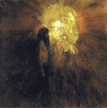
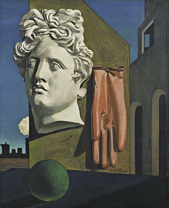
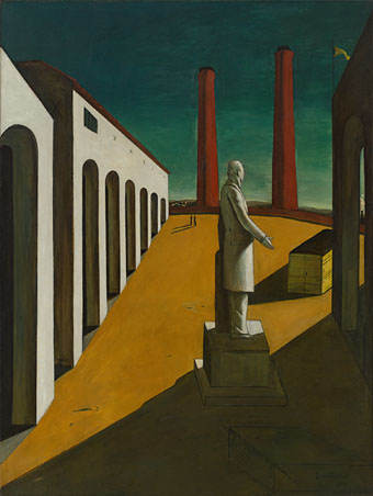
The Song of Love (1914) by Giorgio de Chirico.

His art studies, begun in Athens, were continued in Munich where he discovered the work of Max Klinger and Arnold Böcklin, not to mention the writings of Friedrich Nietzsche and Arthur Schopenhauer, whose influence is perceptible in the paintings he went on to produce in Florence and Turin. In addition, his melancholy temperament lay behind the works that Guillaume Apollinaire labelled “metaphysical,” works in which elements from the real world (deserted squares and arcades, factory chimneys, trains, clocks, gloves, artichokes) were imbued with a sense of strangeness.

Keith Aspley, Historical Dictionary of Surrealism


dechirico02.jpg

The Enigma of a Day (1914) by Giorgio de Chirico.


ernst.jpg

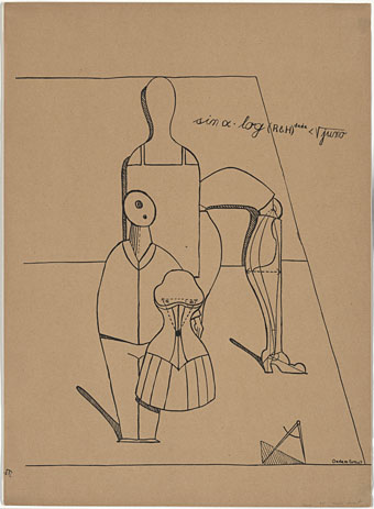
Plate II from Let There Be Fashion, Down With Art (Fiat modes pereat ars) (1920) by “Dadamax Ernst”.


magritte.jpg

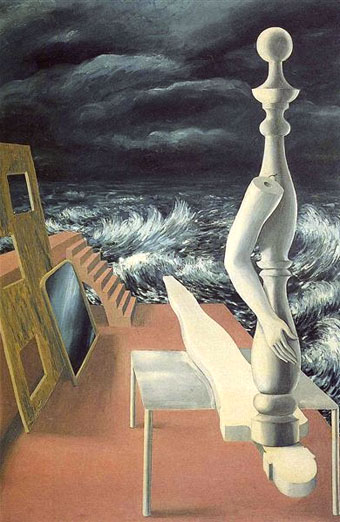
The Birth of an Idol (1926) by René Magritte.

Some time during the latter part of 1923 [Magritte] came face-to-face with his destiny, in the form of a painting by Giorgio de Chirico, who was one of the painters most admired by the Paris Surrealists: Le Chant d’amour (The Song of Love, 1914); to be more precise, a black-and-white reproduction of that painting in the review Les Feuilles libres, a very contrasty reproduction, as Sylvester has it, which only heightened the drama of the outsize objects suspended in the foreground of one of de Chirico’s “metaphysical landscapes”… He was shown it by Lecomte, or Mesens, or both. He was overwhelmed. […] Magritte always spoke of de Chirico as his one and only master. As a rule, he was exceedingly parsimonious in his assessment of other artists, past and present. In his own time, de Chirico (1888–1978) and Ernst (1891–1976) appear as the only two he admired, more or less unconditionally.

Magritte: A Life by Alex Danchev


dali4.jpg

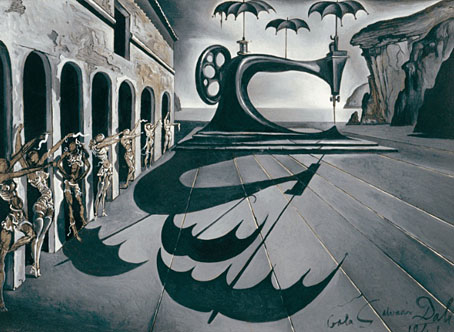
Sewing Machine with Umbrellas in a Surrealist Landscape (1941) by Salvador Dalí.

Continue reading “Echoes of de Chirico”

Symbolist Temptations

khnopff.jpg

The Temptation of St Anthony (1883) by Fernand Khnopff.

This should really be more Symbolist Temptations since Odilon Redon belongs among these artists. Redon may have devoted more of his time than anyone else to the saint’s travails but other artists also took up the theme. Fernand Khnopff seldom depicted religious subjects but his painting—an early work—is remarkable for the way it reduces the phantasmagoric pageants of previous centuries to a simple face-to-face confrontation.

rops.jpg

The Temptation of St Anthony (1878) by Félicien Rops.

Félicien Rops, on the other hand, can always be relied upon to be vulgar and blasphemous in equal measure. The Devil lurking behind the cross was probably added to balance the composition but that silly expression makes the picture seem more comical than shocking. Similar skull-faced cherubs may be found in other Rops prints.

Continue reading “Symbolist Temptations”

Weekend links 177

wickerman.jpg

A new Wicker Man poster by Dan Mumford appears on the cover of the forthcoming DVD/BR reissues. Prints are available.

• The long-awaited release of a restored print of Robin Hardy’s The Wicker Man approaches. Dangerous Minds has a trailer while The Guardian posted a clip of the restored footage. The latter isn’t anything new if you’ve seen the earlier uncut version, but the sound and picture quality are substantially better. I’ve already ordered my copy from Moviemail.

• “It’s a fairly bleak place, and it has this eerie atmosphere. East Anglia is always the frontline when there’s an invasion threatening, so there are lumps of concrete dissolving into sand, bits of barbed wire and tank tracks that act as a constant reminder. I really love it.” Thomas Dolby talking to Joseph Stannard about environment and memory.

Dome Karukoski is planning a biopic of artist Tom of Finland. Related: Big Joy, a documentary about the life and work of James Broughton, poet, filmmaker and Radical Faerie.

The desire to be liked is acceptable in real life but very problematic in fiction. Pleasantness is the enemy of good fiction. I try to write on the premise that no one is going to read my work. Because there’s this terrible impulse to grovel before the reader, to make them like you, to write with the reader in mind in that way. It’s a terrible, damaging impulse. I feel it in myself. It prevents you doing work that is ugly or upsetting or difficult. The temptation is to not be true to what you want to write and to be considerate or amusing instead.

Novelist Katie Kitamura talks to Jonathan Lee.

Leonora Carrington: The Celtic Surrealist opens on Wednesday at the Irish Museum of Modern Art, Dublin.

Julia Holter turns spy in the video for This Is A True Heart.

Alexis Petridis talks to graphic designer Peter Saville.

hashim.jpg

Al-Naafiysh (The Soul) by Hashim. From the Program Your 808 poster series by Rob Rickets.

Rob Goodman on The Comforts of the Apocalypse.

Post-Medieval Illustrations of Dante’s Sodomites.

• Annoy Jonathan Franzen by playing Cat Bounce!

Paolozzi at Pinterest

The Surrealist Waltz (1967) by Pearls Before Swine | The Jungle Line (1981) by Low Noise (Thomas Dolby) | Al-Naafiysh (The Soul) (1983) by Hashim

Haçienda ephemera

hac01.jpg

Haçienda Members’ Newsletter IV, 1982. (The head collaged onto the male figure is from RanXerox by Tanino Liberatore.)

Searching through some papers at the weekend turned up something I’d completely forgotten about: a members’ newsletter for Manchester’s Haçienda club. When the place first opened you needed to be a member to get in, unless you already knew a member in which case you could be signed in as a guest. One reason the place was so empty in its first couple of years was the restricted access, a policy they later dropped.

haccard.jpg

I paid for my membership in September 1982 since I was eager to see William Burroughs appearing in the Final Academy event on October 4th. I think the newsletter must have arrived with the nice Peter Saville-designed card. If there were any other newsletters after this I never received any but then I was never a conscientious club-goer and only went there if there was a decent band playing.

hacflyer.jpg

And speaking of decent bands, I also found this flyer, the only one I have from that period. Einstürzende Neubauten played the Haçienda twice, in August 1983 and February 1985, and I saw them on both occasions. The flyer is for the second event and is a lot more typical of Haçienda products than the fanzine-style newsletter. Neubauten’s first appearance there was sparsely attended but remains one of the best events I’ve witnessed. This was at the tail end of their metal-bashing period, and the performance that night involved a lot of hammering, flames, showers of sparks and broken glass flying into the audience. The climax came when one of them picked up the pneumatic road-drill they used for their noise-making and drilled straight into the concrete wall at the side of the stage. The machine was left hanging there to the consternation of the club staff. A few months later they staged their notorious performance at the ICA in London which was cut short when they started dismantling the stage. The second Haçienda gig drew a larger crowd but was a more subdued affair which would have disappointed those who were yelling for destruction between the songs.

The Haçienda is demolished now so that drilling incident may be seen as a precursor of the inevitable. But the history persists in exhibitions like the recent one at the V&A in London which recreated some of the decor. The typewritten and photocopied members’ newsletter shows a more humble origin than the usual “design classic” label that gets endlessly recycled. Further page scans follow, or you can download a PDF I made. The last two scans in this post are a sheet of guest passes for members to fill, and that ultimate low-tech item: a handwritten and photocopied events list for late 1982. I don’t remember Jah Wobble playing the day after the Burroughs event; I would have liked to have seen that one as well.

hac02.jpg

hac03.jpg

Continue reading “Haçienda ephemera”

Reverbstorm: Bauhaus Horror

reverbstorm1.jpg

Lord Horror (after Klaus Barthelmess).

(No, not Pete Murphy and co.) Now that the Reverbstorm book is at the printers I have an excuse to discuss a few of the art and design appropriations that run through the narrative. I wanted to use some Bauhaus-style design back in the early 1990s when we were putting the first of the comic issues together but that idea got buried under conflicting demands and the need to actually finish all the drawing. It was only when I started designing the opening pages in 2008 that I was able to return to some of the original intentions. There were two reasons for this choice: one was that the minimalist graphics of the Bauhaus style worked well in black-and-white, and also provided an effective counterpoint to the very dense and detailed drawings that followed. The second was that the Bauhaus design school found itself in the early 1930s in opposition to the fascist forces which the figure of Lord Horror represents. (Many of the Bauhaus architects and designers eventually fled Germany for Britain and the United States.) This combination of antagonistic elements yielded another of Reverbstorm‘s collisions of counterposed philosophies and aesthetics.

reverbstorm2.jpg

Reverbstorm title page.

The title page is the most flagrant Bauhaus appropriation, a swipe worthy of Peter Saville at his plundering height. Joost Schmidt’s famous Bauhaus-Ausstellung poster is reworked with a Neville Brody typeface (Industria) and with Oskar Schlemmer’s face logo turned into a scowling profile.

On a typographic note, Industria was used right from the start with Reverbstorm since Brody designed it in the Thatcherite 1980s as a deliberate harking back to the authoritarian 1930s. It also has a very appropriate name. The other typefaces used in the book—Morris Fuller Benton’s Empire and Eric Gill’s Perpetua—date from 1937 and 1928 respectively.

reverbstorm3.jpg

Joost Schmidt (1923).

reverbstorm4.jpg

The reworked Oskar Schlemmer face/logo as it appears on the Appendix page. The lightning flash in Reverbstorm has multiple associations: adapted initially from the symbol used by Oswald Mosley’s British Union of Fascists (a symbol also appropriated at various times by David Bowie and Throbbing Gristle) it can also relate to storms, radio broadcasts and electricity in general. Here it becomes a minimal cipher representing Horror’s outrageous plume of hair.

reverbstorm5.jpg

Oskar Schlemmer (1923).

reverbstorm6.jpg

Reverbstorm, part 8.

In part 8 of Reverbstorm Horror ends up naked inside “a Soul” (don’t ask), and we see his figure juxtaposed against a series of backgrounds that recapitulate earlier aspects of the narrative. It was always the intention to end the series with a change of style so I did this by creating a kind of digital maquette figure using vector shapes that could be posed in a variety of ways. The origin of the figure was a sketch by Klaus Barthelmess, one of the students in Oskar Schlemmer’s drawing class. The sketch below appeared in a slightly altered form in issue 5 of the original publications but I always felt more could have been done with it: a posable figure turned out to be the perfect solution. By coincidence, while I was working on the final pages, Clive Hicks-Jenkins had been running a maquette exhibition on his blog. I was tempted to offer my example but a combination of too much work and a reluctance to throw Lord Horror’s obscene and reprehensible presence into the mix put paid to that. Besides which, my figure is a digital creation, not a bona fide paper cut-out.

reverbstorm7.jpg

Drawing by Klaus Barthelmess (1922).

For those who want more Bauhaus design, the Barbican in London is currently staging a major exhibition, Bauhaus: Art as Life, that will run throughout the summer.

Previously on { feuilleton }
Reverbstorm: an introduction and preview