Weekend links 699

gartside.jpg

November Evening (1955) by Brian Gartside.

• The next Jon Savage compilation for Caroline True Records will be Jon Savage’s Ambient 90s, a dive into the side of rave culture that I always preferred, even while disputing the use of the “A” word. Anything with beats isn’t ambient by my definition, but I’ve been complaining about the nomenclature since 1991 to no avail. It’s on pre-order anyway.

• “They produced in me an infinity of new images and feelings, that sometimes raised me to ecstasy, but more frequently sunk me into the lowest dejection.” Thus Frankenstein’s monster during his reading of three books that happen to be important texts for the Romantic imagination. Hunter Dukes looks at the syllabus of Frankenstein’s monster.

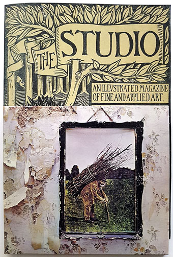
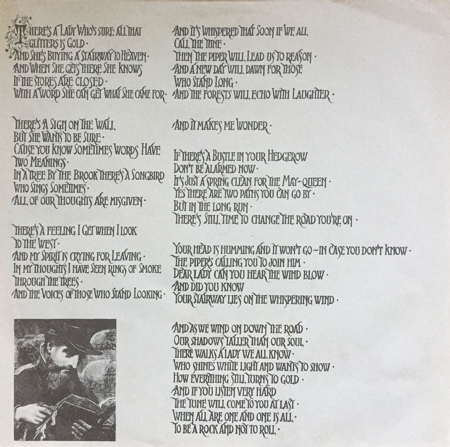
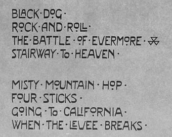
• “Figure on Led Zeppelin IV cover identified as Victorian Wiltshire thatcher”. Last year I discovered the source for the lyrics and credits lettering designs used on the same album’s inner sleeve. Not as newsworthy, obviously, but I thought it was a good piece of cultural detective work.

• At Aquarium Drunkard: An interview with Morton Subotnick, now 90 years old. “Pioneer” is an over-used label, especially in electronic music, but Subotnick really does warrant the description.

• At Wormwoodiana: Mark Valentine on Unburied Bane, an EP by The Heartwood Institute based on a story by “the enigmatic N. Dennett”.

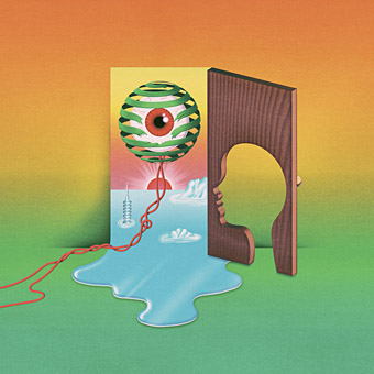
• At Unquiet Things: Art and captions that didn’t make the print version of The Art of Fantasy by S. Elizabeth.

• “Hidden demon revealed in the shadows of a Joshua Reynolds painting.”

• New music: Polygon by Galya Bisengalieva, and Saor by Claire M. Singer.

• Steven Heller’s font of the month is Letraflex.

• At Dennis Cooper’s: Arthur Lipsett’s Day.

Martin Carthy’s favourite music.

Little Demon (1956) by Screamin’ Jay Hawkins | Ballad Of Maxwell Demon (1998) by Shudder To Think | On Demon Wings (2000) by Bohren And Der Club Of Gore

Led Zeppelin IV: Jimmy Page versus Little Bo-Peep

lz4.jpg

Background graphics by Aubrey Beardsley, 1893.

You’d think by now that everything would be known about an album with a Godzilla-sized cultural footprint like Led Zeppelin IV. I certainly thought so until last week when I turned up the source of something that the more obsessive Zepp-heads have been pondering for years. If this puts a bustle in your hedgerow then read on.

symbols.jpg

Led Zeppelin’s fourth album has been around now for half a century which means there really is a lot known about every detail of its production. Mysteries that used to confound friends of mine when we were teenagers have long been solved, questions such as what the hell the four symbols assigned to each member of the group actually signified; not only do we know the origin and meaning of those symbols, the enigmatic “Zoso” sigil chosen by Jimmy Page has an entire website dedicated to its various manifestations. We know where the photo on the cover was taken (Birmingham), and why the sleeve is devoid of identification (Page was annoyed with the press reaction to the previous album); we know that the hermit painting inside the gatefold is based on the Tarot card by Pamela Colman Smith, and we also know a great deal about the writing and recording of Stairway To Heaven. Erik Davis logged much of this in his 33 1/3 study of the album, and while he examines the band symbols in some detail he doesn’t say much about the rest of the hand-written inner sleeve beyond this comment:

Is there a meaning to the nifty Arts and Crafts typeface that Page lifted for the Stairway To Heaven lyrics on the other side of the sleeve? Or just a vibe?

The source, if not the meaning, of this script has been intriguing Zeppelin fans for many years, but I wasn’t aware of this until I happened to be reading the Wikipedia entry about the album and found myself equally intrigued. The game was afoot, Watson.

soh1.jpg

It makes them wonder: the hand-lettered lyrics.

A persistent question you see in fan circles is “What font was used to create X?” People will ask this question even when the design is a one-off, like Syd Mead’s logo for Tron, or something that’s obviously been lettered by hand. Led Zeppelin IV is an album guaranteed to raise the “What font?” question because the lyrics of the group’s most famous song, Stairway To Heaven, cover an entire side of the inner sleeve. On one of the fan forums I was reading someone was eager to identify “the font” because they wanted to apply the words to a bedroom wall. Many more people must have copied out those lyrics since 1971; I once had to do this myself for a female friend who was so besotted with Jimmy Page that she wanted the lyrics in a frame on her own bedroom wall.

tracks.jpg

According to the Wikipedia entry, Page revealed the source of the lettering to be an issue of The Studio, the British art and design magazine which helped launch Aubrey Beardsley’s career and did much to develop and promote the Art Nouveau style in the 1890s. I’m very familiar with The Studio, many posts here refer to it, and I happen to have a complete collection of issues downloaded from the journal archive at Heidelberg University. Seeing the magazine mentioned in this context immediately made me want to find the design that Page had adopted, but before I started flicking through thousands of pages I looked around to see if any of the Zepp-heads had tried searching for the magazine themselves. Evidently not; all the discussion I’ve seen about the inner sleeve tends to recycle the Wikipedia entry, nobody seems to have bothered looking for copies of the magazine. Okay then…

Continue reading “Led Zeppelin IV: Jimmy Page versus Little Bo-Peep”

Hipgnosis interview

hipgnosis1.jpg

This is a frustratingly short piece of film—a mere 16 minutes—but it’s fascinating all the same for the brief views it gives inside the London studio of the Hipgnosis design partnership at the tail end of their golden decade, the 1970s. Being an occasional album cover designer as well as a minor Hipgnosis obsessive I like to see where so many of the team’s album covers originated. The two Hipgnosis founders, Aubrey Powell and Storm Thorgerson are both interviewed; the third member of the partnership, Peter Christopherson, is absent. The film is also undated but the discussion of the cover photo for Look Hear? by 10cc puts the year at around 1980. The views of the studio aren’t much different from the rather murky shots of the place in the first Hipgnosis book, An ABC of the Work of Hipgnosis: Walk Away René (1978), but the film gives a better sense of the dishevelled actuality: those stairs that Thorgerson runs up at the opening are the same ones that form the background to the melting Peter Gabriel photo used on the cover of Gabriel’s third album. Powell and Thorgerson are such engaging interviewees they really ought to have been profiled at greater length by the BBC or ITV, not given a few minutes to discuss some of their more notable creations by a small French film crew.

hipgnosis2.jpg

Aubrey Powell shows off the mystery object from the Presence album by Led Zeppelin.

The Hipgnosis studio occupied two floors of a building in Denmark Street, a minor thoroughfare off the Charing Cross Road that used to be a home to music publishers, rehearsal rooms and many of London’s musical instrument vendors. For a few years it was also home to the original and equally dishevelled Forbidden Planet book and comic shop, a place I first visited shortly after it opened in 1978. I always used to visit Forbidden Planet when I was in the capital but the Hipgnosis team had gone their separate ways by the time I found out they’d been based in the same street. Had I known about this earlier I probably would have wandered around for a while wondering which door led to their rooms. With its clutter and blithe disregard for client-flattering furnishings (the reception room, said Thorgerson, had nowhere to sit down) the studio was a long way from anybody’s idea of a well-appointed design business. The place reminds me of the offices occupied for many years by Savoy Books in Deansgate, Manchester: ancient, first-floor rooms whose better days were long past, with tools of the trade littering every surface, recent works-in-progress on the walls and old stickers peeling off the door. In Walk Away René, Thorgerson also admits that the studio lacked a toilet so they had to resort to pissing in a sink, a disgraceful expediency also shared by the Savoy office. In such places was art once made.

Previously on { feuilleton }
Design as virus 16: Prisms
Storm Thorgerson, 1944–2013
Hipgnosis turkeys
Peter Christopherson, 1955–2010
Storm Thorgerson: Right But Wrong

Weekend links 582

dore.jpg

Illustration by Gustave Doré from L’Espagne (1874) by Jean Charles Davillier.

• Warp Records has announced the forthcoming publication of Atmospherics by Jon Hassell, a short book collecting the diary extracts, composition notes and other ephemera that Jon compiled as an evolving appendix for his website. I was involved with the first iteration of the Atmospherics when we were working on his site in 2004, and for me this section was always the most interesting part of the project, comprising unique, personal material. The book will be published in October.

• “Almost everything in his book would be dismissed by today’s streaming behemoths as ‘too quirky, too local, too slow, too dry, too difficult, too weird’.” Sukhdev Sandhu reviewing The Magic Box, a history of British TV from the 1950s to the 1980s by Rob Young.

• New music: Cobalt Desert Oasis by Marco Shuttle, Angel’s Flight (AD 93) by Biosphere, and The Shildam Hall Tapes: The Falling Reverse by Stephen Prince, a sequel to an earlier release by A Year In The Country which includes an accompanying novella.

• Mix of the week, month and year: Sentimental Ornament: A Broadcast Rarities Mix by Aquarium Drunkard. First posted almost a year ago, I only discovered it last week; Aquarium Drunkard is now added to my RSS feed to avoid further neglect.

• I didn’t post anything for Bloomsday this year but if I’d seen these caricatures by Craig Morriss back in June I would have linked to them at the time.

• At Unquiet Things: The Eerie Moods and Pulpy Frights of Henri Lievens.

• Whole lotta rarities: the strangest Led Zeppelin artwork.

• Old music: A Willow Swept By Train by Janet Beat.

Instant Lettering Database

Atmospheres (1967) by Wimple Winch | Atmospheric Lightness (2018) by Brian Eno | Ligeti: Atmosphères (2019) by Orchestre Philharmonique de Radio France; Alan Gilbert

Weekend links 491

beatty.jpg

The Weirdness is Coming, an illustration by Robert Beatty for an NYMag feature about the near future.

• I’m slightly late to this news, but better late than never: The Doll’s Breath is a 22-minute animated film by the Brothers Quay, shot on 35mm film and with a soundtrack by Michèle Bokanowski. It may take a while before it’s available to view outside the festival circuit but it’s good to know it’s in the world. Related: Filip Lech on the Polish inspirations of the Brothers Quay.

• More from Swan River Press: Joseph Sheridan Le Fanu’s disturbing horror tale, Green Tea, is published in a 150th anniversary edition, with an introduction by Matthew Holness, two essays and a CD containing a theatrical adaptation of the story by the Wireless Mystery Theatre.

• Luca Guadagnino, Olivia Laing and Sandy Powell, Tilda Swinton and John Waters choose favourite pieces of writing by Derek Jarman. Related: Protest!, a Jarman exhibition at the Irish Museum of Modern Art.

Fairport [Convention]’s revolutionary impact came in doing precisely the opposite of what the folklorists had intended when they began collecting the songs. By taking the old songs and setting them down on paper, they had largely believed they were preserving them in the form in which they must remain, ignoring the fact that songs passed through generations orally will always evolve. Fairport, though, played extremely fast and loose with the source material, matching tunes from one source with lyrics from another. As Rob Young put it in his book Electric Eden: “It threw into question the spurious ‘authenticity’ of the folk versions studiously set in stone by the Victorian and Edwardian collectors. Fairport’s electrifying act preserved and restored the guts and spontaneous vigour to the folk continuum.”

Michael Hann on the 50th anniversary of Fairport Convention’s Liege & Leaf

• More Patrick Cowley: PC’s megamix of Hills Of Kat Mandu by Tantra. And the mix of the week: a Patrick Cowley tribute from 1981 by DJ Jim Hopkins.

• The seventh edition of Wyrd Daze—”The multimedia zine of speculative fiction + extra-ordinary music, art & writing”—is out now.

5 Mishaps: A 32-page hardbound handmade book of short stories by Tamas Dobozy, with collage illustrations by Allan Kausch.

• At Dangerous Minds: Lovely Bones: The transfixing skeletons and dreamlike nudes of Belgian painter Paul Delvaux.

• From 1979: a very early TV appearance by Virgin Prunes (their first?) on Ireland’s The Late Late Show.

• Fists of fear: Anne Billson on 10 films featuring severed (and frequently vengeful) hands.

Adrian Curry at MUBI selects his favourite film posters of the 2010s.

Tea For Two (1956) by Duke Ellington | Tea For One (1976) by Led Zeppelin | Tea In The Sahara (2001) by Simon Shaheen & Qantara