Dan O’Bannon, 1946–2009

alien.jpg

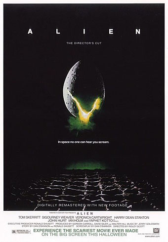
Re-release poster by Bemis Balkind.

Alien was a big deal for me when it appeared in late 1979, one of those films that seems to arrive at exactly the right moment. I’d just left school, I was eagerly reading reprints of French and Belgian comic strips in Heavy Metal magazine, and also paperback reprints of science fiction stories from New Worlds; I was listening to Hawkwind and becoming increasingly obsessed with HP Lovecraft. I was, in short, the target audience for a serious SF-themed horror film with contributions from major artists like HR Giger and Jean “Moebius” Giraud, and I went to see it three times in a row.

Watching Star Wars two years earlier (for which Dan O’Bannon created the computer displays), I’d enjoyed the special effects but been disappointed by its space-opera tone and dumb heroics. HR Giger’s large-format Necronomicon art book was published in the UK the same year and the sight of his work was a revelation for the way it pushed Dalí-esque Surrealism to a pitch of unprecedented mutation and malevolence. A year later his paintings were appearing in Omni magazine but it was Alien which exploded his popularity. Throughout 1979 you could hardly open a magazine or newspaper without finding a Giger interview or examples of his work. Alien benefited from the SF boom that Star Wars generated but Dan O’Bannon didn’t need George Lucas’s feeble mythology to point him towards science fiction, he’d already made one low-budget sf film, Dark Star, with John Carpenter, and was planning the effects for Jodorowsky’s ill-fated Dune project years before the world had heard of Luke Skywalker. Dune introduced him to Moebius, and the pair collaborated on an SF-noir strip, The Long Tomorrow, which was published in Heavy Metal in 1977. But it was Giger’s connection with the Dune project which proved crucial for Alien:

“(Dune) collapsed so badly,” O’Bannon says, “that I ended up in L.A. without any money, without an apartment, without a car, with half my belongings back in Paris and the other half in storage.”

He retreated to the sofa of a friend, screenwriter Ron Shusett, and didn’t leave it for a week. But depressed or not, O’Bannon knew he had to get back to work. He got his files and typewriter out of storage, and he and Shusett went to work on stacks and stacks of partially completed ideas.

“We pulled out one that I liked very much,” he says, “an old script called Memory that was half-finished and was basically what the first half of Alien is now. I told Ron I’d never been able to figure out the rest of the story. So he read it and said, ‘Well, you told me another idea you had once for a movie. It was the one where gremlins get onto a B-17 bomber during World War II and give the pilots a lot of trouble. So why don’t you make that the second half and put it on a spaceship?’

“That was a great idea, but then we had to figure out the monster. Well, I hadn’t been able to get Hans Rudi Giger off my mind since I left France. His paintings had a profound effect on me. I had never seen anything that was quite as horrible and at the same time as beautiful as his work. And so I ended up writing a script about a Giger monster.”

The working title was Star Beast. O’Bannon had a fortunate brainstorm late one night as he continued to write while Shusett slept. “I was writing dialogue and one of the characters said, ‘What are we going to do about the alien?’ The word came out of the page at me and I said, ‘Alien. It’s a noun and an adjective.’ So I went in the other room and shook Ron awake and told him and he said, ‘Yeah, OK,’ and went back to sleep. But I knew I had found a really hot title.”

The Book of Alien (1979) by Paul Scanlon and Michael Gross

Lest we forget, it was O’Bannon who insisted that Ridley Scott look at Giger’s work during the production of the film after artist Ron Cobb failed to produce a sufficiently nightmarish creature. O’Bannon’s script was mauled by Walter Hill who removed sub-plots, and further scenes were trimmed to speed the pace, but Alien‘s unique atmosphere remains as potent today as it was in 1979. It’s ironic that O’Bannon died in the week that James Cameron’s Avatar (which happens to star Sigourney Weaver) is released. To watch all four Alien films in sequence is to witness progressively diminishing returns, and it was Cameron’s sequel which set the pattern for the later films by dropping the adjective part of the O’Bannon’s title in favour of the noun. There had been plenty of movie monsters before but it was the inhuman quality which we label “alien” that O’Bannon and Giger brought to SF cinema. It’s a quality that few have been able to deliver since, not least in Avatar which (from what I’ve seen) looks less alien than something Frank R Paul might have painted in the 1930s. O’Bannon did a lot more after Alien, of course, but it’s his first big success which will always mean the most to me. I recommend Ridley Scott’s director’s cut from 2003 which restored scenes and shots removed from the original release.

Remembering the late, great Dan O’Bannon
The first action heroine: Ellen Ripley and Alien, 30 years on

Previously on { feuilleton }
Alejandro Jodorowsky’s Dune
The monstrous tome

Alejandro Jodorowsky’s Dune

dune1.jpg

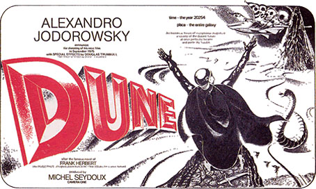
Fortunate Londoners can get to see a new exhibition, Alejandro Jodorowsky’s ‘Dune’: An exhibition of a film of a book that never was, which runs at The Drawing Room until October 25, 2009. As well as production designs from concept artists Moebius, HR Giger and Chris Foss, there’s newly commissioned work by artists Steven Claydon, Matthew Day Jackson and Vidya Gastaldon.

Jodorowsky’s proposed 1976 adaptation of the Frank Herbert novel is now the stuff of legend, and it’s possible that his outrageously ambitious plans are more fun to dream about than they would have been on the screen. But it remains a tantalising prospect that Jodorowsky might well have pulled off a science fiction equivalent of Fellini’s Satyricon. Either way, along with Stanley Kubrick’s unmade Napoleon, it’s one of the great lost films of the 1970s.

Among Jodorowsky’s proposed cast were Orson Welles, Mick Jagger and Salvador Dali, the last of whom was to play the Emperor of the Universe, who ruled from a golden toilet-cum-throne in the shape of two intertwined dolphins. Unable to secure the money from Hollywood to create the ‘Dune’ of his imagination, Jodorowsky abandoned the film before a single frame was shot. All that survives of this project is Jodorowsky’s extensive notes, and the production drawings of Moebius, Giger and Foss. These reveal a potential future for sci-fi movie making that eschewed the conservative, technology-based approach of American filmmakers in favour of something closer to a metaphysical fever-dream.

dune2.jpg

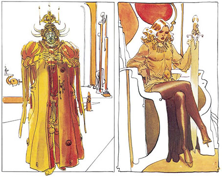
left: Emperor Shaddam IV; right: Feyd Rautha.

Moebius’s designs are wildly different from those used in David Lynch’s 1984 adaptation (which I like nonetheless). His sketch of the Emperor on the left gives some idea of how Salvador Dalí might have appeared in the film, while the figure on the right is Baron Harkonnen’s effete nephew, Feyd, a far more radical conception than the grinning fool played by Sting in the Lynch version. There’s a lot more of Moebius’s sketches at the excellent Dune.info site.

Previously on { feuilleton }
Dalí and Film
Jodorowsky on DVD

The art of François Schuiten

schuiten1.jpg

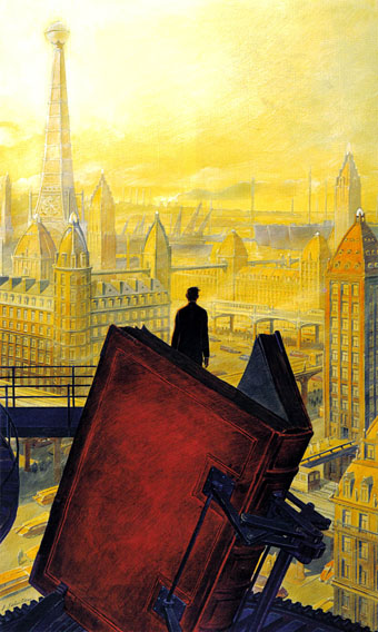
Paris au XXieme Siecle by Jules Verne (1994).

Following a comment I made last week in the post about the Temples of Future Religions by François Garas I’ve decided it’s time to give some proper attention to one of my favourite comic artists, François Schuiten, a Belgian whose obsession with imaginary architecture resembles the earlier endeavours of Garas and others. Schuiten’s parents were both architects which perhaps explains his predilection. In addition to a large body of comics work, he’s produced designs for film—notably Taxandria by Raoul Servais—Belgian stamps, and a steampunk makeover for the Arts et Métiers station of the Paris Métro. In 1994 he created cover designs and a series of illustrations for the publication of Jules Verne’s rediscovered manuscript, Paris au XXieme Siecle.

schuiten2.jpg

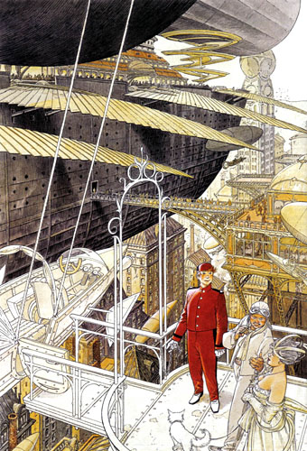
Cover for Spirou (2000).

I first encountered Schuiten’s work in a 1980 issue of Heavy Metal magazine which was reprinting translated stories from the French Métal Hurlant along with original work. Schuiten’s story, The Cutter of the Fog, was an erotic and futuristic tale of a small community and the obsession of the local “fog-cutter”. François’s brother Luc wrote the piece and it bears some similarity with JG Ballard’s Vermilion Sands story, The Cloud Sculptors of Coral D. Unusually for Schuiten, the architecture was downplayed in this one although the small homes with their geodesic roofs are like extrapolations of architectural plans from one of the Whole Earth Catalogues.

The next time I saw his work was several years later when artist Bryan Talbot showed me some of the comic albums he’d brought back from a European convention. Among these there were several of the Cités Obscures books that Schuiten had been creating during the Eighties and Nineties with writer Benoît Peeters. These knocked me out with their apparently effortless creation of an imaginary world comprised of several city states, each with their own unique architectural style, and a wealth of retro-future technology, from dirigibles of all shapes and sizes to ornithopters and huge motorised unicycles. One of the many things I liked about European comic artists, and something which made me favour their work over their American counterparts, was the creation of richly detailed imaginary universes with inhabitants one could expect to meet in our world, not facile superheroes or vigilantes. Schuiten went further than his contemporaries by making the architecture meticulously believable and foregrounding its design to an extent that in some of the Cités Obscures stories architecture itself is the subject.

Continue reading “The art of François Schuiten”

Watchmen

watchmen.jpg

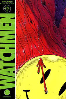
This year sees the 20th anniversary of the publication of Watchmen by Alan Moore and Dave Gibbons. The landmark comic book, one of the few to deserve the designation “graphic novel”, remains a particular favourite of mine, and one that still excites for its consummate command of the comics medium. The following is a very long round table discussion with Watchmen‘s creators from issue 100 of Fantasy Advertiser, first published in March 1988. It’s surprising that this doesn’t seem to have been posted anywhere else on the web as it’s an excellent discussion about this great book.

Spoiler warning: this piece discusses in depth just about every revelation in the story so you’d be advised to skip it if you haven’t read the book.

MARTIN SKIDMORE: Alright, let’s have a starting point… just what is it about Watchmen that distinguishes it from other…
STEVE WHITAKER: Cream cheeses?
MS: …superhero comics on the market?
DAVE GIBBONS: Is this in the form of direct questions to us, or…
FIONA JEROME: No, we’re all gonna talk.
DG: Well, I’ll have a schnoozle then…
SW: The thing that I think distinguishes Watchmen from other comics is that the series holds together more like a novel. Your climax isn’t in the last 3 panels in Watchmen 12. There are long quiet tracts with exciting bits or…moderately exciting bits (LAUGHTER) In terms of Jack Kirby Wham! Smash! Pow! it’s all very quiet. There’s a lot of suffering but…
MS: …it’s all emotional rather than physical suffering.
ALAN MOORE: It’s a difficult question for me and Dave to answer, probably one that you could answer better, but if I had to say anything then it’s the degree of structure that me and Dave have applied to it—I can’t think of many examples of that degree of structure, that degree of layering.
FJ: I was going to say: especially visually you don’t get such a use of motif certainly not in American comics.
MS: Doug Moench has used it occasionally.
FJ: But not with the same complexity and not filling-in with written structure as well.
PETER HOGAN: The thing is: you’re given a world. The characters, alright, they’re based on the Charlton Characters but they’re new as of page 1. Even so, they’re characters with a history that comes out over the course of the thing… Their world has a history… it has a cohesion to it.
SW: Something that quite interests me now we’re talking about structure and stuff, is the symmetry—there is a real symmetry to Watchmen and the way the characters are set up.
DG: Two arms… two legs. (LAUGHTER)
MS: Perhaps the Comedian and Rorschach…
SW: I was thinking more of Osterman and Ozymandias.
MS: That’s right—the intellectual and physical, chaos and law…
AM: It’s difficult pinning down what’s symmetrical to what—I mean to me, at least to some extent, there’s an equally good case for contrasting Nite Owl and Rorschach.

Continue reading “Watchmen”