Ah Pook Is Here

pook1.jpg

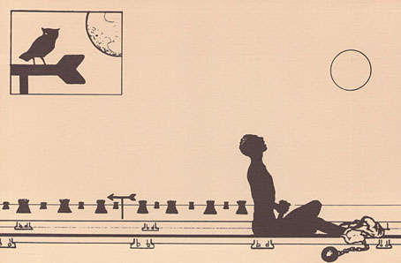
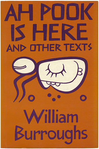
John Calder edition (1979). Design by Brian Paine incorporating a glyph of Ah Pook from the Dresden Codex.

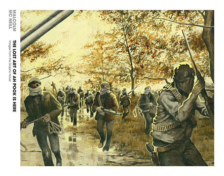
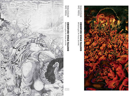
It would have been tempting to write “Ah Pook is finally here” but that’s not quite the case. Artist Malcolm McNeill sent Savoy Books the following preview images last week. What was originally going to be the long-awaited publication of McNeill’s collaboration with William Burroughs, Ah Pook Is Here, will now be two separate volumes published by Fantagraphics Books later this year: The Lost Art of Ah Pook Is Here which will comprise McNeill’s art without the accompanying text (apparently the Burroughs estate objected to its inclusion), and Observed While Falling—Burroughs, Ah Pook and Me, a memoir of the project’s creation. The loss of the text is an annoyance but not the end of the world, at least if you’re fortunate enough to own the scarce Calder book above which comprises a 40-page story that I imagine (and hope) may be read whilst viewing McNeill’s meticulous artwork. Amazon’s listing shows the two books scheduled for October 2012, and there’s now a website for the two books with further preview images.
pook2.jpg

pook3.jpg

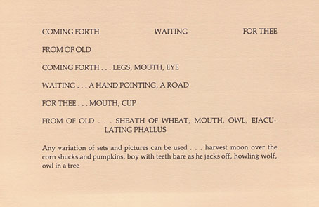
The 1979 Ah Pook Is Here is a fascinating collection, not least for the title piece which fits with the Wild Boys/Port of Saints narratives that Burroughs worked on during the 1970s. It’s also one of the better Burroughs anthologies so it’s always seemed odd that it’s remained resolutely out of print. Burroughs mentions McNeill’s artwork in a preface but doesn’t show any examples of his work. There is other artwork, however: in addition to some uncredited line drawings of figures like those in the Mayan codices there’s the whole of The Book of Breeething, a collaboration with artist Robert F. Gale from 1974. The latter concerns Burroughs’ interest in hieroglyphic communication, and attempts to show how one might convey short sentences through visual images alone, as in the pages below.
breeething1.jpg

The Book of Breeething (1974).

breeething2.jpg

The final piece in the book is The Electronic Revolution, an essay about using technology for guerilla purposes which was an inspiration for Cabaret Voltaire and others. All of this is choice and unusual material so it’s surprising that it’s been out of print for so long. In the case of Ah Pook Is Here it’s even more surprising to find it being prevented from republication despite Burroughs’ hope in his 1978 preface that the text would eventually be published along with the artwork. I’m sure the Burroughs estate have their own reasons for these manoeuvres but you can’t help but feel that this is another example of best intentions acting posthumously against the wishes of the artist they represent. A final irony can be found on the first page of Ah Pook Is Here where we see several mentions of a predatory agency that Burroughs warned against throughout his career, the thing he called CONTROL.

Elsewhere on { feuilleton }
The William Burroughs archive
Reverbstorm: an introduction and preview

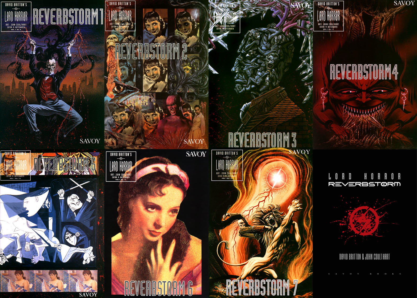
reverbstorm-covers.jpg

Reverbstorm: 1994–2012.

Art, intellectual pursuits, the development of the natural sciences, many branches of scholarship flourished in close spacial, temporal proximity to massacre and the death camps. It is the structure and meaning of that proximity that must be looked at. […] But there is a […] danger. Not only is the relevant material vast and intractable: it exercises a subtle, corrupting fascination. Bending too fixedly over hideousness, one feels queerly drawn. In some strange way the horror flatters attention, it gives to one’s own limited means a spurious resonance. […] I am not sure whether anyone, however scrupulous, who spends time and imaginative resources on these dark places, can, or indeed, ought to leave them personally intact. Yet the dark places are at the centre. Pass them by and there can be no serious discussion of human potential.

George Steiner, In Bluebeard’s Castle: Some Notes Towards the Re-definition of Culture (1971)

Reverbstorm is an eight-part comic series which I began drawing in 1990. Last week I finished work on the final section, and also completed the layout and design for the collected edition, a 344-page volume which Savoy Books will be publishing later this year. All the artwork has been scanned afresh, re-lettered and, in a few places, improved to fix compromises and print errors present in the published issues. This unfinished project has been hanging over me for so long that I make this announcement with some relief. The book will be published without a foreword so this post can serve as an introduction for the uninitiated. But before I get to the details, some history.

rev1.jpg

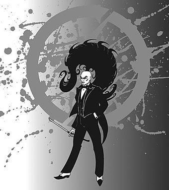
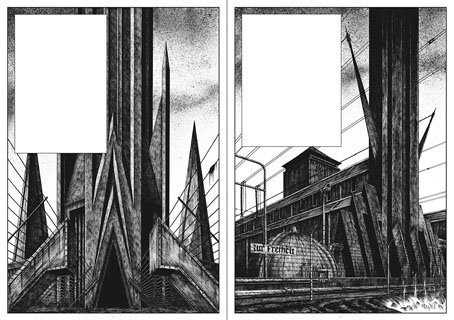
David Britton was the writer and instigator of Reverbstorm, the series being a continued exploration in the comics medium of his Lord Horror character. Lord Horror is an alternate-history equivalent of the real-life William Joyce, a member of the British Union of Fascists in the 1930s whose propaganda broadcasts to Britain from Nazi Germany during the Second World War led the press to dub him Lord Haw-Haw. The first five-part Lord Horror comic series, Hard Core Horror, showed the evolution of Horace William Joyce, aka Lord Horror, from charismatic politician to Nazi collaborator; the final two issues of the series concerned Horror’s involvement in the Holocaust. In Britton’s mythos James Joyce is the brother of Horace Joyce while Jessie Matthews, a popular British musical star of the 1930s, is Lord Horror’s wife. (Britton’s Lord Horror novels are examined in detail by Keith Seward in his Horror Panegyric essay.) My fellow artist at Savoy, Kris Guidio, drew the first four issues of Hard Core Horror; I drew issue five which was less a comic story, more a portfolio of static scenes of death-camp architecture. The series was well-received by regular Savoy readers but mostly ignored by the British comics world, with some justification: the comics were a glossy production but the narrative was very erratic, even technically inept in places. At Savoy the series was regarded as a failed experiment, Kris’s drawing style and flair for cartooning being more suited to the broad humour of the Meng & Ecker strips. But Dave liked what I’d done with the final issue and felt we could try something new that was also more original than a fictional skate through recent history.

rev2.jpg

In addition to producing comics in the late 1980s, Savoy had been recording a number of eccentric cover versions, most of them sung by PJ Proby. A music journalist, Paul Temple, came to interview Proby about the songs and stayed in touch. He subsequently approached the company with a song of his own entitled Reverbstorm, a bombastic number best described as “Wagnerian Northern Soul” which Savoy recorded in 1993. (Temple recounts the origin of the song here.) This gave a title to the new comic series that Dave was planning, the story outline being expanded from a scenario that he and Savoy colleague Michael Butterworth had sketched out when a film company showed some fleeting interest in Lord Horror. Kris Guidio and I worked on the opening pages, the initial idea being that Kris would continue drawing the Lord while I would do everything else. Once I’d convinced Dave that I could draw his Lordship to his satisfaction I took over the series while Kris carried on with the Meng & Ecker comics. I spent most of 1991–1996 drawing the first seven parts of Reverbstorm which were published as separate comics during that period. The first issue came with a CD single of Paul Temple’s song which was sung by Sue Quinn but credited to Jessie Matthews. (It’s now available on iTunes.) The last part of the series was always going to be something that differed from the preceding sections but I didn’t know how this might manifest until 1997 when I painted a series of monochrome double-spreads intended to form backgrounds for Dave’s text. That’s where the series stalled after the paintings had improvised themselves to such a degree of abstraction and incoherence that I didn’t feel able to continue. The breakthrough came a couple of years ago when I started scanning all the artwork into the computer and thinking again about the series. I realised I could complete everything now that my computer graphics skills were adequate enough to complement the earlier issues whilst also adding something new.

Continue reading “Reverbstorm: an introduction and preview”

The art of Ronald Searle, 1920–2012

searle01.jpg

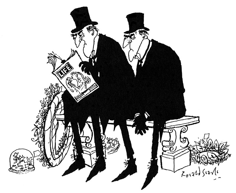
Undertakers. From Punch magazine (undated).

I started trying to draw like Ronald Searle when I was about eight. So there was Jabberwocky and Ronald Searle I was turning into by the time I was thirteen. You know, I was determined to be Lewis Carroll (giggles) with a hint of Ronald Searle.

John Lennon, 1968

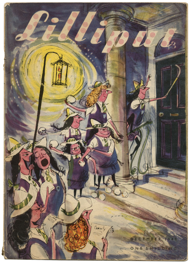
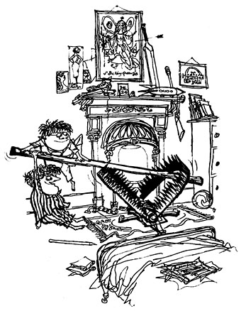
Does the late Ronald Searle need any introduction? Everyone knows he created the anarchic schoolgirls of St Trinian’s in the 1940s, although their exploits had the greatest audience in the films based on Searle’s cartoons rather than the original drawings. Searle’s work first came to my attention through reprints of the Molesworth books he produced with Geoffrey Willans in the 1950s—Down with Skool! (1953), How to be Topp (1954), Whizz for Atomms (1956) and Back in the Jug Agane (1959)—a masculine riposte to St Trinian’s which allowed for a broader range of humour than the slapstick and short-skirted salaciousness the films drifted into. The Molesworth books are perhaps best appreciated at age 11 as this LRB review notes; looked at with older eyes all I see is a portrait of a rigidly class-bound nation whose boarding schools, gowned masters, “maters” and “paters” could only inspire affection in the Etonians currently attempting to govern Britain. But the drawings remain a treat: wiry and mordant with flashes of a viciousness that make Searle the godfather of Gerald Scarfe and Ralph Steadman.

searle.jpg

The girls of St Trinian’s, Lilliput magazine, December 1949.

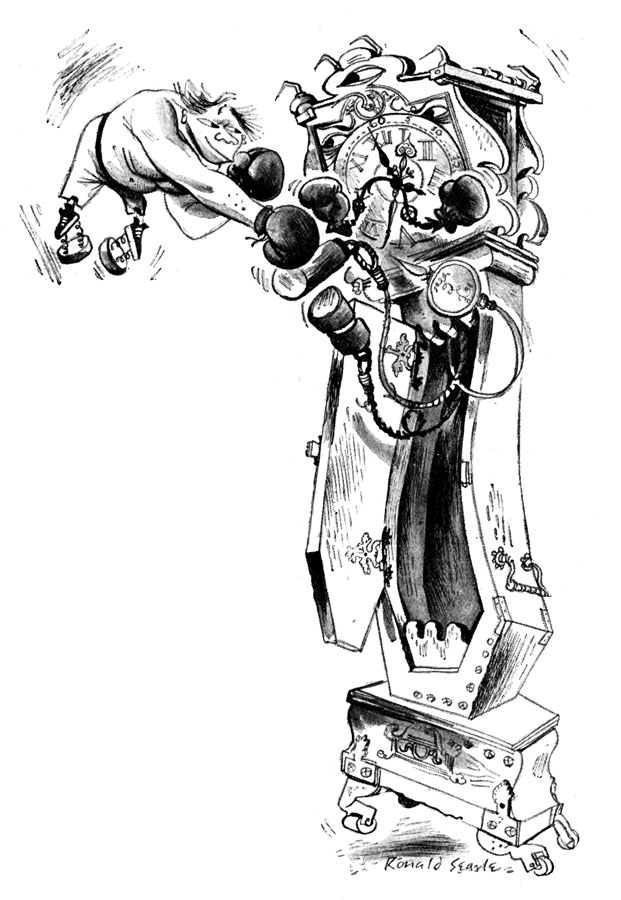
Given Searle’s influence on generations of newspaper cartoonists it’s no surprise that the British papers are being free with the plaudits. Links to various stories follow. The images here are taken from earlier posts or pulled from my bookshelves. The illustration of Engelbrecht below is from the Savoy Books edition of Maurice Richardson’s The Exploits of Engelbrecht which I designed in 2010.

Guardian obituary | Telegraph obituary | NYT obituary
• Ronald Searle in pictures: Telegraph | Guardian
Ronald Searle: a life in pictures by Steve Bell.
Mike Leigh: ‘Ronald Searle was my inspiration’.
Ronald Searle: Now let’s have some fizz: Gerald Scarfe remembers his friend and childhood hero.
Ronald Searle was our greatest cartoonist – and he sent me his pens, says Martin Rowson.

Other links:
Perpetua, the Ronald Searle tribute
Searle at VTS
Winespeak at BibliOdyssey

searle03.jpg

Engelbrecht versus Grandfather Clock. From The Exploits of Engelbrecht (1950) by Maurice Richardson.

molesworth.jpg

“A trap for dere Santa”. From How to be Topp (1954) by Geoffrey Willans and Ronald Searle.

searle02.jpg

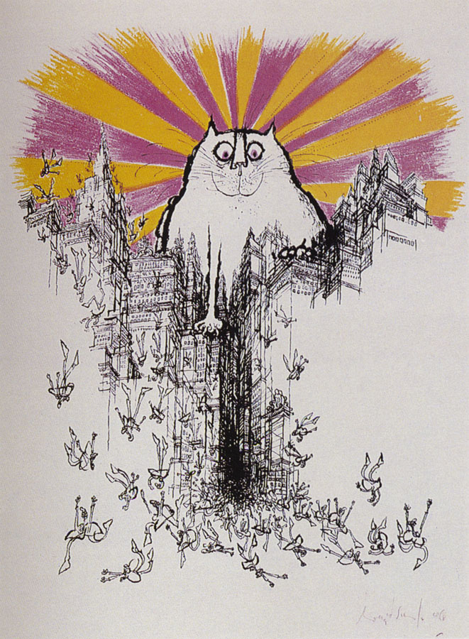
The Coming of the Great Cat God (1968).

Elsewhere on { feuilleton }
The illustrators archive

Previously on { feuilleton }
Engelbrecht lives to fight another day
Ronald Searle book covers
Engelbrecht again

Ten titles and a cover

cdlcover.jpg

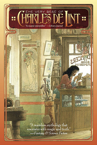
The Very Best of Charles de Lint. Art by Charles Vess.

Over the weekend I found the time to finally update the book design section of the site, adding new pages for most of the titles I’ve been working on recently. There’s still a couple of things missing but I’ll add those in due course. Many of these design jobs have been for the interiors only so what follows is a comparison of title spreads from books I’ve worked on that have been published this year. Lest it seem that I have an army of clones at my service it should be emphasised that I was working on several of these last year (and Engelbrecht was completed in 2008) but the nature of release schedules means they all carry 2010 publication dates.

sr.jpg

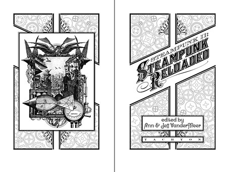
Steampunk II: Steampunk Reloaded, edited by Ann & Jeff VanderMeer.

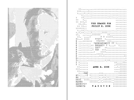
I invariably make a feature of title pages, usually creating them as a spread in order to heighten their impact. The title page is a kind of gateway to the rest of the book which gives you an opportunity to establish a mood for what follows. It’s also the area where you can be most lavish with your graphic treatment and, where necessary, add illustrative material without worrying too much about intruding on the content. With a number of these designs I was following typographic choices from pre-designed covers so the challenge was to find something that would match the cover and connect to the rest of the interior. The Charles de Lint book was a variation on this process in that the author had chosen a Charles Vess drawing for the cover art. I designed a cover to accommodate the drawing then carried the design inside. The colours were chosen to match Vess’s artwork while the general Art Nouveau style came from an Alphonse Mucha poster he’d placed on the wall. With a different cover picture the entire book would have had a very different design.

pkd.jpg

The Search for Philip K Dick by Anne R Dick.

Continue reading “Ten titles and a cover”

Alan Moore: Tisser l’invisible

moore.jpg

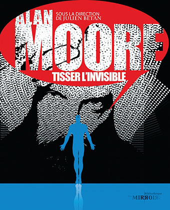
Arriving in the post this week was Alan Moore: Tisser l’invisible from French imprint Les Moutons Électriques. The book is a substantial collection of appreciative texts and analyses of work by the Northampton Ipsissimus edited by Julien Bétan, and, as the title would imply, is in French throughout. A couple of the pieces are reprints which I presume are receiving their first translation here. Michael Moorcock’s Homage to Cornucopia first appeared in Alan Moore: Portrait of an Extraordinary Gentleman and is also reprinted in Moorcock’s Into the Media Web which I designed and Savoy Books published earlier this year.

highpost.jpg

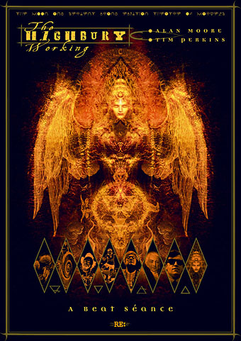
Best thing for me about the French collection is seeing some of my Moore-related work printed in colour as a mini gallery at the front of the book. There are two of the poster designs for the Moon & Serpent CDs, The Highbury Working (above) and Angel Passage, and also my 1999 portrait of Promethea and the Kabbalistic Underground map which I created as a design of my own and Alan subsequently incorporated into the Promethea comic series.

And speaking of Mister Moore, issue 6 of Dodgem Logic is now on sale sporting a cover which can either be interpreted as a gloomy Halloween design or a faithful depiction of the nation’s slough of despond; you decide.

Previously on { feuilleton }
Into the Media Web by Michael Moorcock
Watchmen
Alan Moore interview, 1988