Ten titles and a cover

cdlcover.jpg

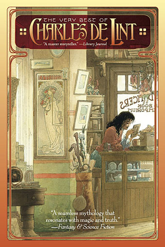
The Very Best of Charles de Lint. Art by Charles Vess.

Over the weekend I found the time to finally update the book design section of the site, adding new pages for most of the titles I’ve been working on recently. There’s still a couple of things missing but I’ll add those in due course. Many of these design jobs have been for the interiors only so what follows is a comparison of title spreads from books I’ve worked on that have been published this year. Lest it seem that I have an army of clones at my service it should be emphasised that I was working on several of these last year (and Engelbrecht was completed in 2008) but the nature of release schedules means they all carry 2010 publication dates.

sr.jpg

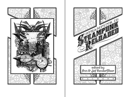
Steampunk II: Steampunk Reloaded, edited by Ann & Jeff VanderMeer.

I invariably make a feature of title pages, usually creating them as a spread in order to heighten their impact. The title page is a kind of gateway to the rest of the book which gives you an opportunity to establish a mood for what follows. It’s also the area where you can be most lavish with your graphic treatment and, where necessary, add illustrative material without worrying too much about intruding on the content. With a number of these designs I was following typographic choices from pre-designed covers so the challenge was to find something that would match the cover and connect to the rest of the interior. The Charles de Lint book was a variation on this process in that the author had chosen a Charles Vess drawing for the cover art. I designed a cover to accommodate the drawing then carried the design inside. The colours were chosen to match Vess’s artwork while the general Art Nouveau style came from an Alphonse Mucha poster he’d placed on the wall. With a different cover picture the entire book would have had a very different design.

pkd.jpg

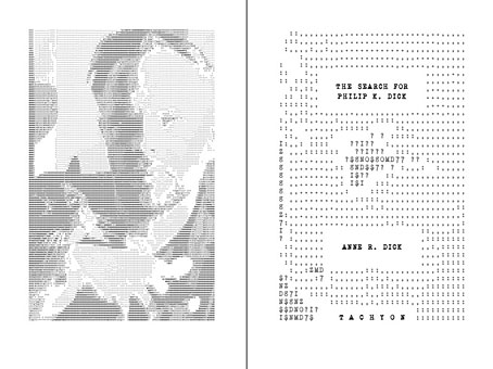
The Search for Philip K Dick by Anne R Dick.

Continue reading “Ten titles and a cover”

Weekend links 38

lovecraftbaw.jpg

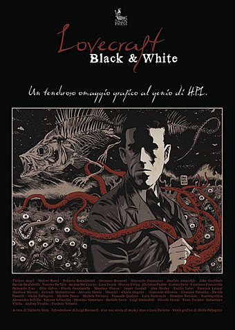
Arriving in the post this week was Lovecraft Black & White, an Italian book whose contents are spelled out in the title, black-and-white illustrations based on the work of the Providence master. Among the featured works is my 1999 rendering of Azathoth. There’s more about the book here and here.

Also on the work front, one of the books I designed interiors for a couple of months back was The Search for Philip K. Dick, a sombre biography and memoir by Anne R. Dick, the author’s third wife. Ms Dick discussed the book with the NYT a few days ago. The design was mostly straightforward layout but I did make a quick ASCII portrait of PKD from one of Anne Dick’s photos.

Farewell, the documentary film about Lady Grace Drummond-Hay’s flight around the world in the Graf Zeppelin, can be viewed here.

• “I personally think that the pages look better on the iPad than they do in real life.” Artist Tom Phillips again on the Humument iPad app.

The Birds Are Flying Elsewhere: singer/songwriter Linda Perhacs. Related: Parallelograms – A Short Film About Linda Perhacs.

St Eia, guitar improvisations by Zali Krishna, “Keywords: jazzgazing; entropy circus; st ives; cornwall; psychogeography”.

Moon Wiring Club and DD Denham: music for children, by children. Related: Moon Wiring Club’s Jayston Mix.

kirkland.jpg

The 1970s was another country, they did things differently there. One of a number of illustrations for science textbooks by Phil Kirkland at A Journey Round My Skull.

• “Fellatio has become a recurrent theme in your work hasn’t it, I say.” Alan Bennett sheds some inhibitions.

Talking To The Sci-Fi Lord: Regenerations & Ruminations With Michael Moorcock.

Time and the Gods (1906) by Lord Dunsany, illustrated by Sidney Sime.

City of Silence, a calendar for 2011 by Thom Ayres.

Scientists glimpse universe before the Big Bang.

• Photography by Josef Sudek (1896–1976).

Aurora photo gallery, November 2010.

The Last Tuesday Society.

Parallelograms (1970) by Linda Perhacs | Six AM (1979) by Thomas Leer & Robert Rental | Rockin’ Back Inside My Heart (1989) by Julee Cruise.

Alan Moore: Tisser l’invisible

moore.jpg

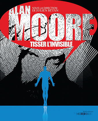
Arriving in the post this week was Alan Moore: Tisser l’invisible from French imprint Les Moutons Électriques. The book is a substantial collection of appreciative texts and analyses of work by the Northampton Ipsissimus edited by Julien Bétan, and, as the title would imply, is in French throughout. A couple of the pieces are reprints which I presume are receiving their first translation here. Michael Moorcock’s Homage to Cornucopia first appeared in Alan Moore: Portrait of an Extraordinary Gentleman and is also reprinted in Moorcock’s Into the Media Web which I designed and Savoy Books published earlier this year.

highpost.jpg

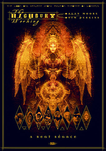
Best thing for me about the French collection is seeing some of my Moore-related work printed in colour as a mini gallery at the front of the book. There are two of the poster designs for the Moon & Serpent CDs, The Highbury Working (above) and Angel Passage, and also my 1999 portrait of Promethea and the Kabbalistic Underground map which I created as a design of my own and Alan subsequently incorporated into the Promethea comic series.

And speaking of Mister Moore, issue 6 of Dodgem Logic is now on sale sporting a cover which can either be interpreted as a gloomy Halloween design or a faithful depiction of the nation’s slough of despond; you decide.

Previously on { feuilleton }
Into the Media Web by Michael Moorcock
Watchmen
Alan Moore interview, 1988

The art of Ray Frederick Coyle, 1885–1924

coyle1.jpg

Another illustrator who died young, Ray Coyle’s short life no doubt explains why his work isn’t more visible today. The first two illustrations here are from a 1920s edition of Jurgen (1919), the scurrilous fantasy novel by James Branch Cabell which has been praised by enthusiasts of ironic comedy as diverse as Aleister Crowley and Michael Moorcock.

coyle2.jpg

Some of the illustrations in this Flickr set bear the date 1923 so they may have been Coyle’s last major work. Frank C Papé is the artist more commonly associated with Cabell, and while his art complements the author’s humour, Coyle’s elegant post-Beardsley style seems more suited to Jurgen’s worldly temperament.

coyle3.jpg

This beautiful drawing is one of six pieces from a memorial book, To Remember Ray Frederick Coyle, published in 1926. A stunning piece of art and this rebound edition has an equally stunning cover design by Jeannie Sack. If anyone has a link to other drawings in this series, please leave a comment.

Elsewhere on { feuilleton }
The illustrators archive

Previously on { feuilleton }
Fantazius Mallare and the Kingdom of Evil

Design as virus 12: Barney’s faces

lowe.jpg

Sleeve for I Love The Sound Of Breaking Glass (1978), a 7″ single by Nick Lowe. Design by Barney Bubbles.

Continuing an occasional series. Designer Vic Fieger had a guest post at Reasons To Be Cheerful earlier this week examining Barney Bubbles’ use of the human face in his graphic designs. This is one side of the Bubbles work I really enjoy, he had a remarkable facility for demonstrating a versatility with abstract shapes—or found objects, as in the piece above—while playing games with our pattern recognition. A recurrent playfulness was one of the many notable things about his approach to design.

colour.jpg

Story title from The Best of Michael Moorcock (2009).

Fieger’s focussing on the faces in Barney’s work struck a chord for me since I’d deliberately tried something similar last year, taking a cue from Barney’s example. The Colour piece above is one of the story titles from The Best of Michael Moorcock published by Tachyon. For each story I designed a different title in a style which complemented the subject; Colour is a science fiction piece in which card games figure, hence the symbols. Mike Moorcock was friends with Barney during the 1970s so there was an additional reason for the reference.

booklife.jpg

I don’t know whether anyone has noticed the face on the cover of Booklife but it is there, with the two flowers at the top forming the eyes and the book’s title standing for the mouth. Once again, this wasn’t strictly necessary for the success of the design but it gave a rationale for the arrangment of the flowers. There’s also the hope when something is this subtle that the attraction of the pattern impells a browser to pick up the book in a shop without quite knowing why.

Booklife and The Best of Michael Moorcock are both available from Tachyon. Paul Gorman’s Barney Bubbles book, Reasons To Be Cheerful: The Life & Work Of Barney Bubbles, will be relaunched later this year in a new edition.

Previously on { feuilleton }
Into the Media Web by Michael Moorcock
Design as virus 11: Burne Hogarth
Design as virus 10: Victor Moscoso
Design as virus 9: Mondrian fashions
The Best of Michael Moorcock
Design as virus 8: Keep Calm and Carry On
Designing Booklife
Design as virus 7: eyes and triangles
Design as virus 6: Cassandre
Design as virus 5: Gideon Glaser
Design as virus 4: Metamorphoses
Design as virus 3: the sincerest form of flattery
Design as virus 2: album covers
Design as virus 1: Victorian borders
Barney Bubbles: artist and designer