Glaser goes POP

glaser1.jpg

The purchase of big art and design books requires careful consideration round here, what with shelf space being stressed in multiple ways. (One of the shelves bearing the heavier volumes sags alarmingly.) But this one was recommended to me by a couple of people, and I’d also had a book token hanging around unused for over a year so here we are.
glaser2.jpg

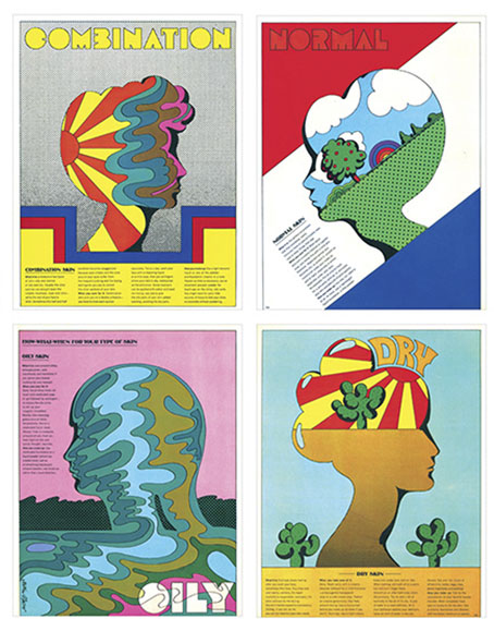
Skin types for Seventeen magazine, 1967.

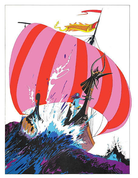
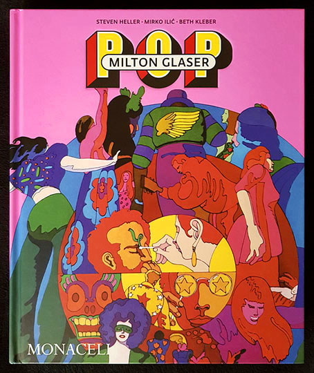
Milton Glaser: POP is a copiously-illustrated 288-page study of the work produced by Milton Glaser and his colleagues at Push Pin Studio, with an emphasis, as the title and cover art suggests, on the company’s prime decade of the 1960s. The book was compiled and edited by the redoubtable Steven Heller, together with Mirko Ilic and Beth Kleber, and presents an overview of Glaser’s remarkable career as designer and illustrator. Glaser was an exceptionally versatile artist, something which has often made appraisal of his career a difficult business. You could easily choose ten of his book or album covers from the many examples assembled by Heller and co., and all would look like the work of different people.
glaser3.jpg

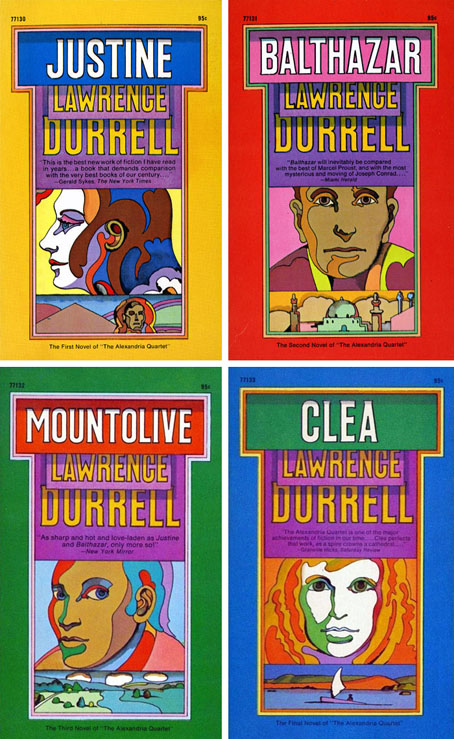
The Alexandria Quartet by Lawrence Durrell; Pocket Books, 1969. I’d much rather have this set than my Faber collection which packages the four books into an unwieldy brick.

Matters are further complicated by the often collaborative nature of the work at Push Pin, and the fact that designers and illustrators aren’t always given credit for their commissions. In the past I’ve gone looking for Glaser’s work then given up when I seemed to be encountering designs that weren’t by him at all. In addition to demonstrating Glaser’s range, Heller, Ilic and Kleber have done everyone a service by showing unused illustrations and crediting work that was previously debatable. Some years ago I wrote a post about the uncredited cover art for the first budget sampler album, The Rock Machine Turns You On (1968), an entry which didn’t manage to resolve the issue of whether or not the cover art was Glaser’s work. It turns out it was by him after all, collage being one of the techniques he employed from time to time.
glaser5.jpg

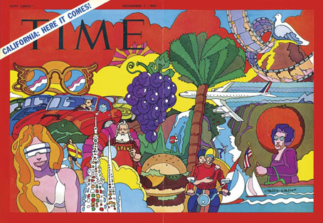
TIME magazine gets groovy. A fold-out cover from 1969.

On a more personal level, Glaser’s versatility and multi-disciplinary approach is encouraging if you find yourself being led in a similar direction. Designer-illustrators are no longer as rare as they used to be, but illustrators, like many fine artists, still tend to develop a favourable style which they then stay with year after year. Illustrators who change their style according to their mood, or the nature of the brief, or a desire to experiment, remain in the minority. Glaser’s illustration ranges more widely than any other artist I’ve seen, from realistic pen-work and watercolour sketches, through bold, stylised designs, to complete abstraction. He could also be playful and frivolous in a manner you can’t imagine from some of his more serious contemporaries, while also being adept enough at illustrating children’s stories that he might easily have spent his career doing this alone.
glaser4.jpg

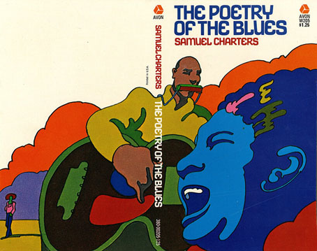
Avon Books, 1970.

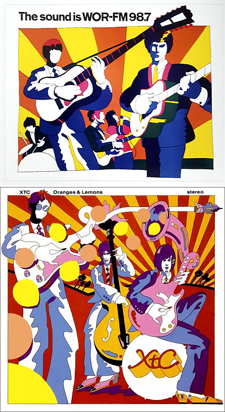
But the main attraction of Milton Glaser: POP for this reader is the focus on all those bold graphics, especially the commissions that reworked the emerging psychedelic styles for the commercial sphere. The cover illustration is emblematic of many other examples. This drawing first appeared in a New York magazine supplement in 1967 to accompany an article about LSD, before being reused on the dustjacket of Tom Wolfe’s book about Ken Kesey and friends, The Electric Kool-Aid Acid Test. Glaser and his colleagues at Push Pin were prime exponents of something I’ve taken to calling “the groovy look“, a term I reserve for commercially oriented quasi-psychedelic art. This isn’t meant to be a serious label, it’s a private term that I used to attach to anything resembling the art styles seen in the Yellow Submarine feature film. Serious or not, the label persists when I continue to feel the need for a suitable descriptor for this type of art. “Psychedelic” is the most common label (and one which obviously suits Yellow Submarine) but it seems inappropriate when discussing magazine adverts for household products or illustrations in children’s books. Steven Heller prefers the term “Pop”, but this strikes me as too loose, risking confusion with the many varieties of Pop Art which seldom resemble the vivid, stylised creations of Glaser et al. Pop would also seem misapplied as a description for commercial art when Pop Art was all about the appropriation (ironic or otherwise) of commercial iconography. If you start to label a swathe of commercial art as Pop along with the gallery art that was borrowing from it then the term becomes so diffuse it loses its meaning. The “groovy style” had a long reach, and evolved beyond the decade it was born in. Plenty of examples may be found in the early 1970s by which time Pop Art (in the gallery sense) had lost its momentum.
glaser6.jpg

Above: Glaser ad art, 1966. Below: Dave Dragon’s cover art for XTC, 1989.

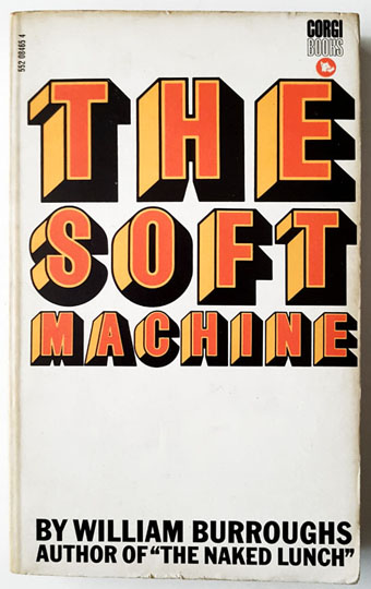
I’ll no doubt return to this question, especially when I’ve just done something in the groovy style myself. (You’ll have to wait a few months before you see the results.) In the meantime there’s a lot to enjoy in this book. I haven’t yet mentioned Glaser’s unused promotional art for the Saul Bass feature film, Phase IV, or the many typeface designs that Glaser created with his associates, and the way one of them—Baby Fat—is used on the cover of the first UK paperback of The Soft Machine. I think this was the first William Burroughs book I ever bought, and it’s been sitting on my shelves all this time without my realising it was a Glaser production. That’s how it often is with graphic designers; they shape our world almost as much as architects do yet their specific influence isn’t always recognised.
glaser7.jpg

Corgi Books, 1970.

And by coincidence, the latest post at The Daily Heller is about a Glaser exhibition tied to the publication of the book. If you’re in New York it’ll be running for the next two weeks.

Previously on { feuilleton }
• The groovy look
• Milton Glaser album covers
X-ray visions

x1.jpg

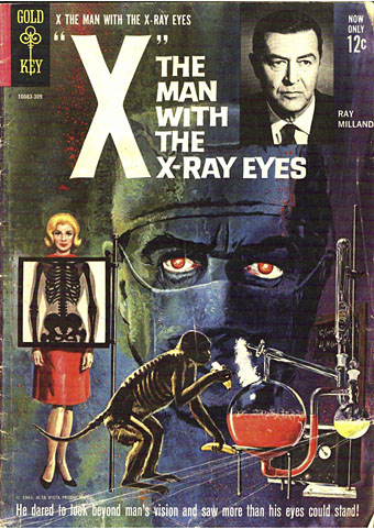
Cover art by George Wilson.

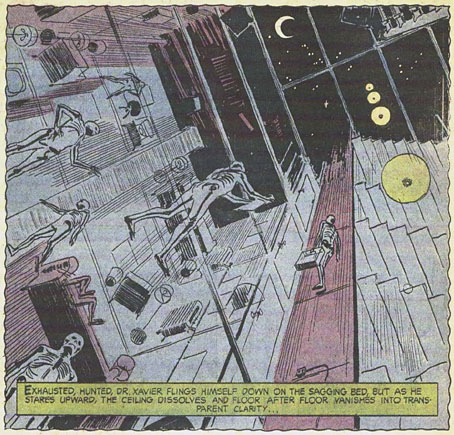
Cosmic weirdness isn’t something you expect to find in the tie-in comics published by Gold Key in the 1960s, but this adaptation of Roger Corman’s film contains a few such traces, as does the film itself. Having watched X: The Man with the X-ray Eyes again recently I was curious to know how artist Frank Thorne would manage with the scenes where Dr Xavier’s vision is showing him more of the world than he wants to see. Despite the general sketchiness of the drawing, in some of the panels these visions are more fully realised than they are in the film, it being easier to draw an unusual effect than capture it on celluloid. Roger Corman had a great idea, a talented co-writer in Ray Russell, and an authentically tormented performance from Ray Milland, but the film is hampered by the limitations of AIP’s budgets. When Xavier complains about the oppressive sight of people above him on the floors of his tenement building only the comic shows us what he sees.

x3.jpg

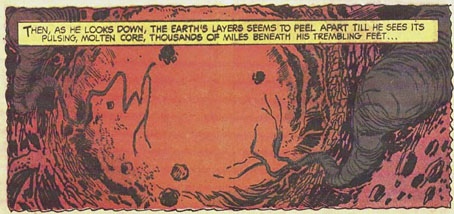
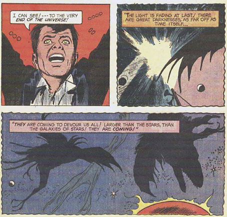
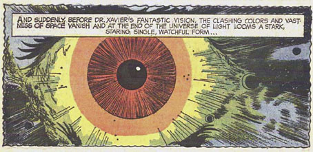
So too with the later scenes, by which time all of Corman’s point-of-view shots are the same combination of a diffracted lens (Spectarama!) and Les Baxter’s wailing theremin. Xavier’s description of a great watching eye “at the centre of the Universe” isn’t conjured so well by Corman’s visuals. The comic gives us an all-too-human eyeball floating in space, but before this there’s a panel of ragged shapes flapping through the interstellar void, as well as something never seen in the film when Xavier looks down into the Earth’s core.

x4.jpg

The comic was written by Paul Newman (not that one), and was evidently adapted from a script rather than a print of the film. None of the characters or scenes resemble their cinematic equivalents, while Xavier’s eyes in the comic hardly change appearance. But the additions to the finale make me wonder whether there was a little more in the script than ended up in the film.

x2.jpg

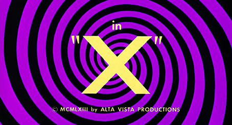
Corman made The Man with the X-ray Eyes in 1963, immediately after The Haunted Palace—the first film to adapt HP Lovecraft—and a few years before The Trip—the first feature film devoted solely to the psychedelic experience. Xavier’s journey into nightmare is a curious hybrid of Lovecraft and psychedelia: the titles are set against a swirling violet spiral, while the doctor’s Spectarama visions are precursors of the delirium experienced by Peter Fonda’s Paul in The Trip. (Corman’s initial idea for The Man with the X-ray Eyes had a jazz musician taking too many drugs.) At one stage in his LSD trip Paul looks in a mirror and announces that he can see inside his own brain, but in the earlier film we get to see inside Xavier’s brain for ourselves when he takes his eye drops for the first time, after which the camera passes through the back of the doctor’s head until we’re looking out of his eyes. This is so close to a moment in Gaspar Noé’s Enter the Void that I’ve been wondering whether Corman’s film is another of Noé’s cult titles like those you see named at the beginning of Climax.

x5.jpg

As for the Lovecraftian quality, The Man with the X-ray Eyes misses an opportunity to do more with the scope of its central concept. Stephen King famously reported a rumour that the film had a suppressed line of dialogue from the very end, when Xavier tears out his eyes then screams “I can still see!” Corman denied that this was the case but admitted it was a good idea. King mentions this in Danse Macabre, in a description of the film which also interprets the story as being far more Lovecraftian—he uses that word—than it actually is. His suggestion (or mis-remembering) is that all the Spectarama effects are Xavier’s growing perception of the Eye at the centre of the Universe, even though Xavier only mentions this presence in the last few minutes.

x6.jpg

The implications of this remain unexplored but Xavier’s final vision of cosmic horror is still truer to Lovecraft’s Mythos philosophy—a warning that the human race peers into the void at its peril—than almost anything else in cinema, and the revelation is made all the more disturbing by the appearance of Xavier’s eyes which by this point are solid black orbs. As King suggests, there’s another film altogether lurking under the surface of this one, a horror film with a cosmic reach. Hollywood still struggles to do anything substantial with Lovecraft’s fiction, but you know the way things are today we’ll be lucky to get anything weirder than more CGI monsters and lumbering kaiju. I wouldn’t want to suggest that Gaspar Noé remake The Man with the X-ray Eyes but if he ever wanted to create a psychedelic horror story then the cosmic route is the way to go.

Previously on { feuilleton }
• Undead visions
• Trip texts revisited
• More trip texts
• Enter the Void

Anger Magick Lantern Cycle, 1966

magick01.jpg

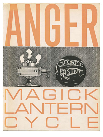
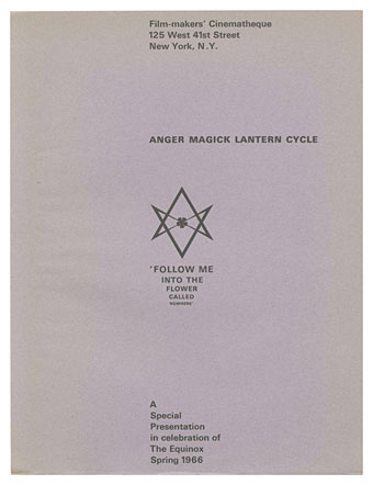
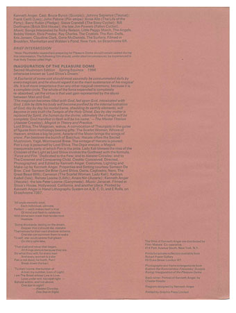
Here’s a rare thing: Kenneth Anger’s programme (PDF) for a Spring Equinox screening of his films in New York in 1966, an event that saw the first public appearance of Magick Lantern Cycle as a collective title. This small publication is described at some length by Bill Landis in the unauthorised Anger biography, while the cover design appears on the first page of the booklet inside the BFI collection of Anger’s films. There are 13 pages in the scan, the original item being a collection of loose sheets inside a folded cover.

magick02.jpg

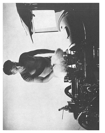
Among the many points of interest are Anger’s evocative production notes and dedications for the films, comments which have been recycled ever since in articles about the director and his work. There’s also a page of biographical detail which includes a list of Anger’s preferences and interests, a Crowley-style piece of hyperbolic self-description, and a collage bearing the title The Golden Grope of Marilyn Monroe. The latter features a Gustave Doré illustration which prefigures the appropriation of Doré for the first Lucifer Rising poster.

magick03.jpg

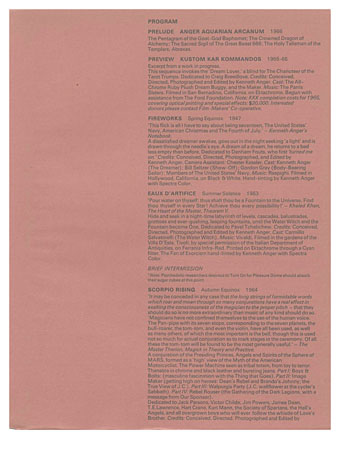
This being early 1966, LSD was hip and still legal, so the screening information suggests the ideal time for psychedelic voyagers in the audience to ingest their sugar cubes. The evening was to begin with the Anger Aquarian Arcanum, a prelude comprising a display of various magical symbols and iconography. Some writers have taken this to be a lost film but Landis says it was a slide show, presumably with Anger’s explanatory commentary. Enough of the programmes for the event were printed that you can still find them for sale today, although if you want to buy one the cheaper copies start at around £500.

magick04.jpg

magick05.jpg

Continue reading “Anger Magick Lantern Cycle, 1966”

Saga de Xam revived

saga1.jpg

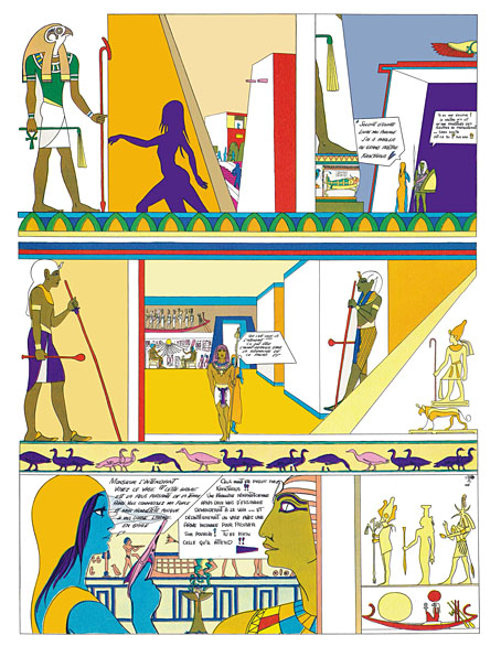
Saga est magnifique. Saga a la peau bleue. Saga est une extraterrestre. Envoyée par la reine de la planète Xam, la voici qui parcourt la Terre à plusieurs époques, traitées dans des styles différents. Son but: découvrir la quintessence artistique, politique et poétique de notre belle Terre. Marquée par l’Art nouveau, le psychédélisme américain, l’érotisme des années 1960 et la contreculture occidentale, Saga est une oeuvre hors norme et inclassable, dessinée sur des formats géants et publiée une première fois par Éric Losfeld en 1967. Hélas, le livre est très vite épuisé et devient un objet pour les collectionneurs. Cette édition reprend l’intégralité des planches de Saga, renumérisées et dotées d’une nouvelle mise en couleurs fidèle à l’originale. Saga peut enfin repartir dans une nouvelle… saga.

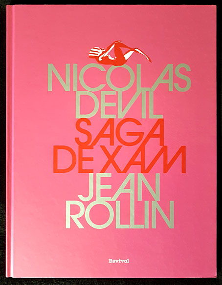
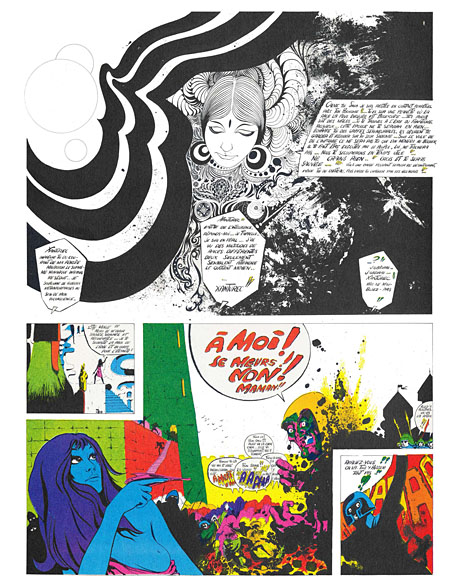
Here’s a book I never expected to see in a new edition. Saga de Xam is a 100-page bande dessinée depicting the time- and space-voyaging adventures of a blue-skinned alien woman, Saga, newly arrived on Earth from the planet Xam. The Xamians are a race of humanoid lesbians (their reproduction is parthenogenetic) whose planet is at war with the masculine Troggs; Saga has been sent to Earth to find a way to combat the Trogg invasion, an expedition that instructs her in the propensity of humans towards conflict and violence. The story was drawn by Nicolas Devil, with contributions from guest artists, and based on an outline by Jean Rollin which had been intended originally for a science-fiction film. There’s no need to go into detail about this cult item, I wrote about it at length several years ago after a couple of its pages stimulated my curiosity when they turned up in an exhibition catalogue. The book was published in 1967 by Éric Losfeld, an edition of 5000 which the publisher said he would never reprint, partly because of the expense, but also because he liked to think of the book becoming a rare object in the future. Rare it still is, although the embargo was broken in 1980, a year after Losfeld’s death, by the publication of a second edition. This was only a partial reprint, however, with a poor cover design and all the interior pages reproduced without their colour overlays.

saga2.jpg

The new edition from Revival is slightly larger than the original (27.5 x 36 cm to the original 24 x 31 cm), and bound between heavy boards. A lengthy preface by Christian Staebler describes the book’s history, offering a few biographical details about Nicolas Deville (as he was known pre-1967), together with further information about the story’s creation. The wildness of the final pages is explained as an attempt by all involved to capture some of the delirium of an LSD trip, while also bringing the story of Saga’s investigation of the human race and its violent nature into the present day. Jean Rollin was apparently unhappy with this dénouement but I find the ending to be a satisfying one for a story where each chapter explores a different period of time (and of space, when Saga returns to her home planet).

saga3.jpg

The icing on the cake is the appearance near the end of a few early drawings by Philippe Druillet, together with several beautiful pages by Devil, one of which found wider circulation when reprinted as a poster. The text in the new edition is still in French, of course, and even on slightly larger pages the legibility problem from the original remains. Devil was drawing on boards that were twice the size of their printed equivalents, without caring too much whether the story would be readable when scaled to a printable size. Losfeld’s solution was to provide a magnifying glass with each copy of the book. This isn’t too much of a problem; the story is easy enough to follow once you know the general outline, and for this story it’s the art that counts more than the words.

saga4.jpg

Continue reading “Saga de Xam revived”

Weekend links 655

brauner.jpg

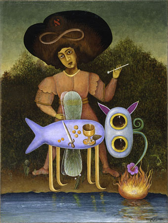
The Surrealist (1947) by Victor Brauner.

• At Dennis Cooper’s: Terry Ratchett presents…18 needlessly obscured avant-garde films by Thomas White, Teinosuke Kinugasa, George Barry, Standish Lauder, Helge Schneider, Dusan Makavejev, Oliver Herrmann, Mauricio Kagel, Mamoru Oshii, Gian Carlo Menotti, Pat O’Neill, Vera Chytilová, Shozin Fukui, Willard Maas, Djouhra Abouda and Alain Bonnamy, Juraj Herz, and Jay Schlossberg-Cohen.

• “When I’m convinced that a certain type of book is completely beyond the capacities of my temperament and my technical skills, I sit down at my desk and start writing it.” Italo Calvino discussing his approach to writing in 1983. The essay, The Written World and the Unwritten World, gives its title to a collection of previously unavailable Calvino pieces translated by Ann Goldstein. John Self reviewed the book.

• New music: Komplett Kollaps (A Dedication To Jóhann Jóhannsson) by Rúnar Magnússon, and Composition 1 by Deathprod.

Brann’s new book sweeps across the vast range of things that hold her interest. It thus invites us to enjoy the life of the mind and to live from our highest selves. A thoughtful encounter with this book will make you, I swear, a better person. The book includes chapters on Thing-Love, the Aztecs, Athens, Jane Austen, Plato, Wisdom, the Idea of the Good. The first half provides an on-ramp to the chapter titled “On Being Interested,” which falls in the dead centre of the book. This central chapter serves as more than a cog in the wheel: it is an ars poetica. Addressing issues of attention, focus, and interest itself, as well as how and where to deploy these functions throughout our lives, “Being Interested” offers a solution for any seeker intrigued by the notion that happiness is not an accident but a vocation. Brann characterizes the pursuit of happiness as “ontological optimism […] to be maintained in the face of reality’s recalcitrance.”

Peggy Ellsberg reviewing The Habit of Interestedness by Eva Brann

• “God told me I should take more LSD.” Sari Soininen on her acid-induced photographs.

• At Public Domain Review: The Procession of the Months by Walter Crane.

• At Smithsonian Magazine: See the chilling beauty of winter on Mars.

• Steven Heller’s font of the month is Edie & Eddy Slab.

• RIP Michael Snow, film-maker and musician.

• Kollaps (1981) by Einstürzende Neubauten | Feed The Collapse (1992) by Main | Collapsing Inwards (2014) by Jóhann Jóhannsson